
In the realm of brand strategy and corporate identity, color is far more than an aesthetic choice; it is a psychological tool, a silent communicator, and a foundational element of visual equity. When designers and brand strategists ask, “What is the complementary color for blue?” they are rarely looking for a simple answer from a primary school color wheel. Instead, they are seeking the key to high-impact visual communication, legibility, and emotional resonance.
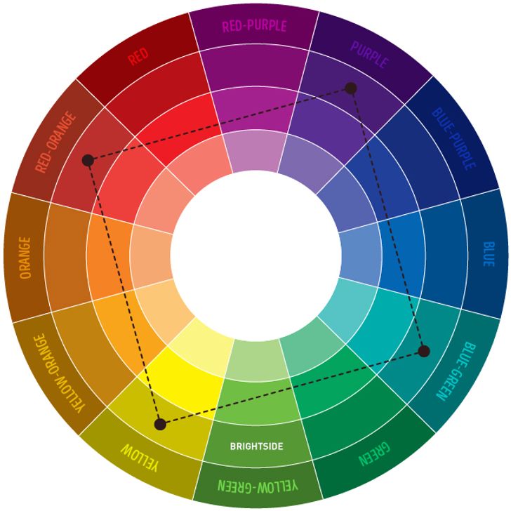
To answer the question directly: the true complementary color for blue is orange. On a traditional RYB (Red-Yellow-Blue) color wheel, orange sits directly opposite blue. This positioning means that these two colors possess the highest possible contrast to one another. In the world of branding, this relationship—known as a complementary color scheme—is the cornerstone of creating identities that demand attention and convey a sense of balance and completeness.

The Science and Psychology of the Blue-Orange Contrast
The relationship between blue and orange is rooted in the physics of light and the biology of human perception. Because they are opposites, when placed side-by-side, they make each other appear more vibrant—a phenomenon known as simultaneous contrast. For a brand, leveraging this effect can mean the difference between a logo that fades into the background and one that pops off a crowded shelf or digital interface.
The Psychological Weight of Blue
Blue is arguably the most dominant color in corporate branding. It is the color of the sky and the sea, universally associated with stability, trust, intelligence, and tranquility. From the deep navy of financial institutions like J.P. Morgan to the vibrant sky blue of social media giants like Twitter (X) and LinkedIn, blue communicates reliability. It lowers the heart rate and fosters a sense of security. However, blue on its own can sometimes lean toward the cold, distant, or overly conservative.
The Energetic Response of Orange
Orange, the complementary opposite, provides the necessary emotional counterweight. It is the color of fire, sunsets, and citrus. It radiates warmth, enthusiasm, energy, and playfulness. While blue is the “thinker,” orange is the “doer.” It is inherently aggressive in its bid for attention but lacks the inherent “danger” signaling of red. By introducing orange into a blue-dominated brand identity, a company can inject vitality, friendliness, and a call to action into an otherwise static visual profile.
Why the Pair Works in Marketing
The “blue and orange” trope is famous in cinematography (the ubiquitous “teal and orange” look in Hollywood posters) because it mimics the contrast between human skin tones and the shadows of a natural environment. In marketing, this translates to maximum legibility. When you use orange as an accent against a blue field, you are utilizing the most effective way to guide a consumer’s eye to a specific point—whether that is a “Buy Now” button, a brand name, or a key product feature.
Strategic Application: Integrating Complementary Schemes into Brand Identity
A sophisticated brand strategy does not simply use equal parts blue and orange. True design mastery lies in the ratio, the saturation, and the specific shades chosen to represent the corporate personality.
The 60-30-10 Rule in Branding
Successful brand identity systems often follow the 60-30-10 rule to ensure the complementary contrast doesn’t become overwhelming.
- 60% Primary (Blue): This provides the “anchor” for the brand. It covers the majority of the collateral, establishing the core values of trust and stability.
- 30% Secondary (Neutral): Whites, greys, or blacks provide breathing room, preventing the blue and orange from vibrating against each other in an unpleasant way.
- 10% Accent (Orange): The complementary orange is used sparingly for high-impact elements. This is the color of the Call to Action (CTA), the logo mark’s “spark,” or the notification badge.
Selecting the Right “Blue” and “Orange”
The “complementary” rule applies across the entire spectrum of blue. Identifying the specific “opposite” is crucial for brand harmony:
- Navy Blue and Amber: A classic, high-end combination often seen in luxury branding or collegiate identities. The amber adds a touch of prestige and “old-world” warmth to the professional navy.
- Teal and Coral: A modern, tech-forward, and lifestyle-oriented pairing. This feels fresh, innovative, and approachable, moving away from the “corporate” feel of darker blues.
- Cyan and Burnt Orange: This provides an industrial, gritty, or high-octane energy, frequently used in sports branding or hardware technology.
Case Studies: Success in Contrast
Consider the branding of FedEx. While their primary palette is purple and orange, the principle of complementary-adjacent colors is what makes the logo iconic. The “Express” portion in orange provides the speed and energy, while the purple (a blue-relative) provides the premium service feel.
In the digital space, Firefox utilized the blue globe against the orange fox to create a visual identity that was instantly recognizable and felt both global (blue) and fast (orange). Even in retail, The Home Depot utilizes orange as a primary disruptor, but when they use blue in their sub-branding or directional signage, it creates a sense of professional guidance within a high-energy environment.
Beyond the Basics: Split-Complementary and Triadic Variations
For many brands, a simple two-color complementary palette can feel too restrictive. Strategic branding often expands the “complementary” concept to include more nuanced color harmonies that still revolve around the blue-orange axis.
The Split-Complementary Scheme
Instead of using pure orange, a brand might use the two colors adjacent to orange: yellow-orange and red-orange. This maintains the high contrast of the blue while offering a more complex and sophisticated color palette. This is an excellent strategy for brands that want to appear multi-faceted—combining the friendliness of yellow and the passion of red with the foundation of blue.
Triadic Harmony for Comprehensive Brand Systems
A triadic scheme uses three colors equally spaced around the color wheel. For blue, this would include red and yellow. While this moves away from a pure complementary pair, the blue-orange tension remains the “secret sauce” that makes these palettes work. Think of Burger King or Pepsi; these brands use the primary triad to create a sense of universality and classic Americana.
Managing Visual Vibrancy and Accessibility
A common pitfall in digital branding is placing high-saturation blue text on a high-saturation orange background (or vice versa). This causes “vibration,” where the eye struggles to focus on the edges, leading to eye strain and poor accessibility. To solve this, brand designers must adjust the “value” (lightness or darkness) of the colors. A dark navy background with a bright, pale orange accent is much more legible and accessible than two colors of the same value.
Implementation: The Digital and Physical Manifestation of Color
When applying the blue-orange complementary scheme, strategists must account for how these colors behave in different mediums. The physics of color changes between a backlit LED screen (RGB) and a printed brochure (CMYK).
Digital-First Identity
In the digital realm, blue is the “default” color of the internet (historically, hyperlinks were blue because it was the color with the highest contrast to black text other than red). When building a digital brand, using orange as the complementary accent is the most effective way to drive conversion. A “Sign Up” button in a vibrant orange on a clean, professional blue interface creates a “visual cliff”—an area where the user’s eye cannot help but land.
Physical Collateral and Environmental Branding
For physical products, the complementary relationship affects perceived weight and temperature. Blue packaging often feels “cooler” (ideal for bottled water or technology that needs to stay cool), while the orange accent can draw attention to flavor, heat, or speed. In environmental design—such as an office space—a blue room with orange furniture feels creative and stimulating, whereas an all-orange room might feel anxious, and an all-blue room might feel somber.
The Evolution of the Palette
Modern brand strategy is rarely static. As a brand matures, it may shift its complementary balance. A startup may lead with aggressive orange to disrupt the market and gain attention. As it becomes a market leader, it may pivot to a more dominant blue to signal stability, keeping the orange as a nostalgic or legacy accent to remind consumers of its innovative roots.

Conclusion: Strategic Mastery of the Blue-Orange Axis
Understanding that the complementary color for blue is orange is only the starting point for high-level brand strategy. The true value lies in how a brand balances the “calm” of blue with the “chaos” of orange to create a visual identity that is both trustworthy and exciting.
By strategically utilizing these opposites, brands can achieve visual dominance, improve user experience through clear hierarchies, and evoke specific emotional responses that drive consumer loyalty. Whether it is a sleek fintech app using navy and gold or a vibrant lifestyle brand using teal and peach, the blue-orange relationship remains one of the most powerful tools in a designer’s arsenal for building a memorable and effective corporate identity.
aViewFromTheCave is a participant in the Amazon Services LLC Associates Program, an affiliate advertising program designed to provide a means for sites to earn advertising fees by advertising and linking to Amazon.com. Amazon, the Amazon logo, AmazonSupply, and the AmazonSupply logo are trademarks of Amazon.com, Inc. or its affiliates. As an Amazon Associate we earn affiliate commissions from qualifying purchases.