
In the realm of brand strategy and corporate identity, the color white is rarely viewed as a mere void or the absence of pigment. Instead, white is a sophisticated strategic tool—a high-impact visual “silence” that allows a brand’s core message to resonate with clarity and authority. In design psychology, white represents a canvas of infinite possibility, conveying purity, efficiency, and modernism. For the world’s most successful brands, white is not what is left over; it is a deliberate choice used to frame value, establish premium positioning, and facilitate seamless user experiences.
The Strategic Foundation of Negative Space
To understand what the color white is in a professional branding context, one must first understand the concept of “negative space.” Negative space is the area of a layout that is left empty, and in the majority of modern branding, that space is white. Far from being “wasted” real estate, white space is a structural pillar that dictates how a consumer perceives a brand’s sophistication and price point.

Minimalist Design and Premium Positioning
There is a direct, measurable correlation between the amount of white space in a brand’s visual identity and its perceived luxury status. Consider the branding of Apple or Tesla. These companies utilize expansive white backgrounds in their advertising, packaging, and digital interfaces. This isn’t just an aesthetic preference; it is a psychological cue.
By surrounding a product with a vast amount of white, a brand signals that the product is so valuable that it does not need to compete with busy graphics or loud promotional text. White acts as a spotlight, stripping away distractions and forcing the consumer to focus on the craftsmanship of the item itself. In this context, white is the color of “high-end minimalism,” transforming a commodity into an icon.
Psychological Impact: Trust and Transparency
In corporate identity, white is often synonymous with transparency and honesty. This is particularly prevalent in the healthcare, skincare, and technology sectors. When a consumer sees a brand anchored in white—such as Glossier in beauty or Stripe in fintech—there is an immediate subconscious association with cleanliness and lack of hidden agendas.
White suggests that the brand has nothing to hide. It creates an atmosphere of clinical precision and reliability. For service-based brands, using white helps to de-clutter the consumer’s mind, reducing the “cognitive load” required to process information. This builds trust by making the brand feel approachable and its offerings easy to understand.
White in Visual Identity and Logo Design
While many brands focus on their primary brand colors—the blues of IBM or the reds of Coca-Cola—the role of white in logo execution is often the unsung hero of brand recognition. White provides the necessary contrast that allows a visual identity to function across diverse media, from smartphone screens to massive billboards.
Contrast, Readability, and the “Knockout” Effect
In graphic design, a “knockout” logo refers to a version of a brand mark that is rendered entirely in white against a dark or colored background. This is a critical component of any robust brand style guide. The color white provides the highest possible contrast against saturated colors, ensuring that a logo remains legible even at small scales.
Furthermore, white is essential for typography. The “leading” (space between lines) and “kerning” (space between letters) are essentially the strategic application of white to ensure readability. A brand that masters the use of white within its typography projects an image of professional polish and attention to detail.
The Versatility of White in Packaging
Packaging is the physical touchpoint where a brand’s promise meets the consumer’s hand. White packaging has become a hallmark of the “Direct-to-Consumer” (DTC) revolution. Brands like Casper, Away, and various “clean beauty” labels use white matte finishes to stand out on shelves otherwise crowded with neon colors and complex patterns.
White packaging performs a specific functional role: it makes the “unboxing experience” feel like a ritual. When a customer opens a white box to find a meticulously placed product, the experience feels curated rather than industrial. This reinforces the brand’s commitment to quality and elevates the perceived value of the purchase.
Cultural Nuances and Global Brand Strategy
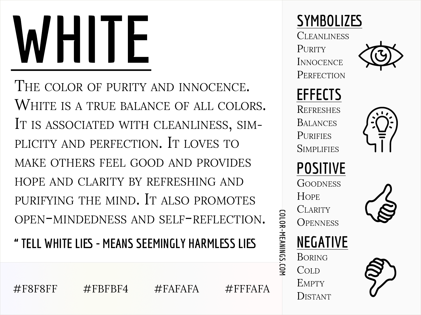
For global brands, the definition of white is not universal. While Western markets largely associate white with weddings, peace, and purity, other global regions interpret the color through different historical and social lenses. A sophisticated brand strategy must account for these nuances to avoid unintended messaging.
The Western vs. Eastern Perspective
In Western cultures, white is almost exclusively positive, representing new beginnings and cleanliness. However, in many East Asian cultures, white has historically been associated with mourning and funerals. While modern globalization has softened these associations—white is now common in Asian tech branding and fashion—the underlying cultural weight remains.
Global brands like Nike or IKEA must navigate these waters carefully when launching regional campaigns. In some contexts, a heavy reliance on white might feel somber rather than minimalist. Understanding that white is a cultural signifier, and not just a hex code (#FFFFFF), is what separates a localized brand from a truly global powerhouse.
The Universal Language of Modernity
Despite regional differences, a “global white” has emerged in the 21st century, largely driven by the tech industry. From the white earbuds of the early 2000s to the minimalist interfaces of modern SaaS platforms, white has become the universal language of the “future.” It represents a world that is digitized, streamlined, and efficient. Brands that lean into this “global white” are often perceived as being at the forefront of innovation, regardless of where their headquarters are located.
Implementing White in Digital Experiences (UI/UX)
In the digital age, the color white is the backbone of the User Interface (UI). As we transition more of our lives into digital spaces, the way white is utilized in app design and web development dictates the quality of the User Experience (UX).
Combatting Information Overload
The modern consumer is bombarded with thousands of data points daily. Brands that use white effectively in their digital products offer a sanctuary from this noise. By utilizing wide margins and white backgrounds, developers can guide a user’s eye toward the “Call to Action” (CTA) without causing visual fatigue.
In digital branding, white space is functional. It defines the hierarchy of information. A well-designed website uses white to separate sections, making the content skimmable. If a brand’s digital presence is too “crowded,” users will experience frustration and high bounce rates. In this sense, white is the color of digital usability.
Dark Mode vs. Light Mode in Brand Perception
The rise of “Dark Mode” in operating systems has forced brands to rethink their relationship with white. While dark interfaces are often seen as “sleek” or “cool,” the “Light Mode” (predominantly white) remains the standard for productivity and long-form reading.
A brand’s decision to default to a white background versus a dark one says a lot about its identity. A white background suggests an “open” and “active” environment (think Google or LinkedIn), whereas a dark background often suggests “entertainment” or “prestige” (think Netflix or Spotify). For a brand strategist, choosing how to deploy white in a digital interface is a foundational decision in defining the brand’s personality.
The Future of White: Sustainability and Modernism
As we move toward a more environmentally conscious marketplace, the color white is taking on new meanings related to sustainability and “honest” materials. In the past, brilliant, bleached white was the goal; today, brands are embracing “off-white,” “eggshell,” and “bone” to signal organic origins.
The Aesthetic of the Unfinished
Many modern eco-friendly brands are moving away from stark, chemically bleached whites in favor of natural, unbleached tones. This “new white” signals that a brand is prioritizing the planet over artificial perfection. In paper stocks and textile branding, this shift reflects a move toward “conscious consumerism.” White is no longer just about clinical perfection; it is about the purity of the ingredients and the transparency of the supply chain.

Conclusion: White as a Brand Powerhouse
In conclusion, “what is the color white” is a question with a deep, multi-layered answer for the modern brand strategist. It is the color of luxury, the engine of digital clarity, and the canvas of corporate trust. By mastering the use of white, a brand can command attention without shouting, convey complex ideas with simplicity, and establish a premium position in a crowded marketplace. White is not the absence of color; it is the presence of clarity, making it perhaps the most powerful tool in any brand’s visual arsenal.
aViewFromTheCave is a participant in the Amazon Services LLC Associates Program, an affiliate advertising program designed to provide a means for sites to earn advertising fees by advertising and linking to Amazon.com. Amazon, the Amazon logo, AmazonSupply, and the AmazonSupply logo are trademarks of Amazon.com, Inc. or its affiliates. As an Amazon Associate we earn affiliate commissions from qualifying purchases.