
In the competitive landscape of professional sports, success is often measured by box scores, championship trophies, and win-loss percentages. However, from a brand strategy perspective, the true pinnacle of a sports franchise is its ability to transcend the game and become a cultural phenomenon. For the Philadelphia Phillies, this phenomenon is encapsulated in two words: “Red October.”
“Red October” is far more than a seasonal reference to the Major League Baseball (MLB) postseason. It is a masterfully executed brand identity that blends emotional resonance, visual consistency, and aggressive marketing to create a tribal sense of belonging among millions of fans. By examining the mechanics of Red October, branding professionals can learn how a regional organization can leverage seasonal momentum to build a global brand equity that lasts well beyond the final out of the World Series.
The Anatomy of a Rallying Cry: Building the Red October Narrative
At its core, a brand is a promise kept. In sports, that promise is usually centered around excitement, community, and the pursuit of excellence. The “Red October” brand represents the moment that promise is fulfilled. It is a distinct sub-brand of the Philadelphia Phillies, activated specifically during the high-stakes environment of the playoffs.
The Origin and Evolution of the Slogan
The term “Red October” originally gained traction during the Phillies’ dominant run from 2007 to 2011, culminating in a 2008 World Series title. While the phrase has roots in popular culture—most notably the Tom Clancy novel and film The Hunt for Red October—the Phillies marketing team successfully reappropriated the term to fit the team’s visual identity.
From a brand strategy standpoint, this was a brilliant move in “anchoring.” By taking a pre-existing, high-energy phrase and tethering it to the team’s signature color, the Phillies created an immediate mental shortcut for their audience. When fans hear “Red October,” they don’t think of submarines; they think of Citizens Bank Park, the roar of the crowd, and the specific shade of Phillies red.
Emotional Resonance and Fan Ownership
A successful brand is not something forced upon a consumer; it is something the consumer chooses to inhabit. The Red October brand works because it positions the fan as the protagonist. In Philadelphia, a city with a “blue-collar” brand archetype, the postseason is framed as a collective struggle.
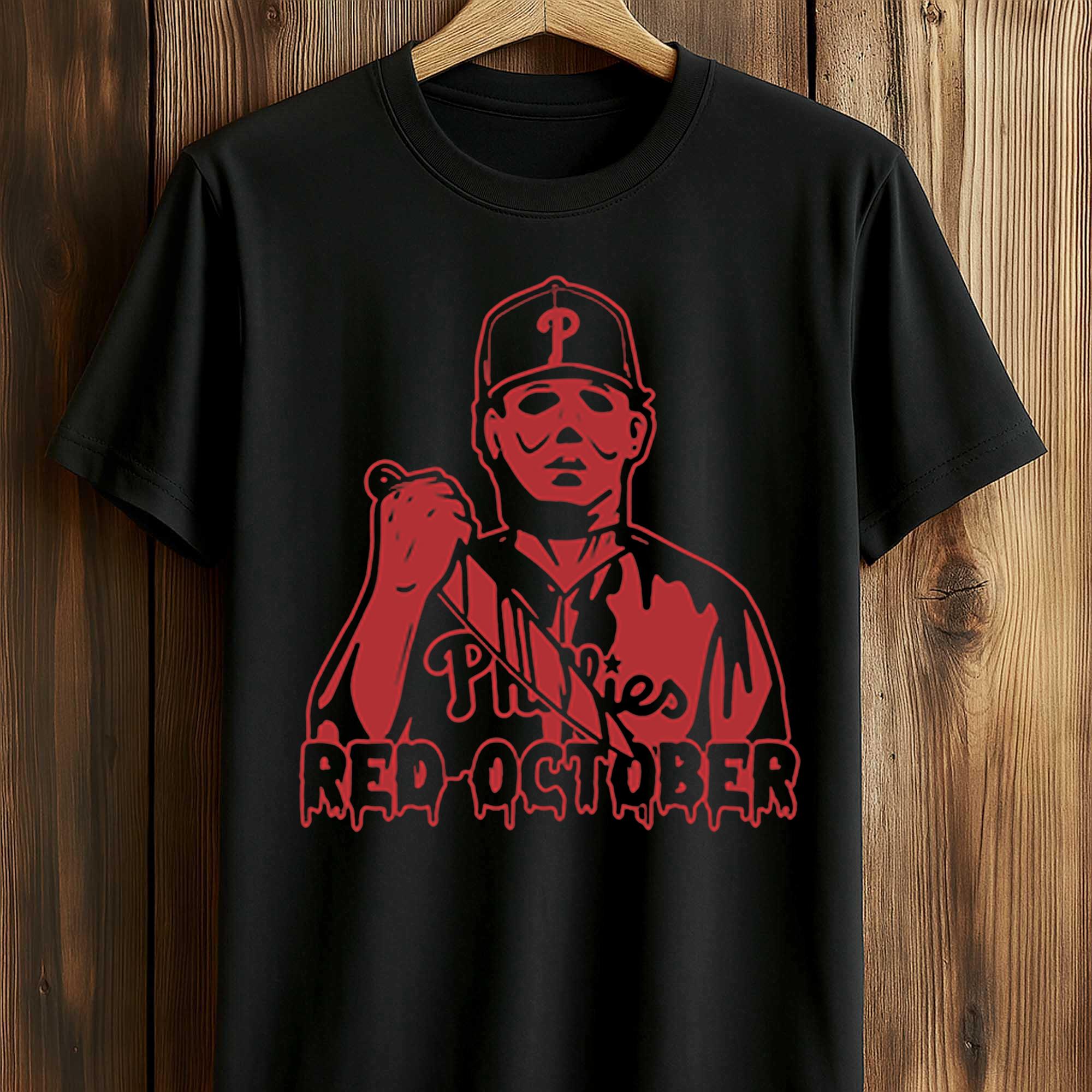
Marketing campaigns surrounding Red October often focus on the fans’ intensity, the noise levels of the stadium, and the shared history of the city. This “participatory branding” ensures that the fans feel they are a vital part of the product. When a fan wears a “Red October” t-shirt, they aren’t just supporting a team; they are signaling their membership in an elite, passionate community. This is the ultimate goal of personal and corporate branding: turning customers into advocates.
Brand Consistency and Visual Identity in Professional Sports
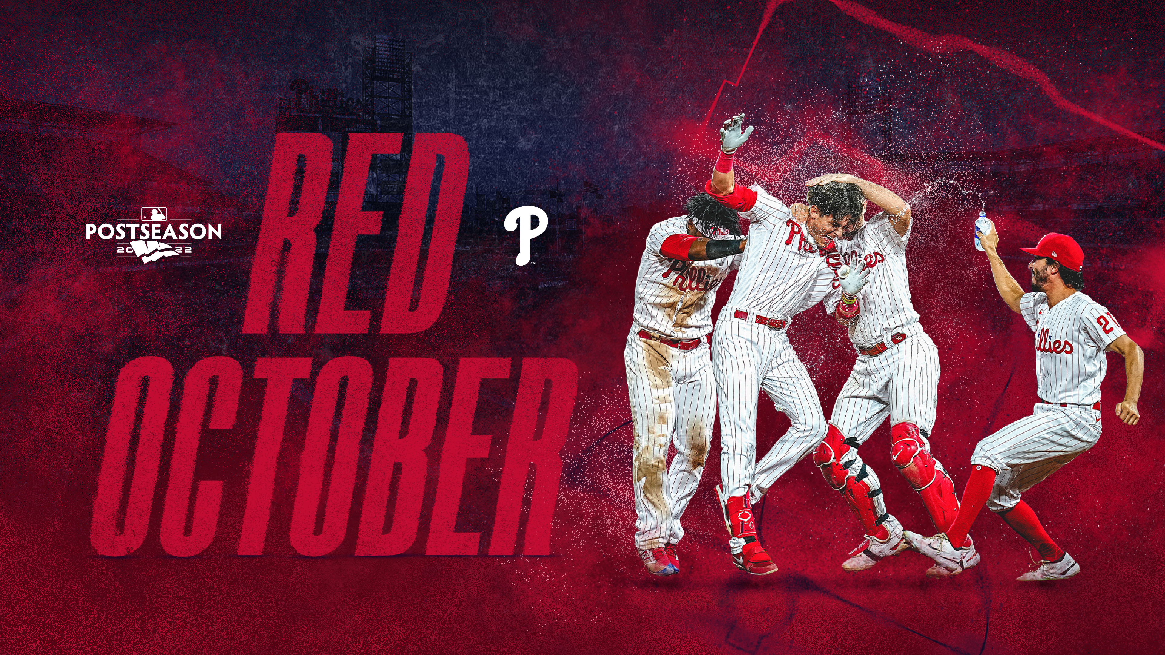
Visual identity is the most immediate way a brand communicates its values and energy. The Phillies have utilized the “Red October” concept to create a visual “red out” that is striking both in person and on global television broadcasts. This visual cohesion is a vital component of their brand strategy.
Color Psychology: The Power of Red
In the world of marketing, color is never accidental. Red is psychologically associated with passion, energy, urgency, and aggression. By leaning heavily into this specific palette, the Phillies amplify the high-stakes nature of playoff baseball.
During Red October, the team’s branding shifts from the standard blue-and-red mix used in the regular season to a monochromatic, high-impact red. This shift creates a sense of “special edition” branding. Just as luxury brands might release a limited-run product in a unique colorway, the Phillies “rebrand” for the postseason to signal to their audience that this period is more important, more intense, and more valuable than the rest of the year.
Logo Integration and Merchandising Strategy
The Red October logo is a study in effective design. It typically incorporates the team’s classic script “P” or the Liberty Bell icon, but stylizes them with “distressed” textures or aggressive typography that suggests grit and determination.
The merchandising strategy behind Red October is a significant revenue driver, but more importantly, it serves as a brand reinforcement tool. By releasing exclusive postseason apparel, the Phillies create a “scarcity” model. Fans want the latest Red October gear not just for the aesthetics, but as a badge of honor that proves they were present for a specific moment in time. This is a classic example of “event-based branding,” where the brand’s value is tied to a specific, fleeting experience.

The Marketing Engine: How the Phillies Leverage Seasonal Momentum
While the brand is built on emotion, it is sustained by a sophisticated marketing engine. The Phillies utilize digital platforms, experiential marketing, and strategic partnerships to ensure that the Red October brand is omnipresent during the autumn months.
Digital Presence and Social Media Amplification
In the modern era, a brand lives or dies on social media. The Phillies’ digital strategy during Red October is characterized by high-speed content production. Within minutes of a game-winning play, social media channels are flooded with high-definition imagery and short-form video content branded with the Red October aesthetic.
The use of specific hashtags, such as #RedOctober or #RingTheBell, allows the brand to track engagement and foster a global conversation. This digital “echo chamber” reinforces the brand’s dominance. When a fan sees their entire social feed turning red, the psychological effect is one of total immersion. This is an essential lesson for any brand: consistency across platforms is the key to creating a dominant market presence.
Experiential Branding: The Stadium Atmosphere
The Phillies understand that their “product” is not just the game of baseball, but the experience of being at the ballpark. During Red October, Citizens Bank Park is transformed into a temple for the brand. From the red LED lighting to the specific rally towels placed on every seat, every touchpoint is designed to reinforce the Red October identity.
This is “environmental branding” at its finest. By controlling the sensory experience—the sight of the red towels, the sound of the specific walk-up music, the “vibe” of the crowd—the organization creates a brand experience that is impossible to replicate. For a business, this translates to high customer loyalty and a premium price point for tickets and concessions.
Lessons in Brand Longevity: Sustaining the “Red October” Legacy
One of the greatest challenges in branding is maintaining relevance over time. A brand that is too tied to a single moment can quickly become a “fad.” The Phillies have avoided this by treating Red October as a recurring “seasonal brand” that builds on its own history.
Beyond the Win-Loss Record
A common mistake in sports branding is tying the brand entirely to winning. If the brand is “Winning October,” it dies the moment the team loses. By naming it “Red October,” the Phillies have created a brand centered on an identity and a feeling rather than a specific outcome.
Even in years where the team does not win the World Series, the Red October brand remains intact because it represents the passion of the journey. For corporate brands, this is a lesson in “purpose-driven branding.” If your brand is built on a set of values (like Philadelphia’s “grit” and “toughness”), it can survive market downturns or product failures because the emotional connection with the consumer remains strong.
Protecting Intellectual Property and Trademarking
From a business finance and brand strategy perspective, the Phillies have been diligent in protecting the Red October name. By securing trademarks and controlling the licensing of the phrase, they ensure that the brand is not diluted by third-party knockoffs.
This legal protection is crucial for maintaining “brand equity.” When a brand becomes as popular as Red October, there is a risk that it becomes a generic term. By maintaining strict control over how the logo and phrase are used, the Phillies ensure that “Red October” remains synonymous with their specific organization, allowing them to capture the full economic value of the brand they built.
Conclusion: The Impact of Red October on the Global Stage
The “Red October Phillies” phenomenon is a compelling case study for anyone interested in brand strategy. It demonstrates how an organization can take a simple color and a month of the year and weave them into a powerful narrative that resonates with millions of people.
By focusing on emotional connection, visual consistency, and a multi-channel marketing approach, the Phillies have created a brand that is more than just a sports slogan. It is a seasonal identity that defines the city of Philadelphia every autumn. For brands in any industry, the takeaway is clear: when you move beyond selling a product and start selling a shared identity, you create a brand that is not just successful, but iconic. Red October is not just a time on the calendar; it is a testament to the enduring power of strategic branding.
aViewFromTheCave is a participant in the Amazon Services LLC Associates Program, an affiliate advertising program designed to provide a means for sites to earn advertising fees by advertising and linking to Amazon.com. Amazon, the Amazon logo, AmazonSupply, and the AmazonSupply logo are trademarks of Amazon.com, Inc. or its affiliates. As an Amazon Associate we earn affiliate commissions from qualifying purchases.