
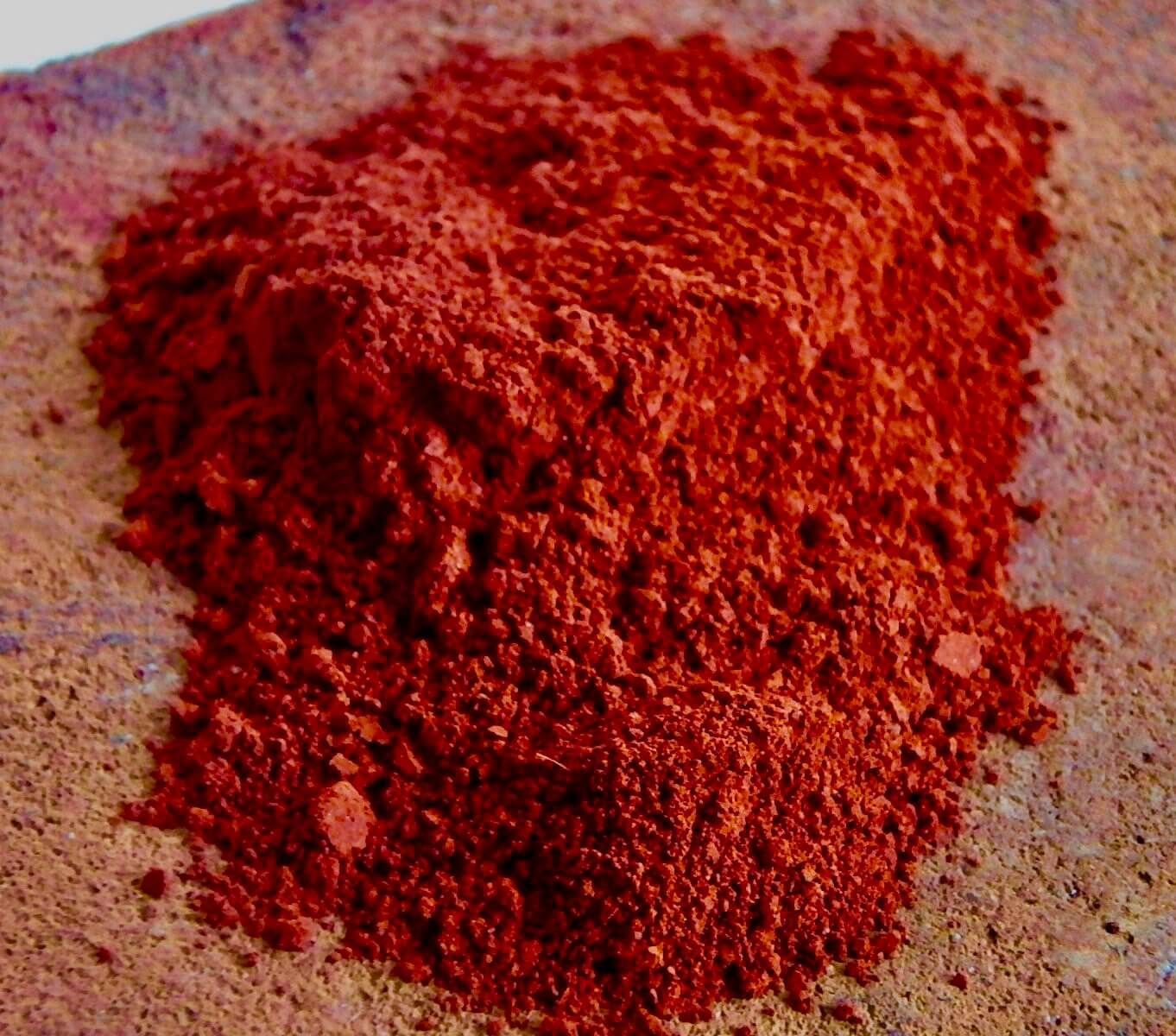
In the hyper-saturated landscape of modern marketing, where neon digital hues and minimalist monochromatic palettes often dominate, a specific pigment from our prehistoric past is making a significant resurgence. Red ochre, a natural earth pigment composed of ferric oxide, clay, and sand, is far more than a geological curiosity. For brand strategists, designers, and corporate identity experts, red ochre represents a bridge between the primal human experience and sophisticated modern positioning.
To understand what red ochre is in the context of brand strategy is to understand the power of semiotics—the study of signs and symbols. Red ochre is humanity’s first “brand color.” It was used in the cave paintings of Altamira and Lascaux, signifying life, ritual, and permanence. Today, brands looking to evoke authenticity, ruggedness, and timelessness are returning to this pigment to ground their visual identity in a world that often feels increasingly ephemeral.

The Historical Semiotics of Red Ochre
The use of red ochre predates modern civilization by tens of thousands of years. From a branding perspective, this gives the color a level of “inherited equity” that synthetic colors simply cannot match. When a brand adopts red ochre, it isn’t just choosing a shade of reddish-brown; it is tapping into a deep-seated evolutionary recognition.
Humanity’s First Trademark
Historically, red ochre was the primary medium for early visual communication. Because it was lightfast and durable, it survived the millennia, allowing us to see the handprints of our ancestors on rock walls. In brand strategy, this translates to “permanence.” While a bright, trending “Gen-Z Yellow” or “Millennial Pink” might offer immediate impact, red ochre suggests a company that has been here forever and intends to stay. It is the color of the earth itself, suggesting a foundational strength that is particularly attractive to heritage brands, financial institutions seeking to project stability, and artisanal manufacturers.
From Prehistory to Modernity
Throughout the Renaissance and into the industrial era, ochres were the backbone of the artist’s palette. They provided the warmth in skin tones and the depth in landscapes. In the corporate world, the transition of this pigment from the artist’s studio to the brand guideline signifies a shift from “artificial” to “organic.” As consumers become more skeptical of corporate polish, the raw, unrefined nature of red ochre serves as a visual shorthand for honesty. It avoids the aggressive “look at me” nature of fire-engine red, opting instead for a “know me” approach that fosters long-term brand loyalty.
The Psychological Architecture of Red Ochre in Marketing
Color psychology is a cornerstone of brand identity. While standard red is often associated with urgency, passion, and danger (think Coca-Cola or Netflix), red ochre operates on a different psychological frequency. It is a “muted red,” which retains the energy of its primary root but tempers it with the stability of brown.
Grounded Energy: Balancing Red and Earth
Red ochre triggers a unique emotional response. It provides the warmth of a fire without the threat of a blaze. In brand strategy, this is often used to create an “approachable authority.” A brand using red ochre feels energized but safe. It is an ideal choice for outdoor lifestyle brands, premium skincare lines, and high-end organic food companies. By using this color, these brands communicate that they are active and vibrant, yet rooted in natural wisdom.
Cultivating Trust and Longevity
In the “Money” and “Trust” sectors, color choice can determine perceived reliability. Red ochre is frequently used in the branding of boutique investment firms and law offices that want to distance themselves from the cold, clinical blues of traditional corporate banking. The earthiness of the pigment suggests “old money” and “land-based wealth.” It implies that the brand’s value is not just in digital spreadsheets but in tangible, real-world assets. This psychological grounding is essential for brands that deal with high-stakes personal or financial decisions.

Red Ochre in Brand Strategy: Case Studies and Applications
Identifying a color is only the first step; the true mastery lies in its application across different industries. Red ochre’s versatility allows it to function as a primary brand color or a sophisticated accent.
Luxury and Artisanal Excellence
In the luxury sector, red ochre is often paired with gold or deep cream to create an atmosphere of “understated opulence.” Unlike the flashy reds used in fast-fashion, red ochre in luxury branding denotes craftsmanship. Take, for example, high-end leather goods or bespoke wineries. The color mimics the natural aging process of quality materials—the patina on a leather bag or the soil of a prestigious vineyard. By integrating red ochre into their corporate identity, these brands emphasize the “process” over the “product,” appealing to a demographic that values origin stories and artisanal skill.
Sustainability and The “Green-to-Brown” Shift
For years, sustainability was synonymous with green. However, as the market became saturated with “greenwashed” identities, savvy brands began looking for more sophisticated ways to signal environmental consciousness. Red ochre, representing the raw earth, has become a key player in this shift. It moves the conversation from “plants” (green) to “soil and planet” (ochre). Brands in the sustainable architecture, ethical mining, and “farm-to-table” movements use red ochre to signify a deeper, more holistic connection to the environment. It is a color that says the brand understands the lifecycle of the earth, from the ground up.
Technical Execution: Incorporating Red Ochre into Your Brand Guidelines
From a design perspective, red ochre is a complex color to replicate across different media. Because it is a natural pigment, its digital representation must be handled with care to ensure it doesn’t lose its “warmth” or appear too muddy on screens.
Defining the Palette: HEX, CMYK, and Pantone
When establishing a brand strategy around red ochre, precision is vital. A typical red ochre HEX code might fall around #A45A52 or #913831, but the specific tone should be adjusted based on the brand’s primary medium.
- For Print: Using a spot color (Pantone) is often better than a CMYK mix to ensure the richness of the iron-oxide undertones isn’t lost in the printing process.
- For Digital: It is essential to test the color against various backgrounds. Red ochre excels when paired with “eggshell” whites or deep “charcoal” greys. It can struggle against pure white (#FFFFFF), which can make the color look dated or “dirty” if the saturation isn’t perfectly calibrated.
Digital Accessibility and Contrast
In the realm of UI/UX design, red ochre presents both opportunities and challenges. Its deep, muted nature provides excellent contrast for white text, making it a viable option for “Call to Action” (CTA) buttons that need to be prominent without being jarring. However, designers must be wary of color blindness. Because red ochre sits between red and brown, it can be difficult for users with certain types of color vision deficiency to distinguish it from other earthy tones. A robust brand strategy will always supplement color with strong typography and iconography to ensure the brand identity is accessible to everyone.
The Future of the Earth Palette
As we move further into a digital-first era, the craving for “tactile” and “real” experiences only grows. This is why “what is red ochre” is a question being asked in the boardrooms of the world’s most innovative companies. It is a response to the “flattening” of design—a way to inject soul, history, and physical presence back into a brand.
The future of brand strategy lies in this intersection of high-tech and high-touch. We see this in AI companies that use earth-toned interfaces to appear more human and less “robotic,” and in digital banks that use ochre-heavy branding to appear more permanent and less “virtual.” Red ochre is not just a color; it is a strategic tool for humanizing the corporate world. It reminds the consumer that behind every screen and every product, there is a human connection that spans back to the very first marks made on a cave wall. In the end, red ochre is the ultimate symbol of a brand that is built to last.
aViewFromTheCave is a participant in the Amazon Services LLC Associates Program, an affiliate advertising program designed to provide a means for sites to earn advertising fees by advertising and linking to Amazon.com. Amazon, the Amazon logo, AmazonSupply, and the AmazonSupply logo are trademarks of Amazon.com, Inc. or its affiliates. As an Amazon Associate we earn affiliate commissions from qualifying purchases.