
In the competitive landscape of modern commerce, a brand is far more than a logo or a product line; it is an entity with a perceived “soul.” When we ask what a color like pink means “spiritually” within the context of brand strategy, we are delving into the subconscious resonance and the emotional frequency that a business emits to its audience. Pink is a color that has undergone a profound transformation in the corporate world, evolving from a strictly gendered signifier to a symbol of radical empathy, innovation, and approachable luxury.
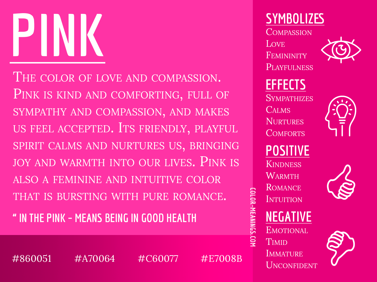
To understand the spiritual essence of pink in branding is to understand the power of soft influence. Unlike the authoritative “spirit” of navy blue or the aggressive “energy” of red, pink occupies a space of compassion, nurturing, and psychological safety. For a brand, adopting pink is a strategic choice to align with the values of human connection and emotional intelligence.
The Psychological and Metaphysical Foundation of Pink in Branding
The spiritual weight of a color in branding is often rooted in its psychological impact on the consumer’s subconscious. Pink, a combination of the passion of red and the purity of white, represents a tempered energy. In the realm of brand identity, this translates to a “spirit” of controlled enthusiasm and refined vitality.
Softness and Approachability
At its core, the spiritual meaning of pink in a professional context is approachability. Brands that utilize pink are often perceived as more “human” and less “corporate.” This is particularly vital in industries that have historically felt cold or transactional, such as fintech or healthcare. By integrating pink into their visual identity, these organizations signal a commitment to the user’s well-being and a departure from the rigid hierarchies of traditional business.
Spiritually, pink is often associated with the heart chakra—the center of love and compassion. In branding, this manifests as a “heart-centered” business model. When a customer sees a pink-branded interface or package, there is an immediate, often unconscious, perception that the brand is empathetic to their needs. It lowers the defensive barriers of the consumer, fostering a sense of trust that is essential for long-term brand loyalty.
The Evolution from Gendered Color to Universal Empathy
For decades, the “spirit” of pink was confined to the feminine. However, modern brand strategy has reclaimed pink as a gender-neutral symbol of modernism and sophistication. The rise of “Millennial Pink” in the mid-2010s marked a spiritual shift in the marketplace. It became the color of a generation that valued transparency, wellness, and the breaking of traditional boundaries.
Today, pink represents a universal sense of empathy. It is used by brands that want to project a spirit of inclusivity. Whether it is a luxury fashion house or a disruptive tech startup, pink signals that the brand is forward-thinking and culturally aware. It suggests a brand that is comfortable in its own skin—one that doesn’t need to rely on the traditional symbols of “strength” (like black or dark grey) to command respect.
Pink as the “Heart Chakra” of Brand Strategy: Building Emotional Trust
In the architecture of a brand’s identity, pink functions as the emotional anchor. While other colors might drive action (orange) or signify stability (brown), pink nurtures the relationship between the brand and the individual. This “spiritual” connection is what transforms a one-time purchaser into a brand advocate.
Cultivating Compassion and Support
Brands that position themselves as caregivers or mentors often find their spiritual home in the pink spectrum. This is evident in the wellness and mental health sectors. A brand identity bathed in soft rose or dusty pink communicates a spirit of “I hear you” and “I am here for you.” It provides a visual sanctuary in a loud, chaotic digital world.
In this context, the spiritual meaning of pink is “support.” It is the color of a brand that prioritizes the customer experience over the bottom line—or at least makes the customer feel that way. This emotional resonance is a powerful tool in brand strategy, as it creates a “halo effect” where the consumer associates the brand with the positive, nurturing aspects of their own lives.
The Role of Pink in Socially Conscious Branding
As corporate social responsibility (CSR) becomes a pillar of modern business, pink has emerged as the color of advocacy and social “spirit.” Beyond its association with specific causes like breast cancer awareness, pink represents a broader commitment to kindness and social justice.
When a brand adopts pink as a primary or secondary color, it often signals a “spirit of giving.” This is a strategic move to align the brand with the values of the modern, conscious consumer. It suggests that the brand’s mission goes beyond profit, aiming instead to contribute positively to the collective “spirit” of society. This alignment is not just a marketing tactic; it is a foundational component of a brand’s corporate identity that dictates how they interact with employees, stakeholders, and the environment.
Strategic Variations: From Millennial Pink to Neon Vibrancy

Not all pinks carry the same spiritual weight. The specific shade chosen by a brand strategist can radically alter the brand’s perceived “energy” and “soul.” The spectrum ranges from the ethereal and calming to the electric and rebellious.
Millennial Pink and the New Neutral
Millennial pink—a muted, dusty shade of rose—has become a spiritual “neutral” for the digital age. It represents a spirit of nostalgia mixed with modern minimalism. Brands that use this shade are often seen as “lifestyle” brands. They don’t just sell a product; they sell a vibe, an aesthetic, and a sense of belonging to a specific cultural moment.
Spiritually, this shade conveys a sense of peace and balance. It is unpretentious and understated, appealing to consumers who are overwhelmed by the aggressive “look-at-me” nature of traditional advertising. It suggests a brand that is confident enough to be quiet.
High-Energy Pink: Innovation and Disruption
On the opposite end of the spectrum lies magenta and neon pink. The spiritual meaning of these vibrant shades is entirely different: they represent disruption, audacity, and high-frequency energy. Brands like T-Mobile or Lyft use these intense pinks to signal a spirit of rebellion against the status quo.
In the world of brand identity, a vibrant pink is a “spiritual” call to action. It is the color of a brand that is fast-paced, innovative, and unafraid to stand out. It suggests a creative spirit that is constantly evolving. This shade is particularly effective in the tech and telecommunications sectors, where “energy” and “connectivity” are the primary spiritual currencies.
Integrating Pink into Your Visual Identity System
To harness the spiritual power of pink, a brand must integrate it thoughtfully into its visual identity system. It is rarely used in isolation; rather, its meaning is shaped by the colors that surround it.
Complementary Color Palettes
When pink is paired with deep forest green, its spiritual meaning shifts toward nature, growth, and organic luxury. This combination is popular in the “clean beauty” and sustainable fashion industries. It suggests a brand spirit that is both nurturing and grounded.
When paired with metallic tones like gold or copper, pink takes on a spirit of “approachable elegance.” It moves from being purely soft to being “spiritually wealthy.” This is a common strategy for brands that want to command a premium price point without appearing elitist or cold.
Pink in Digital Interfaces and User Experience
The spiritual impact of pink is also felt in the user experience (UX). In digital design, pink can be used to guide the user with a “soft hand.” It is often used for call-to-action buttons that are meant to feel encouraging rather than demanding.
The spiritual essence of pink in UX is “frictionless flow.” It creates a digital environment that feels welcoming and easy to navigate. For a brand, this translates to a perceived spirit of efficiency and thoughtfulness. The user leaves the interaction feeling not just satisfied with the service, but emotionally “lighter.”
Case Studies: Brands That Found Their Spiritual Core in Pink
Examining real-world applications of pink reveals how brands have successfully tapped into its spiritual frequency to build global empires.
T-Mobile: Disruption and Boldness
T-Mobile’s use of magenta is perhaps the most famous example of pink in brand strategy. In a sea of blue (AT&T) and red (Verizon), T-Mobile chose a color that vibrated with a different “spirit.” Their magenta is not about softness; it is about the “Un-carrier” spirit—a bold, rebellious energy that promises to change the rules of the game. This strategic use of pink transformed the brand from a struggling underdog into a dominant market force by aligning its visual identity with its disruptive mission.

Glossier: The Modern Community Aesthetic
Glossier is the quintessential example of a brand that built its “soul” around the spiritual meaning of soft pink. For Glossier, pink represents a spirit of “realness” and community. By using a specific shade of “Glossier Pink” across all touchpoints, they created an aesthetic movement. The color signals a brand that values the individual beauty of its customers over the rigid standards of the traditional beauty industry. In this case, the spiritual meaning of pink is “empowerment” and “self-acceptance.”
In conclusion, when we ask what pink means spiritually in the context of branding, we are identifying the emotional and psychological DNA of the business. It is a color that speaks of compassion, innovation, and a profound connection to the human experience. Whether used to soothe or to disrupt, pink allows a brand to move beyond the transactional and enter the realm of the “spiritual”—building a lasting bond with the audience that is rooted in trust, empathy, and shared values.
aViewFromTheCave is a participant in the Amazon Services LLC Associates Program, an affiliate advertising program designed to provide a means for sites to earn advertising fees by advertising and linking to Amazon.com. Amazon, the Amazon logo, AmazonSupply, and the AmazonSupply logo are trademarks of Amazon.com, Inc. or its affiliates. As an Amazon Associate we earn affiliate commissions from qualifying purchases.