
In the world of brand strategy and corporate identity, few transformations are as comprehensive or as visually striking as the transition of Mexico’s capital from the “Distrito Federal” to “CDMX.” While the literal answer to “what does CDMX stand for” is simply Ciudad de México (Mexico City), the acronym represents far more than a linguistic abbreviation. It serves as a masterclass in place branding—a strategic effort to redefine a global metropolis’s image, streamline its identity, and position it as a competitive hub for tourism, investment, and cultural influence.
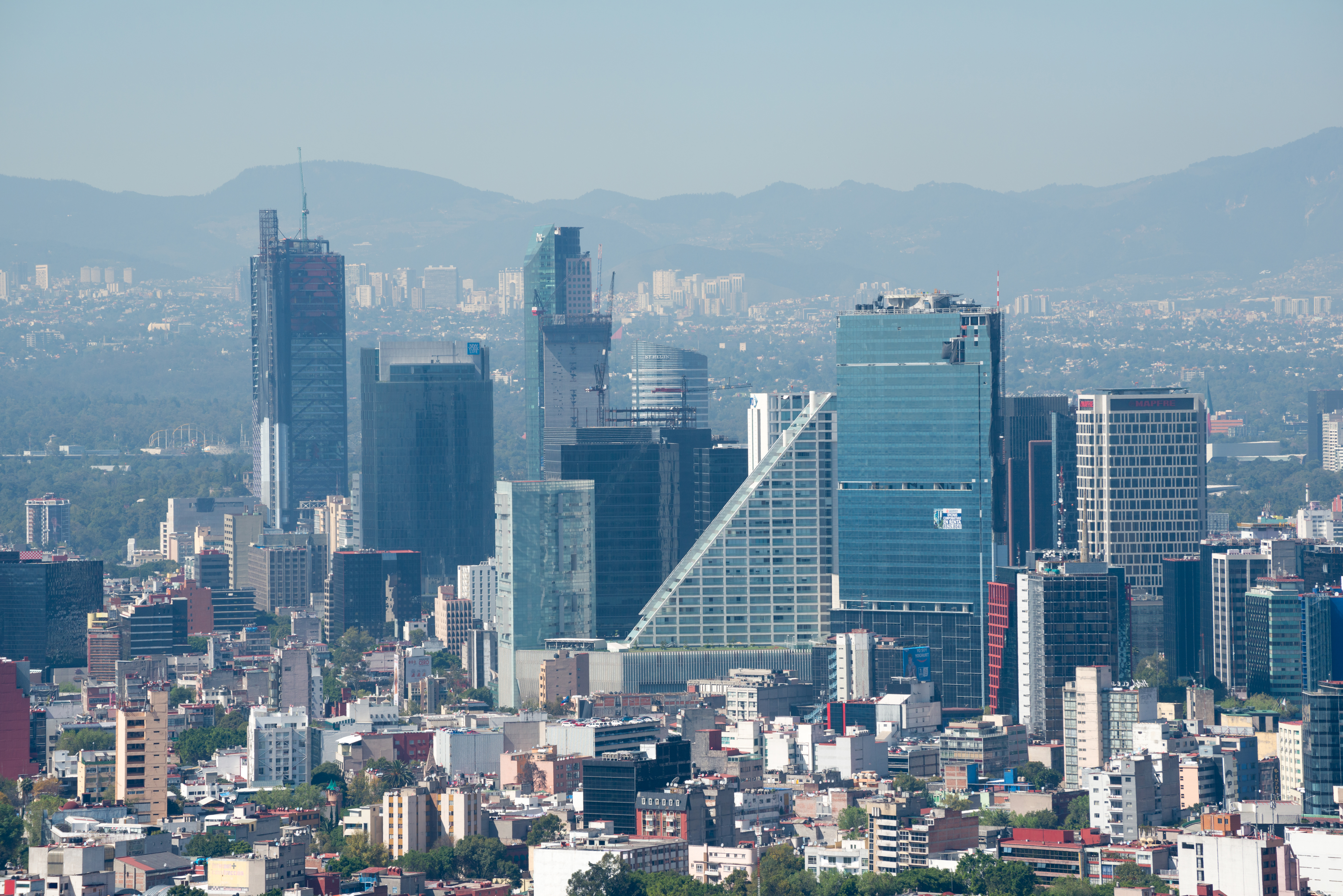
For decades, the city was known primarily as “DF” (the Federal District). This designation was administrative, cold, and lacked the vibrancy of the actual culture it represented. The pivot to CDMX in 2016 was not merely a bureaucratic name change; it was a deliberate rebranding exercise designed to shed the baggage of the past and embrace a modern, cohesive future. Understanding the brand strategy behind CDMX offers vital insights into how logos, visual systems, and nomenclature can reshape public perception on a massive scale.
Beyond the Initials: The Strategic Evolution from DF to CDMX
The shift from Distrito Federal to Ciudad de México was precipitated by a constitutional reform that granted the city more autonomy, similar to the 31 states of the Mexican Republic. However, from a brand perspective, the “DF” moniker had become an outdated asset. It felt institutional and reminiscent of a mid-20th-century bureaucratic era.
The Legal Catalyst for a Brand Reset
When the city’s legal status changed, the marketing opportunity was immense. A brand reset allows an entity—whether a corporation or a city—to audit its current reputation and realign its visual and verbal identity with its modern values. The transition to CDMX provided a clean slate. By dropping the “Federal District” title, the city moved away from an identity defined by the federal government and toward an identity defined by its own residents and unique character.
Defining the New Visual Identity
The visual identity of CDMX was built around a specific typographic treatment and a bold color palette. The choice of magenta—often referred to as “Mexican Pink” (Rosa Mexicano)—was a stroke of branding genius. This color, popularized in the mid-20th century by designer and artist Ramón Valdiosera, is deeply rooted in Mexican traditional clothing, architecture, and flora. By adopting this vibrant hue as the primary brand color, the CDMX identity immediately established a link between modern minimalism and cultural heritage. The logo itself, characterized by its thick, sans-serif block letters, was designed for maximum legibility and scalability, ensuring it could function effectively on everything from social media icons to massive public installations.
CDMX as a Case Study in Place Branding
Place branding is the process of discovering, creating, and communicating a place’s competitive identity. Unlike product branding, where the manufacturer has total control over the offering, a city brand must represent millions of people, thousands of businesses, and a complex history. The success of CDMX lies in its ubiquity and its ability to act as a “lifestyle brand.”
Creating a Global Destination Brand
Before the CDMX rebrand, Mexico City struggled with a fragmented international image. While it was a powerhouse of history and art, it was also frequently associated with logistical challenges and safety concerns. The brand strategy for CDMX sought to pivot the conversation. It positioned the city as a “Capital of Culture” and a “Design Destination.”
By consolidating all city services and tourism efforts under the CDMX banner, the government created a “House of Brands” architecture where every positive experience—a visit to a world-class museum, a meal at a top-rated restaurant, or a stroll through a renovated park—reinforced the master CDMX brand. This is a common strategy in corporate identity: when a parent brand is strong, its sub-brands benefit from the association.
Consistent Visual Language and Public Infrastructure
One of the most effective ways the CDMX brand was cemented in the minds of residents and visitors was through its integration into public infrastructure. The branding was applied to:
- EcoBici: The city’s massive bike-sharing program.
- Public Transit: Taxis were repainted in the signature pink and white CDMX scheme.
- Urban Furniture: Park benches, trash cans, and street signs adopted the brand’s typography and color.
This level of consistency is rare in municipal branding. It functions much like a corporate retail environment; by surrounding the “consumer” with consistent brand touchpoints, the brand creates a sense of reliability and modernity. It turned the city itself into a branded experience.
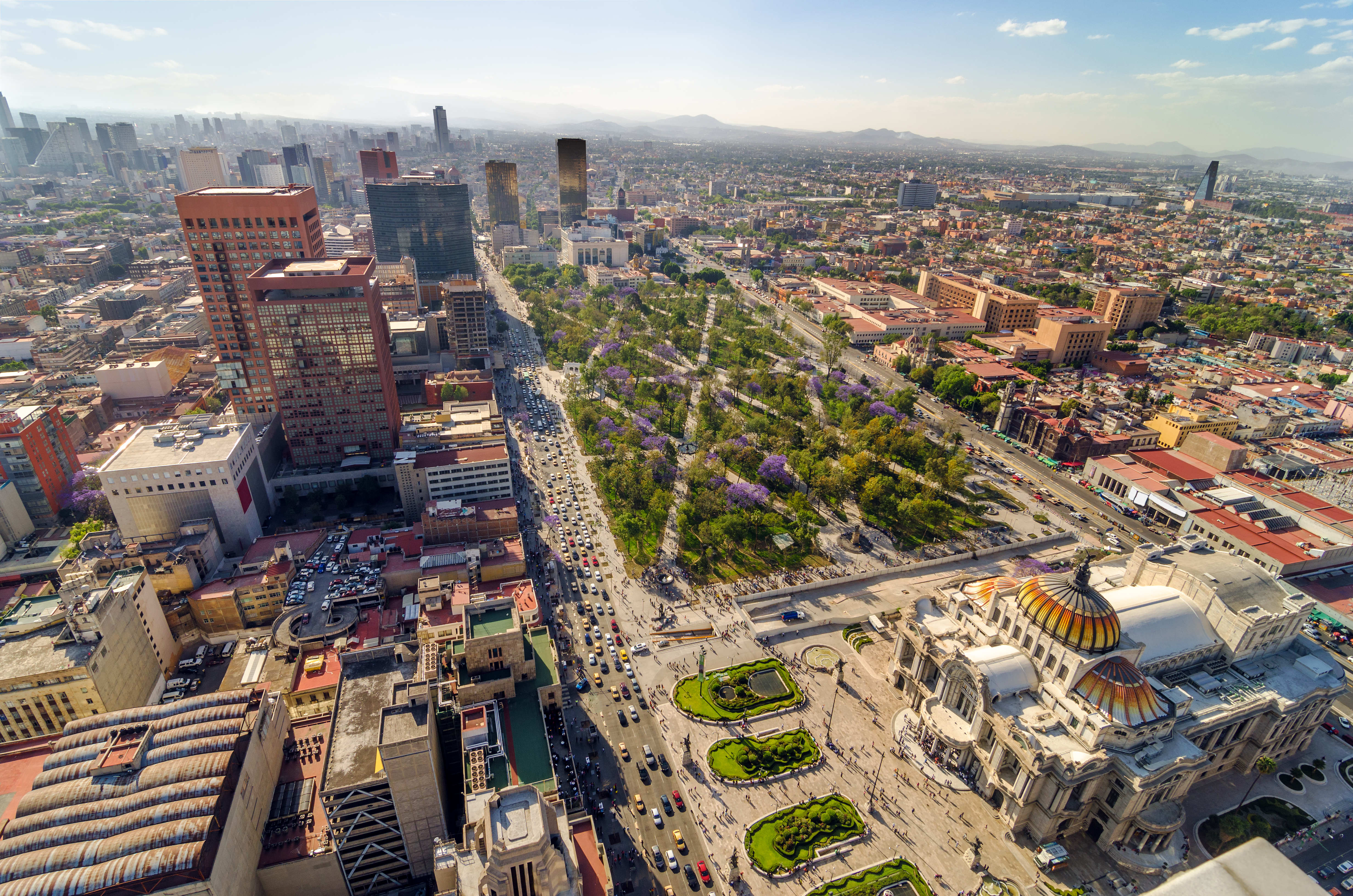
Marketing the Modern Metropolis: Economic and Tourism Impact
A brand is ultimately a promise of value. For Mexico City, the CDMX brand promised a vibrant, cosmopolitan, and accessible experience. The marketing strategy following the 2016 rebrand was aggressive and multifaceted, targeting high-value demographics such as digital nomads, luxury travelers, and tech entrepreneurs.
Digital Presence and Social Media Strategy
The acronym “CDMX” was tailor-made for the digital age. In a world of hashtags and character limits, “CDMX” is significantly more efficient than “Distrito Federal” or “Mexico City.” It is a “social-first” brand. The city’s marketing teams utilized the hashtag #CDMX to aggregate user-generated content, effectively turning millions of tourists into brand ambassadors. When travelers shared photos of the city’s stunning architecture or street food, the “CDMX” watermark or hashtag provided a unified stamp of quality and location.
Soft Power and the “CDMX” Lifestyle
The brand strategy also leveraged “soft power”—the ability to influence through culture and values rather than force. By sponsoring major international events like Formula 1, high-profile art fairs (like Zona Maco), and film productions (the opening sequence of the James Bond film Spectre), the CDMX brand was showcased on a global stage. This positioned the city not just as a location, but as a lifestyle. In the eyes of a global audience, CDMX became synonymous with a certain type of urban energy that rivals New York, London, or Berlin.
Brand Strategy Lessons from Mexico City’s Transformation
The transition to CDMX offers several universal lessons for brand managers and identity designers, regardless of whether they are working for a city or a Fortune 500 company.
The Importance of a Unified Visual System
Fragmentation kills brands. Before the rebrand, various city departments used different logos, colors, and messaging. This created confusion and diluted the city’s impact. The CDMX initiative forced a unified visual system across all touchpoints. This lesson is vital for corporate identity: a brand is only as strong as its most inconsistent application. By creating a rigorous brand guidelines manual, the city ensured that the brand remained recognizable and professional across every medium.
Balancing Heritage with Modernity
A common mistake in rebranding is to completely abandon the past in favor of a “modern” look that feels sterile. CDMX avoided this by using “Mexican Pink” and incorporating elements of the city’s unique typography into its modern aesthetic. For brands with long histories, the goal should be “evolution, not revolution.” You want to retain the equity of your heritage while updating the visual language to meet contemporary standards.
Nomenclature as Strategy
What you call yourself matters. “DF” was an administrative label; “CDMX” is a brand name. When considering a name change or an abbreviation for a brand, one must consider the phonetics, the visual balance of the letters, and the ease of use in digital environments. CDMX is rhythmic, symmetrical, and easy to remember in multiple languages, making it an ideal global trademark.

The Future of the CDMX Brand in a Competitive Global Market
As of the current decade, the CDMX brand has achieved a level of saturation that most corporate brands envy. It is recognized globally and embraced locally. However, brand management is an ongoing process, not a one-time event. The challenge for the future lies in maintaining the brand’s relevance as the city evolves.
In recent years, political shifts have seen some de-emphasis on the “CDMX” logo in favor of new governmental visual identities. This highlights a common risk in public sector branding: the tension between long-term brand equity and short-term political change. For a brand to truly endure, it must transcend the individuals or administrations that created it. It must become part of the cultural fabric.
Despite these shifts, the “CDMX” moniker remains the dominant way the city is referenced in tourism, business, and social media. It has successfully transitioned from a government campaign to a cultural shorthand. The story of CDMX is a reminder that a brand is not just a logo—it is a vessel for a community’s identity, an engine for economic growth, and a bridge between a storied past and an ambitious future. When we ask “what does CDMX stand for,” the answer is no longer just a name; it is a testament to the transformative power of strategic branding.
aViewFromTheCave is a participant in the Amazon Services LLC Associates Program, an affiliate advertising program designed to provide a means for sites to earn advertising fees by advertising and linking to Amazon.com. Amazon, the Amazon logo, AmazonSupply, and the AmazonSupply logo are trademarks of Amazon.com, Inc. or its affiliates. As an Amazon Associate we earn affiliate commissions from qualifying purchases.