The question of “where is Barclays Center” typically prompts a geographical answer: the intersection of Atlantic and Flatbush Avenues in the heart of Brooklyn, New York. However, from a brand strategy perspective, the “where” is far more complex than a set of GPS coordinates. The Barclays Center is not merely a sports and entertainment venue; it is a masterclass in corporate identity, naming rights, and the strategic repositioning of an entire urban district.
In the modern marketplace, a brand’s physical location serves as its primary touchpoint. For Barclays, a global financial giant, the decision to anchor its name to a rusted-steel architectural marvel in Brooklyn was a calculated move to bridge the gap between institutional finance and cultural relevance.

The Geography of a Brand: Positioning at the Crossroads of Culture
To understand the branding power of the Barclays Center, one must first understand its physical placement. Situated atop one of the busiest transit hubs in New York City—the Atlantic Terminal—the arena is accessible to millions. This accessibility is the cornerstone of its brand promise: inclusivity and central relevance.
The Strategic Value of the Atlantic Terminal
By placing the brand at a nexus of subways and the Long Island Rail Road, the Barclays name is integrated into the daily commute of the professional class and the leisure activities of the youth demographic. In brand strategy, this is known as “passive impressions.” Even for those who never step inside the arena for a Brooklyn Nets game or a concert, the Barclays brand becomes a permanent fixture of their mental map of New York City.
Rebranding Brooklyn: From Outer Borough to Global Capital
Before the arena’s completion in 2012, Brooklyn was often viewed through the lens of Manhattan’s shadow. The placement of the Barclays Center served as the definitive “anchor tenant” for the rebranding of Brooklyn. The brand “Brooklyn” itself underwent a transformation during this period, moving toward an aesthetic of “industrial chic” and “authentic grit.” The Barclays Center, with its unique weathered steel exterior, was designed to mirror this brand evolution, ensuring the corporate entity felt like an organic part of the neighborhood rather than a sterile intruder.
Naming Rights and Corporate Identity: The $200 Million Handshake
The relationship between a physical space and a corporate name is one of the most potent tools in marketing. The 20-year naming rights deal signed by Barclays was a signal to the world that the bank was shifting its focus toward American consumer markets and global lifestyle branding.
The ROI of Naming Rights
In the world of corporate identity, naming rights are often criticized as vanity projects. However, the Barclays Center proves the contrary. The “where” of the center—being in the media capital of the world—ensures that every highlight reel, weather report, and social media check-in broadcasts the Barclays name. This constant reinforcement builds a level of brand equity that traditional television or digital advertising cannot replicate. It transforms a financial institution into a “lifestyle enabler.”
Aligning the Bank with the “Cool Factor”
Financial institutions often struggle with a brand perception of being cold or disconnected. By associating with the high-energy, high-status world of professional sports and A-list entertainment, Barclays successfully pivoted its identity. The location of the center allows the bank to host high-net-worth clients in luxury suites, blending corporate hospitality with cultural prestige. This alignment creates a “halo effect,” where the excitement of the venue rubs off on the corporate brand.
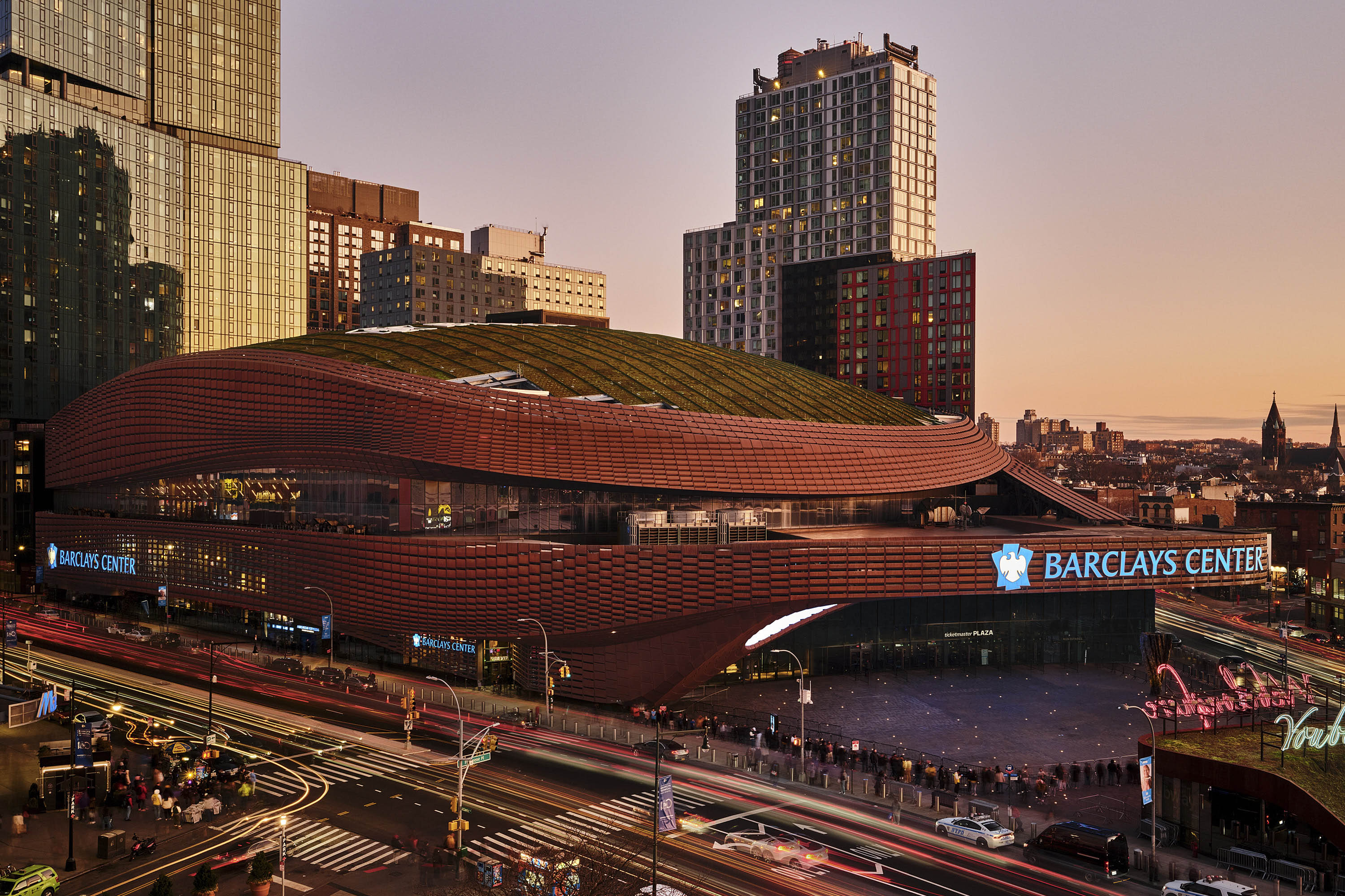
The Aesthetic of the Oculus: Design as a Visual Brand Statement
A brand is not just a name; it is a visual language. The architecture of the Barclays Center, designed by SHoP Architects, is a critical component of its brand identity. It doesn’t look like a traditional arena, and that is entirely the point.
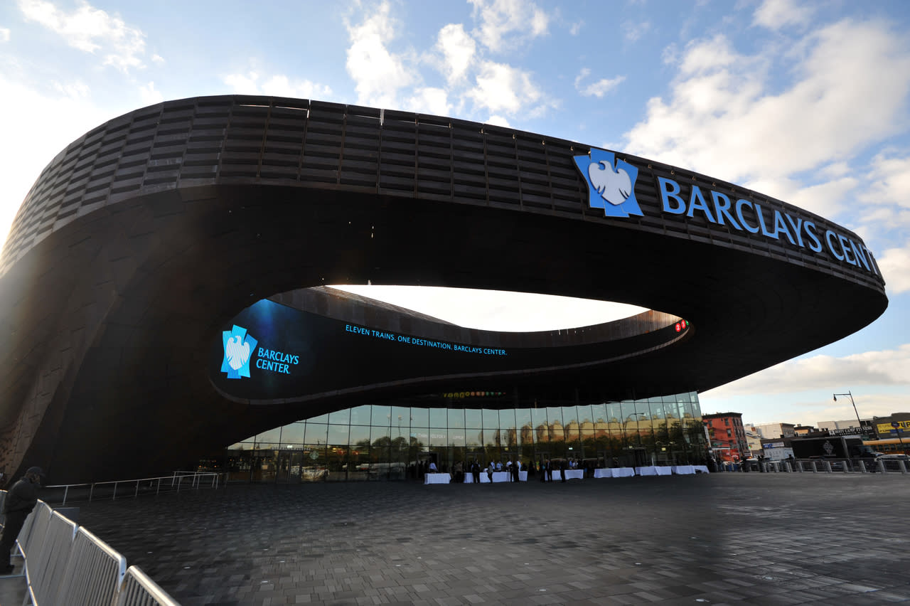
Weathering Steel and Industrial Authenticity
The use of 12,000 unique pre-weathered steel panels gives the building a distinct, brownish-orange patina. From a design strategy standpoint, this choice was a rejection of the “glass and chrome” aesthetic common in corporate architecture. It communicated a brand value of “authenticity.” The material choice acknowledges Brooklyn’s industrial past while looking firmly toward the future, positioning Barclays as a brand that respects heritage but embraces innovation.
The Oculus and the Digital Canvas
The most recognizable feature of the Barclays Center is the “Oculus,” a massive cantilevered overhang that features a 3,000-square-foot LED signage system. This isn’t just a sign; it’s a digital landmark. It serves as a focal point for the “crossroads” of Brooklyn. For the Barclays brand, the Oculus represents transparency and communication. It provides a platform to broadcast the brand’s visual identity to the street level, ensuring that the “where” of the building is synonymous with a vibrant, glowing presence that never sleeps.
Urban Renewal and the Ethics of Place Branding
The location of the Barclays Center was not without controversy. The Atlantic Yards project (now Pacific Park) involved significant eminent domain battles and community displacement. In the context of brand strategy, this represents the “Social” pillar of ESG (Environmental, Social, and Governance) criteria.
Navigating Community Perception
A brand’s reputation is often tied to how it treats its neighbors. Barclays had to navigate the complex waters of being a “global invader” in a local community. To mitigate negative brand sentiment, the arena implemented a “Community Benefits Agreement.” This included local hiring initiatives and discounted ticket programs. From a brand management perspective, these moves were essential to ensure that the “where” of the arena was associated with progress rather than displacement.
The “Brooklyn Nets” Synergy
The relocation of the New Jersey Nets to Brooklyn and their subsequent rebranding was inextricably linked to the Barclays Center’s location. The “Brooklyn Nets” brand—with its minimalist black-and-white color scheme—was designed to fit the aesthetic of the arena. This synergy created a unified brand ecosystem. When people ask “where is Barclays Center,” they are also asking “where do the Nets play?” This dual identity doubles the brand’s reach, capturing both the sports fan and the music lover under one corporate umbrella.
Digital Presence: Extending the Brand Beyond the Physical Location
While the physical location of the Barclays Center is fixed in Brooklyn, its brand presence is global. In the digital age, “where” a brand is located includes its footprint in the metaverse, social media, and broadcast networks.
The Arena as a Content Studio
The Barclays Center is designed to be “social media ready.” Every angle of the building, from the subterranean “Meditation Room” to the high-contrast lighting of the court, is optimized for digital consumption. This turns every visitor into a brand ambassador. When a fan posts a photo to Instagram tagged at “Barclays Center,” the brand is geographically validated while being digitally distributed.
Global Broadcast Value
Because the arena is located in the number one media market (New York), it frequently hosts global events like the MTV Video Music Awards, the NBA Draft, and major championship boxing. This elevates the “Barclays” name from a local landmark to a global stage. The brand’s identity becomes synonymous with “The Big Event.” The strategic positioning ensures that whenever a cultural moment happens in New York, the Barclays brand is the backdrop.
Conclusion: The Landmark as a Living Brand
The answer to “where is Barclays Center” is more than a street address; it is a testament to the power of place-based branding. By anchoring itself in the cultural and transit heart of Brooklyn, Barclays moved beyond the confines of a traditional bank and transformed into a cornerstone of the New York experience.
The arena stands as a physical manifestation of a successful brand strategy: it is accessible, visually distinct, culturally relevant, and strategically integrated into the community. As the world of marketing continues to shift toward experiential and lifestyle branding, the Barclays Center serves as a blueprint for how a corporate entity can use a physical location to define its identity for decades to come. Whether viewed from the seat of a subway train or through the lens of a smartphone, the brand is exactly where it needs to be: at the center of the conversation.
aViewFromTheCave is a participant in the Amazon Services LLC Associates Program, an affiliate advertising program designed to provide a means for sites to earn advertising fees by advertising and linking to Amazon.com. Amazon, the Amazon logo, AmazonSupply, and the AmazonSupply logo are trademarks of Amazon.com, Inc. or its affiliates. As an Amazon Associate we earn affiliate commissions from qualifying purchases.