In the competitive landscape of global commerce, a symbol is rarely just a character; it is a vessel for heritage, a shorthand for quality, and a cornerstone of corporate identity. Among the various icons borrowed from antiquity, few carry as much weight, prestige, and psychological resonance as the Omega symbol (Ω). As the final letter of the Greek alphabet, Omega has transcended its linguistic origins to become one of the most potent tools in the world of brand strategy and marketing.
For a brand, choosing the Omega symbol is a strategic declaration of excellence. It signals “the last word,” the “ultimate,” and the “pinnacle” of a specific craft. This article explores the depth of the Omega symbol within the context of brand strategy, examining how it functions as a visual anchor for luxury, precision, and market dominance.
The Semiotics of the Last Letter: Why Omega Commands Authority
To understand why the Omega symbol is so effective in branding, one must first look at its semiotic roots. Semiotics—the study of signs and symbols—suggests that our brains process images much faster than text, and certain shapes evoke universal emotional responses.
From Ancient Script to Modern Branding
The Omega symbol has lived several lives. In its original Greek context, it represented the long “o” sound, but its position as the 24th and final letter of the alphabet gave it a metaphorical gravity. In Western culture, the phrase “the Alpha and the Omega” has long signified the beginning and the end, the totality of a concept, or the absolute truth.
When a company adopts the Omega symbol, it taps into this collective subconscious. It is not merely a logo; it is a claim to completeness. In brand strategy, this is known as “positioning by essence.” By using a symbol that historically represents the “ultimate,” a brand bypasses the need for verbose slogans. The symbol itself suggests that there is nothing better beyond this point.
The Psychology of Finality and Perfection
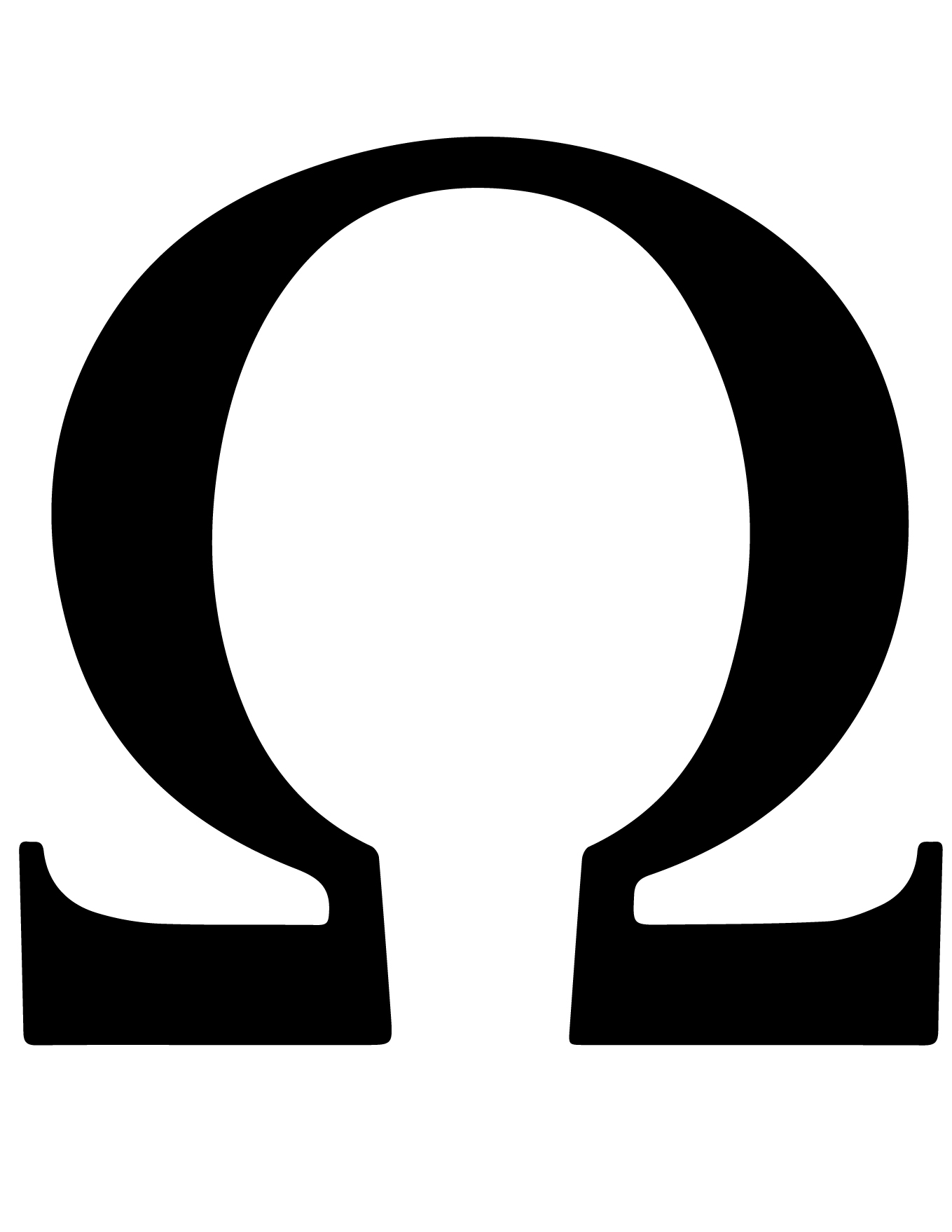
In design, the majuscule Omega (Ω) is an open-ended horseshoe shape, which conveys stability and enclosure, yet remains grounded. Unlike the Alpha (Α), which feels like a starting point or a sharp ascent, the Omega feels like a destination.
From a marketing perspective, this “destination” psychology is invaluable. Brands that use the Omega symbol are often positioning themselves as the final solution to a consumer’s needs. Whether it is a luxury watch or a high-end software suite, the implication is the same: you have reached the top of the mountain. This sense of finality builds a powerful sense of trust and authority, suggesting that the brand has perfected its craft to the point where further evolution is unnecessary.
Case Study: The Omega SA Legacy in Luxury Positioning
Perhaps the most prominent example of this symbolic power is the Swiss luxury watchmaker Omega SA. Their use of the symbol is a masterclass in how a visual mark can define an entire industry’s standard for excellence.
Crafting the Identity of Precision
Founded in 1848, the company did not originally bear the name Omega. It wasn’t until 1894, after the development of a revolutionary movement—the 19-line caliber—that the name was adopted. The movement was so precise and successful that it was dubbed “Omega” to signify that it was the ultimate achievement in watchmaking.
The brand strategy here was brilliant in its simplicity. By renaming the entire company after their most successful product and using the Greek symbol as the logo, they anchored their corporate identity to the concept of “the last word in horology.” Today, when a consumer sees the Ω on a watch crown, they aren’t just seeing a Greek letter; they are seeing a certified promise of chronometric precision.
Co-Branding and Cultural Capital
A symbol’s strength is often reinforced by the company it keeps. Omega SA has strategically aligned its symbol with some of the most significant achievements in human history. By becoming the first watch on the moon (via the Speedmaster) and the official timekeeper of the Olympic Games, the Omega symbol has been associated with “the ultimate” in human performance and exploration.
Furthermore, the brand’s long-standing partnership with the James Bond franchise uses the symbol to represent a specific type of masculine sophistication and reliability under pressure. In these instances, the symbol acts as a silent endorsement. The brand doesn’t need to shout about its technical specs because the symbol has already done the heavy lifting of establishing prestige through decades of strategic association.

Integrating Mathematical Symbols into Corporate Design
The trend of using mathematical or scientific symbols in branding is not limited to luxury goods. In the modern era, many tech-forward brands and startups utilize the Omega symbol to convey a sense of logical perfection and sophisticated engineering.
Simplicity vs. Recognition
One of the primary rules of brand design is that a logo must be simple enough to be sketched from memory but distinct enough to be legally protected. The Omega symbol hits this “sweet spot” perfectly. Its geometric symmetry makes it aesthetically pleasing and highly scalable. Whether it is embossed on a tiny watch component or displayed on a massive digital billboard, the symbol remains legible and iconic.
In the digital space, where “app fatigue” is a real challenge for marketers, a symbol like Omega provides instant recognition. It cuts through the noise of complex, multicolored logos. Brands that lean into minimalist, symbolic identities often find it easier to transition across different markets and cultures because the symbol carries its own meaning, independent of language.
The Versatility of the Greek Alphabet in Tech and Design
Beyond the “ultimate” connotation, the Omega symbol is often used in branding to appeal to an intellectual demographic. Because it is also the symbol for the “ohm” (a unit of electrical resistance), it carries a secondary layer of meaning for engineering and technology firms.
A brand strategy that incorporates the Omega symbol can therefore “double-dip” into different consumer perceptions. To a layperson, it represents luxury and the “best.” To an engineer or a tech enthusiast, it represents technical proficiency and the laws of physics. This dual-layered communication is a powerful way to build brand equity across diverse audience segments.
Strategic Implementation: Using Universal Symbols for Personal Branding
In the age of the “creator economy” and high-stakes executive leadership, personal branding has become as critical as corporate branding. Individuals looking to establish themselves as thought leaders or industry experts can learn a great deal from the strategic use of the Omega symbol.
Establishing Niche Dominance
For a consultant or an expert, branding oneself with the “Omega” concept is about establishing niche dominance. It is the move of an “Alpha” who has matured into an “Omega”—the seasoned veteran who provides the final, most authoritative perspective.
When creating a personal brand identity, using symbols that evoke the “Omega” sentiment—such as minimalist geometry, deep serif fonts, and an emphasis on “the final solution”—can help an individual stand out. It moves the conversation away from “I am one of many options” to “I am the definitive choice.” This is a critical shift in high-ticket service industries where authority and trust are the primary currencies.
Avoiding Clichés in Symbolic Logo Design
While the Omega symbol is powerful, it must be used with strategic intent to avoid becoming a cliché. In modern marketing, “symbolic fatigue” occurs when a mark is used without a genuine connection to the brand’s core values.
To successfully use a symbol as potent as Omega, a brand must ensure that its product or service actually lives up to the “ultimate” promise. If a budget-level brand uses the Omega symbol, it creates a cognitive dissonance in the consumer’s mind. The brand strategy must be holistic: the symbol (the visual promise) must align with the price point, the customer service, and the product durability. When these elements are in harmony, the symbol becomes an impenetrable moat that protects the brand’s market position.

Conclusion: The Last Word on Symbolic Branding
The Omega symbol is far more than a relic of ancient Greece; it is a sophisticated tool of modern brand strategy. By representing the pinnacle of achievement, the finality of a solution, and the precision of engineering, it allows brands to communicate complex values through a single, elegant stroke.
From the high-stakes world of Swiss horology to the cutting-edge fields of technology and personal consulting, the Omega symbol remains the gold standard for representing authority. In an era of fleeting trends and digital clutter, the brands that endure are those that anchor themselves to symbols of timeless meaning. Choosing Omega is not just a design choice—it is a strategic commitment to being the very best in your field, the definitive answer to the consumer’s search, and truly, the last word in quality.
aViewFromTheCave is a participant in the Amazon Services LLC Associates Program, an affiliate advertising program designed to provide a means for sites to earn advertising fees by advertising and linking to Amazon.com. Amazon, the Amazon logo, AmazonSupply, and the AmazonSupply logo are trademarks of Amazon.com, Inc. or its affiliates. As an Amazon Associate we earn affiliate commissions from qualifying purchases.