The question of why amoxicillin liquid might come in different colors, specifically pink and white, often arises for patients and caregivers. While seemingly a minor detail, this distinction offers a fascinating lens through which to explore the subtle dynamics of product identity within the generic pharmaceutical market. Far from indicating a difference in efficacy or formulation of the active drug, these color variations are deliberate choices made by manufacturers, influencing everything from regulatory compliance to consumer perception and pharmacy workflow. Understanding these nuances moves beyond mere pharmacology into the realm of how products, even generics, establish a subtle ‘brand’ or identifiable presence.

Beyond the Molecule: Generic Drugs and the Nuances of Product Identity
At its core, a generic medication is defined by its bioequivalence to a brand-name counterpart. Yet, the path from scientific equivalence to market presence is paved with choices that, while not affecting the drug’s primary function, significantly shape its physical identity.
The Core of Generics: Bioequivalence and API Consistency
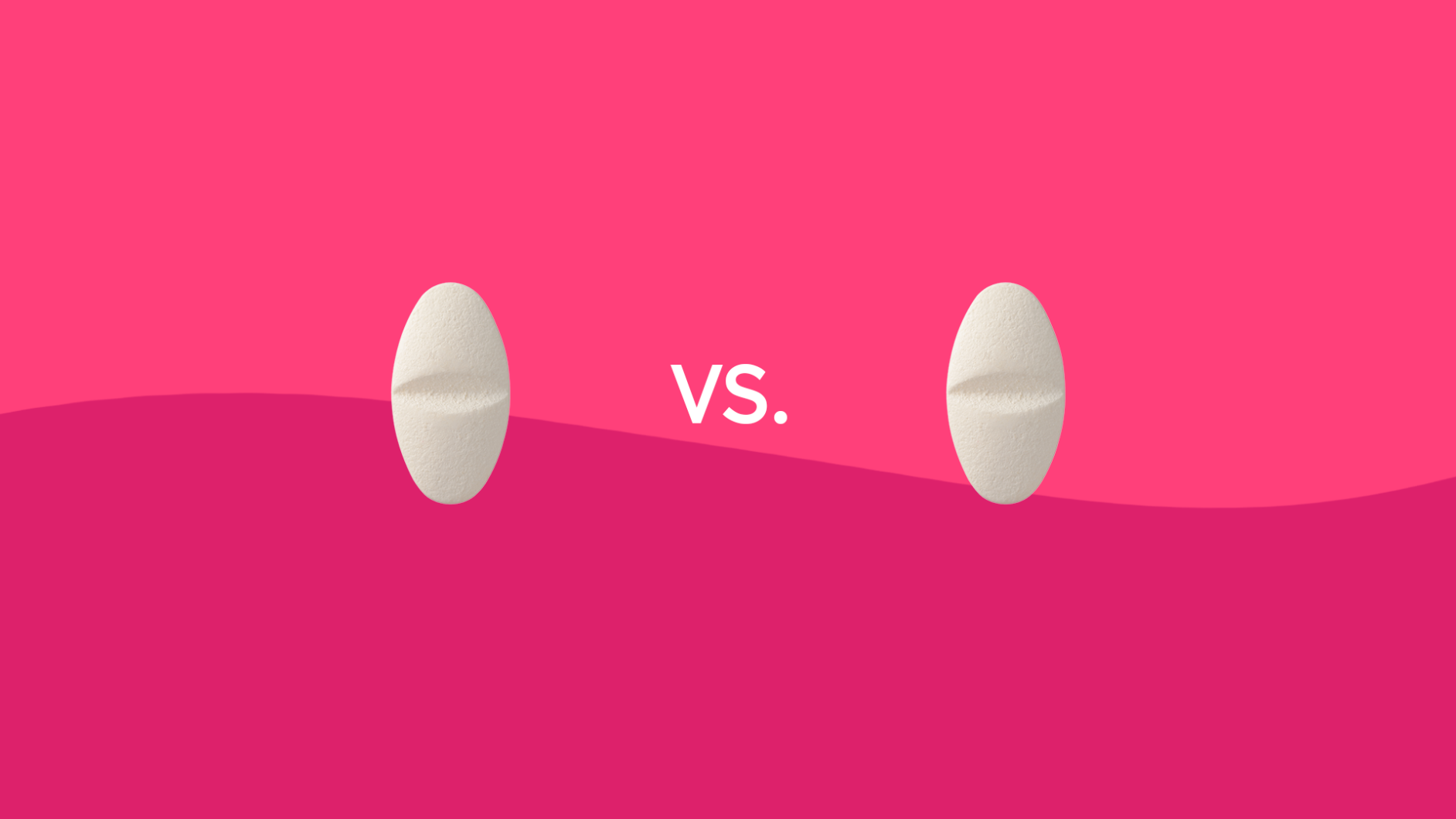
The fundamental principle governing generic drugs is bioequivalence. This means that a generic version must deliver the same amount of active pharmaceutical ingredient (API) to the bloodstream in the same amount of time as its brand-name equivalent. Regulatory bodies like the U.S. Food and Drug Administration (FDA) and the European Medicines Agency (EMA) rigorously test generics to ensure they meet stringent standards for quality, strength, purity, and stability. Crucially, the active ingredient in both pink and white amoxicillin liquid is identical, ensuring that their therapeutic effect is exactly the same. The chemical structure, dosage, and intended use remain constant, regardless of the cosmetic appearance. This is the unwavering standard that underpins the reliability of generic medications.
Superficial Differences: A Common Practice in Generic Manufacturing
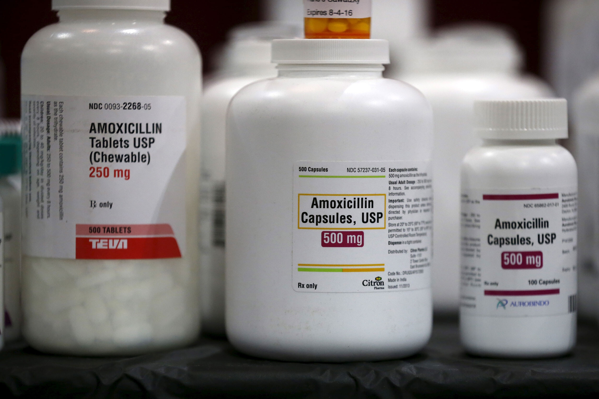
While the active ingredient and its therapeutic action must be consistent, generic manufacturers have considerable flexibility in the “inactive ingredients” or excipients they use. These excipients do not have a therapeutic effect but play vital roles in the drug’s formulation, stability, taste, and appearance. This is where the differences between pink and white amoxicillin liquid emerge. Unlike proprietary brand-name drugs which often maintain a consistent appearance for strong brand recognition, generic manufacturers frequently produce chemically identical drugs that look, taste, or even feel different. This is a common and fully accepted practice across the pharmaceutical industry, extending beyond liquids to pills, capsules, and creams.
The Role of Excipients: Color, Flavor, and Form
Excipients are the unsung heroes of pharmaceutical formulation. They can include binders, fillers, diluents, disintegrants, lubricants, glidants, preservatives, flavoring agents, and coloring agents. In the case of liquid amoxicillin, excipients are used to suspend the active drug, enhance its palatability (especially for children), extend its shelf life, and, yes, provide its color.
- Coloring agents: Dyes are added to achieve a specific color. For instance, a manufacturer might use a red dye to create a pink suspension, while another might opt for no dye, or use an opacifier (like titanium dioxide) to produce a white suspension. These dyes are inert, regulated, and do not impact the drug’s effectiveness. Their selection can be influenced by cost, availability, or the manufacturer’s established internal formulary.
- Flavoring agents: Given that amoxicillin itself can have a bitter taste, flavors (e.g., cherry, bubblegum, banana) are added to make it more palatable, particularly for pediatric patients. These flavor choices can sometimes be subtly associated with a specific manufacturer’s version.
- Suspending agents: These are vital for liquid formulations to ensure the active drug remains evenly dispersed, preventing sedimentation and ensuring consistent dosing. The interplay of these excipients defines the overall physical properties of the liquid, including its color and consistency.
The Palette of Amoxicillin: Why Different Colors for the Same Drug?
The existence of different colored amoxicillin liquids is not arbitrary but rather a result of independent decisions made by various pharmaceutical companies operating within a regulated but flexible framework.
Manufacturer Autonomy and Formulation Choices
Each generic pharmaceutical company develops its own unique formulation for a generic drug, provided it meets bioequivalence standards. This includes selecting specific excipients from a vast range of approved substances. One manufacturer might have a preference for certain approved dyes or flavoring agents, or their production lines might be optimized for a particular set of ingredients. These are strategic business and operational decisions. The choice between a pink dye (often derived from a red food coloring) and a white appearance (from opacifiers or simply the natural color of the suspension without added dye) is entirely at the discretion of the formulator. These choices are driven by internal company policies, cost considerations, supply chain availability of excipients, and sometimes even market research into preferred flavors or colors for pediatric medications.
Regulatory Frameworks and Acceptable Variations
Regulatory bodies like the FDA and EMA play a critical oversight role, but their primary focus is on the safety, efficacy, and quality of the drug product. They approve the entire formulation, including all excipients. As long as the excipients are safe, do not compromise the drug’s stability or bioavailability, and are within approved limits, the specific color or flavor chosen by the manufacturer is generally considered a cosmetic variation. Regulators do not mandate a uniform appearance for generic drugs. This regulatory flexibility is precisely what allows multiple manufacturers to produce the same generic drug with different visual and sensory characteristics. The emphasis is on the active ingredient and its performance, not on the aesthetic consistency across different generic brands.
Consumer Perception and Distinctive Appearance
While not overtly “branded” like a name-brand product, the consistent appearance of a specific manufacturer’s generic drug can create a subtle form of recognition. For caregivers, the “pink amoxicillin” from one pharmacy or dispensing period might become an expected visual cue. A sudden switch to “white amoxicillin,” even if therapeutically identical, can sometimes cause confusion or concern. While not explicit branding, this consistent appearance aids in quick identification and can, over time, build a degree of familiarity or trust for a particular product type from a specific supplier. Conversely, changes in appearance can trigger questions, highlighting the intrinsic human tendency to associate consistency with reliability.
The Subtle Art of Generic Branding: Building Recognition Through Consistency
Even in the world of generics, where the emphasis is on the chemical equivalence rather than marketing, there’s a subtle interplay of product identity that impacts recognition and use.
Distinguishing Products in a Crowded Market
The generic pharmaceutical market is highly competitive, with multiple manufacturers producing the same drug. While they can’t differentiate on the active ingredient, manufacturers can, and do, differentiate through the physical attributes of their products. A consistent color, shape, or flavor for their specific version of a generic drug can serve as a tacit identifier. For pharmacists managing extensive inventories, these visual cues can aid in quickly distinguishing between various manufacturers’ products on the shelf, streamlining inventory management and dispensing processes, even without explicit branding. It becomes a ‘house style’ for that manufacturer’s generic offering.
Patient Adherence and Visual Cues
For patients, especially children, the visual and sensory experience of medication can significantly impact adherence. A child accustomed to “the pink, cherry-flavored medicine” might resist “the white, banana-flavored medicine,” even if it’s the exact same drug. In this context, the consistent color becomes a crucial visual cue that aids in compliance. Any deviation from the expected appearance, even if therapeutically insignificant, can lead to confusion, reluctance, or even anxiety, potentially affecting whether the medication is taken as prescribed. Caregivers often rely on these visual consistencies as part of their routine, and unexpected changes can disrupt this.
Pharmacy Workflow and Dispensing Clarity
Pharmacists are at the forefront of dispensing medications and managing patient expectations. They are acutely aware of the variations in generic drug appearance. While they meticulously verify National Drug Codes (NDCs) and other identifiers, the visual appearance of a drug (like its color) serves as an immediate visual confirmation during the dispensing process. When a pharmacy switches suppliers, leading to a change in the appearance of a generic drug, pharmacists must actively communicate this to patients. This proactive education is a critical aspect of patient safety and satisfaction, preventing confusion and reassuring patients that their medication is correct, despite a different look.
Implications for Healthcare Stakeholders: From Pharmacists to Patients
The differences in generic drug appearances underscore the vital role of communication and education across the healthcare continuum.
Ensuring Clarity and Preventing Confusion
For healthcare providers, particularly pharmacists and prescribers, ensuring clarity about generic drug variations is paramount. Patients often associate the appearance of a pill or liquid with its specific identity. A change in color, even for the same active ingredient, can lead to concerns about medication errors or questions about the drug’s authenticity or efficacy. Proactive communication from pharmacists, explaining that a change in appearance is normal for generics due to different manufacturers, is crucial to prevent confusion and maintain patient trust.
Educating Consumers on Generic Variations
Empowering patients and caregivers with knowledge about generic medications is a key public health objective. Understanding that generic drugs are therapeutically equivalent to their brand-name counterparts, despite possible differences in appearance, flavors, or excipients, helps alleviate anxiety and fosters greater confidence in the healthcare system. Educational campaigns and clear, consistent messaging from pharmacists are vital to reinforcing this understanding, allowing patients to focus on the drug’s therapeutic benefits rather than its superficial characteristics. This educational effort effectively manages the ‘brand perception’ of generics, reinforcing their reliability regardless of cosmetic variations.
The Value of Consistent Communication
For generic manufacturers, while they don’t engage in direct consumer advertising for specific product identities in the same way brand-name companies do, the consistency of their chosen formulation (e.g., always making their amoxicillin pink) can indirectly build a form of recognition within the distribution chain and among long-term users. However, the overarching value lies in consistent and transparent communication from all stakeholders – manufacturers, distributors, pharmacists, and prescribers. By clearly labeling and communicating about generic equivalents, and by educating patients on the acceptable variations, the healthcare system reinforces the safety, efficacy, and trustworthiness of generic medications, irrespective of their visual characteristics. This collective effort ensures that the focus remains on health outcomes, not on the hue of a liquid.
In conclusion, the difference between pink and white amoxicillin liquid is purely an aesthetic distinction, a consequence of different manufacturers utilizing varied, but equally safe and approved, excipients in their formulations. These choices, while seemingly minor, play a role in how a generic product establishes its unique identity, navigates a competitive market, and interacts with patient expectations and pharmacy workflows. Far from diminishing their quality, these variations highlight the robust and flexible nature of generic pharmaceutical production, underpinned by strict regulatory oversight and the unwavering commitment to therapeutic equivalence. Ultimately, whether pink or white, the amoxicillin liquid delivers the same essential medication, proving that in generics, true value lies well beyond the surface.
aViewFromTheCave is a participant in the Amazon Services LLC Associates Program, an affiliate advertising program designed to provide a means for sites to earn advertising fees by advertising and linking to Amazon.com. Amazon, the Amazon logo, AmazonSupply, and the AmazonSupply logo are trademarks of Amazon.com, Inc. or its affiliates. As an Amazon Associate we earn affiliate commissions from qualifying purchases.