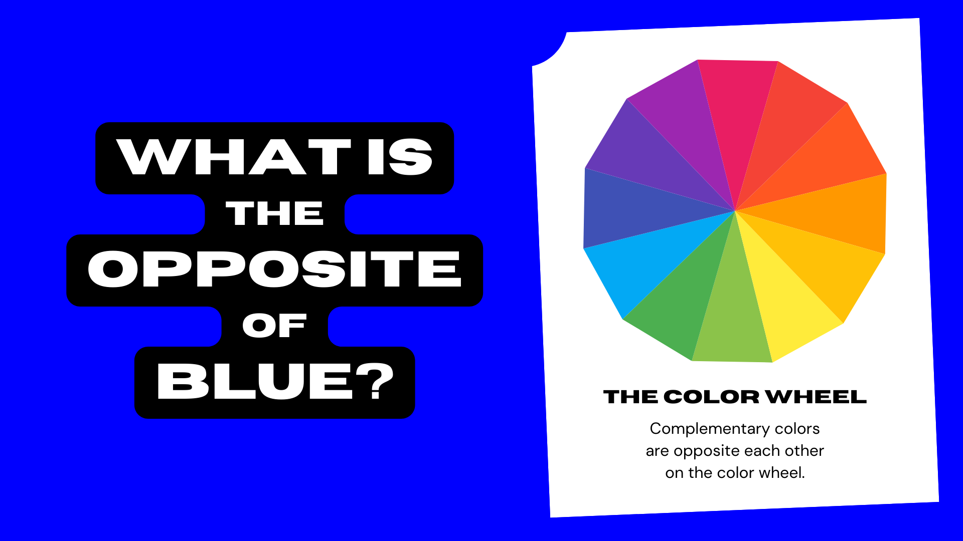
In the world of visual communication, the color wheel is not merely a tool for artists; it is a roadmap for brand strategists and corporate identity experts. When we ask the question, “What is the opposite of blue on the color wheel?” the immediate, technical answer is orange. However, for a brand builder, the answer carries far more weight than simple geometry. It represents the fundamental principle of “Complementary Contrast”—the strategic use of opposing forces to create balance, drive consumer engagement, and establish a memorable market presence.
Understanding why orange is the direct antagonist to blue allows designers and marketing professionals to manipulate human psychology. While blue conveys stability, trust, and professional calm, its opposite, orange, radiates energy, warmth, and urgency. Mastering this dynamic is the difference between a brand that blends into the background and one that commands attention in a saturated digital landscape.
The Science of Color in Brand Identity
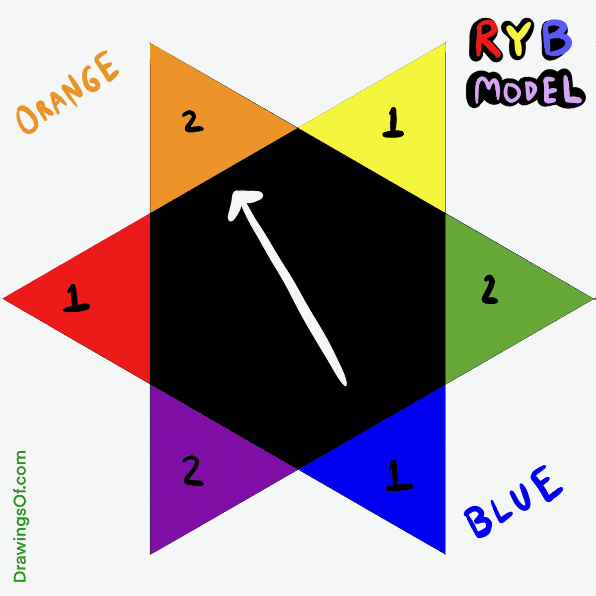
At its core, brand identity is built on how we perceive light and emotion. The traditional RYB (Red, Yellow, Blue) color wheel, used heavily in design and marketing education, places orange directly across from blue. This positioning indicates that they are complementary colors. When placed side-by-side, they create the highest possible contrast, making each color appear more vibrant than it would on its own.
Defining the Color Wheel: Where Blue and Orange Meet
In the context of brand strategy, blue is the most popular corporate color globally. It is the color of the sky and the sea, associated with depth, wisdom, and reliability. This is why financial institutions, healthcare providers, and technology giants—such as Chase, Pfizer, and Intel—rely heavily on blue. However, the ubiquity of blue presents a challenge: saturation. When everyone is blue, no one stands out.
This is where the opposite of blue, orange, enters the strategic framework. Orange is a secondary color, born from the mixture of red’s passion and yellow’s optimism. By understanding the mathematical opposition on the color wheel, a brand strategist can introduce orange to “cut through” the blue-heavy environment of the corporate world.
Why Complementary Colors Drive Visual Impact
The human eye possesses different types of photoreceptor cells. Complementary schemes like blue and orange trigger a specific response in our visual processing where the intensity of one color enhances the perception of the other. This is known as “simultaneous contrast.”
For a brand, this is a powerful psychological lever. If a brand’s primary identity is blue, adding a touch of its opposite—orange—creates an immediate focal point. This is why “Buy Now” buttons on professional, blue-themed websites are frequently orange. It is the most effective way to direct the human eye using the laws of physics and biology.
Strategic Orange: Leveraging Blue’s Opposite for Market Disruption
If blue represents the “status quo” and established reliability, orange represents the “disruptor.” For a brand looking to pivot from a traditional image to a more innovative, energetic one, understanding this color wheel relationship is essential.
The Psychology of Blue vs. Orange
To build a cohesive brand, one must understand the emotional resonance of these opposites. Blue is perceived as constant and dependable, but it can also be seen as cold or distant. Orange, conversely, is perceived as friendly, approachable, and high-energy, but can sometimes feel “cheap” if overused.
The magic happens in the balance. A brand that uses a blue-dominant palette with orange accents (the opposite of blue) signals to the consumer: “We are a stable, trustworthy company (blue), but we are also innovative, friendly, and fast-moving (orange).” This dual-messaging is a cornerstone of modern brand strategy.
High-Contrast Combinations in Global Marketing
When we look at global market leaders, the use of blue and its opposite is everywhere. Consider the film industry’s “Orange and Teal” color grading trend. By pushing shadows toward teal (a blue variant) and skin tones toward orange, filmmakers create a high-contrast image that is naturally pleasing to the human eye.
In corporate identity, this same logic applies to logo design and marketing collateral. A company that utilizes the blue-orange dichotomy ensures that its marketing materials are legible from a distance and pop against the neutral grays and whites of urban environments or digital feeds. It is a deliberate choice to maximize “stopping power.”
Case Studies: Brands Mastering the Blue-Orange Dynamic

To understand how the opposite of blue functions in the real world, we must look at successful brand architectures. These companies don’t just use colors because they “look good”; they use them to occupy specific psychological territories.
Tech and Innovation: The Blue Foundation
Many legacy tech brands started with blue to establish trust in a new, unproven industry. IBM (Big Blue) and Dell are prime examples. However, as the tech landscape became more competitive, brands began incorporating the opposite of blue to signal a shift toward the consumer.
The Firefox logo is one of the most famous examples of this. It utilizes a blue globe wrapped in an orange fox. The blue represents the global connectivity and reliability of the internet, while the orange fox represents the speed, agility, and “human” element of the browser. This use of complementary opposites makes the logo one of the most recognizable icons in the digital world.
Energy and Action: The Orange Catalyst
On the other side of the spectrum, brands that want to be seen as energetic often lead with orange and use blue as a grounding agent. Gulf Oil is a classic example in the corporate world. Their racing livery—light blue and bright orange—is iconic. The orange provides the “heat” and speed associated with racing, while the blue provides the corporate stability and professional engineering associated with fuel technology.
Similarly, the New York Mets and the New York Knicks use blue and orange. These colors were chosen partly as a tribute to New York’s history, but the visual result is a high-energy, high-visibility identity that stands out in a stadium or on a television screen.
Implementing Complementary Palettes in Personal Branding
In the modern economy, personal branding is just as vital as corporate branding. Whether you are an entrepreneur, a consultant, or a digital creator, your visual identity dictates how you are perceived by your audience.
Finding Your Brand’s “Pop” Color
If you have chosen blue as your primary brand color because you want to be seen as a professional authority, you must decide how to use its opposite to drive action. If your entire website or LinkedIn profile is blue, nothing stands out. By introducing orange as a “pop” color, you can strategically guide a lead toward your contact form or your portfolio.
This isn’t about making everything bright orange. It’s about the “Rule of Opposites.” If your brand voice is calm and “blue,” your calls to action should be “orange” to create a sense of urgency. This creates a visual hierarchy that makes your brand easier to navigate and more effective at conversion.
Avoiding Visual Fatigue: The 60-30-10 Rule
A common mistake in branding is using opposites in equal measure. If you use 50% blue and 50% orange, the colors will “vibrate” against each other, causing visual fatigue for the viewer. Instead, brand strategists recommend the 60-30-10 rule:
- 60% Primary Color (Blue): The dominant foundation.
- 30% Secondary Color (Neutral): White, gray, or a lighter blue to provide breathing room.
- 10% Accent Color (Orange): The opposite of blue, used sparingly for the most important elements.
By following this ratio, you maintain the professional integrity of the blue while reaping the psychological benefits of its energetic opposite.
The Future of Color Trends in Corporate Identity
As we move further into a digital-first era, the way we use blue and its opposite continues to evolve. Screen technology, accessibility standards, and “Dark Mode” aesthetics are changing the rules of the color wheel in branding.
Accessibility and Inclusivity in Design
Modern brand strategy must account for color vision deficiency (color blindness). Interestingly, the blue-orange contrast is one of the most accessible color pairings. While many people struggle to distinguish between red and green (another pair of opposites), the blue-orange axis remains distinguishable for the vast majority of people. Choosing the opposite of blue is not just a stylistic choice; it is an inclusive one that ensures your brand message reaches the widest possible audience.
Adapting Color Strategy for Digital-First Brands
In the age of OLED screens and mobile dominance, brands are opting for more vibrant, “electric” versions of blue and orange. These high-saturation palettes are designed to look brilliant on backlit screens. We are seeing a move away from the muted “Navy Blue” of the 1990s toward “Cyber Blue” and “Neon Orange.”
As brands compete for “scroll-stopping” moments, the inherent tension between blue and its opposite remains the most powerful tool in the designer’s kit. Whether it’s a fintech startup wanting to look both secure and fast, or a personal brand wanting to look both wise and energetic, the relationship between blue and orange on the color wheel remains the gold standard for strategic contrast.
By understanding that the opposite of blue is more than just a color—that it is a psychological trigger for action and energy—brand leaders can build more effective, resonant, and enduring corporate identities.
aViewFromTheCave is a participant in the Amazon Services LLC Associates Program, an affiliate advertising program designed to provide a means for sites to earn advertising fees by advertising and linking to Amazon.com. Amazon, the Amazon logo, AmazonSupply, and the AmazonSupply logo are trademarks of Amazon.com, Inc. or its affiliates. As an Amazon Associate we earn affiliate commissions from qualifying purchases.