In the world of global semiotics, few “logos” are as instantly recognizable or as emotionally charged as the American flag. While citizens view it as a symbol of patriotism and history, brand strategists and designers view it as a masterclass in visual identity and corporate-level storytelling. Every element—from the arrangement of the stars to the specific shade of “Old Glory Red”—serves a strategic purpose. To understand what the red stripe on the American flag means is to understand the foundational principles of brand equity, value-based design, and the power of symbolic consistency.

In the context of branding, a symbol’s meaning is its greatest asset. For the United States, the red stripes are not merely aesthetic choices; they are the “brand pillars” that represent the grit and resilience of the organization. By deconstructing the significance of these stripes, we can gain profound insights into how modern brands can build identity systems that endure for centuries.
The Heritage of the Palette: Hardiness, Valor, and Brand Storytelling
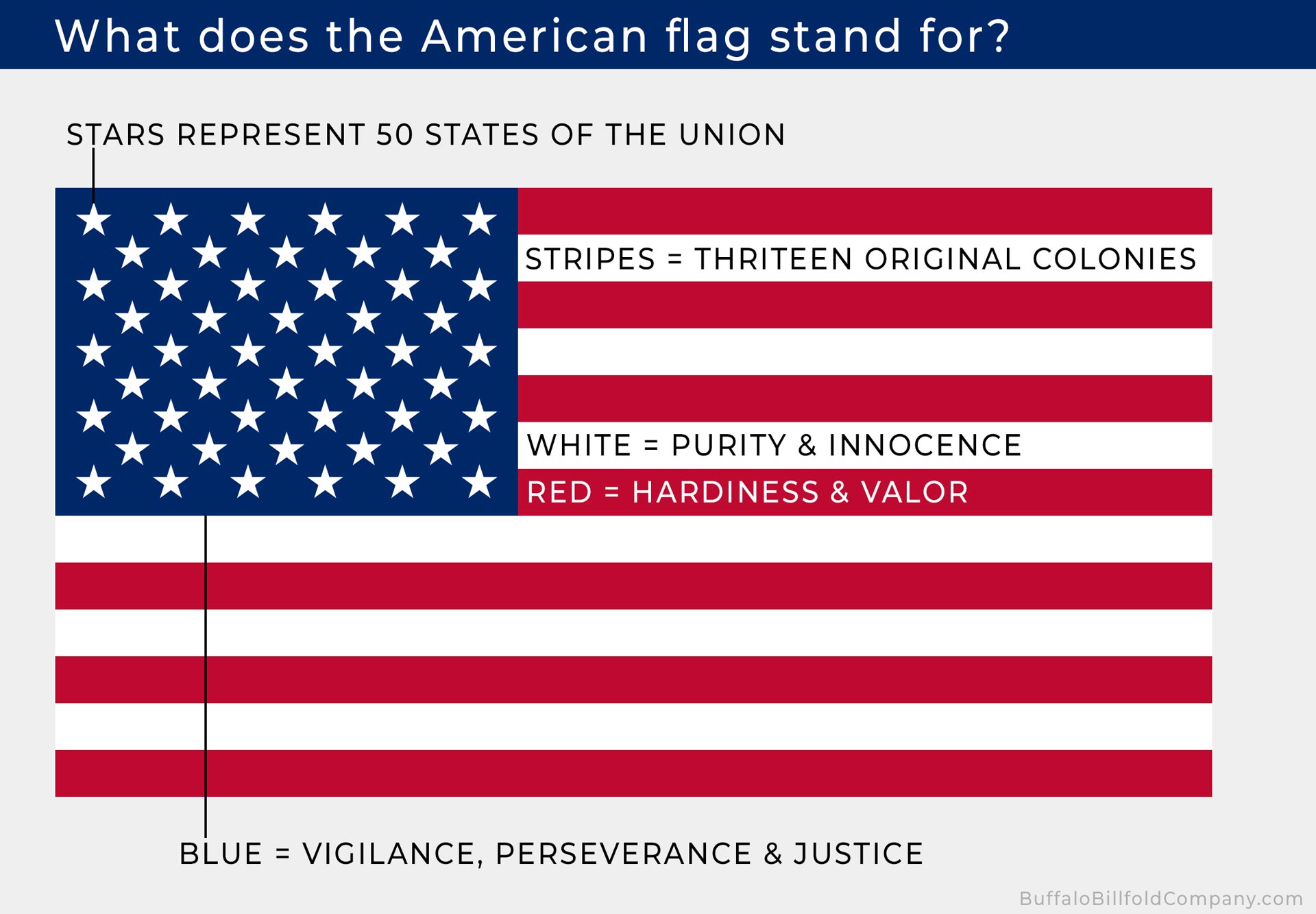
When Charles Thomson, Secretary of the Continental Congress, presented the design for the Great Seal of the United States in 1782, he provided a definitive “brand guide” for the colors that would also define the flag. He stated that the color red—officially referred to today as “Old Glory Red” (PMS 193C)—stands for “hardiness and valor.”
Defining Valor in a Visual Context
In brand strategy, “valor” translates to a brand’s willingness to innovate, disrupt, and stand by its core principles even in a volatile market. The red stripes on the flag are visual reminders of the courage required to establish a new entity. For a modern brand, this is the equivalent of a “challenger brand” mentality. By using red, the “American brand” signaled to the world that it was not a passive observer on the global stage but an active, bold participant. Valor represents the strength of the brand’s promise and its commitment to defending its market position and its stakeholders.
The Psychology of Red in Emotional Branding
From a psychological perspective, red is the most evocative color in the branding toolkit. It increases heart rates, creates a sense of urgency, and commands attention. When we look at global giants like Coca-Cola, Netflix, or Virgin, they utilize red to signify energy, passion, and action. The red stripes on the American flag function in much the same way. They provide a high-contrast visual anchor that suggests vitality. By choosing red as a primary component of the 13 stripes, the designers ensured that the flag would be visible and impactful from a distance, reinforcing the “brand’s” presence in any environment, whether on a battlefield or a diplomatic stage.
Visual Consistency and the Geometry of National Identity
A successful brand identity relies on repetition and rhythm. The American flag utilizes a repeating pattern of seven red stripes and six white stripes. This is not just a stylistic choice but a calculated narrative device that represents the 13 original colonies. In branding, this is known as “heritage storytelling”—using design elements to honor the origin story of the organization.
The Power of Repetition: 13 Stripes for 13 Colonies
Consistency is the bedrock of brand trust. By maintaining 13 stripes even as the number of stars (representing states) grew, the American flag preserved its “brand DNA.” The red stripes act as the literal and figurative framework of the flag. They represent the foundational members of the “brand launch.” For modern businesses, this highlights the importance of maintaining “legacy elements” in a visual identity. Even as a company evolves, expands its product line, or enters new markets, the core visual identifiers—like the red stripes—provide a sense of continuity that reassures the audience of the brand’s stability.
Balancing Tradition with Evolution
The red stripes provide a static element against the dynamic element of the stars. While the “blue canton” (the field of stars) has changed 27 times throughout American history to reflect growth, the stripes have remained largely unchanged since the Flag Act of 1818. This creates a perfect balance between “Brand Tradition” and “Brand Evolution.” The red stripes tell the story of where the brand came from, while the stars tell the story of where it is going. This is a critical lesson for corporate identity: your visual system must be flexible enough to allow for growth but grounded enough to retain its historical significance.
Strategic Semiography: How National Symbols Function as Global Brands
The American flag is often cited as the most powerful brand in the world. It carries an enormous amount of “brand equity”—the value derived from consumer perception rather than the physical asset itself. The red stripe is a key component of this equity, acting as a visual shorthand for a specific set of American values.
Universal Recognition and Brand Equity
When a brand reaches a certain level of maturity, it no longer needs to explain what it stands for; its symbols do the talking. The red stripe, when seen in combination with the white and blue, triggers an immediate emotional response. This is the goal of every brand strategist: to achieve “iconic status” where a single color or shape can represent a complex set of ideals. The red stripes communicate “The American Dream”—a brand promise of opportunity and resilience. Because this meaning has been consistently reinforced for over 200 years, the brand equity of the flag is virtually unshakeable.
Protecting the Brand: Guidelines and Flag Etiquette
Just as a corporation has a “Brand Standards Manual,” the United States has the Flag Code. This code dictates how the flag (the brand asset) should be treated, displayed, and retired. The red stripes must never touch the ground; they must be illuminated at night; they must be handled with reverence. This level of “brand protection” ensures that the symbol does not become diluted or disrespected. In the corporate world, failing to protect your visual identity can lead to brand erosion. The strict adherence to flag etiquette serves as a reminder that the most valuable brands are those that maintain a high standard of presentation and respect for their own symbolism.
Lessons for Modern Brand Architects: Applying the “Red Stripe” Philosophy
How can modern marketers and designers apply the meaning of the red stripe to their own branding efforts? The key lies in “intentionality.” Nothing in the flag’s design is accidental, and the same should be true for any corporate identity.
Creating Meaningful Brand Pillars
If you are designing a brand, you must ask: “What is my red stripe?” What is the element of your identity that represents your hardiness and valor? A brand without a “red stripe”—a core element that signifies strength and courage—often feels hollow or transient. By imbuing specific colors or shapes with deep organizational meaning, you create a narrative that resonates with your audience on a subconscious level. People don’t just buy products; they buy into stories. The red stripe is a story of survival and triumph, which is why it remains so compelling.
Building Longevity through Symbolic Simplicity
The genius of the red stripe is its simplicity. It is a bold, geometric shape that is easy to reproduce and easy to recognize. In an era of digital clutter and over-designed logos, the “red stripe philosophy” encourages us to return to the basics. Great brands are built on simple ideas executed with total conviction. Whether you are a startup or a Fortune 500 company, your visual identity should strive for the same clarity found in the American flag. Use your “red” to show your passion, and use your “stripes” to show your history.
In conclusion, the red stripe on the American flag is far more than a decorative feature. It is a strategic symbol of hardiness and valor that has anchored the American brand for centuries. By understanding the intentionality behind its color, its repetition, and its preservation, brand leaders can learn how to create identities that do more than just identify—they inspire. In the competitive landscape of the 21st century, the most successful brands will be those that, like the red stripe, stand for something enduring, courageous, and unmistakably bold.
aViewFromTheCave is a participant in the Amazon Services LLC Associates Program, an affiliate advertising program designed to provide a means for sites to earn advertising fees by advertising and linking to Amazon.com. Amazon, the Amazon logo, AmazonSupply, and the AmazonSupply logo are trademarks of Amazon.com, Inc. or its affiliates. As an Amazon Associate we earn affiliate commissions from qualifying purchases.