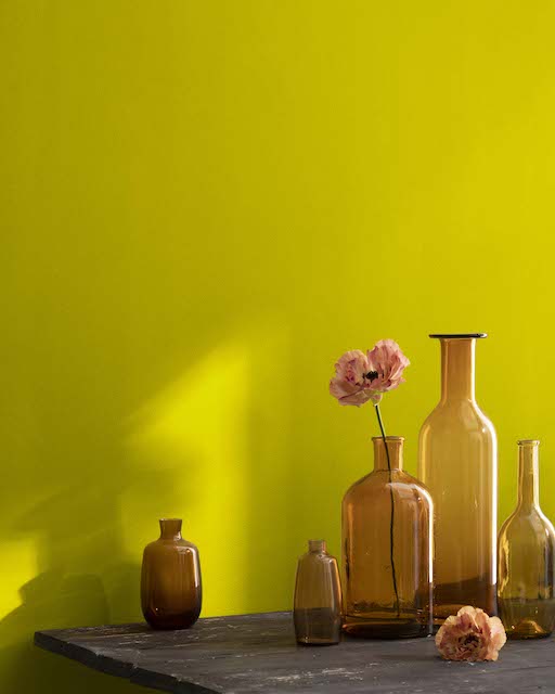
Chartreuse, a color that dances on the edge of perception, often evokes a sense of curiosity and wonder. It’s a hue that defies simple categorization, existing in a vibrant, almost electric space between yellow and green. For those involved in brand strategy, corporate identity, and marketing, understanding and effectively utilizing such distinctive colors is paramount. Chartreuse is not merely a shade; it’s a statement, a signal, and a potent tool in the designer’s arsenal. This exploration delves into the visual characteristics of chartreuse and its strategic implications within the realm of branding, moving beyond a simple definition to uncover its potential impact on perception and recognition.

The Elusive Nature of Chartreuse: Defining a Color at the Crossroads
At its core, chartreuse is a color born from the blending of yellow and green. However, its precise appearance can vary, leading to a spectrum of interpretations. Understanding these nuances is crucial for consistent brand representation across all platforms.
The Spectrum of Chartreuse: From Zest to Emerald
The name “chartreuse” itself originates from a French liqueur produced by Carthusian monks, whose original green liqueur was said to possess a distinctive hue. Over time, the term has evolved to encompass a broader range of shades, each with its own subtle personality.
-
Yellow-Dominant Chartreuse: This end of the spectrum leans heavily towards yellow, with only a hint of green. It’s a bright, almost neon-like hue, exuding energy, optimism, and a playful dynamism. Think of the vibrant zest of a freshly peeled lime or the sunny disposition of a blooming daffodil, infused with a subtle, verdant whisper. This variant is often perceived as lively, accessible, and forward-thinking. It can inject a sense of excitement and urgency into a brand’s visual communication.
-
Green-Dominant Chartreuse: Conversely, this iteration of chartreuse leans more towards green, with a noticeable yellow undertone. It retains a sense of vibrancy but offers a slightly more grounded and natural feel. Imagine the fresh, new growth of spring leaves or the luminous glow of an emerald just before sunset. This shade can evoke feelings of freshness, vitality, and a connection to nature, while still maintaining an element of unexpected brilliance. It offers a balance between the energetic push of yellow and the organic calm of green.
-
The “True” Chartreuse: Many associate chartreuse with a balanced blend, where neither yellow nor green overtly dominates. This is often the most celebrated and recognizable form, possessing a unique luminescence. It strikes a chord between invigorating brightness and subtle sophistication. This shade can be both eye-catching and intriguing, drawing attention without being overwhelming. It’s the color that feels both familiar and distinctly novel.
Beyond the RGB and Hex Codes: The Psychological Resonance of Chartreuse
While precise digital specifications like RGB (e.g., R:127, G:255, B:0 for a very bright, almost lime chartreuse) and HEX codes (e.g., #7FFF00) are essential for digital reproduction, the true power of chartreuse lies in its psychological impact. Colors evoke emotions and associations, and chartreuse is no exception.
-
Energy and Vitality: The inherent brightness and the blend of yellow and green naturally convey a sense of energy, life, and renewal. This makes chartreuse an excellent choice for brands aiming to project dynamism, innovation, and a forward-moving spirit. It suggests a brand that is alive, active, and full of potential.
-
Innovation and Uniqueness: Chartreuse is not a mainstream color; it stands out from the crowd. This makes it a powerful choice for brands that want to position themselves as innovative, unconventional, and distinctive. It signals a willingness to break from tradition and embrace the new.
-
Optimism and Cheerfulness: The yellow undertones contribute to a feeling of optimism and cheerfulness. Brands utilizing chartreuse can evoke a positive and uplifting emotional response from their audience. It suggests a brand that is approachable and brings a sense of joy.
-
A Touch of the Unexpected: Chartreuse often carries an element of surprise. It’s a color that can make people pause and take notice, prompting them to engage more deeply with the brand’s message. This unexpectedness can create memorable brand experiences.
Chartreuse in the Brandscape: Strategic Applications for Distinctiveness
The effective deployment of chartreuse within a brand’s visual identity can significantly influence perception and recognition. It’s a color that, when used thoughtfully, can carve out a unique space in the market.
Making a Statement: Chartreuse as a Primary Brand Color
For brands that aim to be bold and unforgettable, chartreuse can serve as a primary brand color. This is a high-impact strategy that ensures immediate recognition and reinforces a distinct brand personality.
- Tech Startups and Innovative Companies: The energetic and forward-thinking nature of chartreuse aligns perfectly with the ethos of many tech startups and companies focused on innovation. It can symbolize cutting-edge solutions, agility, and a future-oriented vision. Think of a brand that is disrupting an industry or introducing a novel product – chartreuse can embody that disruptive spirit.
-
Lifestyle and Wellness Brands: For brands in the lifestyle or wellness sector that want to convey vitality, health, and natural energy, chartreuse can be a compelling choice. It evokes the freshness of nature and the vibrancy of a healthy lifestyle, without the more subdued tones of traditional greens. It suggests a brand that is about living life to the fullest.
-
Children’s Products and Entertainment: The playful and energetic qualities of chartreuse make it a natural fit for brands targeting children. It can evoke a sense of fun, excitement, and imagination, making products and services more appealing to younger audiences.
Strategic Accentuation: Chartreuse as a Supporting Player
While bold as a primary color, chartreuse can also be incredibly effective as an accent color, providing a burst of energy and visual interest to a more muted palette. This approach allows brands to leverage chartreuse’s impact without overwhelming their core identity.
-
Highlighting Key Information: In digital interfaces, marketing collateral, or product packaging, chartreuse can be used to draw attention to crucial elements such as calls to action, special offers, or key features. Its luminosity makes it stand out, guiding the user’s eye effectively.
-
Adding a Touch of Sophistication with an Edge: When paired with more classic or muted colors like charcoal gray, navy blue, or cream, chartreuse can add a modern and sophisticated edge. It prevents the overall design from feeling too staid or predictable, injecting a contemporary flair. This creates a dynamic tension between established elegance and modern vibrancy.
-
Creating Memorable Packaging and Logos: A small but impactful use of chartreuse in a logo or packaging design can make a brand instantly recognizable. It acts as a visual signature, helping consumers recall and differentiate the brand from competitors. The unexpectedness of the hue can also spark curiosity.
Considerations for Implementation: Harnessing Chartreuse’s Power Wisely
While chartreuse offers significant advantages in branding, its potent nature requires careful consideration to ensure it serves the brand’s objectives rather than detracting from them.
Balancing Act: The Importance of Context and Proportion
The effectiveness of chartreuse hinges on its judicious use. Too much of this vibrant hue can be overwhelming or even jarring, potentially alienating a portion of the audience.
-
Audience Perception: While chartreuse is often associated with positive attributes, its intensity might not resonate with all target demographics. Brands must consider the cultural context and the specific preferences of their intended audience when deciding on the prominence of chartreuse. For example, a very conservative audience might be put off by an overly aggressive use of the color.
-
Brand Personality Alignment: Does chartreuse truly reflect the core values and personality of the brand? If a brand aims for serenity and calm, chartreuse would likely be a poor fit. Conversely, if the brand is about innovation, excitement, and a fresh perspective, it can be an ideal choice.
-
Combinatorial Harmony: Chartreuse pairs exceptionally well with certain colors, and less so with others. It often finds a harmonious balance with deep blues, rich purples, sophisticated grays, and crisp whites. Experimentation is key to finding the perfect complementary palette that enhances, rather than competes with, chartreuse.
Digital vs. Print: Maintaining Consistency Across Platforms
The way chartreuse appears can vary significantly between digital screens and printed materials due to differences in color reproduction technologies. Ensuring consistency is vital for maintaining a cohesive brand image.
-
Color Profiles and Calibration: Utilizing consistent color profiles across all design and production processes is crucial. Designers and printers must work together to ensure that the chartreuse intended for a website is faithfully reproduced in brochures, packaging, or any other physical assets.
-
Pantone Matching: For print applications, using Pantone® matching systems allows for a precise and reproducible color representation. This eliminates guesswork and ensures that the brand’s chartreuse remains consistent regardless of the printing method or location.
-
Digital Testing: Thoroughly test the appearance of chartreuse across various devices and screen settings. What looks vibrant on one screen might appear dull or oversaturated on another. This diligence ensures that the intended visual impact is maintained.

The Enduring Appeal of Chartreuse in Brand Identity
In a world saturated with visual noise, the ability to stand out is a significant competitive advantage. Chartreuse, with its unique position on the color spectrum, offers brands a powerful means to achieve this. It’s a color that speaks of vitality, innovation, and a distinct personality. By understanding its visual nuances, its psychological resonance, and its strategic applications, brands can harness the power of chartreuse to create memorable identities, forge deeper connections with their audiences, and ultimately, carve out a lasting impression in the minds of consumers. It’s more than just a color; it’s a carefully chosen strategic asset that can define a brand’s narrative and elevate its presence.
aViewFromTheCave is a participant in the Amazon Services LLC Associates Program, an affiliate advertising program designed to provide a means for sites to earn advertising fees by advertising and linking to Amazon.com. Amazon, the Amazon logo, AmazonSupply, and the AmazonSupply logo are trademarks of Amazon.com, Inc. or its affiliates. As an Amazon Associate we earn affiliate commissions from qualifying purchases.