In the intricate world of branding, every element, from a company’s mission statement to the typeface used in its logo, carries significant weight. Among these, color plays a particularly potent role, acting as an almost subconscious communicator of a brand’s essence, values, and intended perception. Among the vast spectrum of hues, blue stands out as a consistently popular and versatile choice for businesses across diverse industries. But what exactly does the color blue indicate when wielded in brand strategy? Its pervasive presence is no accident; it’s a deliberate and often highly effective decision rooted in deep psychological associations and cultural interpretations. This article will delve into the multifaceted meanings of blue within the realm of branding, exploring how its inherent qualities translate into tangible brand perceptions and strategic advantages.
The Psychological Resonance of Blue in Brand Perception
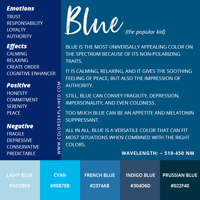
The strategic deployment of color in branding hinges on understanding its psychological impact on consumers. Blue, more than many other colors, possesses a rich and largely positive psychological profile that resonates deeply with human emotions and cognitive processes. This inherent appeal makes it a powerful tool for establishing trust, conveying reliability, and fostering a sense of calm and stability – qualities that are foundational for many successful brands.
Trust, Reliability, and Stability: The Pillars of Blue
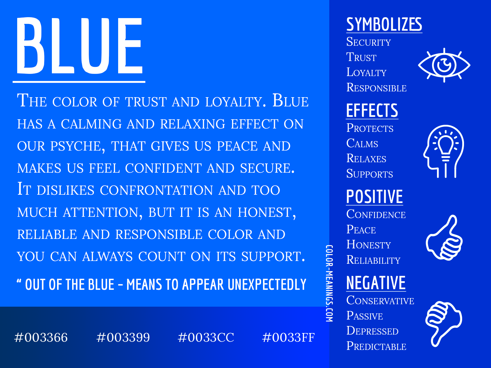
At its core, blue is overwhelmingly associated with trustworthiness and dependability. This connection is not arbitrary; it’s deeply ingrained through millennia of human experience and cultural conditioning. The vastness and constancy of the sky and the ocean evoke feelings of permanence and unwavering presence. In branding, this translates directly into perceptions of a company as being stable, secure, and a reliable partner. For businesses operating in sectors where trust is paramount – such as finance, healthcare, and technology – blue provides an immediate and intuitive signal of credibility.
Financial institutions, for instance, frequently leverage blue to instill confidence in their customers. A bank logo featuring shades of blue suggests financial security and prudent management. Similarly, healthcare providers use blue to convey a sense of calm, professionalism, and a commitment to well-being. The implication is that the organization is dependable and that customers can place their faith in its services. This psychological anchor is crucial for building long-term customer relationships, particularly in industries where the stakes are high and consumer loyalty is hard-won.
Calm, Serenity, and Professionalism: Creating a Soothing Experience
Beyond reliability, blue also carries strong connotations of calmness and serenity. This is particularly relevant in today’s often hectic and information-saturated world. Brands that utilize blue effectively can create a sense of tranquility and order for their audience, offering a welcome respite from the noise. This emotional benefit is a powerful differentiator, allowing brands to establish a positive emotional connection that transcends mere product or service delivery.
The professional aspect of blue is also undeniable. It’s a color often found in formal attire and in environments that demand seriousness and focus. This lends a sense of authority and competence to a brand. Think of the corporate world, where blue suits are a standard, projecting an image of professionalism and competence. Brands that adopt blue can tap into this established association, positioning themselves as serious, competent, and highly capable. This is particularly important for B2B companies, where demonstrating professionalism and expertise is critical for securing deals and building partnerships.
Blue’s Versatility: Adapting to Brand Objectives
The true strength of blue in branding lies not only in its inherent meanings but also in its remarkable versatility. By adjusting the specific shade, saturation, and context, brands can subtly yet effectively modify the message conveyed, aligning the color with specific brand objectives and target audiences. From deep, authoritative navy blues to bright, optimistic sky blues, each variation offers a unique pathway to brand communication.
Darker Blues: Authority, Sophistication, and Exclusivity
Deeper shades of blue, such as navy and midnight blue, exude an aura of authority, sophistication, and even exclusivity. These colors are often associated with established institutions, luxury goods, and brands that want to project a sense of gravitas and expertise. In the corporate landscape, navy blue is a perennial favorite for executive teams and established organizations, signaling stability and a long-standing presence in their respective markets.
Brands that aim to position themselves as leaders in their field, or those offering premium products and services, often find a natural fit with darker blues. These hues communicate a sense of depth and substance, suggesting that the brand has a rich history, a deep understanding of its domain, and a commitment to excellence. When a brand uses navy blue, it’s often a deliberate choice to convey that it is a serious player, one that commands respect and can be trusted with significant responsibilities. This can be particularly effective in B2B marketing, where clients are looking for partners with proven track records and a high degree of competence.
Lighter and Brighter Blues: Openness, Innovation, and Friendliness
In contrast, lighter and brighter blues, such as sky blue, turquoise, and cerulean, evoke feelings of openness, innovation, and friendliness. These shades are often associated with technology, communication, and brands that wish to appear approachable and forward-thinking. The clarity and expansiveness of a bright blue sky can translate into a brand that is perceived as optimistic, transparent, and full of potential.
Technology companies, in particular, frequently utilize lighter blues to convey a sense of innovation and a user-friendly interface. Think of the ubiquitous use of blue in app icons and software interfaces; it creates a welcoming and intuitive experience for the user. These brighter blues can also be used by brands that want to emphasize customer service and approachability. They suggest a brand that is easy to interact with, eager to communicate, and open to new ideas. This can be especially powerful for brands targeting younger demographics or those operating in fast-paced, rapidly evolving industries.
Strategic Applications of Blue Across Industries
The widespread adoption of blue across various industries is a testament to its universal appeal and adaptability. From the staid world of finance to the dynamic realm of social media, blue consistently plays a vital role in shaping brand identity and consumer perception. Understanding these industry-specific applications can offer valuable insights into the strategic thinking behind color choices.

Blue in Finance: The Color of Security and Trust
As previously mentioned, the financial sector is a dominant adopter of blue. This isn’t by chance. The inherent association of blue with trust, stability, and security makes it the ideal color to calm consumer anxieties and build confidence in institutions that manage people’s money. Major banks, investment firms, and insurance companies often employ deep blues in their branding to convey a sense of financial solidity and reliability.
The consistency of blue in this sector reinforces its role as a visual cue for financial safety. When consumers see blue, their minds are subconsciously nudged towards concepts of security and dependability. This can be a significant advantage in an industry where fear and uncertainty can easily drive customers away. Brands that successfully leverage blue in finance are essentially leveraging a universally understood shorthand for trustworthiness, making them appear more appealing and less risky to potential clients.
Blue in Technology: The Palette of Innovation and Connectivity
The technology industry has embraced blue with open arms, using it to signify innovation, intelligence, and seamless connectivity. From operating systems to social media platforms, blue is often the default color for interfaces and logos, suggesting a user-friendly and advanced technological experience. Companies like IBM and Intel, established titans of the tech world, have long used blue to project an image of reliability and technological prowess.
More modern tech giants, such as Facebook and Twitter (now X, though its historical association with blue is undeniable), have also employed blue to foster a sense of openness and widespread connection. The color’s inherent clarity and expansive associations align perfectly with the mission of connecting people and information globally. The choice of blue in tech often aims to convey that a product or service is cutting-edge, intuitive, and will seamlessly integrate into a user’s life, enhancing their digital experience.
Blue in Healthcare and Wellness: The Hue of Calm and Healing
In the healthcare and wellness sectors, blue is utilized for its calming and therapeutic qualities. Hospitals, pharmaceutical companies, and wellness brands often incorporate blue into their visual identities to evoke a sense of peace, trust, and professionalism. The color’s association with serenity can help to alleviate patient anxiety and create a more comforting environment.
The use of blue in medical settings is a deliberate attempt to communicate competence, cleanliness, and a commitment to patient well-being. It suggests a brand that is dependable, knowledgeable, and dedicated to providing effective care. This can be a crucial factor for patients making important decisions about their health and well-being, as it instills confidence in the providers they choose.
The Nuances of Blue: Avoiding Pitfalls in Brand Design
While blue is an incredibly powerful and popular branding color, its effective implementation requires careful consideration. Overreliance, misuse of shades, or pairing it inappropriately can lead to unintended negative associations or a dilution of its intended message. Understanding these nuances is crucial for brands looking to harness the full potential of blue.
The Risk of Coldness and Lack of Passion
One of the primary challenges with blue is its potential to be perceived as cold, distant, or unemotional if not used thoughtfully. While its association with logic and stability is a strength, it can also alienate audiences if a brand needs to convey warmth, passion, or excitement. Brands that are inherently playful, energetic, or deeply human-centric might find that an exclusive reliance on cool blues can detract from their core message.
For instance, a brand focused on vibrant entertainment or deeply personal storytelling might struggle to convey the necessary emotional depth if its primary color is a stark, corporate blue. In such cases, brands often need to strategically incorporate warmer accent colors or use lighter, more cheerful shades of blue to inject the desired feeling of approachability and enthusiasm. The goal is to balance the inherent stability of blue with the specific emotional resonance required by the brand’s personality.
The Importance of Context and Cultural Interpretation
It’s also vital to remember that color perception can be influenced by cultural context. While blue has largely positive associations in Western cultures, its interpretation can vary significantly in different parts of the world. For global brands, understanding these cultural nuances is paramount to ensure that the intended message is received as intended.
For example, in some Asian cultures, blue can be associated with mourning or spiritualism, which could be detrimental to a brand aiming for a positive and approachable image. Therefore, extensive market research and cultural sensitivity are essential when selecting and deploying blue as a core brand color on a global scale. The universal appeal of blue is strong, but it is not entirely without its cultural variations, and overlooking these can lead to significant branding missteps.
Strategic Color Palettes: Blue in Harmony
Ultimately, blue rarely works in isolation. The most effective branding strategies involve integrating blue as part of a carefully curated color palette. By combining blue with other colors, brands can amplify its strengths, mitigate its weaknesses, and create a more nuanced and compelling brand identity.
For example, pairing a reliable navy blue with a vibrant orange or yellow can inject energy and creativity, while still retaining an anchor of trust. Combining a serene sky blue with earthy tones can create a feeling of natural balance and well-being. The art of branding lies in understanding how different colors interact and how to use them in concert to tell a cohesive and impactful story. Blue, when thoughtfully integrated, becomes a powerful cornerstone of this narrative, providing a foundation of trust and stability upon which a compelling brand identity can be built.
aViewFromTheCave is a participant in the Amazon Services LLC Associates Program, an affiliate advertising program designed to provide a means for sites to earn advertising fees by advertising and linking to Amazon.com. Amazon, the Amazon logo, AmazonSupply, and the AmazonSupply logo are trademarks of Amazon.com, Inc. or its affiliates. As an Amazon Associate we earn affiliate commissions from qualifying purchases.