In the world of global marketing and international relations, a national flag serves as the ultimate logo. It is the visual shorthand for a country’s history, values, and aspirations. Among the most recognizable “brand marks” in the world is the Italian Tricolore—the green, white, and red vertical tricolor. To understand what the colors on Italy’s flag mean is to delve into a masterclass in brand strategy, semiotics, and corporate identity. Just as a luxury brand carefully selects its palette to evoke specific emotions and heritage, the Italian flag was synthesized over centuries to represent a unified vision of a nation.
This article explores the evolution of Italy’s visual identity, the psychological impact of its color choices, and how the “Brand Italy” ethos has transcended the flag to influence modern global design and industry.
1. The Semiotics of the Tricolore: Decoding the Brand Palette
The primary function of any visual identity is to communicate a message without words. In the case of the Italian flag, the selection of green, white, and red was not arbitrary; it was a strategic alignment of geography, ideology, and history.
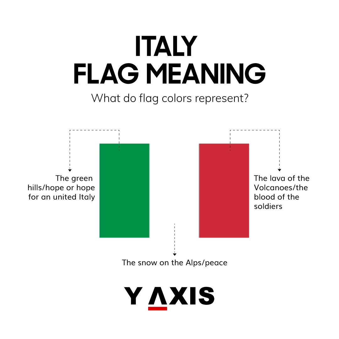
Green: The Symbol of Hope and the Italian Landscape
From a design perspective, green is often associated with growth, renewal, and the natural environment. In the context of the Italian national brand, green represents the lush landscapes of the Mediterranean and the rolling hills of the Apennines. Historically, it was also adopted as the color of “hope”—the hope for a unified, independent Italy during the 18th and 19th centuries. In modern brand psychology, green suggests stability and vitality, qualities that Italy seeks to project as a leading global economy and cultural powerhouse.
White: The Purity of the Alps and Peace
White serves as the “neutral” anchor in the flag’s design. It symbolizes the snow-capped peaks of the Alps, which form the northern border of the country. Beyond geography, white represents peace and the purity of the national spirit. In corporate branding, white space is essential for clarity and focus. On the Italian flag, the white central band provides the necessary contrast to make the green and red pop, ensuring the flag remains highly legible from a distance—a key requirement for any successful visual icon.
Red: The Blood of Valor and the Fire of Passion
Red is arguably the most powerful color in the brand designer’s toolkit. It evokes passion, energy, and action. For Italy, red commemorates the blood spilled during the wars of Italian independence (the Risorgimento). It is a testament to the sacrifice required to build the modern state. However, red also aligns with the Italian cultural identity of passion, warmth, and intensity. Whether it is the red of a Ferrari or the red of a rich Bolognese sauce, this hue has become synonymous with the “Italian fire,” making it an indispensable part of the national visual narrative.
2. From Monarchy to Republic: The Evolution of a Visual Identity
Just as a corporation might undergo a rebranding process to reflect changing leadership or market conditions, Italy’s flag has evolved through various iterations before arriving at its current “minimalist” form.
Napoleon’s Influence and the Birth of a Standard
The origin of the Tricolore dates back to the late 18th century, heavily influenced by the French Revolution. When Napoleon’s troops entered Italy, they brought with them the concept of the tricolor flag. The first official adoption of the green, white, and red occurred in 1797 for the Cispadane Republic. This was a pivotal moment in “Brand Italy” history; it was the first time these specific colors were codified as a representational unit. The choice of green over the French blue was a deliberate “brand differentiation” tactic, marking the Italian identity as distinct from its Gallic neighbors.
Harmonizing Diversity through Design
For much of its history, Italy was a collection of fragmented city-states and kingdoms, each with its own heraldry and colors. The challenge for the architects of the Italian unification was to create a “corporate identity” that could unify diverse populations from Sicily to Piedmont. The Tricolore served as this unifying thread. During the Kingdom of Italy (1861–1946), the flag featured the coat of arms of the House of Savoy in the center. After the 1946 referendum, the coat of arms was removed, resulting in the clean, modern, and egalitarian design we see today. This transition from a monarchical “logo” to a republican “brand” reflects a shift toward a more inclusive national identity.
3. Color Psychology in National Branding: Why These Specific Hues Work
Why has the Italian flag remained so effective as a brand asset? The answer lies in the principles of color psychology and visual ergonomics.
High Contrast for Instant Recognition
The combination of green, white, and red offers high visual contrast. In branding, high-contrast logos are easier to remember and recognize at a glance. This is why the Italian flag is so effective on everything from a diplomatic passport to the tail fin of an Alitalia (now ITA Airways) jet. The colors occupy different parts of the visible spectrum, ensuring that the flag remains distinct even in low-light conditions or when scaled down to a small icon on a digital screen.
Emotional Resonance and Public Trust
The colors of the flag create a psychological “halo effect.” When people see the Italian Tricolore, they often associate it with quality, craftsmanship, and heritage. This trust has been built over centuries of consistent usage. In branding, “consistency equals trust.” By maintaining the same color palette since the late 1700s, Italy has established one of the most stable and trusted national brands in history. This emotional resonance is a powerful asset that Italian businesses leverage every day in the global marketplace.
4. The Halo Effect: How Italy’s Flag Influences Modern Corporate Identity
The “Made in Italy” label is one of the most powerful brand equity indicators in the world. Much of its strength is derived directly from the national flag and the values it represents.
Luxury and Heritage: The Gucci and Prada Connection
Italian luxury brands often incorporate the national palette into their own branding to signal authenticity. Gucci’s iconic green-red-green stripe is perhaps the most famous example of a private brand borrowing from the national visual identity. By aligning their corporate colors with the Tricolore, these fashion houses capitalize on the global perception of Italy as a center of style and excellence. It is a form of “co-branding” where the prestige of the nation elevates the prestige of the product.
Speed and Power: The “Rosso Corsa” Influence
While the flag contains green and white, the color red has taken on a life of its own in the automotive sector. “Rosso Corsa” (Racing Red) became the official racing color of Italy in the early 20th century. Brands like Ferrari, Alfa Romeo, and Ducati have turned this specific shade of red into a global symbol of performance and engineering prowess. Even though a Ferrari is a commercial product, it is often viewed as an extension of the Italian national brand, fueled by the same “passion” represented in the red stripe of the flag.
Culinary Branding: The “Made in Italy” Seal of Excellence
In the food and beverage industry, the green, white, and red palette is a ubiquitous signifier of quality. From pizza boxes in New York to olive oil bottles in Tokyo, the colors of the Tricolore are used to trigger an immediate association with authentic Italian flavor. This is a strategic use of “place branding,” where the geographical origin of a product becomes its primary selling point. The flag acts as a certificate of origin and a promise of a specific sensory experience.
5. Lessons for Modern Brand Architects: Building a Timeless Identity
The story of the Italian flag offers several key takeaways for modern brand strategists, marketing directors, and designers looking to build a lasting identity.
Simplicity as a Scalable Asset
The Tricolore is remarkably simple. It consists of three vertical stripes of equal size. There are no complex gradients, intricate illustrations, or difficult-to-reproduce patterns. This simplicity makes the brand highly scalable. Whether it is embroidered on a shirt, painted on a car, or used as a social media favicon, the identity remains intact. Modern brands should strive for this level of “reductive excellence,” ensuring their mark is versatile enough for any medium.
Staying Consistent Across Eras
The most successful brands are those that can evolve without losing their core essence. Italy has changed its form of government, its economy, and its role in the world, yet the Tricolore has remained the constant visual anchor. This longevity creates a sense of permanence and reliability. For corporate brands, the lesson is to avoid chasing fleeting design trends and instead focus on a timeless visual foundation that can support the brand’s growth for decades.
Leveraging Narrative and Storytelling
The colors of Italy’s flag are powerful because they are backed by a compelling narrative—the story of a landscape, a struggle for freedom, and a passionate culture. A brand without a story is just a commodity. By infusing color choices with meaning and history, organizations can create a deeper emotional connection with their audience. The Italian flag isn’t just a design; it’s a story told in green, white, and red.
In conclusion, the colors on Italy’s flag are much more than historical artifacts. They are the core components of a sophisticated national brand identity that has successfully navigated the complexities of history to become a global symbol of quality and style. For the brand-conscious observer, the Tricolore stands as a testament to the power of visual communication and the enduring impact of a well-executed identity strategy.
aViewFromTheCave is a participant in the Amazon Services LLC Associates Program, an affiliate advertising program designed to provide a means for sites to earn advertising fees by advertising and linking to Amazon.com. Amazon, the Amazon logo, AmazonSupply, and the AmazonSupply logo are trademarks of Amazon.com, Inc. or its affiliates. As an Amazon Associate we earn affiliate commissions from qualifying purchases.