Mint green, a soft and invigorating hue, evokes feelings of freshness, tranquility, and a touch of sophisticated playfulness. Its gentle yet distinctive presence makes it a compelling choice in various design contexts. However, unlocking its full potential requires understanding its harmonious companions. This article delves into the art of color pairing with mint green, focusing specifically on its impactful application within the realm of Brand Design, exploring how strategic color choices can elevate a brand’s identity, communicate its essence, and resonate with its target audience.
The Psychology of Mint Green in Branding
Before we explore specific color pairings, it’s crucial to understand the inherent psychological impact of mint green itself. This understanding forms the bedrock of informed branding decisions.
Evoking Freshness and Purity
Mint green is intrinsically linked to nature, growth, and renewal. Think of the vibrant green shoots of spring or the crispness of a fresh mint leaf. In branding, this translates to associations with:
- Cleanliness and Hygiene: This makes mint green a popular choice for brands in the health, wellness, beauty, and even food and beverage industries where a sense of purity is paramount.
- New Beginnings and Growth: It can symbolize innovation, progress, and a forward-thinking approach.
- Calmness and Serenity: Unlike bolder greens, mint green possesses a soothing quality, promoting relaxation and a sense of well-being. This is particularly effective for brands aiming to reduce stress or offer a peaceful experience.
Communicating Approachability and Sophistication
While often perceived as gentle, mint green can also exude a subtle sophistication. Its lighter tones prevent it from feeling overwhelmingly vibrant, allowing it to blend seamlessly into more refined palettes.
- Youthful Yet Mature: It can appeal to a younger demographic seeking modern and trendy aesthetics, while also retaining a sense of maturity and trustworthiness for broader audiences.
- Understated Elegance: Mint green offers a refined alternative to more common pastel shades, providing a unique yet accessible point of difference.
- Versatility: Its ability to feel both approachable and sophisticated allows it to adapt to a wide range of brand personalities, from eco-conscious startups to established lifestyle brands.
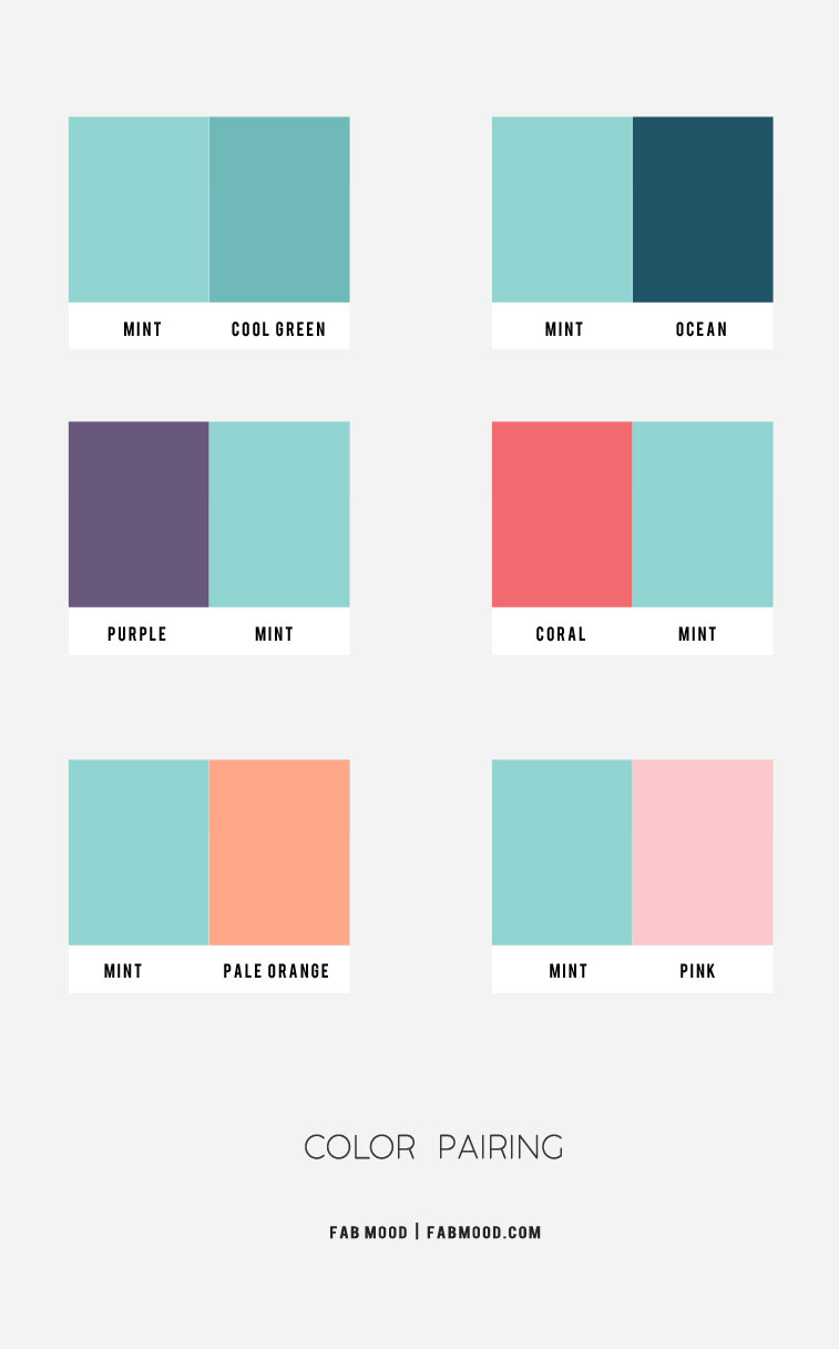
Harmonious Pairings: Building a Mint Green Brand Palette
The true magic of mint green lies in its ability to complement a diverse array of colors, each pairing unlocking a distinct brand narrative. These combinations can be strategically employed across logos, websites, marketing materials, and product packaging to create a cohesive and impactful brand identity.
Neutrals: The Foundation of Sophistication and Clarity
When aiming for a clean, modern, and sophisticated brand presence, neutrals are indispensable partners for mint green. They provide a stable canvas that allows the mint green to shine without overwhelming the viewer.
Whites and Off-Whites: Purity and Minimalism
- Impact: The classic pairing of mint green with crisp whites or soft off-whites immediately communicates cleanliness, purity, and a minimalist aesthetic. This combination is incredibly effective for brands that want to project an image of simplicity, efficacy, and straightforwardness.
- Applications: Think of skincare brands emphasizing natural ingredients, eco-friendly cleaning products, or minimalist interior design firms. White serves as a brilliant backdrop, allowing the mint green to act as a refreshing accent, highlighting key information or brand elements. Off-whites can introduce a touch of warmth and approachability, softening the starkness of pure white.
- Brand Messaging: This palette strongly conveys trustworthiness, transparency, and a focus on essential quality. It’s a safe yet impactful choice for brands seeking to establish credibility and a sense of calm.
Grays: Modernity and Professionalism
- Impact: Pairing mint green with shades of gray, from light silver to charcoal, introduces an element of modern professionalism and understated elegance. Grays ground the inherently airy feel of mint green, adding depth and sophistication.
- Applications: This combination works exceptionally well for tech startups, financial services with a modern outlook, or even fashion brands that aim for a chic, contemporary look. Light grays can maintain a sense of airiness, while darker grays add a more serious and established feel.
- Brand Messaging: This palette speaks to innovation, reliability, and a sophisticated approach. It suggests a brand that is both forward-thinking and dependable, offering a balance of creative flair and practical execution.
Beiges and Creams: Warmth and Naturalism
- Impact: For brands seeking to convey a sense of natural warmth, organic appeal, and gentle comfort, beige and cream are excellent companions for mint green. These warmer neutrals soften the coolness of mint green, creating a cozy and inviting atmosphere.
- Applications: Ideal for brands focused on artisanal products, sustainable living, organic food, or wellness retreats. This pairing evokes a feeling of earthiness and handcrafted quality, suggesting a connection to nature and a mindful approach to business.
- Brand Messaging: This palette communicates authenticity, comfort, and a commitment to natural and wholesome values. It’s a welcoming choice for brands that want to foster a sense of community and well-being.
Warm Tones: Vibrancy and Energy
While mint green is cool, strategically incorporating warm tones can create dynamic and engaging brand experiences, injecting energy and personality without clashing.

Corals and Peaches: Playfulness and Approachability
- Impact: The juxtaposition of cool mint green with warm corals or soft peaches creates a vibrant and playful aesthetic. This combination is inherently energetic and optimistic, evoking a sense of joy and friendliness.
- Applications: Perfect for brands targeting younger demographics, lifestyle products, children’s brands, or businesses aiming for a cheerful and engaging online presence. This palette can inject personality and make a brand feel more approachable and fun.
- Brand Messaging: This pairing communicates happiness, creativity, and a positive outlook. It suggests a brand that is lively, welcoming, and enjoys making a statement.
Soft Yellows and Golds: Optimism and Sophistication
- Impact: Light, buttery yellows or subtle golds can add a touch of sunshine and gentle optimism to a mint green palette. This combination feels uplifting and sophisticated, offering a refined yet cheerful vibe.
- Applications: Suitable for brands in the creative arts, boutique hospitality, or high-end stationery. The yellow adds a hint of luxury and positivity, while the gold can elevate the perceived value and elegance.
- Brand Messaging: This palette conveys optimism, creativity, and a touch of understated luxury. It suggests a brand that is inspiring, joyful, and offers a premium experience.
Rose and Blush Pinks: Femininity and Gentleness
- Impact: Mint green paired with soft rose or blush pinks creates a delicate and feminine aesthetic. This combination is inherently gentle, romantic, and soothing, evoking a sense of care and tenderness.
- Applications: Highly effective for beauty brands, bridal services, women’s lifestyle products, or any brand aiming to convey a sense of nurturing and grace.
- Brand Messaging: This palette communicates love, compassion, and a soft, approachable femininity. It’s ideal for brands that want to evoke feelings of gentleness, beauty, and emotional connection.
Cool Tones: Depth and Serenity
Expanding the cool spectrum with other harmonious blues and greens can create palettes that are deeply serene, sophisticated, and calming, perfect for brands that emphasize tranquility and trust.
Navy Blues: Trust and Professionalism
- Impact: A classic and powerful combination, mint green with navy blue evokes a sense of trust, stability, and professionalism. The deep, rich navy anchors the lighter mint green, creating a balanced and credible look.
- Applications: This pairing is ideal for financial institutions, legal firms, corporate brands, or any business that needs to project an image of reliability and expertise. It offers a sophisticated and timeless appeal.
- Brand Messaging: This palette communicates dependability, authority, and a calm, confident approach. It reassures customers of a brand’s strength and integrity.
Teal and Turquoise: Depth and Creativity
- Impact: Moving into richer, deeper blues and greens like teal and turquoise creates a palette that is both sophisticated and creatively stimulating. This combination offers a sense of depth, luxury, and unique personality.
- Applications: Excellent for creative agencies, interior design firms, travel brands, or businesses that want to convey a sense of adventurousness and artistic flair.
- Brand Messaging: This palette suggests innovation, imagination, and a touch of exoticism. It conveys a brand that is dynamic, inspiring, and offers a unique perspective.
Deeper Greens (Emerald, Forest): Nature and Stability
- Impact: Pairing mint green with deeper, more saturated greens such as emerald or forest green creates a palette that is deeply rooted in nature, stability, and lushness. This combination offers a sense of groundedness and organic richness.
- Applications: Perfect for environmental organizations, organic food brands, landscaping companies, or businesses that want to emphasize a connection to the natural world and sustainability.
- Brand Messaging: This palette communicates growth, abundance, and a strong connection to nature. It suggests a brand that is reliable, nurturing, and committed to environmental well-being.
Strategic Application: Elevating Brand Identity with Mint Green
The power of mint green and its complementary colors lies not just in their aesthetic appeal but in their strategic deployment to craft a compelling brand narrative.
Logos and Visual Identity
- Primary Color: Mint green can serve as a primary color for brands aiming for a fresh, modern, and approachable identity. It’s particularly effective for logos that need to be memorable and friendly.
- Accent Color: When paired with a stronger, more dominant color (like navy or a deep gray), mint green can act as an effective accent, drawing attention to key elements, adding a touch of vibrancy, and breaking up monochromatic schemes.
- Brand Mark: A logo design incorporating both mint green and a chosen complementary color can immediately communicate the brand’s core values. For example, a mint green leaf with a navy stem signifies natural growth within a stable framework.
Website and Digital Presence
- User Interface (UI): Mint green can be used for interactive elements like buttons, links, or navigation bars to guide users and add visual interest. Its gentle nature makes it less jarring than brighter hues, promoting a more pleasant user experience.
- Backgrounds and Imagery: Soft mint green backgrounds can create a calm and inviting online environment. It pairs beautifully with nature-inspired imagery, creating immersive digital experiences for brands in travel, wellness, or outdoor industries.
- Content Emphasis: Mint green can be used for headings, call-to-action buttons, or key information blocks to draw the eye and highlight important content without overwhelming the reader.

Marketing Materials and Packaging
- Brochures and Flyers: Mint green can inject life and memorability into print collateral. When combined with appropriate neutrals, it can create sophisticated marketing materials that stand out.
- Product Packaging: The color of packaging is often the first point of contact a consumer has with a product. Mint green can convey freshness, quality, and a desired emotional response. For example, on a food product, it can suggest natural ingredients, while on a cosmetic, it might imply purity and efficacy.
- Brand Consistency: Maintaining consistent color palettes across all touchpoints – from social media graphics to business cards – is crucial for building a strong and recognizable brand. Strategic pairings of mint green ensure this consistency while allowing for creative expression within the brand’s identity.
In conclusion, mint green is a versatile and impactful color in the brand designer’s toolkit. By understanding its psychological associations and thoughtfully pairing it with complementary hues, brands can craft identities that are not only visually appealing but also deeply resonant, effectively communicating their values, personality, and unique selling propositions to their target audience. The art of color pairing with mint green is about creating harmony, evoking specific emotions, and ultimately, building a memorable and enduring brand.
aViewFromTheCave is a participant in the Amazon Services LLC Associates Program, an affiliate advertising program designed to provide a means for sites to earn advertising fees by advertising and linking to Amazon.com. Amazon, the Amazon logo, AmazonSupply, and the AmazonSupply logo are trademarks of Amazon.com, Inc. or its affiliates. As an Amazon Associate we earn affiliate commissions from qualifying purchases.