In the competitive landscape of corporate identity, color is far more than an aesthetic choice; it is a silent language that communicates values, evokes emotions, and establishes market positioning before a single word of copy is read. Among the most versatile yet underutilized shades in the brand strategist’s toolkit is teal. A sophisticated blend of the calming properties of blue and the revitalizing energy of green, teal occupies a unique psychological space. It suggests clarity, reliability, and modern innovation.
However, the efficacy of teal as a brand cornerstone depends entirely on its environment. To harness its full potential, a brand must understand which colors complement teal to create a cohesive, memorable visual identity. This exploration dives into the strategic application of teal, the color theory behind its most effective pairings, and how brands can leverage these palettes to dominate their niche.

The Psychology and Market Positioning of Teal
Teal is a secondary color that carries the weight of two primary emotional drivers. The blue component provides a sense of stability, trust, and professionalism—traits essential for sectors like finance, healthcare, and technology. The green component introduces themes of growth, health, and environmental consciousness. When merged, they create a color that feels more “human” than sterile navy blue and more “professional” than vibrant lime green.
Bridging the Gap Between Tradition and Innovation
For many emerging brands, the challenge is appearing established enough to be trusted while remaining fresh enough to be disruptive. Teal solves this dichotomy. In the tech sector, for instance, moving away from “Big Tech Blue” toward a deep teal signals a brand that values user experience and creative problem-solving over mere data processing. It is a color of the “new establishment.”
Teal Across Global Industries
The versatility of teal allows it to adapt to various industry standards. In the wellness and organic beauty sectors, lighter shades of teal (often referred to as aqua or turquoise) evoke cleanliness and water. In the luxury and corporate consulting sectors, deeper, darker teals (Mylas or Petrol) provide a rich backdrop that rivals black or charcoal for sophistication, but with added personality. Identifying where your brand sits on this spectrum is the first step in selecting its complementary palette.
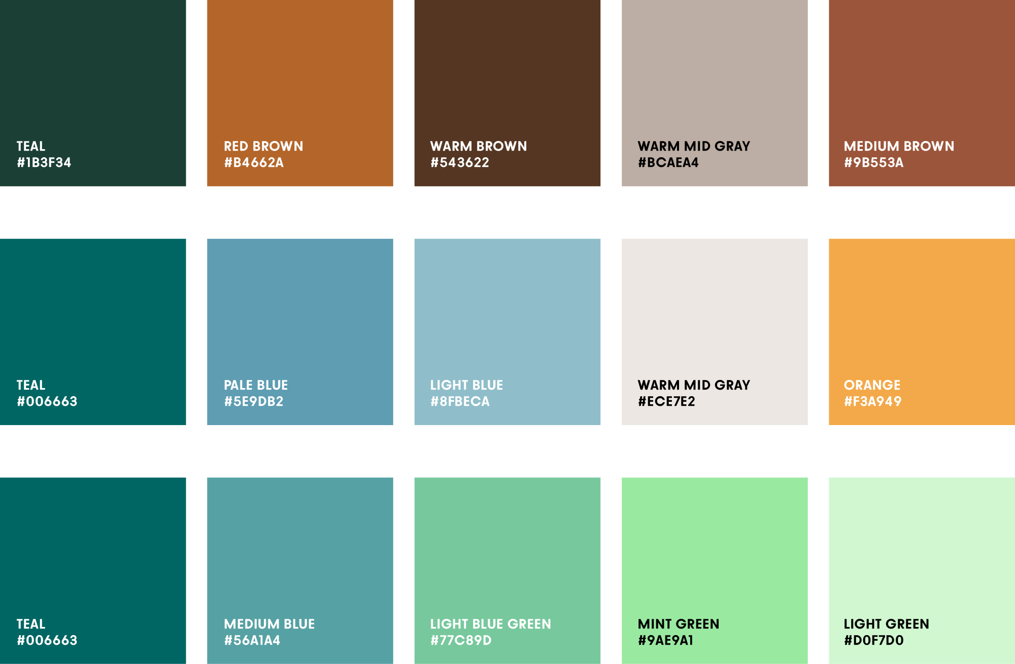
Primary Color Harmonies: What Colors Compliment Teal in Branding?
Selecting a palette is an exercise in balance. Depending on the brand’s “voice”—whether it is loud and energetic or quiet and authoritative—the colors paired with teal will vary. Using the principles of color theory, we can identify three primary directions for brand coordination.
High-Contrast Vibrancy: Teal and Coral or Burnt Orange
On the color wheel, teal sits directly opposite various shades of orange and coral. This complementary relationship creates the highest level of visual tension and energy. For a brand that wants to appear dynamic, youthful, and proactive, pairing a saturated teal with a vibrant coral is an excellent choice.
This combination is frequently seen in “lifestyle” branding and creative agencies. The warmth of the coral cuts through the coolness of the teal, ensuring that the brand doesn’t feel too detached or cold. When using this pairing, brand designers often use teal as the dominant “anchor” color (60%) and coral as the “call-to-action” or accent color (10-20%) to prevent visual fatigue.
Sophisticated Luxury: Teal, Gold, and Deep Metallics
For high-end branding, teal serves as an exceptional alternative to traditional black or navy. When paired with metallic gold, copper, or bronze, teal takes on an air of opulence and heritage. This is a favorite among boutique hotels, premium skincare lines, and high-level financial consultancies.
Gold accents against a dark teal background provide a “glow” that feels both timeless and expensive. The key here is the “weight” of the teal; a desaturated, darker teal (often called “dark cyan”) works best with metallics. This palette suggests that the brand is an investment, prioritizing quality and longevity over fleeting trends.
The Modern Minimalist: Teal and Muted Neutrals
In the world of SaaS (Software as a Service) and modern app design, teal is often paired with a spectrum of grays, “whitesmoke,” or “cool beige.” This creates a clean, distraction-free environment that emphasizes usability.
Using a “Teal and Slate” palette allows the teal to act as the primary signifier of movement and interaction. In a sea of white space, a teal button or icon stands out without being as jarring as red or bright yellow. This approach is ideal for brands that pride themselves on “clarity” and “simplicity,” as it minimizes cognitive load for the consumer while maintaining a distinct visual identity.
Strategic Implementation: Applying Teal Palettes to Brand Assets

Once the complementary colors are chosen, the focus shifts to implementation. A brand’s visual identity must be consistent across digital and physical touchpoints. Teal presents specific opportunities and challenges in these different mediums.
Digital Presence and User Interface (UI) Design
In digital branding, teal is highly favored for its “link-friendly” nature. Because it is a cousin to the traditional blue used for hyperlinks, users instinctively feel that teal elements are interactive. However, designers must be mindful of contrast ratios.
When pairing teal with white text, or vice versa, ensuring WCAG (Web Content Accessibility Guidelines) compliance is vital. A medium teal often requires a darker overlay or a bold font weight to remain readable for users with visual impairments. Strategically, using a “Teal and Mint” analogous palette can create a layered, modern look for website backgrounds and app gradients, providing a sense of depth that a flat color cannot achieve.
Print Media and Tangible Brand Touchpoints
In the physical world—business cards, packaging, and office signage—teal can be notoriously difficult to replicate in CMYK (standard printing) compared to RGB (digital screens). It often requires a “Spot Color” (such as a specific Pantone shade) to ensure the vibrancy isn’t lost.
When teal is paired with textured materials—such as recycled brown kraft paper for an eco-friendly brand or a soft-touch matte finish for a luxury brand—the tactile experience reinforces the color’s message. For example, a “Teal and Cream” palette on heavy, uncoated paper stock communicates a sense of organic “earthiness” and premium craftsmanship that works exceptionally well for sustainable fashion or high-end artisanal goods.
Case Studies: Success Stories in Teal-Centric Branding
Examining brands that have successfully occupied the “teal space” provides a blueprint for how to use complementary colors to establish a market foothold.
The Tech Innovator: Slack and Beyond
While Slack’s logo is a multicolored “octothorpe,” teal (specifically their “Aubergine” and “Teal” accents) plays a massive role in their UI. By pairing teal with white and light purple, Slack created a workspace that felt significantly more inviting and less “corporate” than Microsoft Teams or older enterprise software. This use of teal helped define the “friendly tech” aesthetic of the 2010s.
The Disruptor: Tiered FinTech Palettes
Many “Neobanks” have moved away from traditional “Bank Green” or “Trust Blue” toward teal. By pairing teal with a high-visibility neon yellow or a soft blush pink, these brands signal to a younger demographic that they are a different kind of financial institution—one that is tech-forward and inclusive. The teal provides the necessary “anchor” of financial security, while the complementary brights provide the “disruption.”
Avoiding Common Pitfalls in Teal-Centric Design
While teal is a powerful branding tool, it is not without its risks. Overuse or poor pairing can lead to a brand looking dated or confused.
The “90s Aesthetic” Risk
In the 1990s, a specific shade of teal was ubiquitous in sports branding and paper cup designs (the famous “Jazz” pattern). To avoid making a brand look like a retro throwback (unless that is the intentional “Brand Persona”), strategists should opt for more complex, “muddy,” or highly saturated teals. Avoid pairing teal with bright, primary purples or magentas unless a deliberate 90s-maximalist vibe is required.
Contextual Cultural Significance
In some Middle Eastern cultures, teal and blue-green hues are associated with protection and strength, often used in architectural tiling. In some Western contexts, it can be associated with clinical environments. A brand must research its primary geographic market to ensure that its teal palette doesn’t trigger unintended associations. For a global brand, a “Teal and Charcoal” palette is generally the safest bet, as it remains neutral and professional across most cultural boundaries.
Conclusion: The Versatile Anchor of Modern Branding
Teal is more than just a color; it is a strategic bridge between two worlds. It offers the stability of blue without the coldness, and the vitality of green without the lack of formality. By carefully selecting complementary colors—whether the high-energy contrast of coral, the luxury of gold, or the sleekness of slate gray—a brand can craft an identity that is both visually striking and psychologically resonant.
As the digital landscape becomes increasingly crowded, the ability to stand out through sophisticated color coordination is a competitive advantage. Teal, when utilized with a deep understanding of color theory and brand positioning, provides the perfect canvas for a brand to tell its story, build trust, and leave a lasting impression on its audience.
aViewFromTheCave is a participant in the Amazon Services LLC Associates Program, an affiliate advertising program designed to provide a means for sites to earn advertising fees by advertising and linking to Amazon.com. Amazon, the Amazon logo, AmazonSupply, and the AmazonSupply logo are trademarks of Amazon.com, Inc. or its affiliates. As an Amazon Associate we earn affiliate commissions from qualifying purchases.