In the pantheon of global consumer goods, few items have achieved the level of brand recognition enjoyed by the “Y-Front.” While the term is often used colloquially to describe any pair of men’s briefs, it is, in its purest form, a triumph of brand strategy and corporate identity. Originally a specific design innovation by the company now known as Jockey International, the Y-Front transformed a basic commodity into a branded staple, altering the trajectory of the men’s apparel industry forever.
To understand what Y-fronts are is to understand the power of disruptive marketing, the importance of visual trademarks, and the psychology of brand loyalty. This article explores how a simple functional garment became a case study in building a lasting corporate legacy.
The Birth of a Cultural Icon: Engineering Brand Recognition
Before the mid-1930s, men’s undergarments were largely utilitarian, shapeless, and unbranded. The market was dominated by “union suits” and baggy drawers that offered little in the way of support or aesthetic appeal. The emergence of the Y-Front was not merely a textile innovation; it was the birth of a new category in the brand landscape.
Arthur Kneibler and the Vision of Support
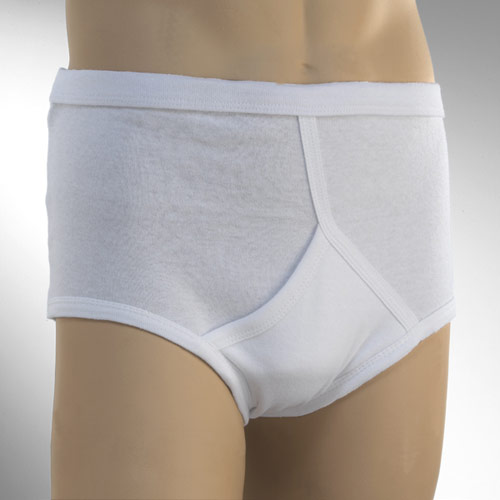
In 1934, Arthur Kneibler, a “hosiery hero” and executive at Coopers, Inc. (the predecessor to Jockey), received a postcard from the French Riviera showing a man in a sleek, supportive swimsuit. Kneibler recognized a gap in the American market for a garment that offered similar “masculine support.” This led to the development of the Jockey brief, featuring the iconic inverted-Y opening.
From a branding perspective, the “Y” was genius. It wasn’t just a functional fly; it was a visual signature. In an era where most undergarments looked identical on a clothesline, the Y-Front provided a distinct silhouette that consumers could identify at a glance.
The 1935 Debut: A Disruption in Retail Marketing
The Y-Front made its debut at the Marshall Field & Company department store in Chicago on a blizzard-ridden day in January 1935. Despite the weather, the product was an instant sensation. The branding strategy relied heavily on “the package.” Coopers, Inc. was one of the first companies to move underwear from behind the counter into cellophane-wrapped packages on top of the counter. This shifted the brand interaction from a whispered conversation with a clerk to a modern, self-service retail experience. By the end of the first day, the store had sold out of its entire stock.
Branding Beyond Utility: How the Y-Front Redefined Masculinity
Successful brand strategy often involves selling an idea rather than a product. The Y-Front didn’t just sell cotton briefs; it sold the concept of the “modern man.” This shift in positioning allowed the brand to command a premium price and foster deep emotional connections with its audience.
The Psychology of Modern Branding
In the post-Depression era, consumers were looking for signs of progress and modernity. The Y-Front was marketed as “scientific” and “hygienic.” Advertisements focused on the “Jockey” brand name, evoking images of athleticism, agility, and elite performance. By naming the product after a professional athlete (the jockey), Coopers, Inc. successfully associated their brand with stamina and precision. This was a pioneering move in “lifestyle branding,” where the product’s identity is linked to the aspirational qualities of its users.

Visual Identity and the “Jockey Boy”
To solidify the brand’s corporate identity, the company introduced the “Jockey Boy” statue—a small, stylized figurine of a jockey that was placed in retail stores across the country. This became one of the most recognized brand mascots in history. The consistency of this imagery ensured that whether a customer was in New York or London, the Y-Front was synonymous with the Jockey brand. This level of visual cohesion is a foundational principle in modern brand strategy, ensuring that the brand survives even as specific product designs evolve.
Survival in a Competitive Market: Strategic Evolution and Brand Longevity
The longevity of the Y-Front as a brand concept is a testament to its ability to adapt to shifting market trends. Over the decades, the brand has faced intense competition from various garment styles, most notably the rise of boxers in the mid-20th century and the “boxer-brief” in the 1990s.
Adapting to Change: Boxers vs. Briefs
The “Great Underwear Debate” of the 1940s and 50s forced the Y-Front brand to double down on its unique selling proposition (USP). While boxers were marketed as “airy” and “traditional,” the Y-Front brand focused on “trimness” and “fit,” aligning itself with the slim-cut trousers of the time. This strategic alignment with broader fashion trends allowed the brand to remain relevant. It demonstrated that a brand must not exist in a vacuum; it must evolve alongside the lifestyle of its target demographic.
Protecting the IP: Trademarking a Silhouette
One of the greatest challenges for any brand is the risk of “genericide,” where a brand name becomes so common that it loses its legal protection (think Kleenex or Escalator). Jockey International worked tirelessly to protect the “Y-Front” trademark and the specific design of the inverted-Y fly. By maintaining strict quality controls and distinctive packaging, they ensured that while other companies could make “briefs,” only Jockey could offer the authentic Y-Front. This protection of intellectual property is a critical component of corporate identity, safeguarding the brand’s value against imitators.
Lessons for Modern Marketers: What the Y-Front Teaches Us About Brand Strategy
The story of the Y-Front offers timeless lessons for today’s brand managers, marketing executives, and entrepreneurs. Even in the digital age, the core principles that made the Y-Front a household name remain valid.
Solve a Friction Point
The Y-Front didn’t just exist to be different; it existed to solve a problem. It provided support that previous garments lacked and offered a more convenient design for daily use. In brand strategy, identifying a “friction point” in the consumer’s life and positioning your product as the definitive solution is the fastest way to build market share.
The Power of Visual Distinctiveness
The “Y” design served as a built-in logo. In a world of digital noise, brands that can distill their identity into a simple, recognizable visual element have a significant advantage. Whether it is the curve of a bottle or a specific stitch pattern, visual distinctiveness creates a “mental shortcut” for the consumer, making the brand easier to remember and choose.
Consistency Across Touchpoints
From the cellophane packaging in 1935 to the celebrity-led advertising campaigns of the modern era, the Y-Front brand has maintained a consistent message of quality, masculinity, and innovation. Brand equity is built over decades, not days. By staying true to its core identity while subtly updating its aesthetic to meet modern tastes, the Y-Front has managed to remain a cornerstone of the apparel industry for nearly a century.

Conclusion: More Than Just a Garment
What are Y-fronts? They are a masterclass in brand evolution. They represent the moment when the apparel industry moved from selling “fabrics” to selling “identities.” Through savvy retail placement, aspirational positioning, and a fierce protection of its visual trademarks, the Y-Front brand has transcended its physical form to become a global symbol of design excellence. For any brand looking to achieve “icon” status, the history of the Y-Front serves as a definitive blueprint for success.
aViewFromTheCave is a participant in the Amazon Services LLC Associates Program, an affiliate advertising program designed to provide a means for sites to earn advertising fees by advertising and linking to Amazon.com. Amazon, the Amazon logo, AmazonSupply, and the AmazonSupply logo are trademarks of Amazon.com, Inc. or its affiliates. As an Amazon Associate we earn affiliate commissions from qualifying purchases.