The question “what are Netherlands people called?” seems straightforward on the surface. The answer—Dutch—is a term known globally. However, beneath this simple demonym lies a complex narrative of history, geography, and one of the most successful examples of national rebranding in the modern era. In the world of brand strategy and corporate identity, the way a nation defines its people and its borders is not merely a matter of linguistics; it is a fundamental component of its global market value.
Understanding the distinction between “Dutch,” “Netherlander,” and the common misnomer “Holland” provides a masterclass in brand management. For professionals in marketing and strategy, the evolution of the Dutch identity offers profound insights into how a collective name can drive international trade, foster professional trust, and build a cohesive personal brand for millions of citizens.

The Branding Paradox: Dutch vs. Netherlander
The first hurdle in understanding the identity of people from the Netherlands is the linguistic disconnect. Unlike “Germans” from Germany or “Italians” from Italy, the people of the Netherlands are called “Dutch.” This creates a unique branding challenge: a name that does not phonetically or visually align with the country’s modern name.
Linguistic Heritage and Brand Recognition
The term “Dutch” stems from the Old Germanic word theodiscus, meaning “of the people.” Over centuries, this evolved into Duits (in Dutch) and Deutsch (in German). In the English-speaking world, “Dutch” stuck as the primary descriptor for those living in the Low Countries. From a branding perspective, this is a “legacy brand.” It is an established term with high equity but low literal alignment with the modern “corporate” name (The Netherlands).
High-equity legacy names are powerful because they evoke immediate recognition. When a consumer hears “Dutch Design” or “Dutch Engineering,” they do not need to check a map; the name itself carries a weight of quality, history, and reliability. However, the disconnect requires the state to work harder to ensure that the “The Netherlands” (the entity) and “The Dutch” (the product/people) remain synonymous in the global mind.
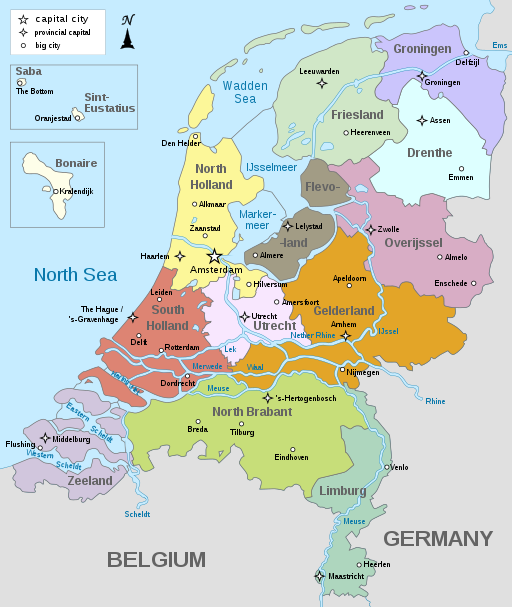
The “Holland” Misnomer: A Case of Regional Dominance
Perhaps the greatest branding confusion arises from the term “Holland.” For decades, the world used “Holland” and “The Netherlands” interchangeably. This is a classic case of a sub-brand overshadowing the parent brand. North and South Holland are merely two of the twelve provinces in the Netherlands, but because they contain the economic powerhouses of Amsterdam, Rotterdam, and The Hague, they became the face of the nation.
In branding terms, allowing a sub-brand to dominate the narrative can be dangerous. It alienates other regions (or “departments”) and creates a narrow perception of what the brand offers. For years, the Dutch brand was limited to tulips, windmills, and wooden shoes—clichés largely associated with the Holland provinces. To grow as a modern tech and maritime hub, the nation had to pivot away from this regional dominance.
Building a National Identity: The “Netherlands” Rebrand
In early 2020, the Dutch government officially dropped the use of “Holland” in its international marketing and communications. This was not a whim; it was a calculated strategic shift in corporate identity. The goal was to reposition the country as an innovative, sustainable, and diverse nation rather than just a tourist destination for the “Holland” provinces.
From “Holland” to “The Netherlands”: A Strategic Shift
A brand is only as good as its promise. By shifting the focus to “The Netherlands,” the government sought to include the tech hubs of Eindhoven and the agricultural innovations of Wageningen. This rebrand was designed to attract investment and talent to the entire country, not just the capital.
The strategy involved updating everything from embassy stationery to tourism board logos. By consistently using “The Netherlands,” the state reinforced a unified brand architecture. This move demonstrates that even a 400-year-old “brand” must occasionally undergo a refresh to remain relevant in a competitive global market. For brand strategists, this serves as a reminder that consistency across all touchpoints is essential for changing public perception.
Visual Identity and the Power of Orange
Central to the identity of the Dutch people—regardless of what they are called—is the color orange. While the national flag is red, white, and blue, the “brand color” of the Netherlands is orange, stemming from the Royal House of Orange-Nassau.
From a marketing standpoint, the Dutch have achieved what most brands dream of: “owning” a color. When the national football team steps onto the pitch, or when Dutch innovators present at a tech conference, the color orange serves as a powerful visual shorthand. It communicates energy, optimism, and a sense of “Oranjegevoel” (Orange feeling). This visual consistency helps bridge the gap between the different names (Dutch/Netherlands) and creates a cohesive emotional connection with the global audience.
The Impact of Demonym Branding on International Trade
Names carry connotations. When we call people “Dutch,” we are invoking a brand history that dates back to the Dutch Golden Age. This historical branding has real-world implications for modern business and international trade.
“Dutch-Made” as a Quality Hallmark
In the global marketplace, the demonym “Dutch” acts as a certificate of origin that commands a premium. Whether it is Philips in electronics, ASML in semiconductor lithography, or Unilever in consumer goods, the “Dutch” label is associated with precision and pragmatism.
This is “Origin Branding.” Just as “Swiss-made” implies precision in horology, “Dutch-made” often implies efficiency in logistics and water management. By maintaining the name “Dutch” for its people and products while using “The Netherlands” for the political and geographical entity, the nation manages a dual-branding strategy that maximizes both historical prestige and modern institutional stability.
Trust and Transparency in Corporate Identity
The Dutch are world-renowned for their directness. In brand strategy, this translates to transparency and honesty—two of the most valued traits in modern B2B relationships. When someone is described as “Dutch,” there is an underlying expectation of straightforwardness.
This reputation is a significant asset in financial and corporate sectors. Trust is the currency of the global economy, and the “Dutch brand” provides a shortcut to establishing that trust. For corporations operating out of the Netherlands, the national identity provides an “umbrella brand” that suggests a high standard of ethics and a no-nonsense approach to business.
Personal Branding and the Dutch Professional Persona
On an individual level, what Netherlands people are called—and how they embody that identity—plays a crucial role in personal branding. The Dutch professional persona is a distinct “product” in the global talent market.
Directness as a Brand Value
In many cultures, “directness” might be seen as a negative trait. However, the Dutch have successfully rebranded this as “efficiency” and “clarity.” In a fast-paced digital economy, the ability to bypass corporate jargon and get straight to the point is a competitive advantage.
Dutch professionals often lean into this aspect of their identity when building their personal brands. By positioning themselves as transparent and results-oriented, they differentiate themselves from professionals in more hierarchical or indirect corporate cultures. This is a lesson in turning a potential cultural “weakness” into a unique selling proposition (USP).
Innovation and the “Polder Model” in Leadership
The “Polder Model”—a method of consensus-based decision-making—is another core component of the Dutch brand. It suggests that even in a competitive environment, cooperation is the key to survival (a necessity born from the historical need to keep the sea at bay).
When Dutch leaders move into international roles, they bring this “brand of leadership” with them. It is an identity built on inclusivity, pragmatism, and long-term thinking. Understanding that “Netherlands people” are proponents of this model helps global partners understand how to negotiate and collaborate with them more effectively.
Future-Proofing the Dutch Brand in a Digital World
As we move further into the 21st century, the way the Netherlands identifies itself is continuing to evolve. The brand is shifting from one of “tradition” to one of “pioneering sustainability.”
Digital Diplomacy and Soft Power
The Netherlands is a leader in digital diplomacy, using social media and digital platforms to reinforce its national brand. By highlighting their leadership in green energy, floating architecture, and circular economies, they are ensuring that the name “Dutch” remains synonymous with “the future.”
Soft power—the ability to influence through attraction rather than coercion—is the ultimate goal of nation branding. By being the people who solve global problems like rising sea levels or food insecurity, the Dutch ensure that their “brand” remains indispensable to the global community.

Maintaining Authenticity in Global Marketing
The challenge for any long-standing brand is staying authentic while evolving. The transition from “Holland” to “The Netherlands” was successful because it was rooted in the reality of the country’s diverse geography and economy. It wasn’t just a name change; it was an alignment of the brand with the actual product.
For marketers and brand strategists, the story of what Netherlands people are called is a reminder that identity is fluid but must be managed with intention. Whether it is a person, a company, or a nation, the name you use and the values you attach to it are your most valuable assets. The Dutch have mastered the art of being “The Netherlands” to the world, “Nederland” to themselves, and “Dutch” to the market—all while maintaining a singular, powerful identity that commands respect across the globe.
aViewFromTheCave is a participant in the Amazon Services LLC Associates Program, an affiliate advertising program designed to provide a means for sites to earn advertising fees by advertising and linking to Amazon.com. Amazon, the Amazon logo, AmazonSupply, and the AmazonSupply logo are trademarks of Amazon.com, Inc. or its affiliates. As an Amazon Associate we earn affiliate commissions from qualifying purchases.