In the dynamic world of web development, staying ahead means embracing tools that offer both speed and flexibility. React, with its component-based architecture, has long been a cornerstone for building interactive user interfaces. Paired with Vite, a next-generation frontend tooling that boasts lightning-fast development server starts and incredibly quick hot module replacement, developers can achieve unprecedented levels of productivity. When you introduce Tailwind CSS into this powerful equation, you unlock a utility-first CSS framework that fundamentally transforms how you approach styling, leading to highly customizable, performant, and maintainable user interfaces.
This comprehensive guide will walk you through the entire process of integrating Tailwind CSS into your React Vite project. From setting up your development environment to configuring Tailwind’s powerful features, we’ll cover every step, ensuring you can harness the full potential of this modern tech stack. By the end, you’ll not only have a robust development workflow but also a deeper understanding of how these technologies converge to create an optimal environment for building cutting-edge web applications. This streamlined approach not only enhances the technical aspects of your projects but also subtly contributes to your brand’s ability to deliver high-quality, polished applications quickly, potentially saving money through increased developer efficiency and faster time-to-market for new features or products.
Setting Up Your React Vite Project
Before we dive into the specifics of Tailwind CSS, it’s essential to have a solid foundation: a React project powered by Vite. If you already have an existing Vite project, you can skip to the next section. Otherwise, follow these straightforward steps to get your development environment ready.
Prerequisites for a Smooth Start
To embark on this journey, you’ll need a few fundamental tools installed on your system. These are standard for modern JavaScript development and likely already present if you’ve done any web development recently.
- Node.js (Version 14.0 or higher): Node.js is the JavaScript runtime that Vite uses to build your project and run your development server. It also comes bundled with npm (Node Package Manager). You can download the latest LTS (Long Term Support) version from the official Node.js website.
- npm or Yarn (Package Managers): These tools are used to install, manage, and update the various libraries and dependencies your project will rely on. npm is installed automatically with Node.js, while Yarn is an alternative that some developers prefer for its speed and features. We’ll use npm commands throughout this guide, but you can easily substitute them with Yarn if that’s your preference (e.g.,
npm installbecomesyarn install,npm run devbecomesyarn dev).
Once you’ve ensured these prerequisites are met, open your terminal or command prompt. This will be your primary interface for interacting with your project.
Creating a Brand New React Vite Application
Vite offers an incredibly fast way to scaffold new projects, including those using React. Its minimalistic setup ensures you’re up and running in seconds, without the need for complex configurations right out of the box.
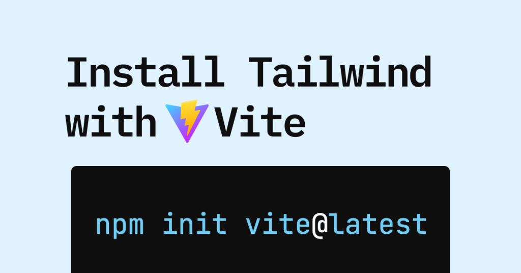
Navigate to the directory where you’d like to create your new project, then execute the following command:
npm create vite@latest my-tailwind-react-app -- --template react
Let’s break down this command:
npm create vite@latest: This command uses npm’screatefeature to execute thevitepackage, specifically its latest version. This is the recommended way to initialize a Vite project.my-tailwind-react-app: This is the name of your new project directory. Feel free to replace it with a name that suits your project’s purpose, perhaps something reflective of your brand or a specific feature you’re building.-- --template react: This tells Vite to use thereacttemplate, ensuring that your new project is pre-configured with the necessary React dependencies and a basic file structure. The double dash (-- --) is necessary to pass arguments to thevitecommand itself.
After running this command, Vite will quickly create the project structure. You’ll then need to navigate into your new project directory and install its initial dependencies:
cd my-tailwind-react-app
npm install
npm install reads the package.json file created by Vite and downloads all the listed dependencies. This typically takes a few moments. Once completed, you can test your basic React Vite application by running the development server:
npm run dev
Your browser should automatically open, or you’ll see a local URL (e.g., http://localhost:5173) in your terminal. Navigating to this URL will display the default Vite + React welcome page. This confirms your core setup is correct and ready for the next step: integrating Tailwind CSS.
Integrating Tailwind CSS into Your Project
Now that your React Vite project is up and running, it’s time to bring Tailwind CSS into the fold. This process involves installing the necessary packages, initializing Tailwind’s configuration files, and linking them to your project’s styling pipeline.
Installing Tailwind CSS and its Peer Dependencies
Tailwind CSS itself is a PostCSS plugin, which means it requires PostCSS to process your CSS. Autoprefixer is another common PostCSS plugin that automatically adds vendor prefixes to CSS rules, ensuring cross-browser compatibility. Both are considered peer dependencies when working with Tailwind CSS in modern build tools.
Execute the following command in your project’s root directory:
npm install -D tailwindcss postcss autoprefixer
Let’s dissect this command:
npm install: The standard command to install packages.-Dor--save-dev: This flag installs these packages as “development dependencies.” This means they are only required during the development and build processes, not in the final production code that runs in the browser. This is good practice for keeping your production bundles lean.tailwindcss: The core Tailwind CSS library.postcss: The tool that Tailwind CSS uses to transform your CSS.autoprefixer: A PostCSS plugin that automatically adds vendor prefixes, improving browser compatibility without manual effort.
Initializing Tailwind CSS Configuration Files
After installing the packages, you need to generate the configuration files that Tailwind CSS will use. These files allow you to customize Tailwind’s default behavior, extend its utility classes, and define where it should look for CSS classes in your project files.
Run the following command:
npx tailwindcss init -p
This command does two things:
npx tailwindcss init: This generates atailwind.config.jsfile in your project’s root. This file is where you’ll define your design system, configure themes, and manage plugins.-por--postcss: This flag also generates apostcss.config.jsfile. This file tells PostCSS to use Tailwind CSS and Autoprefixer. This is crucial for the build pipeline to correctly process your Tailwind utility classes.
After execution, you should see two new files in your project root:
tailwind.config.jspostcss.config.js
Open postcss.config.js. It should look something like this:
export default {
  plugins: {
    tailwindcss: {},
    autoprefixer: {},
  },
};
This configuration ensures that both Tailwind CSS and Autoprefixer are applied during the PostCSS processing step, which Vite will handle automatically in the background.
Configuring Template Paths for Tailwind CSS
For Tailwind CSS to work effectively, it needs to know which files to scan for utility classes. This is how it generates only the CSS you actually use, keeping your final bundle size small and efficient. This process, often referred to as “tree-shaking” for CSS, is vital for performance and a key benefit of Tailwind.
Open your tailwind.config.js file. You’ll find an empty content array. You need to update this array to include the paths to all your React component files (e.g., .jsx, .tsx) and any other files where you might use Tailwind classes (e.g., .html, .js).
Modify tailwind.config.js to look like this:
/** @type {import('tailwindcss').Config} */
export default {
  content: [
    "./index.html",
    "./src/**/*.{js,ts,jsx,tsx}",
  ],
  theme: {
    extend: {},
  },
  plugins: [],
}
Let’s break down the content array:
"./index.html": This ensures that any Tailwind classes applied directly in your mainindex.htmlfile (though less common in React projects) are also processed."./src/**/*.{js,ts,jsx,tsx}": This is a glob pattern that instructs Tailwind to scan all files ending with.js,.ts,.jsx, or.tsxwithin thesrcdirectory and its subdirectories. This covers all your React components and JavaScript/TypeScript files where you’ll be writing your UI.
By correctly configuring the content paths, you guarantee that Tailwind CSS will generate the necessary styles for all the utility classes you employ across your application, ensuring a lightweight and optimized stylesheet.
Adding Tailwind Directives to Your CSS

The final step in the integration process is to import Tailwind’s base styles, components, and utilities into your main CSS file. Tailwind achieves this using special @tailwind directives.
Open your primary CSS file, typically src/index.css (or src/App.css if you prefer to encapsulate styles per component, though index.css is generally recommended for global Tailwind imports). Delete all existing content in this file and replace it with the following three lines:
@tailwind base;
@tailwind components;
@tailwind utilities;
Here’s what each directive does:
@tailwind base;: This injects Tailwind’s base styles, which are a small set of opinionated styles that reset browser defaults to a more consistent foundation. This includes things like normalizing heading sizes, list styles, and form element appearances, providing a clean slate for your designs.@tailwind components;: This injects Tailwind’scomponentlayer, which contains classes for reusable components that you might define (e.g., in plugins) or third-party component libraries that use Tailwind. By default, it’s fairly minimal, but it’s crucial for any custom components you define using@applyor external Tailwind plugins.@tailwind utilities;: This is the most important directive, as it injects all of Tailwind’s powerful utility classes (e.g.,text-blue-500,flex,p-4,shadow-lg). These are the classes you’ll be directly applying to your HTML elements.
With these directives in place, Tailwind CSS is now fully integrated into your React Vite project. The next section will guide you through verifying the installation and starting to build your UI with Tailwind’s utility-first approach.
Verifying the Installation and Building with Tailwind
With all the configuration steps completed, it’s time to confirm that Tailwind CSS is correctly set up and ready to empower your development workflow. This section will guide you through a quick verification process and demonstrate how to start applying Tailwind classes in your React components.
Confirming Tailwind CSS is Active
To verify your setup, first ensure your Vite development server is running. If it’s not, navigate to your project directory in the terminal and execute:
npm run dev
Now, open src/App.jsx (or src/App.tsx if you’re using TypeScript). You’ll typically find some boilerplate React code. Replace the content of your App.jsx file with something simple like this:
import React from 'react';

function App() {
  return (
    <div className="min-h-screen bg-gray-100 flex items-center justify-center p-4">
      <h1 className="text-5xl font-bold text-blue-600 mb-4 animate-bounce">
        Hello Tailwind CSS!
      </h1>
      <p className="text-lg text-gray-700">
        You've successfully installed Tailwind CSS with React and Vite.
      </p>
      <button className="mt-6 px-6 py-3 bg-indigo-600 text-white font-semibold rounded-lg shadow-md hover:bg-indigo-700 transition-colors duration-300">
        Get Started
      </button>
    </div>
  );
}

export default App;
Save the file. Your browser, which should still be pointing to your development server (e.g., http://localhost:5173), should automatically hot-reload. You should now see a page with “Hello Tailwind CSS!” displayed in a large, bold, blue font, along with styled text and a button. If the styles appear as expected (blue text, gray background, styled button), congratulations! Tailwind CSS is successfully integrated and working.
If you encounter any issues, double-check:
- Your
tailwind.config.jscontentarray paths. - The
@tailwinddirectives insrc/index.css. - Any typos in your
npm installcommands or the Tailwind classes themselves.
Leveraging Tailwind’s Utility-First Approach
The example above showcases the core philosophy of Tailwind CSS: applying small, single-purpose utility classes directly in your HTML (or JSX, in React’s case). This utility-first approach offers several compelling advantages:
- Speed of Development: You rarely leave your HTML/JSX. No more juggling between HTML and CSS files, inventing class names, or dealing with context switching. This significantly accelerates the development process, allowing your team to build and iterate faster, which directly impacts project timelines and money saved on development hours.
- No Unused CSS: Because Tailwind generates styles based on what you actually use in your
contentfiles, your final production CSS bundle will be incredibly lean. This leads to faster loading times and a better user experience. - Consistency: By using a predefined set of utility classes, your application’s UI naturally maintains a consistent look and feel across different components and pages. This strengthens your brand’s visual identity and professionalism.
- Maintainability: While it might seem verbose at first, utility classes make it easier to understand how an element is styled at a glance. Changes are localized, reducing the risk of unintended side effects in other parts of your application.
Consider the button example:
px-6 py-3: Padding on the x-axis and y-axis.
bg-indigo-600: Background color.
text-white: Text color.
font-semibold: Font weight.
rounded-lg: Border-radius.
shadow-md: Box shadow.
hover:bg-indigo-700: Changes background on hover.
transition-colors duration-300: Smooth transition for color changes over 300ms.
Each class does one specific job, yet combined, they create a fully styled, interactive button. This composability is at the heart of Tailwind’s power.
Building for Production
When you’re ready to deploy your application, Vite will automatically handle the build process, including optimizing your Tailwind CSS. Run the following command:
npm run build
Vite will produce an optimized, production-ready bundle in the dist directory. Tailwind’s PostCSS setup will automatically purge any unused CSS classes, ensuring that only the styles you’ve explicitly used in your project are included in the final stylesheet. This results in the smallest possible CSS file size, which is critical for performance and user experience. A fast-loading application not only pleases users but also improves SEO and strengthens your digital brand presence, potentially leading to better user engagement and conversion rates.
Advanced Configuration and Best Practices
While the basic setup gets you off to a great start, Tailwind CSS offers extensive customization options and best practices that can further enhance your development experience and project scalability.
Customizing Your Tailwind CSS Theme
One of Tailwind’s most powerful features is its configurability. The tailwind.config.js file is your control panel for customizing every aspect of your design system, ensuring your application adheres to your specific brand guidelines or unique aesthetic.
Open tailwind.config.js again. The theme object is where you’ll define your custom colors, fonts, spacing, breakpoints, and more.
/** @type {import('tailwindcss').Config} */
export default {
  content: [
    "./index.html",
    "./src/**/*.{js,ts,jsx,tsx}",
  ],
  theme: {
    extend: {
      colors: {
        'primary-brand': '#6B46C1', // Custom primary brand color
        'secondary-brand': '#805AD5', // Custom secondary brand color
        'accent-info': '#3182CE',
      },
      fontFamily: {
        sans: ['Inter', 'sans-serif'], // Add a custom font, e.g., 'Inter'
        heading: ['Montserrat', 'sans-serif'],
      },
      spacing: {
        '128': '32rem', // Custom large spacing unit
        '144': '36rem',
      },
      // You can extend other properties like breakpoints, shadows, etc.
    },
  },
  plugins: [],
}
By extending the theme object, you add new values to Tailwind’s default palette without overwriting it. For example, primary-brand will now be available as bg-primary-brand, text-primary-brand, etc. If you want to completely replace a default value (e.g., replace all default red colors with your own custom red values), you would place it directly under theme instead of theme.extend.
Customizing your theme ensures that your application’s design system is consistent and easily manageable, reflecting your brand’s visual identity across all components.
Optimizing for Production with JIT Mode (Already Default)
Historically, Tailwind CSS offered a purge configuration to remove unused styles in production. With Tailwind CSS v3.0 and later, the Just-In-Time (JIT) engine is the default and significantly improves development experience and build performance.
The JIT engine:
- Generates styles on demand: Instead of generating all possible utility classes, it only generates the CSS for the classes it finds in your
contentfiles. This is done rapidly during development. - Eliminates the need for explicit purging: Because it only generates what’s used, the final production build is automatically optimized and minimal.
This means you don’t need any special purge configuration in tailwind.config.js anymore. The content array configuration we set up earlier is all that’s needed for the JIT engine to work its magic, both in development and production. This efficiency is a direct saving of developer time and computational resources, a subtle yet significant contributor to the project’s overall money management.
Integrating with VS Code Extensions
For an even smoother development workflow, consider using VS Code extensions that enhance Tailwind CSS support:
- Tailwind CSS IntelliSense: This official extension provides intelligent autocompletion, linting, and hover information for Tailwind CSS classes directly in your HTML/JSX. It significantly speeds up writing Tailwind classes and reduces errors.
- Headwind: An opinionated Tailwind CSS class sorter. It automatically sorts your Tailwind classes in a consistent order, improving readability and maintainability of your component code.
These tools, while minor in isolation, contribute to a highly productive development environment, reducing friction and allowing developers to focus on building features rather than debugging styling issues. This increased productivity translates into faster project delivery and better allocation of resources.
Conclusion: Empowering Your Development with React, Vite, and Tailwind CSS
You’ve successfully navigated the integration of Tailwind CSS into a React Vite project, setting up a modern and highly efficient development stack. This combination represents a powerful trinity for building contemporary web applications:
- React: Provides a robust, component-driven architecture for building dynamic user interfaces.
- Vite: Offers an incredibly fast development experience with instant server starts and hot module replacement, revolutionizing developer productivity.
- Tailwind CSS: Delivers a utility-first approach to styling that accelerates UI development, ensures design consistency, and produces highly optimized CSS bundles.
By combining these technologies, you’re not just building websites; you’re crafting high-performance, maintainable, and visually consistent applications that load quickly and offer a superb user experience. This advanced tech stack is an investment in future-proofing your projects, allowing you to iterate rapidly and respond to evolving design and feature requirements with agility.
From a broader perspective, embracing such an efficient workflow directly impacts your brand’s ability to deliver polished, high-quality digital products to market faster. Reduced development cycles and optimized performance contribute to a stronger online presence and positive user perception. Furthermore, the efficiency gains in development, thanks to instant feedback loops and streamlined styling, can translate into significant money savings in terms of developer hours and operational costs over the lifecycle of a project.
As you continue your journey, don’t hesitate to explore Tailwind’s extensive documentation, experiment with its powerful customization options, and leverage the vibrant community. The utility-first paradigm might feel different initially, but with practice, you’ll discover its unparalleled efficiency and flexibility, empowering you to create stunning and performant web experiences with unprecedented speed and confidence. Happy coding!
aViewFromTheCave is a participant in the Amazon Services LLC Associates Program, an affiliate advertising program designed to provide a means for sites to earn advertising fees by advertising and linking to Amazon.com. Amazon, the Amazon logo, AmazonSupply, and the AmazonSupply logo are trademarks of Amazon.com, Inc. or its affiliates. As an Amazon Associate we earn affiliate commissions from qualifying purchases.