
The Evolving Visual Brand Identity of Jesus
The question, “what does Jesus look like?” is not merely a historical or theological inquiry; it represents a fascinating case study in brand identity, visual communication, and the enduring power of iconography. Unlike a modern CEO or product, Jesus’s “personal brand” was established and disseminated without direct oversight, evolving organically through centuries of artistic interpretation, cultural adaptation, and spiritual devotion. This process has resulted in a global brand image that is both universally recognizable and remarkably fluid, demonstrating the profound impact of design and marketing principles, even in their most nascent forms.
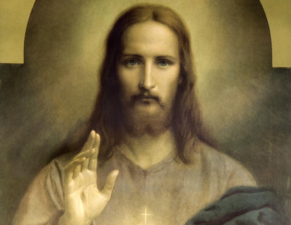
From the earliest catacomb paintings to contemporary digital art, the visual representation of Jesus has undergone significant transformations. In the nascent Christian communities, depictions were often symbolic and allegorical, such as the Good Shepherd, a figure that resonated with existing pastoral imagery and conveyed a message of care and guidance. This initial phase of visual branding prioritized conceptual association over literal portraiture, establishing core brand values through metaphorical imagery. Early Christian art eschewed the common Greco-Roman practice of deifying rulers with heroic, often nude, depictions, instead opting for a more humble and accessible iconography that aligned with the brand’s core message of humility and service.
As Christianity expanded and formalized, the visual brand began to consolidate around more humanistic forms. By the Byzantine era, a more consistent iconography emerged, heavily influenced by imperial portraiture and theological imperatives. The “Christ Pantocrator” (Ruler of All) became a dominant visual motif, depicting Jesus with a majestic, often austere, expression, emphasizing his divine authority. This shift represented a strategic evolution in the brand’s messaging, moving from primarily symbolic representation to a more direct articulation of power and sovereignty, visually reinforcing the institutional church’s growing influence. The standardization of features – often a beard, long hair, and specific facial characteristics – began to lay the groundwork for a highly recognizable global brand asset.
The Renaissance brought a profound reinterpretation, infusing the image of Jesus with heightened humanism and emotional depth. Artists like Leonardo da Vinci and Michelangelo crafted images that emphasized suffering, compassion, and divine grace, often drawing on contemporary European aesthetics. This period saw the “brand” localized to European physiognomy, inadvertently establishing a visual archetype that would become dominant globally. The proliferation of these images through printing technology further cemented a specific brand aesthetic, akin to a successful marketing campaign distributing a consistent visual identity across broad audiences. This era demonstrates how artistic innovation can profoundly shape and disseminate a brand’s visual language, embedding specific traits into the collective consciousness.
Crafting a Global Icon: Archetypes and Brand Recognition
The enduring visual identity of Jesus, despite its historical variations, stands as a testament to the power of archetypal imagery in fostering unparalleled brand recognition. The most widely disseminated image – that of a man with long hair, a beard, often in flowing robes – functions as a potent visual archetype that transcends linguistic and cultural barriers. This archetype is not accidental but has been meticulously, albeit unconsciously, crafted over centuries through artistic convention and cultural repetition, becoming a universal signifier.
The Power of Consistent Visual Elements
The consistency of certain visual elements has been critical in establishing this global brand. The beard, for instance, has long been associated with wisdom, maturity, and authority in many cultures, lending gravitas to the figure. Long hair, similarly, can evoke a sense of the spiritual or prophetic. These elements, combined with distinctive robes, create a visual shorthand that allows immediate identification. In branding terms, these are core brand assets – recognizable symbols and styles that instantly communicate the brand’s essence and purpose. Just as a corporate logo aims for instant recall, the visual archetype of Jesus achieves this on a monumental scale, allowing for instant recognition across diverse demographics and geographies. This consistent visual messaging, repeated over millennia through art, literature, and media, has ingrained the “Jesus look” into the global collective consciousness, making it one of the most recognized personal brands in human history.
Strategic Emotional Connection Through Imagery
Beyond mere recognition, the visual brand of Jesus often evokes deep emotional responses, a critical objective in successful branding. Whether depicted in moments of compassion, suffering, or triumph, the imagery is designed to forge a profound connection with the audience. Renaissance and Baroque art, in particular, leveraged dramatic lighting, expressive faces, and realistic human forms to maximize emotional impact. This strategic use of visual storytelling cultivates brand loyalty and emotional resonance, far beyond the reach of mere product features. The consistent portrayal of certain emotional states associated with Jesus—such as empathy, sacrifice, and hope—reinforces the brand’s core values and purpose, enabling it to connect on a deeply personal level with billions worldwide. This emotional branding strategy ensures that the image is not just seen but felt, creating a lasting impact that sustains the brand’s relevance through generations.
Cultural Adaptation and Localization in Personal Branding
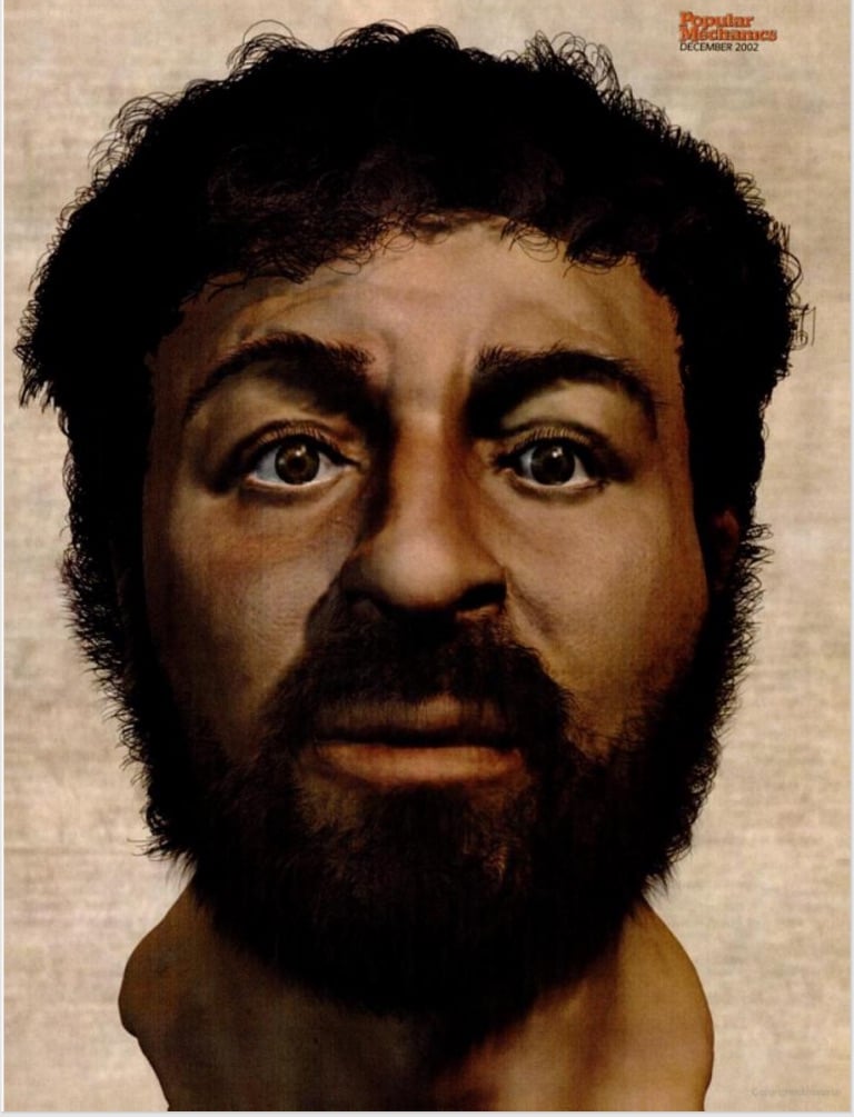
A truly global brand understands the necessity of localization and cultural adaptation. While a predominant visual archetype of Jesus exists, its strength lies not only in its consistency but also in its remarkable capacity for cultural integration. The question, “what does Jesus look like?” receives a myriad of answers when viewed through the lens of diverse cultures, each reinterpreting the figure to reflect local identities, values, and aesthetics. This phenomenon offers a compelling example of effective brand localization, where a core brand identity is successfully tailored to resonate with specific market segments without losing its fundamental essence.
Reimagining the Archetype for Local Audiences
Across Asia, Africa, and Latin America, artists and communities have reimagined Jesus with features, skin tones, and attire that reflect their own ethnicities and cultural contexts. In Ethiopia, Jesus is often depicted with dark skin and Afro-textured hair. In Chinese art, he might wear traditional Hanfu robes and possess East Asian features. In indigenous communities of the Americas, he is sometimes shown with Native American features, situated within local landscapes and alongside local flora and fauna. This deliberate re-contextualization is a powerful branding strategy, making the figure more relatable and accessible to diverse audiences. It minimizes cultural distance and fosters a deeper, more personal connection, demonstrating that successful personal branding acknowledges and celebrates the diversity of its global audience. This form of “audience segmentation” through visual identity enhances the brand’s reach and impact by making it feel genuinely “of” a place, rather than an external imposition.
Enhancing Relatability and Market Penetration
The act of visually integrating Jesus into local cultures serves several critical branding functions. Firstly, it enhances relatability, allowing individuals to see themselves reflected in the brand’s central figure. This fosters a stronger sense of ownership and belonging, which are crucial for building deep brand loyalty. Secondly, it acts as a form of “market penetration,” allowing the brand to transcend cultural barriers that might otherwise impede its acceptance. By adopting local visual codes, the “Jesus brand” effectively speaks in a visual language that is inherently understood and embraced by each specific cultural group. This adaptive strategy illustrates that a brand’s visual identity, while needing core consistency, can also benefit immensely from strategic flexibility, ensuring its relevance and resonance across an ever-expanding global market. The ability to be simultaneously universal and culturally specific is a hallmark of truly iconic and enduring brands.
The Power of Consistent Imagery vs. Diverse Interpretations
The dichotomy between a widely recognized visual archetype and the myriad of diverse cultural interpretations encapsulates a sophisticated aspect of brand management: the balance between global consistency and local relevance. For the “Jesus brand,” this tension has not fragmented its identity but rather amplified its reach and depth, creating a resilient and remarkably adaptable presence worldwide.
The Strength of a Unified Core Visual
The existence of a prevailing visual archetype—often a Europeanized image of a light-skinned, long-haired, bearded man—provides a strong foundational visual anchor for the “Jesus brand.” This core image offers a familiar reference point, enabling immediate global recognition and serving as a mental shortcut. In branding, a consistent core visual identity simplifies communication and strengthens brand recall across vast and varied audiences. It functions much like a global corporate logo, providing a stable, identifiable mark regardless of where or how the brand is encountered. This unified core helps maintain a sense of coherence for the overall brand narrative, ensuring that despite localized variations, the fundamental identity remains intact and recognizable to a global audience. This consistent touchstone is vital for sustaining long-term brand equity and maintaining a clear brand narrative across time and space.

Enriching the Brand Through Diverse Expressions
Conversely, the vibrant array of localized interpretations significantly enriches the overall brand, preventing it from becoming monolithic or culturally exclusive. These diverse depictions demonstrate the brand’s inherent flexibility and its capacity to transcend any single cultural straitjacket. By allowing and even encouraging adaptation, the “Jesus brand” showcases its universal appeal and its ability to resonate personally with individuals from all backgrounds. This creative freedom in visual representation can be likened to a robust brand style guide that, while outlining core elements, also provides ample room for creative expression and localized marketing campaigns. The sum of these diverse interpretations creates a multi-faceted brand identity that is far more comprehensive and compelling than a singular, unyielding image could ever be. It proves that a truly powerful brand can thrive not just through strict adherence to a single visual identity, but also through the dynamic interplay of a consistent core and diverse, culturally relevant expressions, ultimately enhancing its longevity and global impact.
aViewFromTheCave is a participant in the Amazon Services LLC Associates Program, an affiliate advertising program designed to provide a means for sites to earn advertising fees by advertising and linking to Amazon.com. Amazon, the Amazon logo, AmazonSupply, and the AmazonSupply logo are trademarks of Amazon.com, Inc. or its affiliates. As an Amazon Associate we earn affiliate commissions from qualifying purchases.