
In the dynamic landscape of technology, where data reigns supreme, understanding complex information efficiently is not merely an advantage but a necessity. For developers, data scientists, AI engineers, and product managers alike, the ability to quickly grasp the distribution, central tendency, and spread of data is crucial for debugging, optimizing, and innovating. Among the most potent tools in a tech professional’s data visualization arsenal is the box plot, also known as a box-and-whisker plot. Far from being a mere academic exercise, this statistical graphic offers an incredibly concise yet powerful summary of a dataset’s distribution, making it an indispensable asset for anyone navigating the vast seas of digital information.

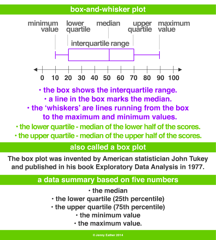
At its core, a box plot is a standardized way of displaying the distribution of data based on a five-number summary: the minimum, first quartile (Q1), median, third quartile (Q3), and maximum. It reveals outliers and what their values are, and whether data is symmetrical, how tightly grouped the data is, and if and how the data is skewed. For tech professionals dealing with everything from server response times to user engagement metrics or algorithm performance, this visual shorthand translates into faster insights and more informed decision-making.
The Core Mechanics of Data Visualization for Tech Professionals
Understanding a box plot begins with decoding its fundamental components. Each element provides a critical piece of information about the dataset’s statistical properties, which can be invaluable when analyzing system performance, software bugs, or machine learning model outputs.
Understanding the Five-Number Summary
The strength of a box plot lies in its efficient representation of key statistical measures:
- Median (Q2): This is the central line within the box. It represents the 50th percentile of the data, meaning half of the data points fall below this value and half fall above it. For instance, if analyzing network latency, the median would tell you the typical delay users experience, unaffected by extreme outliers.
- First Quartile (Q1): The bottom edge of the box indicates the first quartile, or the 25th percentile. 25% of the data points are less than or equal to this value. In a tech context, if examining code execution times, Q1 might represent the performance of the fastest quarter of operations.
- Third Quartile (Q3): The top edge of the box marks the third quartile, or the 75th percentile. 75% of the data points are less than or equal to this value. This could show, for example, the upper boundary of typical memory consumption for a specific application.
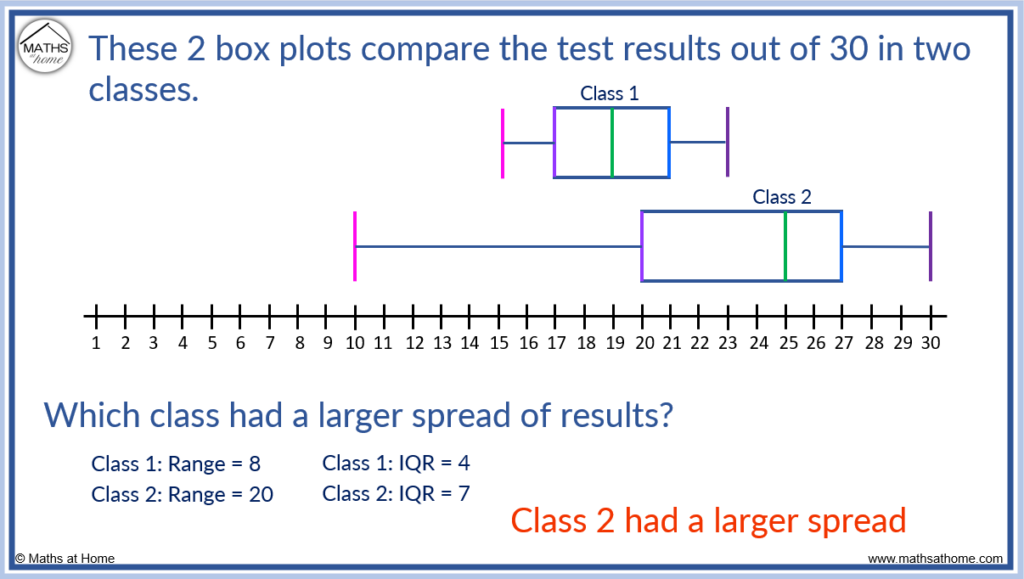
- Interquartile Range (IQR): The length of the box itself, from Q1 to Q3, represents the IQR. This range contains the middle 50% of the data. A smaller IQR suggests data points are tightly clustered around the median, while a larger IQR indicates greater variability. Monitoring the IQR of error rates can quickly show if the system’s reliability is stable or fluctuating significantly.
- Whiskers: These lines extend from the box to the lowest and highest data points within 1.5 times the IQR from Q1 and Q3, respectively. They illustrate the range of the majority of the data. Data points beyond the whiskers are typically considered outliers. For anomaly detection in IT security, these whiskers can define the normal operational parameters.
- Outliers: Individual data points plotted beyond the whiskers are identified as outliers. These are values that fall significantly outside the general pattern of the data. In tech, outliers often represent critical events: a server crash, a sudden spike in user activity, an unusual sensor reading, or a bug causing a transaction to take an abnormally long time. Their immediate visual identification is one of the box plot’s most valuable features.
Visualizing Spread and Skewness
Beyond the individual summary points, the overall shape of the box plot provides immediate insights into the data’s distribution:
- Symmetry: If the median line is roughly in the middle of the box, and the whiskers are of similar length, the data distribution is likely symmetrical. This suggests a balanced performance or distribution of values.
- Skewness: If the median is closer to one end of the box, or one whisker is significantly longer than the other, the data is skewed. A longer upper whisker or the median closer to Q1 indicates positive (right) skewness, meaning there are more higher values or a few extremely high values pulling the mean up. Conversely, a longer lower whisker or the median closer to Q3 indicates negative (left) skewness, suggesting a tail of lower values. Understanding skewness is vital for interpreting performance metrics; for instance, positively skewed response times might indicate that while most responses are fast, a few are very slow, impacting user experience.
Why Box Plots are Indispensable in Software and Data Science
The concise nature of box plots makes them highly effective in environments where rapid data analysis and comparison are paramount. Their utility extends across various facets of the tech industry, from software development to advanced AI research.
Rapid Outlier Detection
In tech, outliers are rarely just statistical anomalies; they are often indicators of critical issues. A sudden spike in CPU usage on a server, a database query taking an unusually long time, or a sensor reading outside normal operating parameters could all manifest as outliers. Box plots make these deviations immediately apparent, allowing engineers to quickly pinpoint potential problems that require investigation. This proactive identification is crucial for maintaining system stability and performance in real-time applications.
Comparing Distributions Across Systems or Datasets
One of the most powerful applications of box plots is the ability to compare multiple distributions side-by-side. Imagine you are evaluating the performance of two different algorithms, comparing the load times of an application across various regions, or assessing the battery drain of different firmware versions. By plotting multiple box plots horizontally or vertically, you can instantly compare their medians, variability (IQR), and the presence of outliers. This comparative analysis provides a high-level overview, revealing which system or version performs better on average, which is more consistent, and which might suffer from more extreme issues, without delving into hundreds or thousands of individual data points.
Performance Monitoring and Debugging
For software engineers, understanding the performance characteristics of their code is non-negotiable. Box plots can visualize distributions of metrics like:
- API response times: Are most responses fast, but a few are extremely slow?
- Database query execution durations: Which queries are consistently bottlenecks?
- Memory usage: Is the application’s memory footprint stable, or are there significant variations?
- Error rates: How consistent are the error occurrences, and are there periods of abnormal spikes?
By monitoring these metrics over time using box plots, development teams can quickly identify performance regressions, pinpoint areas for optimization, and debug issues much more efficiently. They offer a clearer picture than a simple average, which can be heavily skewed by a few extreme values.
Generating Box Plots with Modern Software Tools
The accessibility of powerful programming libraries and spreadsheet software has made generating box plots straightforward, integrating them seamlessly into daily tech workflows.
Python (Matplotlib, Seaborn)
Python is a cornerstone of data science and AI, and its visualization libraries offer robust capabilities for creating box plots.
- Matplotlib: The foundational plotting library,
matplotlib.pyplot, allows for basic box plot generation withplt.boxplot(). It offers extensive customization options for colors, labels, and plot aesthetics. - Seaborn: Built on Matplotlib, Seaborn provides a higher-level interface for statistical graphics, making it easier to create aesthetically pleasing and informative box plots, especially when dealing with multiple categories or complex datasets. Its
sns.boxplot()function is highly intuitive and powerful for comparative analysis.
These libraries are indispensable for data scientists analyzing model performance, engineers visualizing system logs, or researchers exploring experimental results.
R (ggplot2)
R, another powerhouse in statistical computing, boasts the ggplot2 package, renowned for its elegant and grammar-of-graphics approach to data visualization. Creating box plots in R with ggplot2 is highly flexible and enables the creation of sophisticated, publication-quality graphics. It’s favored by statisticians and data analysts for its ability to build complex plots layer by layer, perfect for nuanced data exploration in tech research and development.
Spreadsheet Software (Excel, Google Sheets) and Business Intelligence Tools
For those less inclined towards coding, or for quick ad-hoc analyses, mainstream spreadsheet applications and business intelligence (BI) tools provide user-friendly interfaces for box plot generation:
- Microsoft Excel: While historically more cumbersome, recent versions of Excel have improved their charting capabilities, allowing users to create box plots directly from data ranges with just a few clicks. This is often sufficient for initial data exploration or presenting findings to non-technical stakeholders.
- Google Sheets: Offers similar functionality, making it easy to create and share box plots collaboratively.
- BI Tools (e.g., Tableau, Power BI): These platforms excel at interactive data visualization. They allow users to drag-and-drop data fields to instantly generate box plots, facilitating dynamic exploration and dashboard creation. This is particularly valuable for product managers and business analysts who need to monitor key performance indicators (KPIs) and identify trends in real-time.
Advanced Applications and Best Practices in Tech Analytics
Leveraging box plots effectively goes beyond mere generation; it involves thoughtful interpretation and integration into a broader analytical strategy.
Interpreting Complex Datasets Efficiently
In modern tech, datasets are rarely simple. They might involve multiple variables, time series data, or hierarchical structures. Box plots, especially when used in conjunction with other visualization techniques or arranged in grids (faceting), can help make sense of this complexity. For example, comparing distributions of cloud resource utilization across different regions, user segments, or application versions can quickly highlight geographical performance disparities or varying user behaviors. This multi-faceted view is crucial for holistic system optimization and user experience improvement.
Avoiding Misinterpretation: Context is Key
While box plots are powerful, like any statistical tool, they require careful interpretation. A large IQR doesn’t inherently mean “bad” data; it simply means more variability. Outliers aren’t always errors; they could represent rare but significant events (e.g., a flash sale, a successful hack attempt, or an experimental new feature’s impact).
It is vital to always consider the domain context of the data. For instance, extremely high response times (outliers) might be critical for a real-time trading platform but acceptable for a daily batch process. Furthermore, while box plots summarize distributions, they don’t show density within the quartiles; combining them with violin plots or jittered scatter plots can sometimes provide a more complete picture of the data’s internal structure.
In conclusion, the box plot is more than just a statistical graph; it’s a vital diagnostic and comparative tool for the tech industry. From instantly spotting anomalies in system logs to comparing the efficacy of different machine learning models or simply gaining a quick overview of performance metrics, its ability to distill complex data into a clear, actionable visual summary makes it an indispensable component of any data-driven professional’s toolkit. Mastering its creation and interpretation empowers individuals and teams to make more informed decisions, leading to robust software, efficient systems, and innovative solutions.
aViewFromTheCave is a participant in the Amazon Services LLC Associates Program, an affiliate advertising program designed to provide a means for sites to earn advertising fees by advertising and linking to Amazon.com. Amazon, the Amazon logo, AmazonSupply, and the AmazonSupply logo are trademarks of Amazon.com, Inc. or its affiliates. As an Amazon Associate we earn affiliate commissions from qualifying purchases.