
The Strategic Role of Color in Personal Branding at Social Events
In the intricate landscape of social engagement, every detail contributes to one’s personal brand. Attending a wedding as a guest is not merely about presence; it’s a profound exercise in demonstrating respect, understanding social cues, and strategically curating your individual image. Color, often underestimated, plays a pivotal role in this non-verbal communication. The hues you choose for your attire transmit messages about your discernment, your attention to detail, and your capacity to align with the overarching ‘brand’ of the event – in this case, the couple’s meticulously planned celebration.
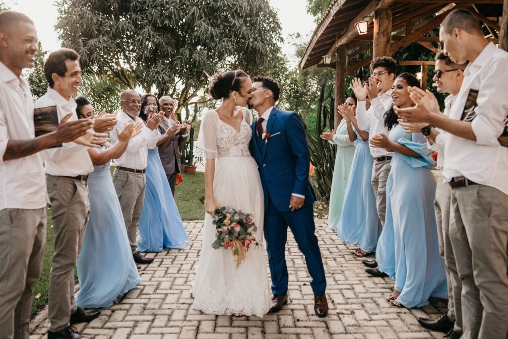
Your choice of color is a silent, yet potent, branding statement. It reflects your awareness of the occasion’s formality, the time of year, and the celebratory atmosphere, all while subtly reinforcing your personal aesthetic. A well-chosen color palette ensures you enhance the collective visual narrative without overshadowing the principals, thereby solidifying your reputation as a perceptive and considerate individual. Conversely, an ill-considered color choice can inadvertently project an image of insensitivity or a lack of understanding regarding social etiquette, potentially undermining your personal brand.
Decoding the Wedding’s Brand: Factors Influencing Color Choices
To effectively leverage color for personal branding at a wedding, one must first thoroughly “decode” the event’s inherent brand identity. This involves analyzing several key factors that influence the appropriate palette, ensuring your attire harmonizes with the couple’s vision and the overall aesthetic they aim to convey.
Understanding the Dress Code’s Nuances
The dress code serves as the primary guideline for the wedding’s brand formality. “Black-tie” dictates a sophisticated, often darker, and more subdued color palette, favoring deep jewel tones, classic black, or elegant navy. These choices project an image of gravitas and refined taste. “Semi-formal” or “cocktail attire” allows for a broader spectrum, including rich jewel tones, pastels, or even thoughtfully selected brighter hues that still maintain a polished aesthetic. “Casual” or “garden party” invitations might embrace lighter fabrics and more vibrant colors, yet still require a level of intentionality to avoid appearing underdressed. Understanding these nuances is crucial for aligning your personal brand with the event’s expected level of grandeur and respect.
Venue and Season as Brand Elements
The wedding’s venue and the prevailing season are significant, albeit often subtle, brand elements that inform color selection. An outdoor garden wedding in spring, for instance, naturally lends itself to a brand aesthetic of lightness and freshness. Guests’ attire in soft pastels, floral prints, or muted tones complements this brand, projecting an image of effortless elegance and seasonal appropriateness. Conversely, an opulent ballroom wedding in winter evokes a brand of richness and depth, better suited to deep jewel tones, metallic accents, or classic dark colors like burgundy, emerald, or sapphire. Aligning your color choices with these environmental and seasonal cues demonstrates an acute awareness of context, further enhancing your personal brand’s adaptability and sophistication.
Respecting the Couple’s Brand and Culture
Crucially, the ultimate brand to respect is that of the couple themselves. This primarily translates to avoiding colors that might compete with or detract from the bride’s attire. The most prominent example is the universal dictum against wearing white, ivory, or cream. Doing so is a significant personal branding faux pas, as it implicitly attempts to usurp the bride’s singular visual prominence. Furthermore, cultural considerations are paramount. Some cultures assign specific meanings to colors (e.g., red symbolizing good fortune in many Asian weddings, often worn by the bride), making it essential to research and avoid unintentional clashes or appropriation. Demonstrating sensitivity to these cultural or personal preferences reinforces a personal brand built on respect, empathy, and global awareness.
Crafting Your Personal Brand with Appropriate Color Palettes
Once the wedding’s brand context has been analyzed, you can strategically select colors that enhance your personal brand while harmonizing with the occasion.
Timeless Elegance: Neutrals and Deep Tones
For a consistently sophisticated and unimpeachable personal brand, neutrals and deep tones are invaluable. Classic black, while sometimes debated for weddings, remains a staple for evening events, projecting an image of sleek elegance and understated power. Navy blue communicates trustworthiness and calm authority, making it an excellent choice for a professional yet celebratory presence. Charcoal gray offers a contemporary alternative, conveying refinement without severity. Deep greens like forest or emerald, and rich burgundies or marsalas, offer a luxurious depth that speaks to cultivated taste and confidence, especially for fall and winter weddings. These colors allow your personal brand to shine through your demeanor and interactions, rather than demanding attention through overt visual statements.

Seasonal Sophistication: Embracing the Environment
Adapting your color palette to the season is a hallmark of a well-rounded and perceptive personal brand. Spring weddings invite colors that reflect renewal and vibrancy – think delicate pastels like lavender, mint green, blush pink, or sky blue. These shades project an image of approachable charm and lightheartedness. For summer, brighter, yet still sophisticated, hues such as coral, teal, or sunny yellow can convey warmth and vivacity. Fall weddings often call for earthier tones and deeper, warmer shades: rust, mustard, olive green, or plum, which communicate a grounded and refined sensibility. Winter weddings, as mentioned, are perfect for jewel tones, metallic shades (silver, gold, bronze), or classic darks, projecting an aura of elegant festivity. This seasonal alignment demonstrates an intelligent appreciation for context and an ability to adapt your brand presentation appropriately.
Thoughtful Vibrancy: When and How to Use Brighter Hues
While the focus should always be on the couple, strategic use of vibrant colors can subtly express a cheerful and confident personal brand. The key lies in thoughtfulness and moderation. Avoid neon or fluorescent shades, which tend to be jarring and can project an unprofessional or attention-seeking image. Instead, opt for rich, saturated versions of bright colors – a deep fuchsia, a vibrant cobalt blue, or a radiant marigold. These colors, when selected in luxurious fabrics and classic silhouettes, can convey personality and joy without being overwhelming. They signal a personal brand that is confident and celebratory, yet acutely aware of appropriate social boundaries.
Patterns and Textures: Adding Depth to Your Brand Narrative
Beyond solid colors, patterns and textures can add significant depth and nuance to your personal brand narrative. Subtle floral prints for spring/summer, delicate brocades for formal events, or a sophisticated plaid for a rustic-chic wedding can communicate creativity, sophistication, and an eye for detail. The texture of your fabric—silk, satin, velvet, or a refined wool blend—also plays a crucial role in conveying luxury and quality, directly impacting the perceived value and polish of your personal brand. When chosen judiciously, patterns and textures reinforce a personal brand that is multifaceted and sophisticated, without diverting focus from the main event.
Common Branding Missteps: Colors to Approach with Caution
Just as certain colors elevate your personal brand, others can inadvertently create a negative impression or detract from the celebratory atmosphere. Understanding these “branding missteps” is vital for maintaining a polished image.
The Unspoken Rule: Avoiding Bridal White and Ivory
This rule is paramount. Wearing white, ivory, or any shade closely resembling the bride’s gown is perhaps the most significant personal branding misstep at a wedding. It conveys a profound lack of awareness, disrespect, or even an attempt to compete with the bride. Your personal brand should always aim to support and celebrate the couple, not to overshadow them. This extends to even white garments with patterns, unless the white element is minimal and clearly not the dominant color.
Overpowering Hues: Neons and Fluorescents
Colors that are excessively bright, such as neons or fluorescents, can be jarring in a wedding setting. While they might project a fun and edgy image in other contexts, at a wedding, they risk appearing attention-seeking or inappropriate for the solemnity and elegance of the occasion. A personal brand built on subtlety, respect, and grace will steer clear of these visually aggressive tones.
Casual Conflicts: Denim Blues and Everyday Neutrals
While neutrals are generally safe, certain shades can inadvertently convey a sense of casualness that clashes with the wedding’s formality. Light denim blues, while versatile in everyday wear, typically lack the polish required for a wedding. Similarly, some very light, muted grays or beiges can sometimes lean too casual unless impeccably styled and accessorized. The distinction lies in the fabric, cut, and overall presentation. Always aim for neutrals that appear luxurious and intentional, rather than simply utilitarian.

Beyond Color: Integrating Personal Brand with Overall Presentation
While color is a powerful tool in personal branding for a wedding guest, it is always one component of a larger, cohesive presentation. The fit of your attire, the quality of your accessories, your grooming, and your overall demeanor are equally critical in projecting a refined and thoughtful personal brand. Your intentional color choice, when combined with these other elements, forms a comprehensive statement of respect, discernment, and celebratory spirit, ensuring your presence enhances the occasion without ever detracting from the couple’s special day. Every detail contributes to the narrative of your personal brand, making wedding attendance a nuanced yet rewarding exercise in strategic self-presentation.
aViewFromTheCave is a participant in the Amazon Services LLC Associates Program, an affiliate advertising program designed to provide a means for sites to earn advertising fees by advertising and linking to Amazon.com. Amazon, the Amazon logo, AmazonSupply, and the AmazonSupply logo are trademarks of Amazon.com, Inc. or its affiliates. As an Amazon Associate we earn affiliate commissions from qualifying purchases.