
In the intricate world of brand identity and visual communication, understanding color is not merely an aesthetic choice; it is a strategic imperative. Color drives recognition, evokes emotion, and communicates core values without a single word. For brand strategists, designers, and marketers, mastering the fundamentals of color mixing, even for seemingly simple hues like green, is crucial for crafting impactful and cohesive brand experiences. Green, with its diverse palette from vibrant lime to deep forest, holds significant psychological weight and versatile application in branding, making its origins a vital piece of knowledge for any design professional.
The Foundational Role of Color in Brand Identity
Color is often the first element of a brand that consumers perceive and remember. A well-chosen color palette can differentiate a brand in a crowded market, establish an emotional connection, and reinforce its message. Conversely, a haphazard approach to color can lead to confusion, undermine credibility, and weaken brand recall. Therefore, a deep dive into color theory, beginning with how colors are physically created, is not just academic; it’s a cornerstone of effective brand strategy and design.
Understanding Color Theory Basics for Branding
Color theory provides a systematic approach to understanding how colors relate to each other, how they are perceived, and how they can be used effectively. For branding, this means going beyond personal preference to select colors that align with a brand’s personality, target audience, and industry. Key concepts include primary, secondary, and tertiary colors, as well as the distinction between additive and subtractive color models, which dictates how colors are mixed in digital versus print contexts. Grasping these basics ensures that a brand’s visual identity is built on a scientifically sound and aesthetically pleasing foundation, capable of delivering consistent impact across all touchpoints.
Primary, Secondary, and Tertiary Colors in Visual Design
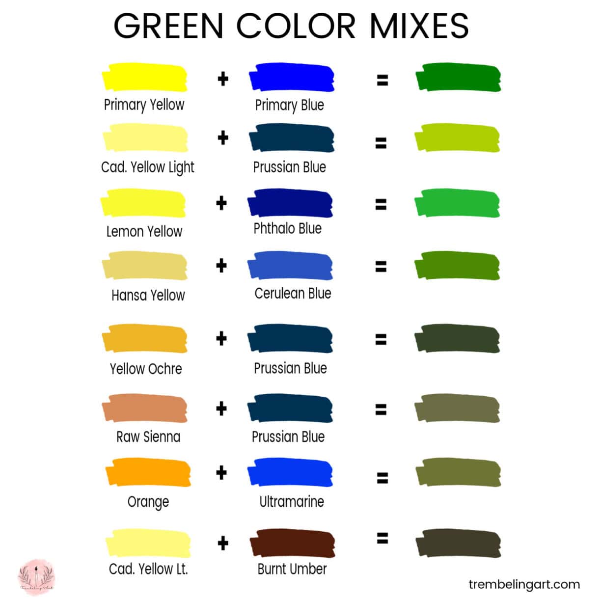
The traditional color wheel forms the bedrock of color theory. Primary colors are the fundamental building blocks from which all other colors can be mixed; they cannot be created by mixing other colors. In the context of pigment (paint, ink), the primary colors are red, yellow, and blue. When these primary colors are mixed, they produce secondary colors. Green is one such secondary color, derived from the mixture of two primary colors. Specifically, in subtractive color mixing, yellow and blue combine to make green. Beyond this, mixing a primary color with an adjacent secondary color yields tertiary colors, such as yellow-green or blue-green, further expanding the spectrum of possibilities for brand palettes and ensuring nuanced visual expressions.
Demystifying Green: Primary Pigment and Light
The question “what colors mixed makes green” has two distinct answers depending on whether one is referring to pigments (like paints and inks for print) or light (like on digital screens). This distinction is critically important for brand consistency, as colors rendered in print can appear different on a screen if the underlying color models are not understood and managed.
Subtractive Color Mixing: The CMYK Model (Print & Pigments)
In the world of physical materials like ink on paper or paint on a canvas, color mixing operates on the principle of subtractive color. This model works by absorbing certain wavelengths of light and reflecting others. The more colors you mix, the more light is absorbed, resulting in a darker color. The primary colors in the subtractive model are Cyan, Magenta, Yellow, and Key (Black) – commonly known as CMYK.
For designers working with print materials, understanding CMYK is paramount. To create green using pigments, the traditional primary colors are relevant: yellow and blue are mixed to produce green. In a CMYK context, specific proportions of yellow (Y) and cyan (C) inks are combined. For instance, a pure green might be achieved with 100% Yellow and 100% Cyan, with 0% Magenta and 0% Black (C100 M0 Y100 K0). Varying these percentages allows for an infinite spectrum of greens, from a warm, yellowish lime to a cool, bluish teal. This precise control is essential for brand consistency across brochures, packaging, and outdoor advertising.
Additive Color Mixing: The RGB Model (Digital Screens)
Contrasting with subtractive mixing is additive color mixing, which applies to light sources, such as computer monitors, television screens, and LED displays. In this model, the primary colors are Red, Green, and Blue – forming the RGB model. Instead of absorbing light, these colors add light together. When all three primary colors of light are combined at full intensity, they produce white light.
On digital platforms, green is not created by mixing two other colors; rather, green is one of the primary colors of light itself. A digital green is produced by activating the green pixels on a screen. When designing logos, websites, social media graphics, or app interfaces, brand professionals primarily work within the RGB color space. For example, a pure green in RGB would be represented as R:0, G:255, B:0 (assuming an 8-bit color depth where 255 is maximum intensity). Understanding that green is a primary in RGB and a secondary in CMYK is fundamental to ensuring accurate color reproduction and brand consistency between digital and physical assets.
Strategic Applications of Green in Branding and Marketing
Green is a color imbued with a rich array of associations and psychological impacts, making it a powerful tool in a brand’s visual arsenal. Its strategic use can communicate specific brand values, appeal to particular demographics, and differentiate a brand in competitive markets.
The Psychology of Green: Associations and Perceptions
Psychologically, green is overwhelmingly associated with nature, growth, renewal, and vitality. It evokes feelings of harmony, balance, and tranquility. Brands aiming to project an image of sustainability, environmental responsibility, or health and wellness frequently leverage green. Deeper greens can signify wealth, stability, and prestige (think of money or traditional institutions), while brighter, lighter greens often communicate freshness, youthfulness, and innovation.
However, like all colors, green has its nuances and can carry negative connotations if not used carefully. Overuse or an unflattering shade might inadvertently suggest envy, inexperience, or even illness. A strategic brand professional meticulously considers the specific shade of green and its accompanying palette to ensure the intended message is clearly and positively conveyed, aligning perfectly with the brand’s core identity and aspirations.
Crafting Brand Messaging with Green
The choice of green, and how it’s mixed, directly influences brand messaging. A financial institution might opt for a deep, conservative green to convey trustworthiness and prosperity. A health food brand would likely choose a fresh, vibrant green to emphasize organic ingredients and vitality. A tech startup focused on renewable energy might blend cool greens with blues to suggest innovation and ecological consciousness.
Effective brand messaging with green goes beyond simply adopting the color; it involves integrating it thoughtfully across all communications. This includes not just visual design but also how the color informs the brand narrative, tone of voice, and even product naming. For example, a “Green Future Fund” immediately communicates sustainability, reinforced by its visual identity. This integrated approach ensures that the color choice resonates deeply with the brand’s overarching story and strategic objectives.
Green in Logo Design and Visual Assets
Green frequently appears in successful logos and visual assets across various industries. Its versatility allows for a broad range of expressions:
- Environmental & Sustainability Brands: Obvious choices like Whole Foods, Starbucks (early branding), and numerous eco-friendly product lines use green to directly communicate their core mission.
- Healthcare & Wellness: Brands promoting natural remedies, pharmacies, or health insurance often use calming greens to signify health, safety, and well-being.
- Finance & Banking: While often associated with blues, many financial institutions incorporate darker greens to symbolize wealth, stability, and growth.
- Technology & Innovation: Tech companies, especially those in renewable energy or eco-tech, leverage green to highlight forward-thinking and sustainable solutions.
When designing a logo or developing visual assets, brand strategists must not only select the right shade of green but also ensure its consistency across all mediums – from digital screens to print collateral, product packaging, and merchandising. This requires a deep understanding of the differences between RGB and CMYK models to maintain color integrity and brand recognition.
Achieving Desired Green Tones for Brand Cohesion
The subtle differences in shades of green can significantly alter a brand’s perceived identity. Precision in color selection and reproduction is therefore critical for maintaining brand cohesion across all touchpoints.
Customizing Shades: Beyond Basic Blends
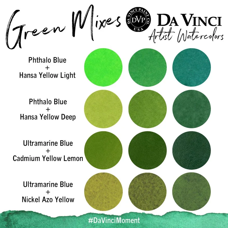
While yellow and blue make green, the exact proportions, along with the specific hues of yellow and blue, determine the resulting shade. Adding a touch of red (which is magenta in CMYK or red in RGB) can mute a vibrant green, pushing it towards an olive or khaki, signifying earthiness or tradition. A splash of white lightens it to a pastel, conveying softness or innocence. Conversely, adding black (K in CMYK) or reducing overall brightness (in RGB) deepens the green, giving it a more luxurious or formal feel.
For brands, this means moving beyond a generic “green” to specify precise color values using hexadecimal codes (#00FF00 for bright green), RGB values (0, 255, 0), or CMYK percentages (C100 M0 Y100 K0). This level of specificity is indispensable for designers to consistently reproduce the brand’s unique shade of green, ensuring it always aligns with the brand’s distinct visual language and strategic intent.
Consistency Across Platforms: Print vs. Digital
One of the biggest challenges in brand design is maintaining color consistency between digital and print mediums. A vibrant green that looks stunning on a calibrated monitor (RGB) might appear dull or different when printed on paper (CMYK). This discrepancy arises because of the fundamental differences between additive and subtractive color models.
To bridge this gap, brand guidelines often specify both RGB and CMYK values for all brand colors. Designers also use Pantone Matching System (PMS) colors, which are standardized, pre-mixed inks that ensure consistent color reproduction across various printing processes and materials, regardless of the CMYK conversion. Furthermore, regular color calibration of monitors and proofing of print materials are essential practices to ensure that the brand’s green, however it’s mixed, remains true to its intended appearance across all platforms.

Tools and Techniques for Color Management
Effective color management is vital for any brand serious about its visual identity. Modern design software like Adobe Photoshop, Illustrator, and InDesign provide robust tools for specifying and converting colors between RGB, CMYK, and Hex codes. These tools allow designers to preview how colors will appear in different models and make necessary adjustments.
Beyond software, physical color swatches, such as Pantone guides, are indispensable for comparing digital mock-ups to printed outputs. Implementing a strict brand style guide that outlines precise color values and acceptable variations ensures that all internal teams and external vendors adhere to the brand’s color standards. Ultimately, a thorough understanding of how colors like green are mixed and reproduced, combined with disciplined color management practices, safeguards a brand’s visual integrity and strengthens its market presence.
aViewFromTheCave is a participant in the Amazon Services LLC Associates Program, an affiliate advertising program designed to provide a means for sites to earn advertising fees by advertising and linking to Amazon.com. Amazon, the Amazon logo, AmazonSupply, and the AmazonSupply logo are trademarks of Amazon.com, Inc. or its affiliates. As an Amazon Associate we earn affiliate commissions from qualifying purchases.