
In the intricate world of brand identity, color is more than just an aesthetic choice; it’s a powerful psychological tool, a silent communicator of values, and a cornerstone of recognition. When considering a vibrant duo like pink and purple, the strategic implications for branding are particularly profound. These two colors, often associated with creativity, luxury, and playfulness, offer a rich palette of possibilities for brands looking to make a distinctive mark. Understanding not only their individual meanings but also how they interact with other hues is crucial for crafting a compelling and coherent brand narrative.

The Psychological Impact of Pink and Purple in Branding
Before delving into complementary colors, it’s essential to grasp the inherent psychological associations of pink and purple themselves. These colors carry potent emotional and cultural baggage that, when harnessed correctly, can significantly amplify a brand’s message.
Understanding Pink’s Brand Associations
Pink, a tint of red, typically softens the intense energy of its parent color, bringing forth associations of youth, playfulness, and romance. Historically, pink has been strongly linked to femininity, although modern branding increasingly utilizes it to signify innovation, boldness, and even subversion of traditional norms.
- Youthfulness & Playfulness: Brands targeting a younger demographic or wishing to convey a fun, lighthearted persona often leverage pink. Think of confectionery brands, toy companies, or fashion labels that embrace a whimsical aesthetic.
- Romance & Gentleness: Pink is inherently tied to love, compassion, and tenderness. Brands in the beauty, bridal, or self-care sectors frequently use pink to evoke feelings of comfort and care.
- Modern & Bold: Beyond its traditional associations, shades like fuchsia or neon pink are adopted by cutting-edge brands in technology or fashion to signal vibrancy, confidence, and a forward-thinking approach. It can also signify disruption, breaking free from convention.
Deciphering Purple’s Brand Resonance
Purple, a captivating blend of red’s energy and blue’s tranquility, holds a unique position in the color spectrum, carrying connotations of royalty, mystery, creativity, and spirituality. Its dual nature allows for versatility in branding, depending on the chosen shade and context.
- Luxury & Royalty: Historically, purple dyes were expensive and rare, making it the color of kings and queens. This legacy persists, with many premium and luxury brands using deep purples to convey exclusivity, sophistication, and high quality.
- Creativity & Imagination: Purple is often associated with the artistic and imaginative mind. Brands in creative industries, such as design agencies, entertainment companies, or innovative tech firms, use purple to symbolize vision, originality, and unconventional thinking.
- Wisdom & Spirituality: Lighter, more serene shades of purple, like lavender or lilac, can evoke a sense of calm, wisdom, and spiritual depth. Wellness brands, meditation apps, or holistic businesses often incorporate these hues to promote tranquility and mindfulness.
- Mystery & Intrigue: Darker purples can add an element of enigma and allure, suitable for brands that wish to spark curiosity or suggest a hidden depth to their offerings.
When pink and purple are combined, their individual strengths can either harmonize to reinforce similar messages (e.g., playful creativity, luxurious femininity) or create a dynamic tension that signifies a multifaceted brand identity (e.g., traditional romance meets modern luxury).
Strategic Color Pairings: Complementing Pink and Purple
The art of color combination lies in selecting hues that not only look good together but also strategically reinforce your brand’s core message. When pink and purple form the foundation, other colors can be introduced to balance, highlight, or add new dimensions to the palette.
Neutrals for Sophistication and Balance
Neutrals are the unsung heroes of any color palette, providing grounding, sophistication, and allowing more vibrant colors to truly shine.
- White and Off-White: Pure white offers a crisp, clean contrast, making pink and purple pop with freshness and modernity. It suggests clarity, simplicity, and professionalism. Off-white shades like cream or ivory add a touch of warmth and softness, creating a more inviting and luxurious feel, particularly with softer pinks and purples. Brands aiming for an elegant, minimalist aesthetic often leverage white as a primary background.
- Grays: From light silver to deep charcoal, gray provides a contemporary and sophisticated backdrop. Light grays can enhance the delicacy of pink and purple, while darker grays offer a strong, grounding contrast that adds gravitas and modernity, perfect for tech or fashion brands looking for an understated yet powerful presence.
- Black: Black introduces drama, luxury, and a strong sense of authority. When paired with pink and purple, especially brighter or neon shades, black can create a bold, edgy, and high-fashion aesthetic. It allows pink and purple to stand out intensely, suitable for brands that want to make a powerful, unforgettable statement.
Analogous and Monochromatic Harmony
These approaches focus on creating seamless, harmonious palettes that are easy on the eye and convey a sense of unity.
- Analogous Colors: These are colors located next to pink and purple on the color wheel. For pink (red-violet hue) and purple (red-violet to blue-violet), analogous colors would include various shades of blues (for purple’s blue side) and reds/oranges (for pink’s red side).
- Blues (Teal, Navy, Sky Blue): Pairing purple with blues creates a serene, harmonious, and sophisticated palette, leaning into purple’s calm and wise associations. Teal, in particular, can introduce an element of freshness and modernity. This combination works well for brands focused on wellness, technology, or luxury goods that value tranquility and depth.
- Reds & Oranges (Magenta, Coral, Blush): Incorporating deeper reds, magentas, or even corals can enhance the warmth and vibrancy of a pink and purple palette. This approach emphasizes the energetic and passionate aspects of both colors, ideal for creative, entertainment, or fashion brands that want to exude dynamism and excitement.
- Monochromatic Schemes: This involves using different tints, tones, and shades of pink and purple. For example, a palette could include lavender, deep violet, fuchsia, and rose pink. This creates a cohesive and sophisticated look, highlighting the nuances within the pink and purple spectrum. It’s often used by brands aiming for a refined and elegant appearance without introducing stark contrasts.
Bold Contrasts for Dynamic Brand Statements
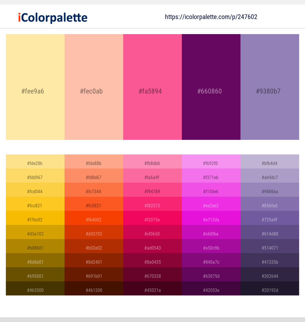
Sometimes, a brand needs to break through the noise with a palette that demands attention. Complementary and triadic colors offer this vibrancy.
- Green: Green is generally considered complementary to red (which influences pink) and often works well with purple. A carefully chosen green, especially mint, sage, or a deep forest green, can provide a refreshing and unexpected contrast to pink and purple. This combination can evoke themes of nature, growth, and innovation, creating a vibrant and balanced yet eye-catching palette. It suggests a brand that is both creative and grounded.
- Yellow/Gold: Yellow, especially a mustard or a vibrant canary yellow, provides a powerful and energetic contrast to purple, its direct complementary color. With pink, yellow adds cheerfulness and optimism. Gold, on the other hand, elevates the luxury aspect, pairing beautifully with deep purples and soft pinks for a truly opulent brand identity. Brands wanting to convey optimism, creativity, and a premium feel often experiment with yellow or gold accents.
Applying Pink and Purple Combinations in Brand Identity
The chosen color palette comes to life across all touchpoints of a brand. Strategic application ensures consistency and reinforces the desired message.
Logo and Visual Mark Design
The logo is often the first visual encounter with a brand, making color choice paramount.
- Primary and Secondary Colors: Decide whether pink or purple will be the dominant color, with the other serving as an accent. A deep purple logo with a subtle pink element can convey luxury with a touch of modern femininity, while a bold pink logo with purple details might suggest playful innovation.
- Versatility: Ensure the pink and purple combination, along with any complementary colors, works effectively across different mediums – digital screens, print, embroidery, and single-color applications. A simplified, monochromatic version for certain uses might be necessary.
Marketing Collateral and Digital Presence
Consistency across marketing materials and online platforms solidifies brand recognition.
- Website and App Design: Use the chosen pink and purple palette for UI elements, call-to-action buttons, and background accents. Complementary neutrals (white, gray) provide readability, while bold accents (green, yellow) can highlight key features. The goal is to create an immersive, branded experience.
- Social Media Graphics: Leverage the full spectrum of your pink and purple combinations to create engaging, shareable content. Varying the dominant color and accents keeps the feed fresh while maintaining brand consistency.
- Print Materials: Brochures, business cards, and advertisements should meticulously adhere to the brand’s color guidelines, ensuring color accuracy and impact in physical form.
Product Packaging and Experience
For tangible products, packaging is a critical extension of the brand.
- Visual Appeal and Messaging: Pink and purple packaging can convey everything from playful indulgence (e.g., cosmetics, confectionery) to luxurious sophistication (e.g., high-end beauty, specialty goods). The combination should instantly communicate the product’s essence and target audience.
- Unboxing Experience: Consider how the colors unfold as the customer interacts with the product. Inner packaging, tissue paper, or product components can subtly feature the complementary colors, enriching the overall brand experience.
Case Studies and Best Practices
Observing how successful brands implement color theory provides invaluable lessons.
Brands Successfully Leveraging Pink and Purple
- T-Mobile: While primarily known for its magenta (a vivid pink/purple hybrid), T-Mobile often pairs this bold hue with white and dark grays. The choice signifies a brand that is energetic, unconventional, and customer-focused, standing out in a historically blue-dominated telecom industry.
- Lush Cosmetics: Lush frequently uses a vibrant palette that includes various shades of pink and purple, often combined with earthy greens and bright yellows. This eclectic mix speaks to their natural, handcrafted, and ethically conscious brand identity, emphasizing creativity and a joyful experience.
- Hallmark: Many Hallmark products, especially cards for special occasions, utilize purples and pinks, often accented with gold or silver. This combination reinforces their brand promise of sentimentality, quality, and celebration.
Avoiding Common Color Combination Pitfalls
- Overuse: Too many vibrant colors without enough neutral space can lead to visual clutter and overwhelm. Allow pink and purple to breathe by incorporating balancing neutrals.
- Clashing Hues: Not all shades of pink and purple (or their complements) work well together. Experimentation and understanding color theory are key to avoiding jarring combinations.
- Ignoring Target Audience: While pink and purple have broad appeal, certain shades or combinations might resonate more with specific demographics. Always consider who your brand is speaking to.
- Lack of Consistency: Once a palette is chosen, it must be applied consistently across all brand assets to build strong recognition and trust.
Mastering Your Brand’s Color Palette
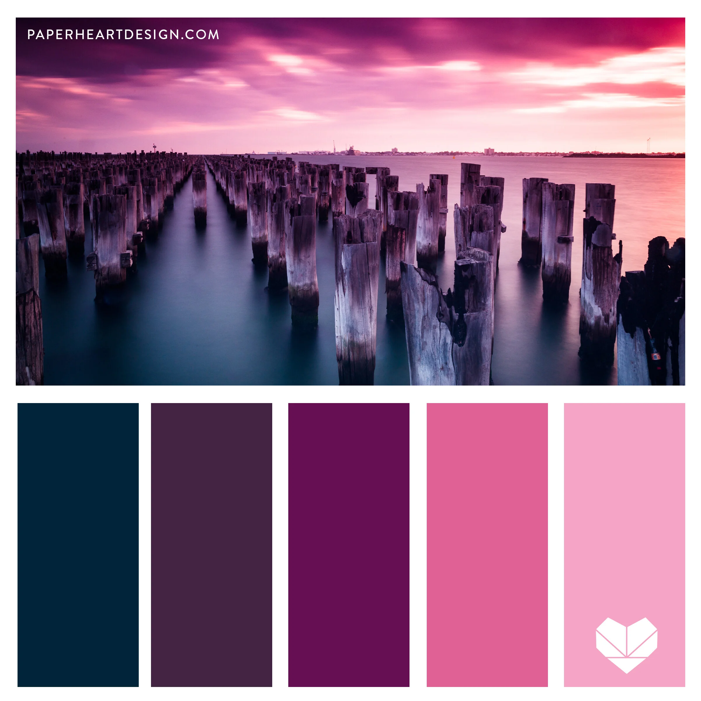
Choosing “what colors go with pink and purple” for your brand is not merely about aesthetic appeal; it’s a strategic decision rooted in understanding psychology, market positioning, and brand values. Pink and purple, with their diverse meanings from playful youthfulness to regal luxury, offer a dynamic foundation. By thoughtfully integrating neutrals for balance, analogous colors for harmony, and bold complements for impact, brands can craft a distinctive and memorable visual identity. The goal is to create a color narrative that is authentic, engaging, and consistently reinforces the unique story your brand wants to tell. A well-executed pink and purple palette isn’t just beautiful; it’s a powerful asset in your brand’s arsenal, capable of capturing attention, conveying emotion, and fostering lasting connections.
aViewFromTheCave is a participant in the Amazon Services LLC Associates Program, an affiliate advertising program designed to provide a means for sites to earn advertising fees by advertising and linking to Amazon.com. Amazon, the Amazon logo, AmazonSupply, and the AmazonSupply logo are trademarks of Amazon.com, Inc. or its affiliates. As an Amazon Associate we earn affiliate commissions from qualifying purchases.