
Color is more than just an aesthetic choice; it’s a silent, yet powerful, language that communicates your brand’s essence, values, and personality to the world. For brand strategists, designers, and marketers, understanding the nuances of color psychology and pairing is paramount to crafting an identity that resonates and endures. Magenta, with its vibrant, intriguing presence, presents both exciting opportunities and unique challenges in brand design. Determining “what color matches with magenta” isn’t merely about visual appeal; it’s about strategic alignment to reinforce your corporate identity, enhance marketing efforts, and ultimately, connect with your target audience on a deeper level.

The Psychological Resonance of Magenta in Branding
Before diving into specific color pairings, it’s crucial to grasp magenta’s inherent psychological impact and its place within the broader spectrum of brand communication. Magenta is a non-spectral color, meaning it doesn’t appear in the rainbow but is perceived as a mix of red and blue light. This unique origin contributes to its complex and often contradictory associations.
Decoding Magenta’s Core Meanings
Magenta frequently symbolizes innovation, creativity, and unconventional thinking. Its red undertones lend it energy, passion, and excitement, while its blue components infuse it with a sense of sophistication, intuition, and calm. This duality makes magenta a powerful choice for brands seeking to convey dynamism paired with elegance, or a rebellious spirit balanced with approachability. It’s often associated with femininity, luxury, glamour, and modernity. Brands in the fashion, beauty, technology, and creative industries often leverage magenta to project forward-thinking ideals and a premium, distinctive image. However, its intensity means it requires thoughtful application to avoid overwhelming or alienating an audience.
Strategic Implications for Brand Identity
A brand choosing magenta as a primary or accent color is making a statement about its willingness to stand out, challenge norms, and embrace a vibrant identity. It signals a brand that is confident, bold, and perhaps a touch playful. Understanding these inherent qualities is the first step in identifying complementary colors that will either amplify or temper magenta’s message, ensuring the overall brand narrative remains coherent and impactful. The right pairings can transform magenta from a standalone hue into a cornerstone of a robust, memorable brand ecosystem.
Mastering Color Theory: Pairing Principles for Magenta
Effective color matching for branding is rooted in fundamental color theory. For magenta, a color with significant visual weight, applying these principles ensures harmony, contrast, and strategic impact across all brand touchpoints.
Complementary Harmony: Green
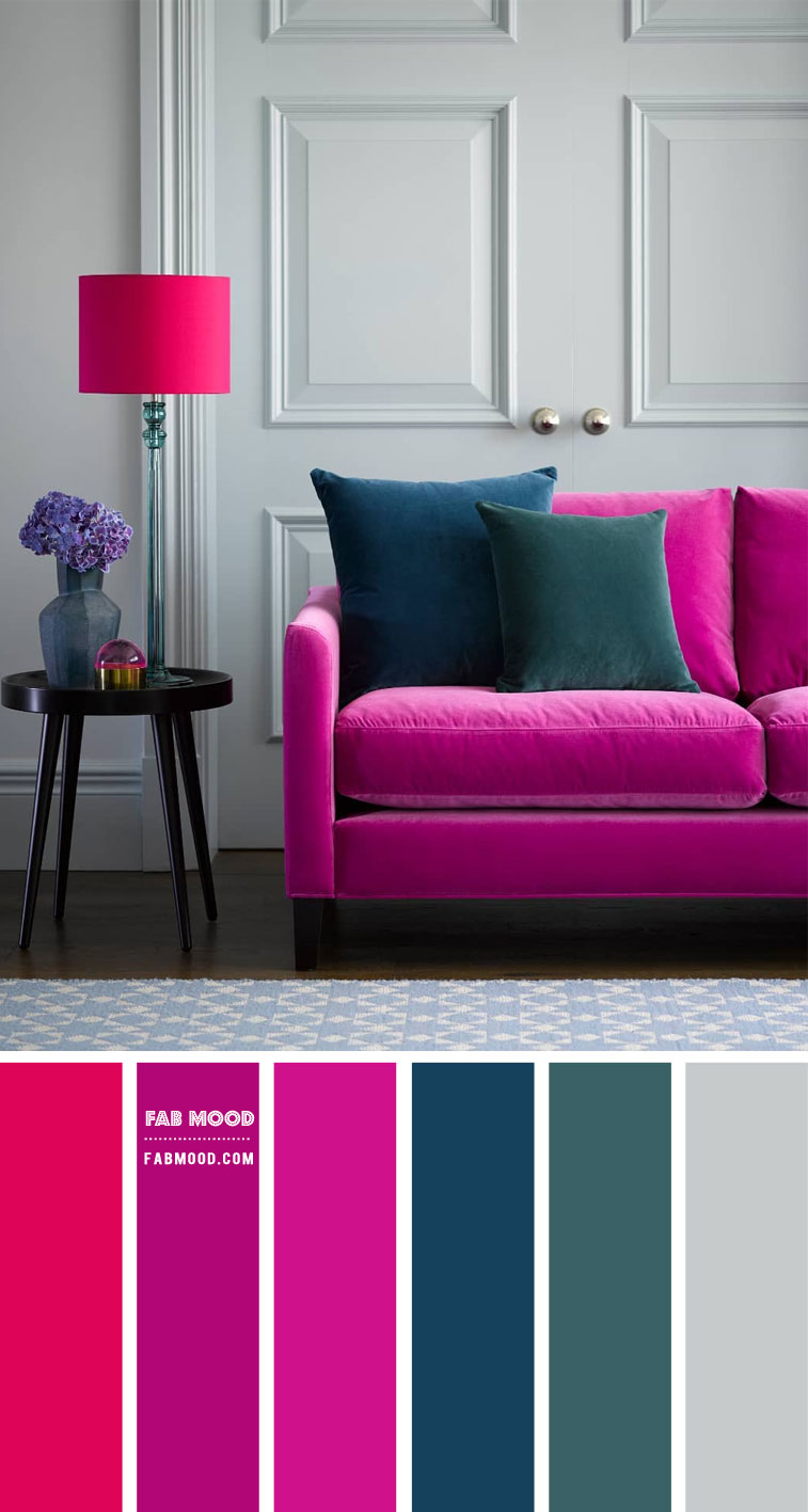
On the traditional color wheel, green sits directly opposite magenta, making it its complementary color. This pairing creates high contrast and visual vibrancy, as each color makes the other appear more intense.
- Application in Branding: A lush, deep forest green or a more muted olive can provide a grounding, natural balance to magenta’s effervescence. This combination can be particularly effective for brands aiming to merge innovation with sustainability, or luxury with a touch of earthiness. Imagine a tech company (magenta for innovation) emphasizing eco-friendly practices (green). The stark contrast demands attention and conveys a dynamic tension that can be highly engaging. However, due to its high contrast, it should be used judiciously, often with one color dominating and the other serving as an accent.
Analogous Allure: Pinks, Purples, and Reds
Analogous colors are those located next to each other on the color wheel. For magenta, this includes various shades of pink (closer to red) and purple (closer to blue).
- Application in Branding: This creates a harmonious, soothing, and sophisticated palette.
- With Pinks: Pairing magenta with softer pinks can enhance its feminine, romantic, or playful aspects. Think fuchsia with rose gold or blush pink for beauty brands, fashion labels, or brands targeting a younger, trend-conscious demographic. The subtle shift in hue creates depth without harsh contrasts.
- With Purples: Combining magenta with deeper purples, like plum or violet, elevates its sense of luxury, mystery, and sophistication. This is often seen in high-end product branding, arts and culture institutions, or brands that wish to project an aura of creativity and prestige. The gradient effect from magenta to purple feels rich and seamless.
Triadic Impact: Cyan and Yellow
A triadic color scheme uses three colors evenly spaced around the color wheel, forming a perfect triangle. For magenta, its triadic partners are typically cyan (a vivid blue-green) and yellow.
- Application in Branding: This combination offers a balanced yet highly energetic and vibrant palette. It’s inherently playful and attention-grabbing.
- With Cyan and Yellow: Imagine a design with magenta as the primary, accented by pops of bright cyan and optimistic yellow. This scheme is ideal for brands that want to convey creativity, fun, and innovation in a bold, dynamic way—often seen in digital media, entertainment, or youth-oriented brands. The challenge lies in maintaining balance so that no single color overwhelms the others, usually by letting one dominate and using the others as deliberate accents.
Monochromatic Sophistication: Tonal Depth
A monochromatic scheme uses different shades, tints, and tones of a single color. For magenta, this involves using lighter pastel pinks, deeper purples, and richer berry tones that all stem from the magenta family.
- Application in Branding: This approach creates a cohesive, refined, and sophisticated look. It’s excellent for brands aiming for elegance, minimalism, and a strong, singular brand identity. While it lacks the high contrast of complementary or triadic schemes, it compensates with subtle variations that add depth and texture. A monochromatic magenta palette can project confidence and luxury without being ostentatious, making it suitable for high-end fashion, beauty, or even innovative tech solutions that prioritize sleek design.
Strategic Application of Magenta Pairings in Brand Elements
Once the theoretical pairings are understood, the next critical step is their practical application across various brand assets. The chosen color combination must work cohesively from a logo to a marketing campaign, reinforcing a consistent brand narrative.
Logo Design and Corporate Identity
The logo is often the first visual encounter a customer has with a brand. If magenta is part of the primary logo, its accompanying colors must be chosen with extreme care.
- Clarity and Readability: When pairing magenta with a contrasting color like green, ensure sufficient contrast for readability, especially in smaller formats or against different backgrounds. For example, a magenta logo with a subtle green accent could convey vibrancy while remaining legible.
- Versatility: Consider how the logo will appear in monochrome, reverse, or on various materials. A brand guide should clearly define acceptable color variations and their contexts. A sophisticated grey or a pristine white can often serve as a perfect neutral base, allowing magenta to truly pop in a logo, conveying modernity and clarity without additional visual noise.
Marketing Collateral and Digital Presence
From brochures to websites, the selected color palette for magenta must translate effectively across all marketing materials.
- Website Design: Magenta can be a stunning accent color for call-action buttons or key headlines on a website, drawing the eye without being overwhelming. Paired with softer grays, creams, or even light pastels (analogous scheme), it creates a clean yet engaging user interface.
- Social Media Graphics: For dynamic social media content, a triadic or complementary scheme with magenta can generate high engagement. Bright greens or electric yellows can create energetic posts that stand out in a busy feed, aligning with brands focused on youth, tech, or entertainment.
- Print Materials: The specific shades of magenta (and its partners) should be consistent across digital and print to maintain brand integrity. Pantone matching is crucial for critical brand colors.
Product Packaging and Experience
For physical products, color extends beyond mere visuals into tactile and experiential realms. Magenta in packaging can evoke luxury, playfulness, or innovation.
- Luxury Goods: A deep, rich magenta paired with metallic accents (gold, silver, rose gold) or a muted, sophisticated grey/black creates an unmistakable sense of premium quality and exclusivity. This aligns with high-end fashion, cosmetics, or artisanal food products.
- Innovative Products: For tech gadgets or cutting-edge products, magenta with clean whites, blacks, or even electric blues/cyans (triadic) can communicate modernity, sleek design, and futuristic appeal. The boldness of magenta can signify a product that’s ahead of its time.
- Everyday Items: Even for more common products, a thoughtful magenta pairing can differentiate. A magenta toothpaste tube with a mint green cap suggests freshness and novelty, injecting personality into a mundane item.

Crafting a Brand Mood Board with Magenta
A mood board is an invaluable tool in the early stages of brand development. It visually encapsulates the desired emotional and aesthetic direction. When working with magenta, populate the mood board with imagery, textures, and typography that reflect the intended pairings. If aiming for elegance, include luxurious fabrics, minimalist designs, and sophisticated imagery alongside your magenta and analogous purple swatches. If the goal is vibrant playfulness, incorporate bold patterns, dynamic shapes, and imagery suggesting energy and movement with your magenta and triadic partners. This holistic approach ensures that the chosen colors work synergistically to tell a compelling brand story.
The question “what color matches with magenta” is not just a query about aesthetics; it’s a strategic entry point into designing a brand identity that speaks volumes. By understanding magenta’s psychology and applying sound color theory principles to various brand touchpoints, businesses can harness its unique power to create a visual identity that is not only beautiful but also deeply effective in conveying their core message and connecting with their audience.
aViewFromTheCave is a participant in the Amazon Services LLC Associates Program, an affiliate advertising program designed to provide a means for sites to earn advertising fees by advertising and linking to Amazon.com. Amazon, the Amazon logo, AmazonSupply, and the AmazonSupply logo are trademarks of Amazon.com, Inc. or its affiliates. As an Amazon Associate we earn affiliate commissions from qualifying purchases.