
The Strategic Power of Navy Blue in Branding
Navy blue stands as a formidable cornerstone in the realm of brand identity, chosen not merely for its aesthetic appeal but for its profound psychological and strategic associations. This deep, authoritative hue intrinsically communicates stability, trust, professionalism, and sophistication. Brands that anchor their identity in navy blue often aim to project reliability, expertise, and a sense of enduring quality, making it a favored choice among financial institutions, corporate enterprises, luxury marques, and educational establishments. It imbues a perception of credibility and gravitas that can resonate deeply with a discerning audience.

However, even a color as robust and influential as navy blue requires carefully selected partners to construct a comprehensive and dynamic brand presence. Left in isolation, navy blue can sometimes appear overly monolithic, unapproachable, or even conservative. The strategic integration of complementary colors serves to soften its edges, inject vitality, highlight specific brand attributes, or carve out a distinct identity within a competitive market. The thoughtful curation of a color scheme around navy blue transcends mere visual harmony; it becomes a powerful amplifier of a brand’s core message, allowing it to appeal to its target audience on a deeper, more emotional plane. This deliberate approach transforms a simple hue into an essential tool for effective communication and indelible brand recognition.
Complementary Hues: Building a Cohesive Brand Palette
The quest to determine “what color matches navy blue” for branding purposes is a nuanced exercise, demanding a delicate balance between visual appeal and strategic intent. The ultimate objective is to forge a palette that is both captivating and steadfastly reinforces the brand’s desired positioning and values.
Classic Combinations: Timeless Appeal
For brands aspiring to exude sophistication, tradition, and universal appeal, classic pairings with navy blue offer an invaluable blueprint for enduring elegance.
- White/Cream: This pairing represents perhaps the most enduring and universally professional combination. White provides unparalleled crispness and clarity, making navy blue appear even more authoritative and immaculately clean. Cream, conversely, introduces a subtle warmth that softens the contrast, lending an air of approachable elegance often favored by luxury or heritage brands seeking a slightly less stark presence. This duo consistently signals professionalism, transparency, and an understated, enduring quality, reminiscent of classic corporate identities or maritime aesthetics.
- Gold/Silver: When the objective is to convey luxury, prestige, or a premium brand experience, metallic accents like gold or silver are quintessential. Gold imbues a sense of richness, tradition, and high intrinsic value, frequently seen in high-end fashion, fine jewelry, or celebratory branding initiatives. Silver, in contrast, offers a sleek, modern, and sophisticated edge, often associated with technological innovation, contemporary luxury, or forward-thinking design. These metallic combinations elevate navy blue, suggesting exclusivity, superior craftsmanship, and an unwavering commitment to quality.
- Grey/Taupe: These sophisticated neutral tones provide a balanced and versatile backdrop for navy blue, allowing it to maintain its dominance while introducing depth and flexibility to the palette. Light grey can lighten the overall feel of a palette, imparting a modern and airy quality, while darker greys create a more serious, grounded, and stable impression. Taupe, with its subtle blend of grey and brown, introduces warmth and organic sophistication, a choice frequently employed by interior design brands or those emphasizing natural elements with a refined, contemporary twist.
Modern Pairings: Fresh and Dynamic
Brands aiming to project innovation, energy, or a more contemporary image can effectively explore bolder and more vibrant color matches that breathe new life into navy blue.
- Coral/Peach: These warm, inviting hues provide a striking and lively contrast to navy blue’s inherent coolness. Coral can inject a palpable sense of vibrancy, youthfulness, and approachability, making it ideal for lifestyle brands or those seeking to balance professionalism with a friendly, engaging demeanor. Peach offers a softer, more optimistic touch, evoking creativity and a welcoming spirit. This combination proves particularly effective for brands targeting a younger demographic or those wishing to appear less formal and more dynamic.
- Teal/Aqua: Remaining within the cool spectrum but introducing a refreshing new dimension, teal and aqua offer harmonious yet invigorating pairings. Teal, a captivating blend of blue and green, speaks to innovation, clarity, and often implies sustainability or an connection to nature, while aqua brings a light, airy, and calming quality. These colors can transform a navy blue brand into one that feels more expansive, forward-thinking, and environmentally conscious, making them excellent choices for technology companies or wellness brands.
- Lime Green/Chartreuse: For a truly energetic, audacious, and unequivocally modern statement, a carefully placed pop of bright lime green or chartreuse can be exceptionally impactful. These colors command attention, signaling creativity, innovation, and a dynamic, progressive spirit. They are best deployed as judicious accent colors to prevent overwhelming the navy blue, ideal for brands operating in cutting-edge industries, sports, or those aiming for a high-impact, memorable, and distinctive identity.
Subtlety and Contrast: Achieving Balance
The true efficacy of a color palette lies not merely in the individual colors chosen, but in their intricate relationship – the delicate interplay of subtlety and bold contrast that defines the overall visual experience.
- Monochromatic Harmonies: While navy blue possesses inherent strength, incorporating lighter shades of blue (such as sky blue or powder blue) or darker variations (like midnight blue) within the same palette can create a sophisticated sense of depth without introducing entirely new hues. This approach results in a highly cohesive and serene brand identity, often favored by brands that prioritize calm, unwavering reliability, and clarity.
- Analogous Schemes: Pairing navy blue with colors adjacent to it on the color wheel, such as deeper greens or rich purples, yields a harmonious yet richly textured palette. These combinations are inherently less jarring than direct complementary contrasts but offer significantly more visual interest than purely monochromatic schemes. They convey a sense of nuanced sophistication and a thoughtful aesthetic.
- Triadic or Tetradic Schemes: For brands with more complex visual requirements, especially those in creative industries, selecting colors from a triadic (three colors equidistant on the color wheel) or tetradic (four colors forming a rectangle on the color wheel) scheme can produce remarkably vibrant and diverse results. However, these require masterful management to ensure one color remains dominant (navy blue in this context), with the others acting as carefully measured supporting roles or accents, thereby preventing a chaotic or disjointed appearance.
Beyond Aesthetics: Psychological Impact of Color Combinations
The careful selection of colors to complement navy blue transcends mere visual appeal, delving deeply into the profound realm of color psychology and how these pairings subconsciously influence audience perception and behavior. Brands wield color strategically to evoke specific emotions, communicate core values, and forge a resonant connection with their target demographic on an often unspoken, intuitive level.
When navy blue is paired with crisp white, it powerfully reinforces messages of honesty, transparency, and clinical precision. This makes it an indispensable staple for healthcare providers, legal firms, and corporate entities where trustworthiness and clarity are paramount. The combination creates an impression of clean, unambiguous communication.

The pairing of navy blue and gold immediately communicates luxury, aspiration, and a sense of heritage. It suggests premium quality, exclusivity, and often an established legacy, frequently seen in high-end retail, sophisticated hospitality, or for personal brands positioning consultants as top-tier, authoritative experts. The inherent warmth of gold subtly tempers navy blue’s potential sternness, making the overall impression feel more regal and distinguished rather than simply formal.
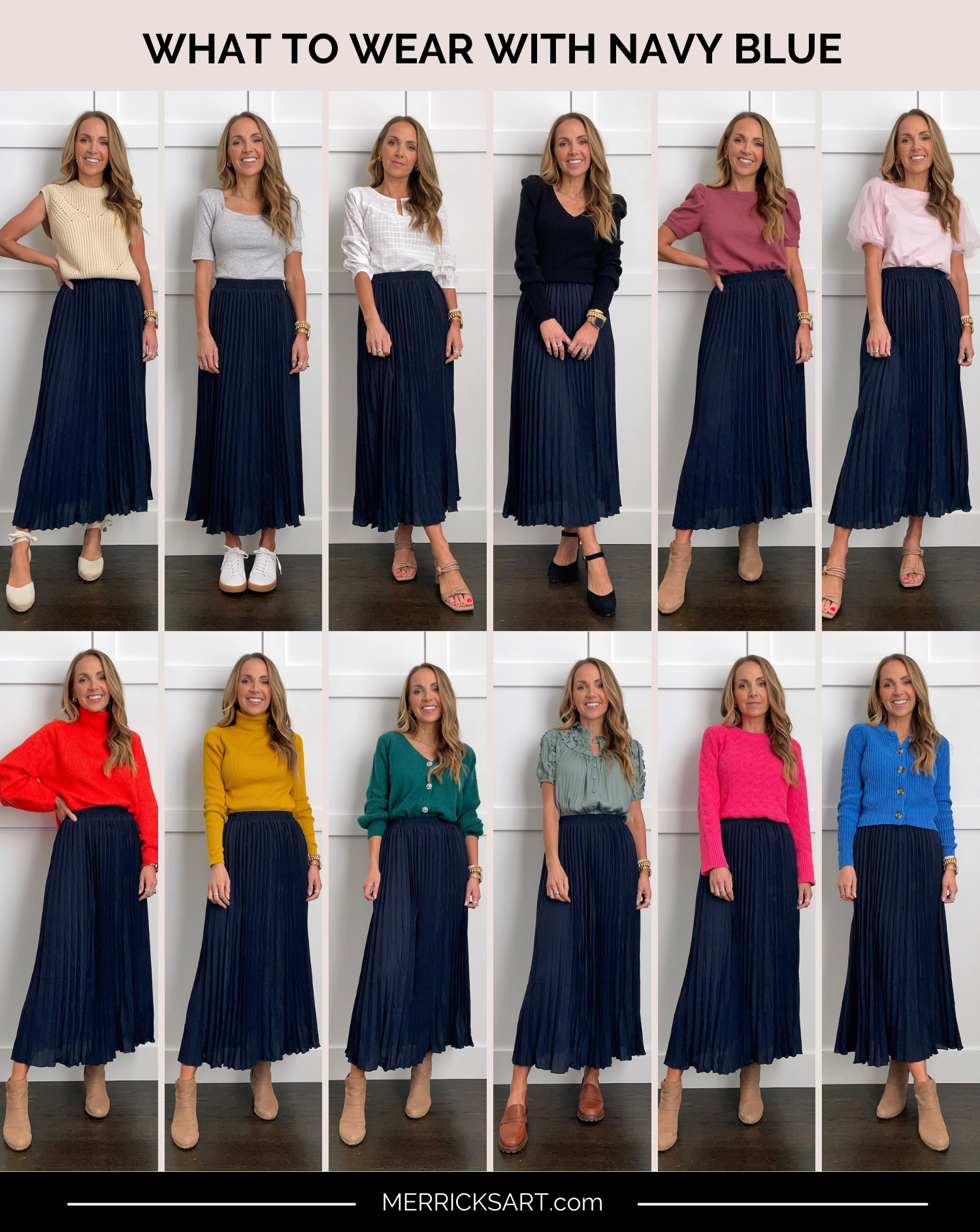
Introducing bright greens or oranges as accents alongside navy blue injects a palpable sense of energy and a youthful, innovative spirit. This signals a deliberate departure from traditional corporate rigidity, conveying that while the brand possesses stability and gravitas (thanks to navy blue), it is also dynamic, forward-thinking, and potentially more accessible or creatively inclined. Technology startups or brands focused on rapid innovation might leverage this combination to balance established credibility with an energetic, pioneering image.
Conversely, when softer, earthy tones such as taupe or blush pink are judiciously combined with navy blue, the brand can convey an impression of understated elegance, warmth, and genuine approachability. This blend is often employed by lifestyle brands, interior designers, or personal brands aiming for a sophisticated yet comforting and humane presence, effectively balancing navy blue’s inherent authority with a softer, more inviting human touch.
The psychological interplay of these combinations means that each pairing crafts a distinct and potent narrative. A brand’s chosen navy blue palette is far more than a simple design decision; it is a non-verbal declaration of its identity, its unwavering values, and the precise experience it pledges to deliver to its audience. A deep understanding of these underlying psychological impacts is crucial to ensure that the visual identity is not only aesthetically pleasing but truly aligns with and powerfully supports the overarching brand strategy.
Implementing Your Navy Blue Palette Across Brand Touchpoints
Once a cohesive and strategically sound navy blue color palette has been meticulously established, the subsequent critical phase involves its consistent and meticulous application across every conceivable brand touchpoint. This unwavering consistency is not merely a preference; it is paramount for cultivating strong brand recognition, reinforcing the brand’s unique identity, and fostering an invaluable sense of trust with the audience.
Logo and Visual Identity
The logo frequently serves as the initial and most enduring impression of a brand. If navy blue is designated as a primary color within the logo, its chosen complementary colors must be thoughtfully integrated. They might manifest in an accompanying symbol, a carefully crafted tagline, or as subtle accents embedded within the logotype itself. These secondary colors also play a pivotal role in defining the broader visual identity system, dictating the colors of typography, the styling of icons, and the graphic patterns that seamlessly accompany the logo across all media. Ensuring optimal legibility and impactful presence at various scales – from a tiny favicon to a sprawling billboard – is an absolute necessity.
Website and Digital Presence
A brand’s website, social media profiles, and digital advertising campaigns often represent its most frequently accessed touchpoints. Within this digital realm, the navy blue palette assumes a guiding role in user interface (UI) design, defining the colors of interactive buttons, background shades for headers, accent elements, and hyperlinks. A judiciously chosen complementary color can be strategically employed to draw attention to crucial calls-to-action, highlight essential information, or create clear visual separation between distinct content sections. Consistent application across all digital platforms guarantees a unified and harmonious brand experience, ensuring the brand is instantly recognizable whether a customer is navigating the corporate website, scrolling through an Instagram feed, or opening an email newsletter. Accessibility is also a fundamental consideration; ensuring sufficient contrast between text and background colors is not only a hallmark of good design but also a requirement for inclusive branding practices.
Marketing Collateral and Packaging
From professional business cards and informative brochures to innovative product packaging and impactful signage, physical marketing materials provide tangible, sensory representations of the brand. Here, the navy blue palette dictates the overarching aesthetic, guiding decisions regarding print finishes, material selections, and graphic layouts. If navy blue acts as the dominant background, a contrasting accent color can make key messages vividly stand out. For product packaging, the selected palette must accurately reflect the product’s value proposition and appeal directly to the target demographic, using color as a powerful communicator of quality, sustainability, or luxury. Consistent application across these physical assets builds a cohesive, tangible brand story that extends seamlessly into the real world.
Personal Branding Applications
For individuals engaged in building a robust personal brand, particularly professionals, consultants, or creatives, the question of “what color matches navy blue” holds equally vital importance. Navy blue often conveys inherent professionalism, authority, and trustworthiness in personal branding, making it highly suitable for LinkedIn profiles, professional websites, and impactful presentation decks. Complementary colors can be skillfully used to inject personality and individuality without undermining professional credibility. A carefully chosen pop of coral or a softer blush can make a personal brand feel more approachable and memorable, while subtle gold or silver accents can elevate its perceived value and sophistication. This principle extends even to personal style choices for public appearances, ensuring that one’s visual presentation consistently aligns with the professional brand identity being cultivated.
The Art of Consistency: Maintaining Brand Integrity
The true and undeniable power of a thoughtfully constructed navy blue color palette is fully unleashed only through relentless and unwavering consistency in its application. Brand integrity is not merely contingent on possessing a striking logo or an impeccably designed website; it hinges on the ability to present a unified, cohesive visual narrative across every single point where the brand interacts with its audience. Inconsistent application of brand colors can swiftly dilute brand recognition, create confusion among the audience, and, over time, significantly erode the invaluable trust that a brand strives to build.
To meticulously maintain this essential consistency, developing a comprehensive brand style guide is an indispensable tool. This guide should meticulously document the specific shades of navy blue and its chosen matching colors, including their precise color codes across various applications (Pantone, CMYK for print, RGB, and Hex for digital). Beyond just color values, it should provide unequivocal guidelines on how these colors are to be employed – outlining primary and secondary roles, specifying acceptable accent applications, detailing approved combinations, and explicitly identifying any “forbidden” pairings to prevent visual dissonance.
Every team member involved in brand communication, from graphic designers and marketing specialists to content creators and sales personnel, must strictly adhere to these established guidelines. This ensures that regardless of how a customer encounters the brand – be it through an email, a social media post, a printed advertisement, or a physical product – the visual experience remains harmonious, instantly recognizable, and consistently reinforces the brand’s identity.
In today’s highly saturated and competitive marketplace, a brand’s consistent visual identity, meticulously anchored by a strategically chosen color palette built around navy blue, transcends a mere aesthetic preference; it becomes a powerful and enduring differentiator. This consistency helps a brand to cut through the pervasive noise, embed itself deeply and memorably in the audience’s mind, and build an invaluable foundation of familiarity, reliability, and trust that forms the bedrock of long-term brand equity. The answers to “what color matches navy blue” are not simply subjective aesthetic choices; they are strategic decisions that, when consistently executed, underpin the entire architecture of an enduring and successful brand.
aViewFromTheCave is a participant in the Amazon Services LLC Associates Program, an affiliate advertising program designed to provide a means for sites to earn advertising fees by advertising and linking to Amazon.com. Amazon, the Amazon logo, AmazonSupply, and the AmazonSupply logo are trademarks of Amazon.com, Inc. or its affiliates. As an Amazon Associate we earn affiliate commissions from qualifying purchases.