
Blue and red, two of the most potent primary colors, are staples in the visual language of brands across the globe. Their inherent strength and distinct psychological profiles offer a powerful foundation for a brand’s corporate identity. However, effectively harnessing their impact—and understanding what complementary hues can elevate their message—is critical for creating a cohesive, memorable, and impactful brand presence. This exploration delves into the strategic considerations for integrating blue and red, and the art of pairing them with other colors to forge a compelling brand narrative.
The Psychology of Blue and Red in Branding
Understanding the individual and combined psychological effects of blue and red is the cornerstone of strategic brand design. These colors are not merely aesthetic choices; they are powerful communicators that influence perception, evoke emotions, and drive consumer behavior.
The Power of Blue: Trust, Stability, and Professionalism
Blue is universally recognized for its association with trust, reliability, and corporate stability. It evokes feelings of calm, logic, and professionalism, making it a favored choice for financial institutions, tech companies, and healthcare providers. Brands leveraging blue aim to project an image of dependability, expertise, and a reassuring presence. From a marketing perspective, blue can communicate a sense of security and loyalty, encouraging long-term relationships with customers. Its cool, receding nature suggests a steady hand, meticulousness, and a commitment to quality.
The Dynamic Red: Energy, Urgency, and Passion
In stark contrast, red is a color of intense energy, passion, and urgency. It captures attention immediately, stimulating excitement, warmth, and even appetite. Brands that utilize red often seek to convey dynamism, boldness, and a youthful vigor. It’s a color frequently employed in sales and marketing to prompt action, signify importance, or express love and desire. Fast-food chains, automotive brands, and media companies often lean into red to inject vibrancy and communicate a sense of immediacy and excitement. However, its intensity requires careful management to avoid overwhelming or aggressive perceptions.
When blue and red are combined, they create a fascinating tension and balance. The steadfastness of blue can temper the impulsiveness of red, while red can inject much-needed dynamism into blue’s potential stoicism. This pairing signifies a brand that is both reliable and energetic, established yet innovative, serious but passionate. It represents a comprehensive brand personality that can appeal to a wide spectrum of audiences.
Crafting a Cohesive Brand Identity with Blue and Red
The challenge and opportunity with blue and red lie in their powerful individual statements and their combined effect. Strategic integration ensures that these colors work harmoniously to reinforce the brand’s core message, rather than creating visual dissonance.
Strategic Integration: Beyond the Primary Duo
While blue and red can stand alone as a brand’s primary palette, their true potential is unlocked when thoughtfully integrated within a broader visual system. This involves deciding which color takes precedence and how the other acts as a supporting element or an accent. For instance, a brand focusing on trust and reliability might feature blue predominantly, with red used sparingly for calls to action or to highlight key benefits. Conversely, a brand emphasizing energy and passion might lead with red, using blue to ground the design and add a layer of credibility. The perceived dominance dictates the overarching feeling of the brand.
Consider the context of your industry, target audience, and brand personality. A financial technology company might opt for a sophisticated, deep blue as its primary color, accented by a vibrant, modern red to signal innovation and urgency in a competitive market. This nuanced approach moves beyond a simple two-color scheme to a strategic visual hierarchy.
Balancing Dominance and Support
Effective branding with blue and red requires a careful balance. If both colors are used in equal measure or with conflicting intensities, the result can be jarring or ambiguous. The goal is to create a visual conversation where each color plays a defined role. This could mean using blue for background elements and primary information, while red is reserved for buttons, alerts, or specific product features.
The strategic use of saturation and brightness also plays a pivotal role. A subdued, professional navy blue might be paired with a bright, poppy red to signify a traditional brand with a modern twist. Alternatively, a lighter, more approachable sky blue could be matched with a deep, sophisticated maroon for a more elegant and mature brand appeal. The interplay of shades, tints, and tones allows for a vast spectrum of personalities to be expressed within the blue and red framework.
Complementary and Analogous Hues: Expanding the Palette
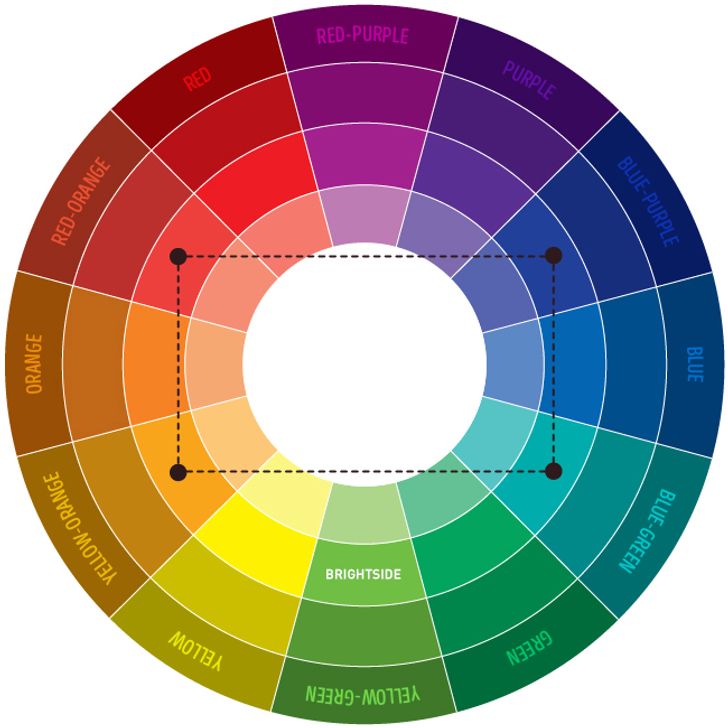
While blue and red form a strong foundation, introducing other colors can enrich the brand’s visual identity, add depth, and allow for greater versatility across various marketing materials. The art lies in selecting colors that complement, contrast, or harmonize with blue and red without diluting their impact.
Introducing Neutrals: White, Gray, and Black for Sophistication

Neutrals are indispensable when working with strong primary colors like blue and red. White provides clean space, allowing the primary colors to breathe and stand out. It signifies purity, simplicity, and modernity, making it ideal for backgrounds, typography, and minimalist designs. Gray offers sophistication and a bridge between blue and red, lending a sense of balance and professionalism. A warm gray can soften the intensity, while a cool gray can enhance the perception of trust. Black, when used strategically, can add gravitas, luxury, and a strong sense of definition. It provides powerful contrast and can anchor a design, making blue and red appear more vibrant and intentional. These neutrals are not merely fillers; they are active participants in shaping the brand’s tone and readability.
Earth Tones and Metallics: Adding Depth and Luxury
For brands aiming for a more grounded, organic, or luxurious feel, incorporating earth tones and metallics can be highly effective. Golds and silvers can infuse elegance and a premium feel, suggesting quality and distinction. A metallic sheen can make a blue and red palette feel more exclusive and high-end, suitable for luxury goods or high-value services. Earth tones, such as warm browns, deep olives, or muted ochres, can add a sense of heritage, naturalness, or warmth. They can soften the intensity of blue and red, creating a more approachable or rustic brand image, particularly effective for outdoor brands, artisan products, or companies emphasizing sustainability.
The Role of Accents: Yellow, Green, and Orange for Pop
Strategic accent colors can inject personality, highlight specific messages, and prevent a two-color palette from becoming monotonous.
- Yellow: A vibrant yellow can add optimism, energy, and a youthful exuberance. It creates a dynamic contrast with blue and a lively complement to red, making it excellent for calls to action or to convey cheerfulness.
- Green: Depending on the shade, green can introduce connotations of growth, nature, health, or wealth. A deep forest green with blue and red might evoke a classic, established feel, while a bright lime green could signal innovation and environmental consciousness.
- Orange: Sitting between red and yellow, orange embodies creativity, enthusiasm, and friendliness. It can soften the intensity of red while adding warmth that blue lacks, making it suitable for brands that want to appear approachable and dynamic.
These accent colors should be used sparingly and intentionally to ensure they enhance, rather than detract from, the core blue and red identity. Their role is to provide strategic highlights and functional differentiation across brand touchpoints.
Application Across Brand Touchpoints
The chosen blue and red palette, along with its complementary hues, must be consistently applied across all brand touchpoints to build recognition and reinforce the brand’s identity.
Logo Design and Brand Mark
The logo is often the first and most lasting impression of a brand. Here, the interplay of blue and red is paramount. Is blue the primary element, symbolizing stability, with red providing an energetic accent in a specific mark or typography? Or does red dominate, conveying passion, with blue offering a grounding element? The negative space, typography, and graphic elements within the logo should all harmoniously work within the chosen color scheme. Consider iconic brands that successfully merge these colors, using them to create instant recognition and convey their core values.
Marketing Collateral and Digital Presence
From brochures and business cards to websites and social media profiles, consistency is key. Websites might use blue for navigation and trustworthiness, red for calls to action, and white for readability. Social media templates should carry the same color story, ensuring that every piece of content reinforces the brand. Advertising campaigns must strategically employ the palette to evoke desired emotions and prompt specific actions, whether it’s the calming reassurance of blue or the urgent excitement of red. Digital applications also allow for animation and interactive elements that can leverage these colors in dynamic ways.
Product Packaging and Retail Environments
For physical products, packaging is a critical brand touchpoint. How blue and red are used on packaging communicates quality, value, and brand personality directly to the consumer. A high-end product might use deep blues and subtle reds with metallic accents to signify luxury, while a mass-market product might employ brighter hues for visibility and appeal. In retail spaces, the color palette extends to store design, signage, and uniforms, creating an immersive brand experience. The strategic use of lighting can also enhance the perception of these colors, further shaping the customer’s interaction with the brand.
Case Studies and Best Practices
Analyzing successful brands that master blue and red combinations offers valuable insights into effective color strategy. While specific names are not provided here, consider the principles they embody.
Leveraging Contrast and Vibrancy
Brands that effectively use blue and red often play with high contrast to create impact and visual interest. A bright, almost neon red against a dark, saturated blue can convey a modern, cutting-edge image, appealing to younger, tech-savvy audiences. Conversely, a muted, desaturated blue paired with a deep, sophisticated red can suggest heritage, luxury, and timelessness. The key is to understand the emotional resonance of the specific shades and their combined effect. Experimenting with different tints, tones, and shades of blue and red can yield a broad spectrum of brand personalities, from playful to profound.

Maintaining Consistency and Adaptability
Ultimately, the power of a blue and red brand identity lies in its consistent application across all channels, yet with enough adaptability to suit various contexts. A brand guide should clearly define the primary and secondary color palettes, usage rules, and examples of correct and incorrect application. This ensures that whether the brand is presented on a minimalist website, a bustling billboard, or an elegant product label, the core visual message remains strong and unified. The ability to adapt the palette—for instance, using more blue for a corporate report and more red for a sales promotion—while adhering to core guidelines, allows for strategic flexibility without sacrificing brand recognition.
In conclusion, “what goes with blue and red” in branding is far more than an aesthetic question. It’s a strategic inquiry into psychology, perception, and purpose. By carefully selecting complementary colors and applying them thoughtfully across all brand touchpoints, businesses can harness the inherent power of blue and red to build a brand identity that is not only visually striking but also deeply resonant and strategically effective.
aViewFromTheCave is a participant in the Amazon Services LLC Associates Program, an affiliate advertising program designed to provide a means for sites to earn advertising fees by advertising and linking to Amazon.com. Amazon, the Amazon logo, AmazonSupply, and the AmazonSupply logo are trademarks of Amazon.com, Inc. or its affiliates. As an Amazon Associate we earn affiliate commissions from qualifying purchases.