
In the intricate world of brand strategy and corporate identity, color is far more than a mere aesthetic choice; it is a powerful, non-verbal communicator capable of evoking emotion, shaping perception, and driving consumer behavior. Among the spectrum of hues, orange holds a unique position, radiating a compelling blend of attributes that savvy brands leverage to carve out distinct identities. Understanding what orange stands for is crucial for any organization aiming to harness its potential for marketing impact and brand resonance.
The Vibrant Psychology of Orange in Branding
Orange, a secondary color formed by the combination of red and yellow, inherits qualities from both its parent hues, creating a distinctive psychological profile. It embodies the energy and passion of red, tempered by the warmth and optimism of yellow. This amalgamation results in a color that is often perceived as friendly, invigorating, and adventurous.
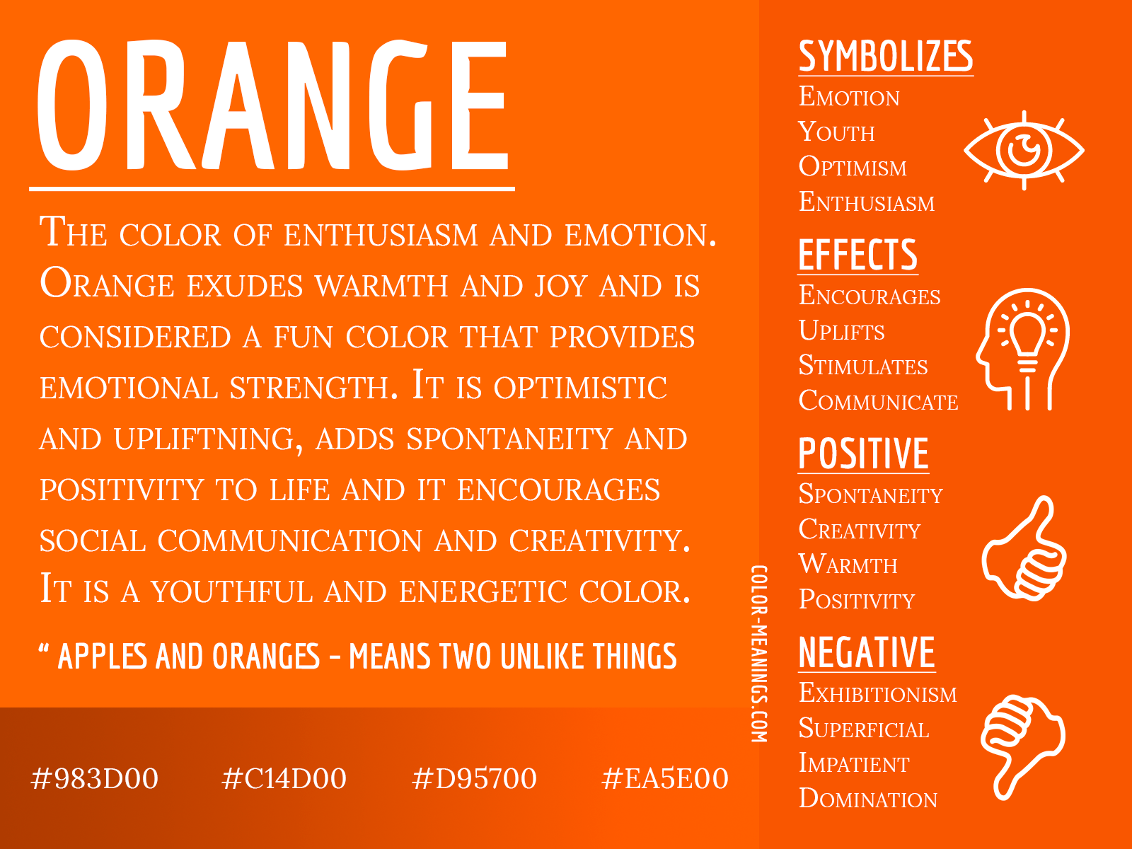
Energy, Enthusiasm, and Optimism
At its core, orange pulsates with an undeniable energy. It’s a color that can ignite enthusiasm and inspire a sense of vigor. Brands that aim to convey dynamism, excitement, or a forward-thinking outlook often gravitate towards orange. This makes it a popular choice for industries focused on activity, recreation, or anything that promises a boost to one’s mood or performance. For consumers, the sight of orange can subtly suggest optimism and a positive experience, making a brand appear more approachable and inviting.
Creativity and Innovation
Beyond mere energy, orange often symbolizes creativity and a youthful, innovative spirit. It’s a color associated with unconventional thinking and a departure from the mundane. Companies that position themselves at the cutting edge, or those that encourage imaginative solutions and novel ideas, frequently incorporate orange into their branding. This association stems from its vibrant, attention-grabbing nature, which suggests a brand that isn’t afraid to stand out or challenge the status quo. It communicates a willingness to experiment and embrace the new.
Affordability and Accessibility
Interestingly, orange can also carry connotations of affordability and accessibility, particularly when used strategically. Unlike red, which can sometimes imply premium or luxury (think high-end sports cars), orange often feels more down-to-earth and less intimidating. This perception can make a brand appear more welcoming to a broader audience, suggesting that its products or services are within reach. It fosters a sense of approachability, reducing perceived barriers to entry and making consumers feel more comfortable engaging with the brand. This is a subtle yet powerful psychological lever for mass-market brands or those aiming to democratize a product or service.
Warmth and Approachability
The warmth inherited from yellow makes orange a friendly and approachable color. It can create a sense of comfort and invitingness, akin to a warm sunset or a crackling fire. Brands that prioritize customer service, community, or a friendly user experience often find orange to be an ideal choice. It fosters a welcoming atmosphere, signaling that the brand is easy to interact with and values its human connection. This warmth is particularly effective in branding that seeks to build trust and long-term relationships through a personable demeanor.
Strategic Application: Leveraging Orange for Brand Identity
For brand strategists, the decision to incorporate orange is a calculated one, based on its specific psychological impact and its ability to differentiate a brand in a crowded marketplace. It’s not just about liking the color; it’s about understanding how it aligns with core brand values and resonates with the target audience.
Differentiating in a Saturated Market
In sectors where competitors often default to blues (trust, corporate) or reds (power, urgency), orange offers a potent opportunity for differentiation. Its inherent vibrancy and unique psychological associations allow a brand to stand out visually and conceptually. By choosing orange, a brand signals its distinctiveness, suggesting it offers something different, perhaps more energetic, creative, or accessible than its competitors. This visual distinctiveness is critical for immediate recognition and memorability.
Target Audience Resonance
The effectiveness of orange hinges significantly on the target audience. Brands appealing to younger demographics, who often value originality, excitement, and a less formal approach, may find orange particularly appealing. Similarly, brands in the sports, adventure, or creative industries will find that orange naturally resonates with their audience’s desire for enthusiasm and innovation. A deep understanding of the target consumer’s preferences and psychological triggers is paramount to ensure orange communicates the intended message and avoids misinterpretation.
Visual Impact and Memorability
Orange is a high-visibility color, making it excellent for catching the eye and ensuring memorability. Its brightness naturally draws attention, which can be invaluable for signage, packaging, or digital calls-to-action. However, its intensity requires careful handling. Too much orange can be overwhelming or aggressive, whereas a balanced application can create a powerful and lasting impression. Strategic placement and thoughtful design ensure that orange enhances, rather than detracts from, the overall brand experience.
Pairing Orange: Complementary Colors and Context
The impact of orange is rarely felt in isolation. Its full power is often unlocked through thoughtful pairing with other colors. When combined with blues, orange can create a dynamic contrast that is both energetic and balanced. With neutrals like grey or white, orange pops with modern sophistication. Even with analogous colors like red or yellow, different shades of orange can create a harmonious, warm palette. The context in which orange is used—be it the primary logo, a secondary accent, or within specific marketing campaigns—also dictates its perceived meaning and effectiveness. A bright, neon orange suggests modernity, while a muted, earthy orange might convey naturalism or heritage.
Orange Across Industries: Case Studies and Impact
Many successful brands across diverse sectors have harnessed the power of orange to define their identity and connect with consumers. Their strategic use of the color provides tangible examples of its versatile applications.
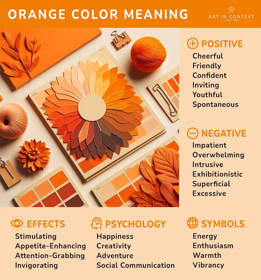
Food and Beverage: Stimulating Appetites and Friendliness
In the food and beverage industry, orange often signals health, freshness, and deliciousness, reminiscent of citrus fruits and root vegetables. It’s also linked to warmth and hospitality. Brands like Dunkin’ leverage a vibrant orange to convey energy, approachability, and the simple pleasure of a morning coffee or donut. The color evokes a friendly, informal atmosphere that encourages indulgence. Similarly, certain juice brands use orange to highlight natural ingredients and vitality, appealing to health-conscious consumers.
Technology and Innovation: Modernity and Vision
For technology companies, orange can represent innovation, creativity, and a forward-thinking ethos. Mozilla Firefox uses a fiery orange fox to symbolize speed, agility, and a pioneering spirit in the web browser space. The color aligns with their innovative open-source approach and their commitment to evolving the internet experience. Orange helps tech brands convey that they are dynamic, user-friendly, and at the forefront of development, rather than being cold or overly corporate.
Retail and E-commerce: Value and Urgency
In retail, orange can be used to grab attention during sales or promotions, signaling value and a sense of urgency. The high visibility of orange makes it effective for call-to-action buttons or sale banners. It communicates excitement and a good deal without necessarily implying cheapness. The Home Depot, for example, uses a strong orange to convey reliability, utility, and an accessible, hands-on approach to home improvement, suggesting value for practical projects.
Service Industries: Approachability and Trust
For service-oriented businesses, orange can foster a sense of approachability and friendly efficiency. A financial advisor or a community service organization might use softer shades of orange to appear less intimidating and more welcoming. It can suggest a personable service that values client relationships. While not as common as blue for trust, a judicious use of orange can differentiate a brand by making it seem more human and less bureaucratic.
Navigating Cultural Nuances and Perceptions
While color psychology offers general guidelines, the specific meaning of orange can vary significantly across cultures. Brands operating on a global scale must be acutely aware of these nuances to avoid unintended messages.
Western vs. Eastern Interpretations
In many Western cultures, orange is generally associated with warmth, enthusiasm, and harvest. However, in some Eastern cultures, particularly in parts of Asia, orange (saffron) holds deep spiritual significance, often linked to divinity, sanctity, and courage in Buddhism and Hinduism. For a brand, using orange in these regions without understanding its religious context could be seen as disrespectful or inappropriate if not handled with sensitivity. Conversely, leveraging its spiritual associations in a respectful manner could create powerful connections.
Political and Social Associations
Beyond religion, orange can carry political or social connotations in certain regions. It has been associated with various political movements or national identities (e.g., the Netherlands, Northern Ireland). Brands need to research these specific associations within their target markets to ensure their color choice reinforces, rather than contradicts, their brand message. A color that signifies celebration in one culture might symbolize conflict in another.
Avoiding Misinterpretation
The key to successful international branding with orange lies in thorough research and cultural sensitivity. What is perceived as playful and innovative in one market could be seen as frivolous or even offensive in another. Brands should conduct local market research and potentially adapt their color palettes or messaging for different regions, ensuring that their chosen shade and application of orange consistently convey the desired brand attributes without causing any cultural friction.
Crafting Your Brand’s Orange Strategy
Integrating orange effectively into a brand’s identity requires a strategic approach that goes beyond mere aesthetic preference. It demands alignment with core brand values, target audience insights, and market differentiation goals.
Auditing Your Brand’s Existing Color Palette
Before introducing orange, conduct a comprehensive audit of your current brand colors. Understand how your existing palette communicates, and identify gaps or opportunities that orange could fill. Would orange serve as a primary identifier, a secondary accent, or be reserved for specific campaigns? A balanced color system ensures that orange plays its intended role without overwhelming or conflicting with other brand elements.
Iteration and Testing
Color perception is subjective, and its impact can be subtle. Therefore, iterative design and testing are crucial. Create mock-ups, conduct A/B tests on digital assets, and gather feedback from focus groups. Observe how different shades of orange, combined with various typography and imagery, are perceived by your target audience. This data-driven approach ensures that the chosen orange effectively resonates and communicates the desired brand message.

Consistency Across Touchpoints
Once an orange strategy is established, consistency across all brand touchpoints is paramount. From your logo and website to packaging, social media, and physical storefronts, the application of orange should be uniform and intentional. Consistency builds recognition, reinforces brand identity, and solidifies the psychological associations you aim to cultivate with the color. Any deviation can dilute the brand’s message and confuse consumers, undermining the strategic effort invested in color selection.
In conclusion, orange is a dynamic and versatile color in the brand strategist’s toolkit. When understood and applied with strategic intent, it can infuse a brand with energy, creativity, approachability, and distinctiveness. Its power lies not just in its vibrant hue, but in its nuanced psychological and cultural implications, making it a formidable asset for any brand aiming to make a memorable and impactful statement.
aViewFromTheCave is a participant in the Amazon Services LLC Associates Program, an affiliate advertising program designed to provide a means for sites to earn advertising fees by advertising and linking to Amazon.com. Amazon, the Amazon logo, AmazonSupply, and the AmazonSupply logo are trademarks of Amazon.com, Inc. or its affiliates. As an Amazon Associate we earn affiliate commissions from qualifying purchases.