
In the intricate tapestry of personal branding, every visual choice contributes to the narrative an individual presents to the world. Beyond mere aesthetics, the colours we choose for our attire act as potent non-verbal cues, influencing perceptions, conveying messages, and subtly shaping our professional and social interactions. Green pants, a distinctive wardrobe item, offer a unique opportunity to articulate specific brand attributes through thoughtful colour pairings. This isn’t merely about fashion; it’s about strategic design and communication, leveraging colour theory to enhance one’s personal identity and impact.

The Psychology of Colour in Personal Branding
Colour psychology is a fundamental pillar of brand strategy, extending far beyond corporate logos to encompass individual presentation. Each hue evokes distinct emotional responses and associations, and understanding these can transform a simple outfit into a powerful branding tool. When considering green pants, it’s crucial to first dissect the intrinsic messaging of green itself.
Green: Stability, Growth, and Natural Authority
Green is universally associated with nature, growth, renewal, and harmony. In a personal branding context, sporting green can communicate several compelling attributes:
- Stability and Trustworthiness: Darker shades of green, such as forest green or olive, evoke a sense of groundedness, reliability, and tradition. They project an aura of calm authority, making them suitable for leaders and professionals who wish to be perceived as dependable and secure.
- Innovation and Growth: Lighter, vibrant greens like emerald or lime suggest dynamism, creativity, and forward-thinking. These shades can strategically brand an individual as an innovator, someone open to new ideas, and a proponent of progress – ideal for entrepreneurs, creatives, or those in emerging industries.
- Balance and Approachability: Mid-tone greens, like sage or moss, often convey balance, empathy, and approachability. They communicate a natural, unassuming confidence, making connections feel more genuine and less intimidating.
By selecting green pants, an individual immediately positions themselves outside the conventional neutrals, making a deliberate, albeit subtle, statement. The colours chosen to accompany these green pants then serve to amplify, contrast, or refine this initial brand impression.
Complementary Hues: Enhancing or Softening Your Message
The surrounding colours are not incidental; they are strategic modifiers of your personal brand message. A strong understanding of colour theory—specifically complementary, analogous, and neutral palettes—enables one to construct a visual identity that resonates with their professional objectives. The aim is to create visual harmony and intentional impact, rather than a cacophony of conflicting signals.
Crafting Your Visual Identity: Design Principles for Green Pants
The art of personal branding through attire lies in applying design principles consciously. When styling green pants, the goal is to create a cohesive visual narrative that supports your desired brand attributes. This involves understanding how different colour schemes interact with green and what messages they convey.
Monochromatic & Analogous Schemes: Subtlety and Sophistication
For a personal brand that values sophistication, consistency, and understated power, monochromatic or analogous colour schemes are exceptionally effective.
- Monochromatic (various shades of green): Pairing green pants with a top in a lighter or darker shade of green creates a seamless, elegant, and intelligent look. This scheme speaks to a refined taste and a self-assured personal brand. It suggests thoughtfulness and a deep understanding of one’s own identity, free from the need for overt flamboyance. This approach is particularly effective for creative professionals or consultants who want to project both distinctiveness and gravitas.
- Analogous (colours adjacent on the colour wheel): Combining green pants with blues or yellows creates a harmonious and natural flow. A deep olive green pant with a navy blue blazer and a light blue shirt, for instance, communicates calm confidence and trustworthiness (blue) combined with the stability of green. This palette is excellent for those in leadership roles or finance, where reliability and sound judgment are paramount. It offers a subtle visual interest without being distracting, reinforcing a brand built on quiet competence.
Complementary & Triadic Schemes: Impact and Distinction

When the objective is to make a memorable statement, project creativity, or signal a dynamic presence, complementary or triadic colour schemes offer a powerful avenue.
- Complementary (opposite on the colour wheel): Red is the direct complement to green. While a full red top with green pants might be too bold for many professional settings, strategic integration of red elements—such as a burgundy tie, a deep red pocket square, or even a subtle red pattern in a shirt—with green pants creates a vibrant contrast. This pairing projects energy, confidence, and a willingness to stand out, ideal for personal brands focused on innovation, public speaking, or entrepreneurial ventures that require high visibility. It suggests a bold, impactful brand that isn’t afraid to challenge norms.
- Triadic (three colours equally spaced on the colour wheel): A triadic palette involving green, purple, and orange offers an even bolder statement of creativity and uniqueness. Again, this should be approached with subtlety in a professional context. For example, forest green pants paired with a subtle lavender shirt and an accessory featuring a touch of orange can present a personal brand that is artistic, visionary, and unconventional. This communicates a highly individualistic brand, suited for artists, designers, or thought leaders looking to break traditional molds.
Neutrals: The Foundation for Versatility
Neutrals (black, white, grey, beige, tan, brown) are indispensable in personal branding, serving as the canvas upon which other colours can shine. When paired with green pants, neutrals offer:
- Professionalism and Clarity (White/Light Grey): A crisp white shirt or a light grey sweater with green pants projects cleanliness, order, and professionalism. This combination is a classic choice for a personal brand that emphasizes clarity, efficiency, and a direct communication style. It’s safe, yet sophisticated, making the green pants a focal point of subtle distinction.
- Sophistication and Seriousness (Black/Dark Grey): Pairing green pants with black or dark grey elements introduces a layer of seriousness and sophistication. Darker neutrals lend an air of authority and mystery. This branding strategy works well for those in formal business environments or creative fields where a polished, understated gravitas is desired. A charcoal grey blazer with deep green pants can communicate power and executive presence.
- Warmth and Approachability (Beige/Brown): Earthy neutrals like beige, tan, or various shades of brown harmonize naturally with green. This combination evokes warmth, approachability, and a natural, grounded aesthetic. It’s excellent for personal brands that prioritize authentic connection, sustainability, or a more relaxed yet professional demeanor, such as consultants, educators, or individuals in wellness industries.
Case Studies in Strategic Colour Pairing
To truly grasp the power of strategic colour choice with green pants, consider how different professional personas might leverage these principles to reinforce their personal brand.
The Entrepreneur: Projecting Innovation and Approachability
An entrepreneur seeking to brand themselves as innovative yet trustworthy might opt for emerald green chinos.
- Top: A medium grey crew-neck sweater (neutral for professionalism) or a light blue button-down (analogous, signalling calm and clarity).
- Accent: A subtle pocket square with a touch of a complementary red or a vibrant yellow to hint at creativity and energy without overpowering the core message of stability and innovation.
- Brand Message: “I am a forward-thinking, dynamic leader who builds reliable solutions and connects authentically with people.”
The Creative Professional: Expressing Individuality and Vision
A graphic designer or artist aiming to convey a strong, individualistic brand presence might choose a unique shade like olive green utility pants.
- Top: A cream-coloured knit sweater for an artisanal, thoughtful look, or a subtly patterned shirt incorporating deep purples (triadic element) for artistic flair.
- Accent: A rich brown leather belt and boots (earthy neutrals for grounding) and perhaps a watch with a subtle pop of orange on the dial, demonstrating an eye for detail and unconventional pairings.
- Brand Message: “I am a visionary, an original thinker who brings unique perspectives and a refined artistic sensibility to my work.”
The Corporate Leader: Communicating Authority and Balance
A senior executive focused on conveying authority, stability, and sound judgment could select dark forest green tailored trousers.
- Top: A crisp white dress shirt (clarity, professionalism) under a navy blue blazer (traditional authority, trust).
- Accent: A burgundy tie (subtle complementary contrast, signalling ambition and sophistication) and polished black leather shoes.
- Brand Message: “I am a decisive, trustworthy leader who fosters growth and maintains stability, guiding with calm expertise.”
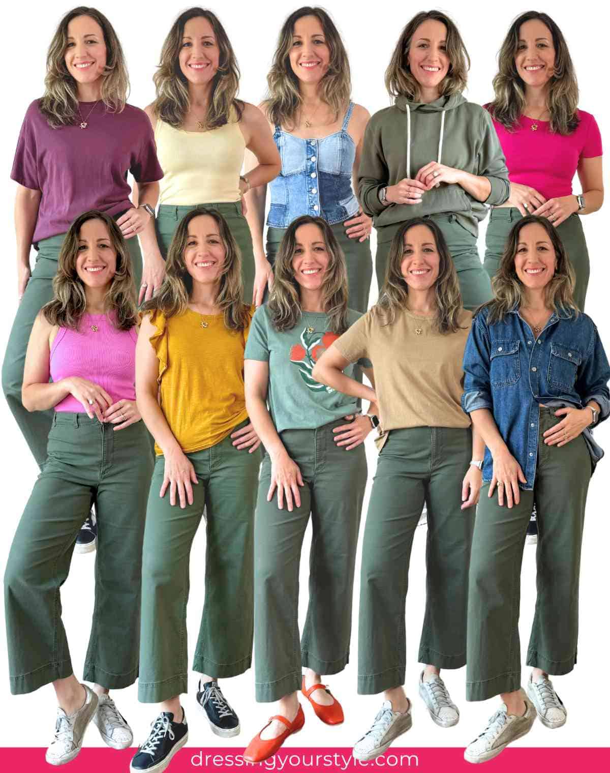
Beyond Colour: Texture, Fit, and Context in Personal Branding
While colour is a crucial element, the success of a personal branding strategy involving green pants also hinges on texture, fit, and context.
- Texture: A smooth, worsted wool green pant conveys formality and professionalism, whereas a linen or corduroy green pant leans towards casual comfort or creative expression. The texture contributes to the perceived quality and formality of your personal brand.
- Fit: A well-tailored fit universally communicates attention to detail, self-respect, and competence. Ill-fitting clothes, regardless of colour, detract from a polished personal brand.
- Context: The environment in which you wear your green pants is paramount. While a vibrant emerald might be perfect for a creative industry pitch, a muted olive is more suitable for a formal board meeting. Understanding your audience and the desired outcome of your interaction should always guide your ultimate choices.
In conclusion, the question “what colour goes with green pants” transcends simple fashion advice. It is an inquiry into intentional visual communication, a design challenge within the realm of personal branding. By understanding the psychology of colour, applying strategic design principles, and considering the nuances of texture, fit, and context, green pants can become a powerful, distinctive component of an individual’s curated personal brand, subtly yet effectively communicating their unique value proposition to the world.
aViewFromTheCave is a participant in the Amazon Services LLC Associates Program, an affiliate advertising program designed to provide a means for sites to earn advertising fees by advertising and linking to Amazon.com. Amazon, the Amazon logo, AmazonSupply, and the AmazonSupply logo are trademarks of Amazon.com, Inc. or its affiliates. As an Amazon Associate we earn affiliate commissions from qualifying purchases.