
In the intricate tapestry of brand strategy and visual identity, every colour choice is a deliberate stroke, imbued with purpose and potential. When blue and purple converge, they do more than merely mix pigments; they forge a new hue that carries a unique set of psychological associations and aesthetic implications crucial for effective marketing and design. Understanding the outcome of this particular chromatic synthesis—and its strategic deployment—is vital for brands aiming to communicate specific values, evoke desired emotions, and establish a memorable presence in the marketplace.
The Chromatic Synthesis: Unpacking Blue and Purple’s Blend
At its core, the question of what colour blue and purple make delves into the principles of subtractive colour mixing, which governs how pigments combine in the physical world of print and design. Unlike additive colour mixing (light), where combining blue and purple light might produce magenta, pigments absorb certain wavelengths of light and reflect others.

The Science of Subtractive Colour Mixing for Branding
In the RYB (Red, Yellow, Blue) colour model, commonly used in art and design, blue is a primary colour. Purple (or violet) is a secondary colour, created by mixing blue and red. When you combine blue with purple, you are essentially adding more blue pigment to a mixture that already contains blue.
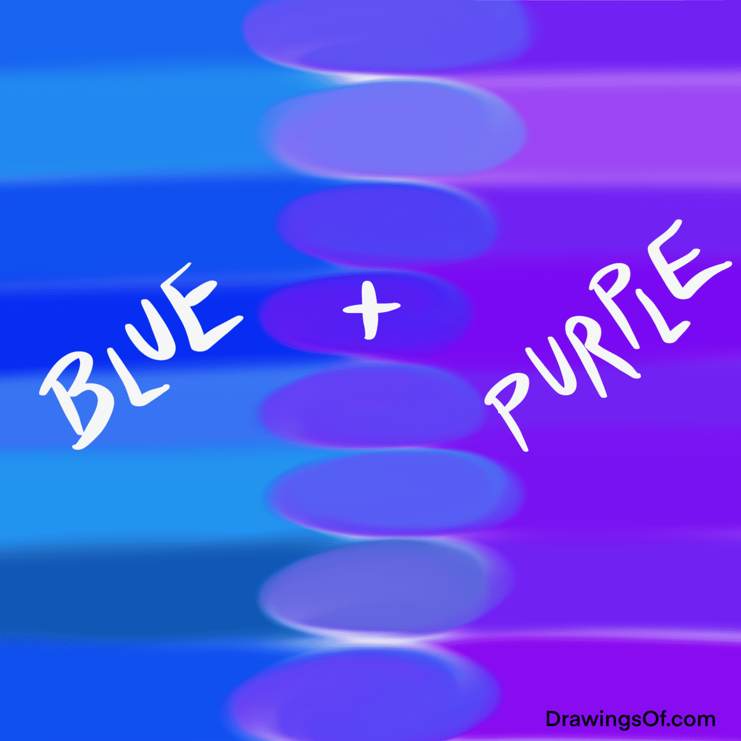
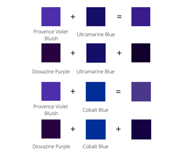
The direct result of mixing blue and purple pigments will typically be a shade that falls somewhere between blue and purple on the colour wheel, specifically leaning towards a blue-violet or indigo hue. The exact shade will depend on the proportions of each colour and their specific undertones. If there’s more blue, the resulting colour will be a deep, dark blue with a hint of purple. If there’s more purple, the outcome will be a richer, more saturated violet with a pronounced blue undertone. This blue-violet spectrum offers a range of sophisticated and often enigmatic colours for brand palettes.
Primary, Secondary, and Tertiary Hues: Where Blue and Purple Stand
- Blue: A primary colour, representing stability, trust, depth.
- Red: A primary colour, representing energy, passion, urgency.
- Purple (Violet): A secondary colour, born from blue and red, embodying creativity, luxury, mystery.
- Blue-Violet/Indigo: A tertiary colour, the direct result of combining blue and purple, marrying the attributes of both parent colours with a distinct character.
This specific tertiary colour—blue-violet—is not merely a darker version of purple or a slightly purplish blue; it stands as a distinct entity with its own psychological resonance. For brands, this distinctiveness is an opportunity to carve out a unique visual niche.
Psychological Impact and Brand Perception of Blue-Violet Hues
Colours are potent psychological triggers, capable of influencing perception, mood, and even purchasing decisions. When blue and purple merge into a blue-violet, the resulting hue inherits and blends the psychological associations of its predecessors, creating a powerful, nuanced message for brand identity.
The Serenity of Blue in Branding
Blue is globally recognised for its association with trust, reliability, calmness, and professionalism. It is often chosen by financial institutions, tech companies, and healthcare providers to convey stability and security. Its cool nature can evoke a sense of peace and order, making it a cornerstone for brands that aim to project authority without aggression.
The Sophistication of Purple in Branding
Purple, a historical symbol of royalty and luxury due to the rarity of its ancient dyes, communicates creativity, imagination, wisdom, and spiritual depth. It’s often embraced by brands seeking to project an air of exclusivity, innovation, or even a touch of magic. It can be perceived as opulent and unconventional, distinguishing a brand from more common colour palettes.
The Blended Message: Authority, Creativity, and Mystique
When blue and purple combine to form a blue-violet or indigo, they create a compound psychological effect. This new hue embodies:
- Authority and Trust with a Creative Edge: It retains blue’s gravitas and dependability but infuses it with purple’s imaginative and sophisticated qualities. This makes it ideal for brands that are innovative yet reliable, established yet forward-thinking.
- Mystique and Depth: Blue-violet hues often carry a sense of mystery and introspection. They are deep, rich colours that invite contemplation, appealing to brands in luxury goods, high-end technology, or services that promise an elevated experience.
- Exclusivity and Sophistication: The unique nature of blue-violet can help a brand stand out, signaling a premium offering or a distinctive approach. It suggests refinement and a keen eye for aesthetics.
This complex emotional profile makes blue-violet an incredibly versatile tool for brand strategists looking to convey a message that is both authoritative and unique, blending the cerebral with the imaginative.
Strategic Application in Brand Identity and Marketing Design
Leveraging blue-violet effectively in brand identity and marketing design requires a deep understanding of its psychological weight and visual versatility. It’s not just about selecting a pretty colour; it’s about crafting a strategic visual narrative that resonates with the target audience.
Industries Where Blue-Violet Thrives
The sophisticated and multifaceted nature of blue-violet makes it particularly well-suited for specific industries:
- Luxury Brands: From high-fashion labels to premium automotive brands, blue-violet can underscore exclusivity, quality, and timeless elegance.
- Technology and Innovation: For companies pushing the boundaries of technology, blue-violet suggests cutting-edge innovation combined with a sense of intelligent design and reliability. It avoids the often stark or overtly playful tones of some tech brands.
- Creative Agencies and Design Studios: These entities thrive on demonstrating imagination and artistic flair. Blue-violet helps convey creativity, professionalism, and a sophisticated aesthetic sensibility.
- Financial Services (Premium Segment): While often dominated by classic blues, a blue-violet can differentiate a premium financial advisor or wealth management firm, suggesting forward-thinking strategies and an exclusive client experience.
- Wellness and Spirituality: Brands in these sectors can use blue-violet to evoke calm, introspection, wisdom, and a touch of the mystical, aligning with their focus on inner peace and personal growth.
Crafting Visual Hierarchy and Emotional Resonance with Blue-Violet
Strategic use of blue-violet involves more than just selecting it as a primary colour. It can be used to:
- Establish a Premium Baseline: As a primary brand colour, it immediately signals sophistication and a premium offering.
- Highlight Key Elements: When used as an accent, blue-violet can draw attention to call-to-action buttons, key product features, or important textual information, making them feel more significant or exclusive.
- Create Depth and Mood: In backgrounds or larger graphical elements, it can create a sense of depth, tranquility, and a sophisticated atmosphere, enhancing the user experience on websites or in print materials.
- Evoke Specific Emotions: Depending on the shade, a brand can lean into the calmer, more trustworthy aspects of blue or the more imaginative, luxurious aspects of purple. A deep indigo might suggest profound authority, while a lighter lavender-blue might evoke gentle sophistication.
Complementary Colours and Palettes for Blue-Violet Dominance
To prevent blue-violet from becoming too overwhelming or somber, it’s crucial to pair it with a well-chosen palette of complementary colours.
- Analogous Colours: Pairing blue-violet with true blues and purples can create a harmonious, serene, and sophisticated palette, ideal for conveying depth and tranquility.
- Monochromatic Schemes: Utilizing various tints, tones, and shades of blue-violet itself can create an elegant and cohesive look, emphasizing refinement.
- Complementary Contrast: Yellow and orange are complementary to blue and purple, respectively. Therefore, a vibrant yellow-orange or a warm gold can provide a striking contrast to blue-violet, making it pop while adding energy and warmth to the brand’s visual identity. This can be particularly effective for accents or calls-to-action.
- Neutral Companions: Greys, silvers, creams, and whites provide excellent backdrops or secondary colours, allowing blue-violet to take center stage without competition, while reinforcing a sense of modernity and cleanliness. Metallic finishes (silver, gold) often pair exceptionally well with blue-violet, enhancing its luxurious feel.
Case Studies and Best Practices for Utilising Blue-Violet
While specific brand names might evoke intellectual property concerns, we can examine archetypal uses and best practices for incorporating blue-violet effectively into branding.
Iconic Brands Leveraging Blue-Violet (Archetypes)
Consider a high-end chocolatier whose packaging often incorporates deep indigo or blue-violet. This choice elevates the product beyond mere confectionery, suggesting an artisanal quality, sophisticated taste, and a luxurious indulgence. The colour helps create an aura of exclusivity that justifies a premium price point and enhances the gifting experience.
Another example might be a cutting-edge software company specializing in data analytics. Instead of the ubiquitous corporate blue, they might opt for a blue-violet logo and brand elements. This communicates their analytical prowess (blue) but also signals their innovative approach and creative problem-solving (purple), differentiating them from competitors who might appear more traditional.
Avoiding Pitfalls: Ensuring Clarity and Brand Differentiation
While blue-violet is powerful, its use must be strategic.
- Avoid Overuse: Too much blue-violet without sufficient contrast or complementary colours can make a brand feel too heavy, overly serious, or even melancholic. Balance is key.
- Ensure Readability: Dark blue-violet backgrounds require lighter text for optimal readability, especially in digital contexts. Font choice and size become even more critical.
- Maintain Consistency: Like any brand colour, blue-violet must be applied consistently across all touchpoints—from logos and websites to physical products and marketing collateral—to build strong brand recognition.
- Consider Cultural Nuances: While blue and purple generally have positive associations in Western cultures, it’s always prudent to consider global audiences and any potential alternative interpretations.
The Evolving Role of Colour in a Digital-First World
In today’s digital landscape, where screen presence is paramount, the nuances of blue-violet take on new significance. Digital displays render colours differently than print, requiring careful consideration of RGB values alongside CMYK. Brands must ensure that their chosen blue-violet maintains its intended emotional impact and visual consistency across all digital platforms, from mobile apps to social media feeds. The colour’s ability to stand out in a cluttered digital space, while retaining its sophisticated appeal, is a testament to its strategic value.
Ultimately, the colour formed by combining blue and purple is far more than just a shade of blue-violet or indigo. It is a strategic asset, a blend of authority and imagination, trust and luxury, that can uniquely position a brand in the minds of its audience. For designers and marketers, understanding this chromatic synergy unlocks a potent tool for crafting distinctive, resonant, and impactful brand identities.
aViewFromTheCave is a participant in the Amazon Services LLC Associates Program, an affiliate advertising program designed to provide a means for sites to earn advertising fees by advertising and linking to Amazon.com. Amazon, the Amazon logo, AmazonSupply, and the AmazonSupply logo are trademarks of Amazon.com, Inc. or its affiliates. As an Amazon Associate we earn affiliate commissions from qualifying purchases.