
Pink, often perceived as a singular hue, is in reality a vast and versatile spectrum of colors, each carrying its own unique connotations and brand potential. For designers and marketers, understanding the fundamental components of pink is not merely an exercise in color theory, but a strategic imperative. The ability to precisely mix and deploy different shades of pink can significantly influence brand perception, evoke specific emotions, and differentiate a brand in a crowded marketplace. This exploration delves into the foundational elements of pink, its psychological impact, and its strategic application in crafting a compelling brand identity.

The Fundamental Science of Pink in Brand Design
At its core, pink is not a primary color. It is, by definition, a tint of red. This fundamental understanding is crucial for anyone working in brand design, as it immediately tells us that red is the primary component. However, the simplicity of “red plus white” belies the complexity of achieving the right pink for a brand.
The Subtlety of Red and White: Primary Mix
The most basic way to create pink is by mixing red with white. White dilutes the intensity of red, reducing its saturation and lightening its value. The proportion of red to white dictates the resulting shade:
- More red, less white: Creates deeper, richer pinks, like fuchsia or magenta, which retain some of red’s boldness and passion.
- Less red, more white: Produces softer, pastel pinks, such as baby pink or blush, often associated with gentleness and subtlety.
This foundational mix is the starting point, but the journey to a brand-specific pink rarely ends here. Understanding this basic principle allows designers to consider the underlying red’s characteristics (e.g., a warm, orange-red versus a cool, blue-red) and how that will inherently influence the pink. A warm red will produce a warmer pink; a cool red, a cooler pink. This nuance is critical when aligning a brand’s color palette with its overall message and target audience.
Understanding Color Theory Basics for Branding
To master pink, one must grasp broader color theory principles. Hue, saturation, and value are the three pillars that define any color, including pink.
- Hue: Refers to the pure color itself (e.g., red, blue, yellow). In pink’s case, the dominant hue is red.
- Saturation (Chroma): Describes the intensity or purity of the color. A highly saturated pink is vivid and bright; a desaturated pink is duller and more muted. For branding, saturation dictates how much a pink “pops” or recedes.
- Value (Lightness/Darkness): Indicates how light or dark a color is. Adding white increases value, creating lighter pinks. Adding black (though sparingly, as it can muddy the color) or a darker complementary color can decrease value, making pinks deeper or more somber.
A brand’s choice of pink is not just about its hue, but its specific saturation and value. A vibrant, high-saturation pink might suit a playful children’s brand, while a desaturated, light pink might be perfect for a luxury skincare line.
Additive vs. Subtractive Color Models for Consistency
The way pink is created also depends on the medium.
- Subtractive Color (CMYK for Print): When mixing physical pigments like paints or inks (e.g., for print materials, packaging), we use the subtractive color model. Here, “pink” is typically achieved by reducing the amount of magenta or by mixing magenta with white. Cyan and yellow, the other primary printing colors, are typically avoided or used in minimal amounts to prevent muddiness unless a specific, complex shade is desired. For precise brand consistency in print, designers often refer to Pantone (PMS) colors, which provide standardized recipes for specific pinks, ensuring uniform output across different printing presses.
- Additive Color (RGB for Digital): On digital screens (websites, apps, social media), colors are created using the additive model, where Red, Green, and Blue light combine. Pink in RGB is primarily achieved by combining a high value of Red with a significant amount of Blue, and often a reduced or zero Green value, allowing for a vast array of subtle variations by adjusting these three light components. For example, a common digital pink might be represented as RGB(255, 192, 203) for a light pink.
Understanding these two models is paramount for maintaining brand color consistency across all touchpoints, from print advertisements to digital banners. A pink that looks vibrant on screen may appear dull in print if not properly converted and managed, leading to a fragmented brand identity.
The Spectrum of Pink: Beyond Basic Blends for Brand Identity
While red and white form the foundation, the true artistry of pink in branding lies in its extensive spectrum. There are hundreds of, if not thousands, of pink variations, each with the potential to convey a distinct message and personality.
Achieving Specific Pink Shades: From Rose to Fuchsia
The initial red + white mix provides a basic pink, but to achieve specific, nuanced shades, designers often introduce other colors or adjust proportions with greater precision.
- Rose Pink: Often achieved by mixing red, a touch of yellow (to warm it), and white. It evokes classic romance, elegance, and natural beauty. Brands aiming for a sophisticated, gentle femininity might choose a rose pink.
- Coral Pink: Features more orange or yellow undertones, moving it closer to peach. It’s vibrant, lively, and warm, often associated with summer, energy, and friendliness. Travel brands or those in beauty products for youthful demographics might leverage coral.
- Fuchsia/Magenta: These are bolder, often purplish-pinks that lean heavily on red with a significant blue component (or a specific magenta pigment). They are energetic, modern, luxurious, and confident. Tech brands or fashion labels looking to make a strong, trendy statement often gravitate towards these powerful pinks.
- Blush Pink: A very light, desaturated, soft pink with significant white. It speaks of softness, delicacy, intimacy, and often luxury. High-end beauty, lingerie, or wellness brands frequently use blush tones.
- Dusty Pink: Muted and sophisticated, often with a hint of grey or brown to reduce saturation. It conveys vintage charm, understated elegance, and a sense of calm. Interior design brands or those with a rustic yet refined aesthetic might find dusty pink appealing.
Each of these shades is not just an aesthetic choice; it’s a strategic decision rooted in the brand’s values, target audience, and desired emotional response.
Incorporating Secondary Colors for Nuance
Beyond red and white, secondary and tertiary colors can be strategically introduced, often in minute quantities, to fine-tune pink’s character.
- A Touch of Blue: Adding a minuscule amount of blue to a red-and-white mix will cool down the pink, pushing it towards purplish tones. This can make the pink feel more sophisticated, tranquil, or even mysterious, moving it away from the purely warm, passionate red base. Brands seeking an elegant or slightly ethereal feel might experiment with cooler pinks.
- A Touch of Yellow/Orange: Conversely, adding a tiny amount of yellow or orange will warm up the pink, making it feel more vibrant, friendly, or playful. This shifts the pink towards peach or coral, evoking warmth and approachability. Brands focused on joy, youthfulness, or tropical themes often benefit from warmer pinks.
- A Hint of Grey/Black: Introducing a small amount of grey or black (with extreme caution, as too much can muddy the color) can deepen a pink, making it more muted, sophisticated, or “dusty.” This technique is employed when a brand wants to convey maturity, understated luxury, or a vintage aesthetic, moving away from bright or saccharine pinks.
These subtle additions allow for immense control over the emotional resonance of a pink, transforming it from a simple color into a powerful brand asset.
The Role of Intensity and Saturation in Brand Perception
The intensity and saturation of pink are paramount in defining its brand voice.
- High-Intensity, Saturated Pinks: These are vibrant and energetic. They demand attention, convey youthfulness, excitement, and modern flair. Brands in fashion, entertainment, or innovative tech often use highly saturated pinks to stand out and communicate dynamism.
- Low-Intensity, Desaturated Pinks: These are softer, calmer, and more subdued. They evoke feelings of tranquility, tenderness, sophistication, and luxury. Brands in wellness, beauty, and premium services often leverage desaturated pinks to create an aura of elegance and gentle care.
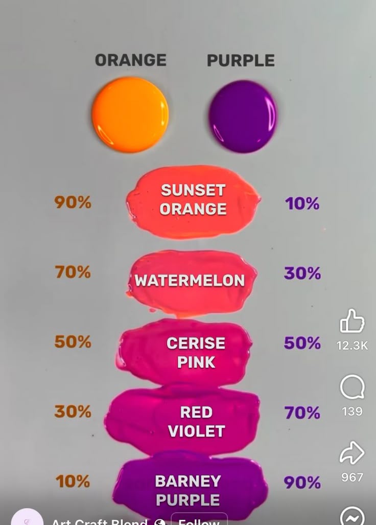
The deliberate manipulation of intensity and saturation allows designers to fine-tune a pink to perfectly align with a brand’s desired personality, ensuring that the color actively supports, rather than detracts from, the overall brand message.
Pink’s Psychological Impact and Brand Associations
Pink is arguably one of the most psychologically charged colors in the spectrum, carrying a rich tapestry of associations that brands must navigate and leverage strategically.
Common Perceptions: Femininity, Playfulness, Sweetness
Historically and culturally, pink has been strongly associated with femininity, often linked to softness, tenderness, and nurturing qualities. This association has led many brands targeting women or girls (e.g., cosmetics, children’s toys) to adopt pink extensively. Beyond gender, pink also commonly evokes:
- Playfulness and Youth: Brighter, more vibrant pinks are often used by brands targeting younger demographics or those wanting to project an image of fun, creativity, and lightheartedness.
- Sweetness and Indulgence: Given its ties to candies, desserts, and flowers, pink often implies sweetness, indulgence, and pleasantness. Food brands, bakeries, or luxury lifestyle brands might use pink to evoke these sensory experiences.
- Romance and Affection: Lighter, softer pinks are inherently romantic, associated with love, tenderness, and gentle affection. Brands in the bridal industry, florists, or those selling gifts often utilize these hues.
These deep-seated perceptions provide a powerful shorthand for brands, allowing them to quickly communicate certain values and appeal to specific emotional responses from their audience.
Evolving Meanings: Modern Brands and Gender Neutrality
While traditional associations persist, pink’s meaning is continually evolving. Modern brands are increasingly challenging and redefining its narrative:
- Breaking Gender Stereotypes: Many contemporary brands are deliberately using pink in non-traditional contexts to defy gender stereotypes. For instance, tech companies, financial services, or even traditionally masculine product lines might incorporate pink to signal inclusivity, modernity, and a fresh perspective, moving away from binary color coding. This progressive use of pink can be a strong differentiator.
- Sophistication and Power: Deeper, more sophisticated shades of pink, like magenta or dusty rose, are being employed by luxury and high-fashion brands to convey power, confidence, and cutting-edge style, rather than just softness. This positions pink as a color of strength and forward-thinking elegance.
- Rebellion and Edge: In some subcultures and alternative brands, vibrant, almost neon pinks are used as a symbol of rebellion, punk aesthetics, or counter-culture movements, contrasting sharply with its traditional gentle image.
Brands that understand these evolving meanings can harness pink not just for its inherent appeal but for its capacity to make a statement, challenge norms, and resonate with a diverse, modern audience.
Cultural Nuances of Pink and Global Branding
The perception of pink is not universal; it varies significantly across cultures. While pink largely signifies femininity in Western cultures, its meaning can differ elsewhere:
- Japan: Pink is associated with spring, cherry blossoms, and transient beauty, often embraced by both men and women.
- India: Pink can be associated with hospitality and welcome.
- Certain African cultures: Pink might have no specific traditional gender association or could be seen as an expensive, luxurious dye.
For global brands, a deep understanding of these cultural nuances is vital. A pink that signifies playfulness in one market might be misunderstood or even irrelevant in another. Strategic deployment requires careful research and often localized color palettes to ensure the brand message is consistently and appropriately received across diverse geographical markets.
Strategically Deploying Pink in Your Brand Ecosystem
Integrating pink into a brand’s visual identity requires more than just choosing a pretty shade; it demands a strategic approach that considers every touchpoint.
Logo and Visual Identity: Making a Memorable Mark
The choice of pink for a logo is perhaps its most critical application. A logo’s color is its first and most enduring impression.
- Differentiation: A unique pink can help a brand stand out from competitors, especially in categories saturated with traditional colors. Think of the distinct pinks used by T-Mobile or Lyft – they’re immediately recognizable.
- Brand Personality: The specific shade of pink chosen for a logo should perfectly embody the brand’s core values. A light, airy pink for a meditation app versus a bold, electric pink for a music festival.
- Versatility: The pink in a logo must be versatile enough to work across various platforms and backgrounds, both in print and digital, without losing its impact or legibility.
Marketing Materials and Campaigns: Evoking Emotion
Beyond the logo, pink plays a crucial role in marketing collateral, advertisements, and digital campaigns.
- Emotional Resonance: Pink’s inherent emotional qualities can be leveraged to evoke specific feelings in advertising. A gentle pink background for a product promoting relaxation, or a vibrant pink call-to-action button for an exciting flash sale.
- Targeted Appeal: Marketing campaigns can strategically use different shades of pink to appeal to distinct segments of a target audience, creating personalized visual experiences.
- Contrast and Complement: Pink can be effectively paired with complementary colors (like greens or blues) or contrasting neutrals (greys, blacks) to create dynamic and engaging visual compositions that highlight key messages or products.
Digital vs. Print Consistency: Ensuring Brand Integrity
As previously discussed, the inherent differences between RGB (digital) and CMYK (print) color models pose a significant challenge for brand consistency.
- Color Conversion: Designers must meticulously convert RGB pink values to CMYK for print, often requiring adjustments to maintain visual integrity. Using Pantone Spot Colors for print can guarantee consistency, as they are pre-mixed inks that bypass the CMYK conversion variables.
- Screen Calibration: Acknowledging that screens vary widely in color display, brands should aim for a pink that translates well across a majority of common devices, and prioritize the exact shade for critical assets like logos and key visuals.
- Brand Guidelines: Comprehensive brand guidelines must specify exact color codes (HEX, RGB, CMYK, Pantone) for all approved pink variations, ensuring that any designer or vendor working with the brand can replicate the colors accurately across all mediums.

When Pink Works Best: Target Audience and Brand Message Alignment
The decision to use pink, and which specific pink, must always be rooted in a deep understanding of the brand’s target audience and its overarching message.
- Audience Demographics & Psychographics: Is the target audience youthful or mature? Traditional or progressive? What are their cultural associations with pink?
- Brand Values & Personality: Is the brand playful, luxurious, compassionate, rebellious, or innovative? The chosen pink must authentically reflect these attributes.
- Competitive Landscape: How does the brand’s pink differentiate it from competitors? Does it allow the brand to carve out a unique visual niche?
Ultimately, selecting the right pink is a nuanced art and a precise science. It’s about blending red with white, adjusting for other subtle hues, and calibrating saturation and value, all while keeping the brand’s strategic objectives, psychological impact, and cultural context at the forefront. When executed thoughtfully, pink transforms from a simple color into a powerful, evocative, and unforgettable brand asset.
aViewFromTheCave is a participant in the Amazon Services LLC Associates Program, an affiliate advertising program designed to provide a means for sites to earn advertising fees by advertising and linking to Amazon.com. Amazon, the Amazon logo, AmazonSupply, and the AmazonSupply logo are trademarks of Amazon.com, Inc. or its affiliates. As an Amazon Associate we earn affiliate commissions from qualifying purchases.