
Dark purple, a color rich with history and symbolism, holds significant power in brand identity and design. It evokes a sense of luxury, mystery, creativity, and sophistication, making it a compelling choice for businesses aiming to differentiate themselves in a crowded marketplace. However, harnessing its full potential requires a thoughtful understanding of how it interacts with other hues. Selecting the right accompanying colors is not merely an aesthetic choice; it’s a strategic decision that shapes perception, influences audience engagement, and reinforces brand messaging.
The Psychology of Dark Purple in Branding
Before diving into specific color pairings, it’s crucial to grasp the psychological underpinnings of dark purple itself. Its deep, resonant tones carry a complex set of associations that, when strategically applied, can powerfully communicate a brand’s core values and aspirations.

Authority and Luxury
Historically associated with royalty and the clergy, purple signifies power, ambition, and wealth. Darker shades amplify this perception, lending an air of opulence and exclusivity. Brands that utilize dark purple often aim to position themselves at the premium end of their market, appealing to a discerning clientele that values quality, prestige, and a touch of the extraordinary. This makes it ideal for luxury goods, high-end services, and sophisticated corporate identities.
Creativity and Mysticism
Beyond its regal connotations, dark purple also taps into themes of imagination, introspection, and spirituality. It’s often linked with creativity, artistic expression, and abstract thought. Brands in creative industries, wellness, or those promoting innovation might use dark purple to signal their forward-thinking nature, their depth of insight, or their commitment to fostering unique experiences. It suggests a brand that is not just functional but also inspiring and thought-provoking.
Target Audience Considerations
The perception of dark purple can vary across demographics and cultures. While universally conveying a sense of richness, its specific emotional resonance might shift. For instance, a younger, trend-conscious audience might perceive it as edgy and fashionable, while an older, more traditional demographic might associate it more directly with luxury and heritage. Understanding your target audience’s psychological response to color is paramount in crafting an effective brand palette that resonates authentically.
Foundational Color Theory for Dark Purple Palettes
The success of any color palette hinges on applying fundamental color theory. For dark purple, this means exploring complementary, analogous, triadic, and monochromatic schemes to achieve specific visual and emotional effects.
Complementary Colors: Yellow and Gold Tones
On the traditional color wheel, yellow sits directly opposite purple. This makes various shades of yellow, from bright lemon to deep gold, the primary complementary colors for dark purple. This pairing creates a high-contrast, vibrant, and energetic dynamic.
- Gold: For brands aiming for ultimate luxury and sophistication, pairing dark purple with rich gold accents is unparalleled. Gold adds a touch of metallic sheen and reinforces the sense of opulence and prestige. Think high-end jewelry brands, premium spirits, or exclusive event branding.
- Mustard Yellow: A more muted, earthy yellow can provide a sophisticated contrast without the overt extravagance of gold. This combination can feel more grounded, artistic, or vintage, suitable for creative agencies, artisanal products, or lifestyle brands seeking a unique, warm aesthetic.
- Pale Yellow/Cream: Lighter yellows or creamy off-whites can act as a gentle counterpoint, offering warmth and readability. This pairing can soften dark purple’s intensity, making it more approachable while retaining its inherent elegance, ideal for packaging or user interfaces where clarity is key.
Analogous Colors: Blues and Pinks
Analogous colors are those that sit next to each other on the color wheel, creating harmonious and serene palettes. For dark purple, these include deep blues and rich pinks/magentas.
- Deep Blues: Incorporating navy, indigo, or even a very dark teal alongside dark purple creates a sophisticated and calming gradient. This combination often feels trustworthy, professional, and profound. It’s excellent for corporate branding, financial services, or tech companies seeking to convey stability and innovation.
- Rich Pinks/Magentas: Moving towards the red side, colors like fuchsia, deep rose, or magenta offer a vibrant and creative complement. This pairing can evoke a sense of passion, femininity, or modern artistry. It’s often used by fashion brands, beauty companies, or creative studios looking to convey energy and boldness.
- Teal/Emerald Green: While technically a bit further on the color wheel, dark purples also pair beautifully with deep jewel-toned greens. This combination feels natural, luxurious, and often mystical, reminiscent of deep forests or precious stones. It’s fantastic for wellness brands, eco-luxury products, or brands focused on natural beauty.
Triadic and Tetradic Schemes: Dynamic Balance
Triadic schemes involve three colors equally spaced on the color wheel. For dark purple, this often brings in shades of green and orange. Tetradic schemes use four colors. These create more complex, vibrant, and often playful palettes that require careful balancing to avoid visual clutter.
- Triadic (Purple, Green, Orange): A sophisticated approach might involve a deep forest green and a burnt orange or rust color. This scheme can be very rich and earthy, suitable for brands that want to convey depth, tradition, or a connection to nature with a creative twist.
- Tetradic (Purple, Yellow, Blue-Green, Red-Orange): This is the most complex. A brand might use dark purple as dominant, a golden yellow as secondary, and then carefully introduce hints of teal and coral for accents. This requires a professional designer’s touch to ensure harmony, but it can result in incredibly dynamic and memorable brand identities, often seen in disruptive tech or highly creative ventures.
Monochromatic Depth: Subtle Sophistication
A monochromatic palette uses varying shades, tints, and tones of a single color. For dark purple, this means exploring lavenders, lilacs, plums, and nearly-black purples. This approach creates an inherently sophisticated, unified, and tranquil aesthetic.
- Subtle Elegance: By pairing dark purple with lighter shades of purple and incorporating whites or very light grays for contrast, a brand can achieve a refined and elegant look. This works well for personal branding, high-end fashion, or luxury services where understatement speaks volumes.
- Gradient Flow: Using a gradient of purples can create a sense of depth and fluidity, often seen in digital interfaces, abstract art, or brands wanting to convey transformation and subtlety.
Crafting Brand Identity with Dark Purple
The chosen color palette must be consistently applied across all brand touchpoints to build a cohesive and recognizable identity. Dark purple and its companion colors become integral to the brand’s visual language.
Logo Design and Primary Palettes
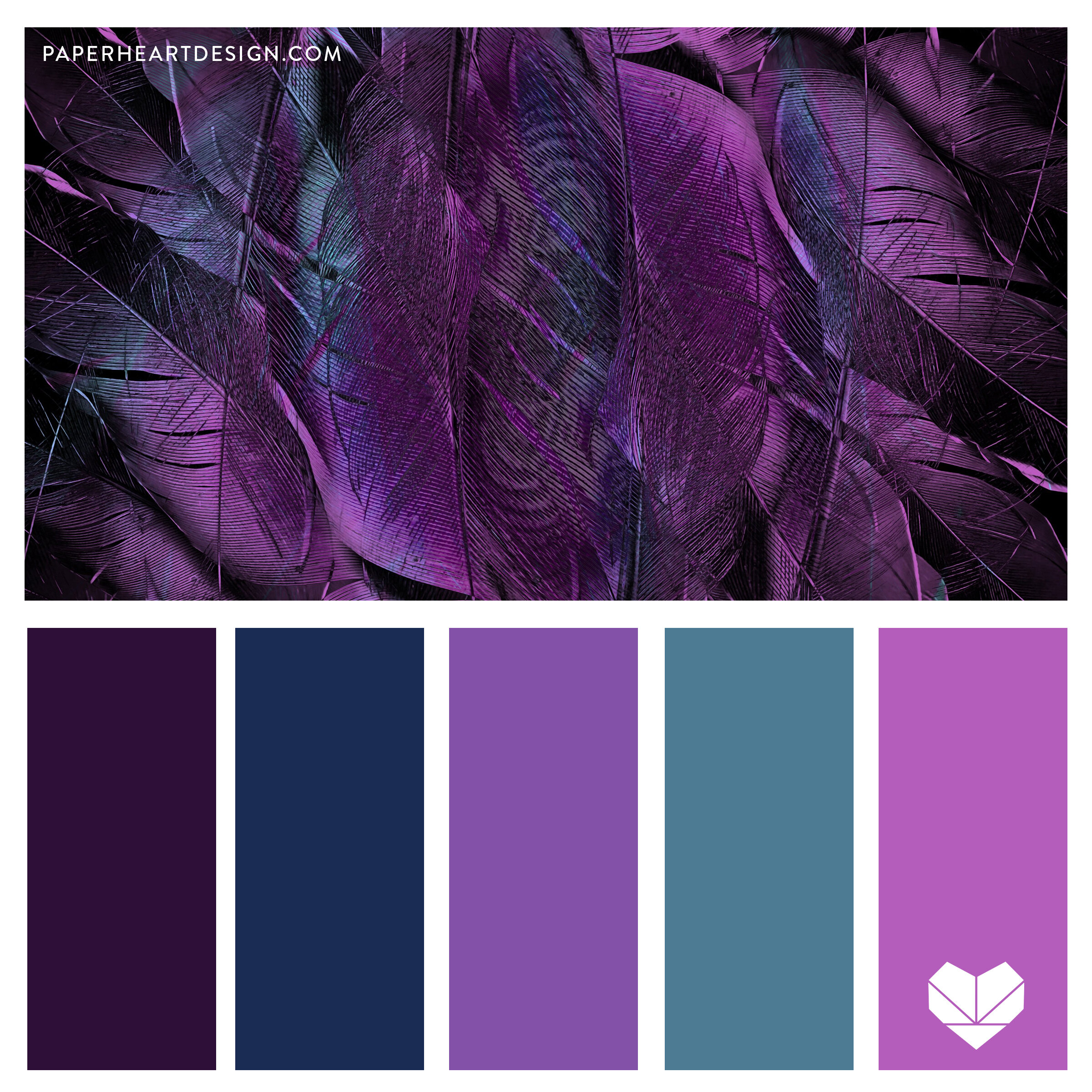
The logo is often the first visual encounter with a brand. Dark purple can serve as the primary color, conveying the brand’s core essence. Its accompanying colors should be carefully selected for secondary elements, text, or accents. A strong logo in dark purple might be paired with a metallic gold mark for a luxury brand, or a crisp white font for a minimalist tech company. The primary palette established here will guide all future design decisions.
Website and Digital Presence
On a website, dark purple can dominate backgrounds, hero sections, or navigational elements to create an immersive and premium experience. Contrast is crucial for readability, so complementary lighter colors (whites, creams, pale yellows) should be used for text and interactive elements. Analogous blues or vibrant pinks can be utilized for call-to-action buttons or accent graphics to draw attention without clashing. The digital realm also allows for subtle gradients and animations that can further enhance the depth and sophistication of a dark purple palette.
Marketing Collateral and Packaging
Physical marketing materials—brochures, business cards, merchandise, and product packaging—offer tactile opportunities to reinforce the brand’s color story. Dark purple packaging often implies exclusivity and quality. Imagine a dark purple box with gold foil lettering, or a product label featuring a contrasting teal detail. The texture, finish (matte vs. gloss), and printing techniques (embossing, spot UV) can all be used to further elevate the chosen dark purple palette, adding to the perceived value of the brand.
Interior Design and Experiential Branding
For brick-and-mortar establishments, retail spaces, or corporate offices, extending the dark purple palette into interior design creates an all-encompassing brand experience. Dark purple walls, furniture accents, or lighting can set a luxurious and inspiring mood. Paired with natural woods, metallic fixtures, or contrasting fabrics in complementary colors, it can create environments that are both memorable and deeply resonant with the brand’s identity. This holistic approach ensures every interaction with the brand, physical or digital, tells a consistent visual story.
Practical Application: Case Studies and Industry Examples
While specific brand names aren’t being cited, consider how different industries might leverage dark purple with varying color partners to achieve distinct brand objectives.
Tech and Innovation Brands
Many forward-thinking tech companies use dark purple, often paired with bright, energetic complements like electric blues, vibrant greens, or even neon accents. This communicates innovation, creativity, and a futuristic outlook. The dark purple provides a sophisticated base, while the brighter colors convey dynamism and cutting-edge technology, suggesting a brand that is both established and disruptive.
Luxury and Lifestyle Brands
Brands in high fashion, fine dining, or exclusive travel frequently employ dark purple with gold, silver, or cream. This combination unequivocally signals opulence, heritage, and uncompromising quality. The aim is to create an aspirational aesthetic that resonates with an elite clientele seeking exclusivity and refined taste. Subtlety and premium finishes are key in these applications.
Creative and Wellness Brands
Art studios, meditation apps, holistic health centers, or boutique agencies often pair dark purple with muted greens, earthy browns, or soft teals. This palette fosters a sense of calm, introspection, and natural harmony, while the purple still speaks to creativity and spiritual depth. It creates an inviting and nurturing atmosphere, perfect for brands focused on personal growth, creativity, or well-being.
Avoiding Common Pitfalls and Ensuring Brand Consistency
While dark purple is a powerful color, its effective use requires careful consideration to avoid pitfalls that could dilute or misrepresent a brand.
Overwhelming the Palette
Dark purple is a strong color. Using too much of it, or pairing it with too many equally dominant colors, can result in a heavy, overwhelming, or visually confusing palette. The key is balance: often, dark purple works best as a primary color, supported by carefully chosen, less dominant secondary and accent colors. Allow it to breathe and make its statement without unnecessary competition.
Accessibility and Readability
When using dark purple for backgrounds, ensure that text and interactive elements have sufficient contrast to meet accessibility guidelines. Light text (white, cream, or a pale, contrasting hue) against dark purple is generally highly readable, but specific color combinations should always be tested, especially for web content, to ensure legibility for all users.
Cultural Nuances of Color
While purple often signifies royalty and luxury in Western cultures, its connotations can vary globally. In some cultures, it may be associated with mourning or spirituality in different ways. Brands operating internationally should research and understand these cultural nuances to ensure their chosen palette resonates positively across all target markets.

The Importance of Brand Guidelines
Once a dark purple palette and its accompanying colors are established, creating comprehensive brand guidelines is crucial. These guidelines should specify exact color codes (CMYK, RGB, Hex, Pantone), usage rules, and examples of correct and incorrect application across various mediums. This ensures consistency across all brand touchpoints, from digital ads to physical signage, reinforcing the brand’s identity and professional image over time.
Mastering the art of pairing colors with dark purple is a strategic advantage for any brand. By understanding its psychological impact, applying sound color theory, and ensuring consistent application, businesses can craft a powerful, memorable, and resonant brand identity that captivates and endures.
aViewFromTheCave is a participant in the Amazon Services LLC Associates Program, an affiliate advertising program designed to provide a means for sites to earn advertising fees by advertising and linking to Amazon.com. Amazon, the Amazon logo, AmazonSupply, and the AmazonSupply logo are trademarks of Amazon.com, Inc. or its affiliates. As an Amazon Associate we earn affiliate commissions from qualifying purchases.