
In the intricate tapestry of brand strategy and corporate identity, color selection is far more than an aesthetic choice; it is a profound psychological tool that shapes perception, evokes emotion, and drives consumer engagement. Peach, with its inherent warmth, softness, and versatility, presents a unique opportunity for brands looking to convey a specific set of values and moods. Understanding which colors harmoniously coexist with peach is critical for crafting a cohesive, impactful, and memorable brand presence across all touchpoints.
The Strategic Power of Peach in Branding
Peach, occupying the spectrum between orange and pink, carries a distinct psychological weight. It’s a color often associated with warmth, friendliness, approachability, and youthful exuberance. Lighter, more pastel shades of peach can evoke a sense of calm, gentleness, and sophistication, while richer, more vibrant hues can suggest vitality, creativity, and a modern edge. For brands, harnessing peach means tapping into these nuanced connotations to build a specific brand personality.

A brand choosing peach as a primary or secondary color often aims to project a welcoming, human-centric image. It can differentiate a brand in sectors typically dominated by starker, cooler tones, injecting a sense of optimism and approachability. However, the true power of peach is unleashed when paired strategically with complementary, analogous, or contrasting colors, each combination telling a different story and appealing to diverse audiences.
Understanding Peach’s Psychological Impact
Peach’s psychological resonance is its most valuable asset in branding. It can be perceived as:
- Warm and Inviting: Ideal for hospitality, food and beverage, or service-oriented brands seeking to create a sense of comfort and welcome.
- Youthful and Playful: Perfect for children’s brands, trendy fashion, or innovative tech companies aiming for a fresh, energetic vibe.
- Gentle and Soothing: Suitable for wellness, beauty, or skincare brands emphasizing natural ingredients and a calming experience.
- Sophisticated and Elegant: When paired with the right accents, deeper peaches can convey luxury and refined taste, especially in fashion, interior design, or high-end lifestyle brands.
- Creative and Optimistic: For artistic ventures, educational platforms, or marketing agencies, peach can signal innovation and positive outlook.
The specific shade of peach is paramount. A desaturated, almost beige-peach will communicate a different message than a vibrant, coral-infused peach. Understanding the core message of the brand is the first step in selecting the precise hue and its accompanying palette.
Mastering Complementary Colors for Brand Impact
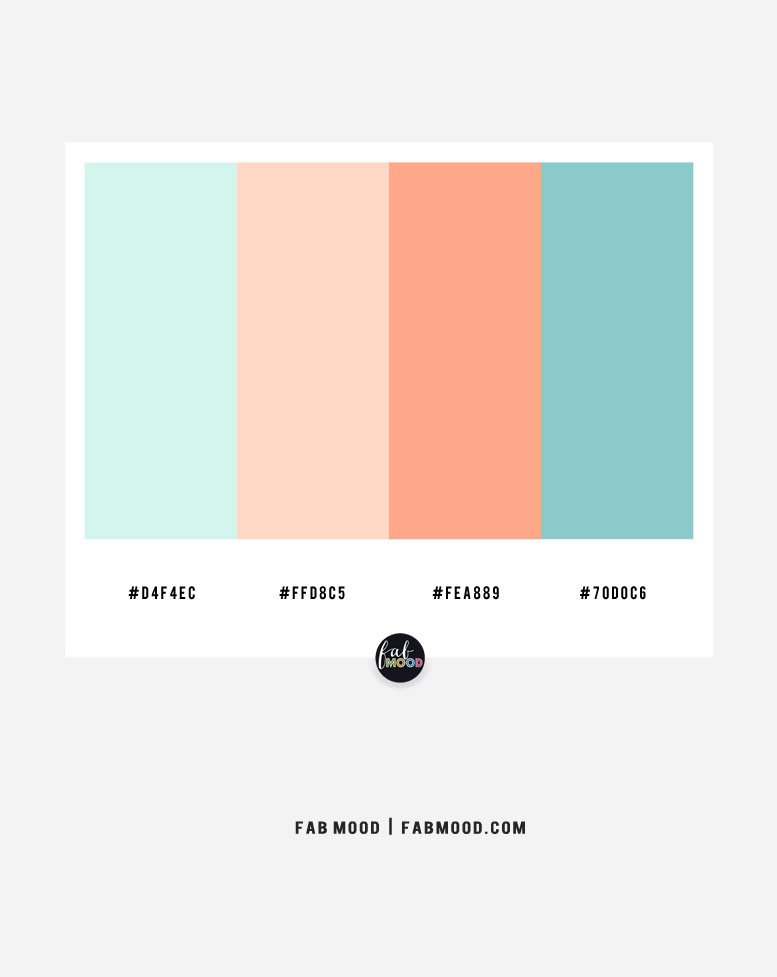
On the color wheel, peach (being a variant of orange/pink) finds its complementary counterparts in the blue-green spectrum. This direct opposition creates a high-contrast, visually stimulating effect that can make a brand pop. Complementary pairings are often used to create dynamic brand identities that demand attention and convey energy.
When peach is paired with true complements like teal, turquoise, or even a deep navy, the contrast is invigorating. A beauty brand might use a soft peach for its product and a rich teal for its packaging to signify both natural beauty and sophisticated design. A tech company could leverage a vibrant peach for its user interface elements against a cool blue background to convey innovation and user-friendliness. The key is to balance the intensity to avoid visual clash, ensuring that one color dominates while the other acts as an accent or anchor.
Classic Pairings: Elevating Peach with Neutrals
Neutrals are the unsung heroes of any color palette, providing balance, sophistication, and a timeless foundation. When it comes to peach, neutrals like white, cream, beige, various shades of grey, and even charcoal black, serve to elevate its qualities without competing for attention.
- Peach and White/Cream: This classic combination is synonymous with freshness, purity, and minimalism. It’s a clean slate that allows peach to shine, conveying elegance and simplicity. Ideal for wedding brands, high-end fashion, or minimalist beauty lines.
- Peach and Beige/Taupe: These earthier neutrals ground peach, creating a warm, organic, and approachable feel. This pairing is excellent for natural product lines, home decor, or brands emphasizing comfort and authenticity.
- Peach and Grey/Charcoal: Pairing peach with shades of grey introduces a modern, sophisticated, and slightly more serious dimension. A light grey can soften peach, making it feel more contemporary and chic, while a dark charcoal or slate grey provides a strong contrast, lending an air of professionalism and luxury. This works well for corporate branding, luxury goods, or architectural firms seeking a refined yet inviting aesthetic.
These neutral combinations are versatile and provide excellent readability, making them suitable for logos, website backgrounds, typography, and packaging where clarity is paramount.
Dynamic Duos: Bold Combinations for Modern Brands
For brands aiming for a more contemporary, energetic, or avant-garde identity, exploring bolder pairings with peach can yield striking results.
- Peach and Deep Blues (Navy, Indigo): This pairing offers a rich contrast, blending peach’s warmth with blue’s stability and professionalism. It creates a balanced yet powerful aesthetic suitable for corporate brands looking to soften their image, or tech companies wanting to appear approachable without losing credibility.
- Peach and Olive Green/Forest Green: Rooted in nature, this combination evokes an organic, earthy feel. Olive green grounds the playful nature of peach, suggesting sustainability, health, and natural living. Excellent for eco-friendly brands, outdoor apparel, or organic food products.
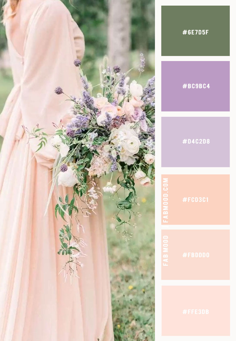
- Peach and Muted Purples/Lavender: These pairings create a dreamy, whimsical, and often feminine aesthetic. Muted purples add a touch of luxury and mystery, while lavender enhances peach’s softness and serenity. Ideal for holistic wellness brands, boutique fashion, or creative services.
- Peach and Gold/Copper: For a touch of opulence and luxury, metallic accents like gold or copper can transform a peach palette. This combination screams high-end, sophistication, and celebration. Perfect for luxury goods, event planning, or premium beauty products.
- Peach and Terracotta/Rust: Moving towards monochromatic but with a twist, pairing peach with deeper, earthier reds and oranges creates a rich, warm, and inviting palette reminiscent of sunsets and natural landscapes. It offers depth and a touch of rustic charm, suitable for artisanal brands or those inspired by natural elements.
These dynamic duos require careful application, often using peach as a base or dominant color, with the bolder hue serving as an accent to guide the eye and emphasize key brand elements.
Analogous Harmony: Subtle Sophistication with Peach
Analogous color schemes involve using colors that are next to each other on the color wheel. For peach, this typically means incorporating shades of pink, orange, and even light yellow. This approach creates a harmonious, low-contrast, and visually soothing palette, perfect for brands seeking a gentle, cohesive, and sophisticated look.
- Peach and Pink: This combination is inherently soft, feminine, and often perceived as romantic or youthful. It’s excellent for beauty, fashion, confectionery, or lifestyle brands that want to convey warmth, tenderness, and charm. Varying the intensity, from blush pinks to deeper fuchsias, can add complexity without disrupting the harmony.
- Peach and Orange: Leaning into the warmer side, pairing peach with softer oranges creates an energetic yet approachable palette. This evokes warmth, creativity, and enthusiasm, making it suitable for brands in entertainment, hospitality, or any sector aiming to project a vibrant and friendly image.
- Peach, Pink, and Light Yellow: Expanding the analogous scheme to include a light, warm yellow adds another layer of brightness and optimism. This triadic analogous scheme is reminiscent of sunrises or tropical fruits, bringing a fresh, lively, and optimistic energy to brands in travel, wellness, or food.
Analogous palettes are superb for creating gradients, subtle branding elements, and cohesive visual narratives that flow smoothly without harsh breaks. They are particularly effective when a brand wants to communicate softness, accessibility, or a natural progression of ideas.
Triadic & Tetradic Schemes: Complex Palettes for Rich Narratives
For brands with multifaceted identities or those needing to convey a rich, dynamic story, triadic and tetradic color schemes involving peach can be incredibly powerful. These advanced palettes offer more complexity and visual interest but require a sophisticated understanding of balance and proportion.
- Triadic Schemes: A triadic palette consists of three colors evenly spaced on the color wheel. For peach (which sits between red-orange and red-pink), a triadic approach might involve a cool blue-green and a reddish-purple. For example, a brand could use peach as its primary warm tone, accent it with a muted teal for innovation, and introduce a hint of lavender or plum for luxury or creativity. This creates a vibrant, balanced, and stimulating visual experience, ideal for lifestyle brands, creative agencies, or educational platforms that need to convey diversity and depth.
- Tetradic (Rectangular/Square) Schemes: These schemes use four colors, either in two complementary pairs (rectangular) or four colors equally spaced (square). While challenging to execute, a well-balanced tetradic scheme provides maximum richness and variety. A peach-centric tetrad could involve peach, a contrasting blue-green, a complementing red-violet, and a harmonizing yellow-orange. Such palettes are excellent for large corporations with diverse product lines, editorial designs, or brands looking to tell a comprehensive story across multiple segments. The key here is to designate one dominant color (often peach), with others acting as supporting roles or accents to maintain coherence and prevent visual clutter.
These complex schemes are not for the faint of heart but, when masterfully applied, can create truly distinctive and memorable brand identities that resonate deeply with specific target demographics.
Application Across Brand Touchpoints
The chosen peach color palette must be consistently applied across all brand touchpoints to build strong brand recognition and reinforce its intended message.
- Logo Design: The core of the brand’s visual identity, where the primary peach hue and its key companions should be established.
- Website and Digital Interfaces: Color choice impacts user experience. Peach can be used for calls-to-action, background accents, or interactive elements, while complementary colors might define navigation or section breaks.
- Packaging: Crucial for physical products, where the palette evokes the product’s quality, benefits, and brand personality on the shelf.
- Social Media Graphics: Consistency across platforms ensures immediate brand recognition in a crowded digital space.
- Marketing Materials: Brochures, advertisements, and campaigns must align with the palette to maintain a unified brand voice.
- Interior Design (Retail/Office Spaces): For physical locations, the color scheme extends the brand experience into a tangible environment, using peach and its companions in furnishings, wall colors, or decorative elements to create the desired atmosphere.
Ultimately, the best colors to go with peach are those that align with the brand’s core values, target audience, and strategic objectives. Whether aiming for soft elegance, vibrant energy, or sophisticated modernity, peach offers a versatile foundation upon which to build a compelling and enduring brand narrative. The careful selection and consistent application of its companion colors will determine the depth of its impact and its ability to connect with consumers on an emotional level.
aViewFromTheCave is a participant in the Amazon Services LLC Associates Program, an affiliate advertising program designed to provide a means for sites to earn advertising fees by advertising and linking to Amazon.com. Amazon, the Amazon logo, AmazonSupply, and the AmazonSupply logo are trademarks of Amazon.com, Inc. or its affiliates. As an Amazon Associate we earn affiliate commissions from qualifying purchases.