
In the intricate world of brand perception and visual communication, every element, no matter how subtle, contributes to the overall message conveyed. Color, a fundamental component of design, wields an extraordinary power to influence how objects, individuals, and even entire organizations are perceived. The question “what color makes you look thinner?” extends far beyond personal wardrobe choices; it delves into the core principles of visual psychology and optical illusion, offering profound insights for personal branding, corporate identity, marketing, and design strategy. Understanding how specific hues manipulate perception of size, depth, and form can be a transformative asset in crafting a desired brand image – whether that image is one of sleek efficiency, premium compactness, or refined elegance.
The Psychology of Perception: How Color Influences Form and Volume
The human eye and brain are constantly interpreting visual stimuli, creating a subjective reality shaped by light, shadow, and color. When we talk about a color making something “look thinner,” we are essentially discussing its ability to create an optical illusion that reduces perceived volume or expands perceived length. This phenomenon is rooted in the physics of light and the psychology of vision.
Understanding Light Absorption and Reflection
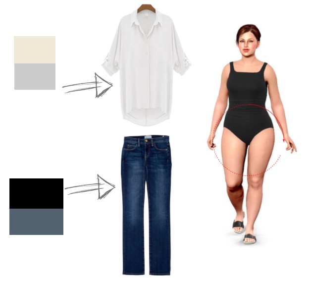
Darker colors, by their very nature, absorb more light and reflect less. When light hits a dark surface, a significant portion of it is absorbed, causing the object to appear to recede and diminish in size. This optical effect makes dark objects seem smaller, more compact, and visually less imposing. Conversely, lighter colors reflect more light, scattering it across their surface. This reflection makes objects appear to expand, come forward, and occupy more visual space. Think of a black hole absorbing light versus a white cloud reflecting it; the former appears to draw in, the latter to spread out. This principle is foundational to understanding how color can visually “trim” perceived dimensions. A continuous, unbroken expanse of a dark color creates an uninterrupted visual line, which further enhances the slimming or elongating effect by minimizing visual interruptions that might otherwise broaden the perception of an object or figure.
The Illusion of Depth and Dimension
Beyond simple absorption and reflection, colors interact to create illusions of depth and dimension. Strategic use of color can carve out contours, create shadows where none physically exist, or smooth over existing ones. For instance, a dark central panel flanked by lighter shades can create an illusion of depth, making the central object appear narrower and more defined. Similarly, a monochromatic dark palette applied to a three-dimensional object or a two-dimensional design can make it appear less voluminous. This is because the lack of visual distinction within a single, dark color field allows the eye to perceive a continuous, unbroken surface, minimizing the perception of outward expansion. The absence of strong contrasts within the form itself contributes to a more streamlined and less bulky appearance, whether it’s an individual’s silhouette or a product’s packaging.
Psychological Associations with Color
While optical effects are primary, the psychological associations attached to colors also play a significant role in shaping perception. Black, for example, is not only optically slimming but also carries connotations of sophistication, power, elegance, and seriousness. Navy blue projects trustworthiness, professionalism, and depth. Charcoal grey suggests stability and modernity. These psychological underpinnings can reinforce the visual message of sleekness or efficiency. When a brand chooses dark, “slimming” colors, it’s not just altering perceived size; it’s also tapping into an established lexicon of meanings that can elevate brand perception, suggesting quality, precision, and a refined aesthetic. The choice of color, therefore, communicates more than just visual characteristics; it imbues the subject with an aura of specific attributes that align with the brand’s desired persona.
Strategic Color Application in Personal Branding and Professional Presentation
Applying these principles to personal branding and professional presentation involves conscious choices in attire and overall visual identity. The aim is to leverage color to project an image of authority, efficiency, and refined aesthetic – often correlating with the perception of a streamlined, “thinner” or more compact form.
The Power of Monochromatic and Dark Palettes
For individuals looking to project an image of sleekness and authority, monochromatic dark palettes are invaluable. Black, navy blue, charcoal gray, deep browns, and rich jewel tones like forest green or burgundy are perennial favorites. When an individual wears a single, dark color from head to toe, it creates an unbroken vertical line. This continuous visual flow prevents the eye from stopping at different color breaks, which can otherwise create horizontal divisions and make the body appear wider or shorter. The uninterrupted dark expanse elongates the silhouette, making the wearer appear taller and, by extension, thinner. This strategy is widely adopted by professionals who want to convey confidence and competence, as it provides a minimalist yet powerful visual statement that minimizes distraction and maximizes impact.
Leveraging Contrast and Accent Colors Wisely
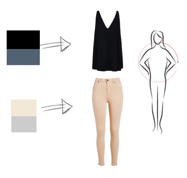
While dark and monochromatic schemes are effective, strategic use of contrast and accent colors can further enhance the desired effect. The key is to use them in a way that guides the eye and sculpts the form, rather than broadens it. For instance, wearing a dark outer layer (like a blazer or cardigan) over a slightly lighter, but still muted, inner layer can create a vertical strip of contrasting color down the center. This “column of color” effect draws the eye inward and upward, reinforcing the elongating and narrowing illusion. Similarly, using a small, strategically placed accent color – perhaps a tie, a scarf, or a piece of jewelry – can draw attention to a specific area (like the face) while allowing the main dark color to maintain its slimming effect. The crucial aspect is to ensure that accent colors do not break up the primary vertical line or add visual bulk to areas where a slimmer appearance is desired.
Fabric and Texture’s Role in Visual Perception
The interplay between color, fabric, and texture is critical. A dark, matte fabric, for instance, will absorb light more uniformly than a dark, shiny fabric. Shiny fabrics reflect light unevenly, potentially highlighting curves and adding perceived volume. Structured fabrics, which hold their shape, can create cleaner, more defined lines that contribute to a streamlined look, especially when paired with dark colors. Conversely, overly clingy or overly voluminous fabrics, even in dark colors, can work against the slimming effect by either emphasizing perceived “bulges” or adding unnecessary visual weight. Therefore, when selecting attire for professional or personal branding purposes, the choice of fabric texture and drape must be considered in conjunction with color to achieve the optimal visual outcome of sleekness and refinement.
Beyond Clothing: Applying Perceptual Strategies to Digital and Corporate Branding
The principles guiding how color makes something “look thinner” extend far beyond fashion, offering powerful tools for designers and marketers in the digital and corporate realms. Here, “thinner” translates to perceptions of sleekness, efficiency, modernity, and premium quality, or the visual compactness of a product or digital interface.

Website Design and User Interface (UI)
In website and user interface design, the strategic use of darker colors can profoundly impact user perception and experience. Dark themes or backgrounds are popular not only for their aesthetic appeal but also for their functional benefits. A dark background can make content (text, images, interactive elements) stand out more sharply, creating a sense of focus and reducing visual clutter. This can contribute to a perception of a “lighter” or less “heavy” interface in terms of information load, even if the actual content is dense. Furthermore, dark UI elements can make a digital product or application appear more sophisticated, modern, and premium – qualities often associated with a sleek, minimalist aesthetic. By making surrounding elements recede, dark colors can guide the user’s eye and create a streamlined navigation experience.
Product Packaging and Presentation
For physical products, packaging color plays a pivotal role in influencing perceived size, weight, and value. Using darker colors for product packaging, especially black, deep blues, or charcoal grays, can make a product appear more compact, denser, and often more luxurious. A dark package often suggests a premium product, subtly communicating exclusivity and high quality, much like a dark suit conveys professionalism. It can visually reduce the perceived bulk of a larger item or enhance the sleekness of a smaller one. This strategy is frequently employed in luxury goods, electronics, and cosmetics, where the aim is to convey sophistication and a refined aesthetic that transcends mere functionality. The visual “thinning” or “compacting” of a product through dark packaging can elevate its status in the consumer’s mind.
Marketing Collateral and Visual Communications
From logos and brochures to presentations and advertisements, the color choices for marketing collateral heavily influence brand perception. Brands aiming to project an image of efficiency, precision, or cutting-edge modernity often gravitate towards streamlined designs that incorporate darker or minimalist color palettes. A logo that utilizes a sleek, dark typeface on a lighter background, or a corporate brochure dominated by deep, muted tones, can communicate professionalism and a focus on essential information. This avoids the visual “noise” or “bulk” that can be associated with overly bright, cluttered, or disparate color schemes. The goal is to ensure that all visual communications align to reinforce a cohesive brand identity that suggests streamlined operations, innovative thinking, and an uncluttered, focused approach.
Customizing Your Color Strategy: It’s Not One-Size-Fits-All
While the general principles of color psychology and optics hold true, the application of color strategy for branding is never a one-size-fits-all solution. Its effectiveness hinges on a deep understanding of the brand’s core message, target audience, and the specific context in which it operates.
Understanding Your Brand’s Core Message
For a brand, the goal isn’t literally to “look thinner” but to embody qualities like sleekness, efficiency, precision, modernity, or premium status. Each of these attributes can be visually reinforced by the strategic use of color. A tech startup might use dark blues and greys to communicate innovation and reliability, while a luxury fashion brand might lean into black and metallic accents to project exclusivity and sophistication. The chosen colors must directly align with and amplify the brand’s unique value proposition and its desired position in the market. The “thinness” analogy becomes a metaphor for streamlined operations, clear communication, and a refined aesthetic that resonates with the brand’s ethos.
The Importance of Context and Target Audience
The impact of color is also heavily dependent on context and cultural relevance. A color palette that effectively communicates “sleek and efficient” for a B2B software company might appear sterile or unapproachable for a consumer-facing brand targeting a younger, more vibrant demographic. Cultural associations with colors also vary widely; what signifies elegance in one culture might represent mourning or aggression in another. Therefore, a thorough understanding of the target audience’s psychological responses, cultural backgrounds, and aesthetic preferences is paramount. Brands must research and adapt their color strategies to ensure they resonate positively and accurately with their intended demographic, avoiding misinterpretations that could undermine the desired brand image.
Experimentation and Feedback
Effective color strategy, like all aspects of branding, is an iterative process. It requires ongoing experimentation, analysis, and responsiveness to feedback. A brand might test different color palettes for its website, product packaging, or marketing campaigns and meticulously track metrics related to user engagement, conversion rates, and brand perception. A/B testing can reveal which color schemes evoke the desired responses—whether that’s a perception of increased efficiency, higher quality, or simply more aesthetic appeal. Regularly gathering audience feedback and making data-driven adjustments ensures that the brand’s visual identity remains dynamic, relevant, and optimally aligned with its strategic objectives.
The Holistic Brand Image: Integrating Color with Form and Function
Ultimately, achieving a “thinner” or more streamlined brand image is not solely the work of color; it is the result of a synergistic integration of all design elements. Color is a powerful tool, but its true potential is unlocked when it works in harmony with typography, layout, form, and overall brand consistency.
Synergy with Typography and Layout
The perceived sleekness of a brand is significantly influenced by its typography and layout. A sophisticated color palette paired with a heavy, clunky font or a cluttered layout will negate the slimming effect of the colors. Conversely, an elegant, minimalist typeface and a clean, spacious layout will amplify the impact of strategically chosen dark or muted colors, reinforcing an overall impression of refinement, efficiency, and clarity. The interplay of negative space, font weight, and color creates a cohesive visual language that speaks volumes about a brand’s attention to detail and its commitment to a streamlined aesthetic. Every visual element must contribute to the overarching narrative of the brand.
Consistency Across All Touchpoints
For a brand to effectively communicate its desired image, including that of sleekness, efficiency, or premium quality, consistency across all touchpoints is non-negotiable. The chosen color palette must be uniformly applied across every brand asset—from the logo and website to product packaging, social media presence, and physical storefronts or office spaces. Inconsistent application of color can dilute the brand message, confuse the audience, and undermine the carefully constructed perception. Maintaining a cohesive visual identity ensures that every interaction a customer has with the brand reinforces the desired qualities, building strong brand recognition and solidifying the perception of a well-defined, modern, and efficient entity. The deliberate application of color, integrated with a comprehensive visual strategy, is how brands truly sculpt their identity in the mind’s eye of their audience.
aViewFromTheCave is a participant in the Amazon Services LLC Associates Program, an affiliate advertising program designed to provide a means for sites to earn advertising fees by advertising and linking to Amazon.com. Amazon, the Amazon logo, AmazonSupply, and the AmazonSupply logo are trademarks of Amazon.com, Inc. or its affiliates. As an Amazon Associate we earn affiliate commissions from qualifying purchases.