
The seemingly simple question, “what color is sangria?”, unlocks a profound discussion about the intricacies of brand identity, consumer psychology, and the pervasive influence of color in marketing. Sangria, a beloved wine-based punch, is celebrated for its vibrant character, but its visual appeal – its color – is a silent, yet powerful, communicator of its heritage, flavor, and the very lifestyle it represents. For brands operating within the beverage sector and beyond, understanding the nuances of how a product’s color is perceived is not merely an aesthetic choice; it is a fundamental pillar of strategic branding and market positioning.
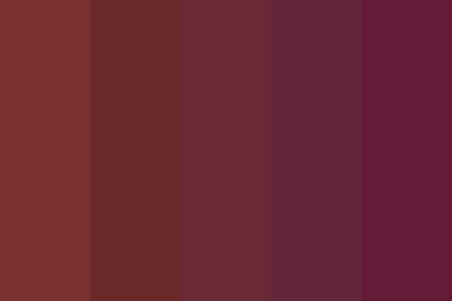
The Chromatic Spectrum of Sangria: More Than Just Red
While commonly associated with a rich, ruby red, the actual color of sangria can span a surprisingly broad spectrum, a variability that itself offers valuable branding lessons. This diversity stems from its traditional preparation methods and the creativity of its makers, creating distinct visual identities that appeal to different segments of the market.
Traditional Hues and Regional Variations
Traditionally, sangria is made with red wine, infusing it with chopped fruit, a sweetener, and sometimes a splash of brandy or orange juice. This classic concoction typically yields a deep, inviting ruby or garnet red, often with amber or purple undertones depending on the wine varietal and the ripeness of the fruit. This “traditional sangria red” is arguably the most recognizable and forms the bedrock of its visual brand. However, the emergence of Sangria Blanca (white sangria), made with white wine, presents an entirely different palette, ranging from pale gold to a delicate straw yellow, sometimes with a faint green tint. Rosé sangria introduces shades of pink, from blush to salmon. Each variation, while still “sangria,” possesses a unique visual signature that brands leverage to target diverse consumer preferences – perhaps a lighter, more refreshing image for white sangria, versus the robust, celebratory feel of the red. The choice of fruits also plays a significant role; berries deepen the red, while citrus brightens yellow and orange notes, offering a natural spectrum for branding exploration.
The Psychology of “Sangria Red”: Evoking Emotion and Association
The classic deep red of sangria is more than just an appealing hue; it’s a potent psychological trigger. In color psychology, red is often associated with passion, energy, warmth, and excitement. For a beverage like sangria, these associations are invaluable. It conjures images of festive gatherings, warm evenings, and convivial shared experiences. Brands utilize this inherent emotional connection to position their red sangrias as the perfect accompaniment to celebrations, social events, and moments of joyful indulgence. This specific shade of red communicates a sense of richness and depth, suggesting a robust flavor profile and a premium experience. In contrast, the lighter, brighter colors of white or rosé sangria can evoke feelings of freshness, lightness, and sophisticated simplicity, targeting consumers seeking a more subtle or versatile drink option. Understanding these deeply ingrained color associations allows brands to craft narratives that resonate profoundly with their target audience, shaping perceptions of taste, quality, and occasion before the product is even tasted.
Color as a Cornerstone of Beverage Branding
In the fiercely competitive beverage market, where countless options vie for consumer attention, color transcends mere aesthetics to become a critical component of brand strategy. The color of a product, especially a liquid, is often the very first point of contact between a brand and its potential customer, acting as a silent salesperson and a powerful differentiator.
First Impressions and Shelf Appeal
Imagine a supermarket aisle brimming with bottles. What draws the eye? Often, it’s the distinctive color of the liquid within. For sangria, a vibrant red bottle immediately signals its identity, often cutting through the noise of other wines and pre-mixed cocktails. This initial visual cue is vital for creating strong shelf appeal. Brands strategically select packaging that enhances and showcases the product’s color, using clear glass bottles, specific label designs, and even lighting to optimize visibility. A deep, rich red suggests quality and tradition, while a bright, clear color might imply freshness and a modern take. This immediate visual communication helps consumers make quick purchase decisions, often subconsciously associating certain colors with preferred taste profiles, origins, or even price points.
Differentiating Through Hue
While “sangria red” is iconic, smart brands understand the power of subtle variations to carve out a unique niche. In a market where many products share a similar color palette, slight shifts in hue, saturation, or brightness can signify a distinct offering. A brand might choose a slightly darker, more opaque red to suggest an aged or more traditional recipe, while another might opt for a lighter, more translucent red to convey a fresher, fruit-forward profile. Similarly, in white sangrias, a brand might emphasize a golden tint for a richer flavor perception or a pale straw for a crisp, light experience. This deliberate manipulation of hue allows brands to differentiate their products not just from competitors but also within their own product lines, guiding consumers to specific taste profiles or ingredient stories. It’s a nuanced dance between meeting consumer expectations of what sangria “should” look like and introducing enough novelty to stand out.
Brand Recognition and Recall
Consistency in color is paramount for building strong brand recognition. Just as a specific logo or typeface becomes synonymous with a brand, so too does its signature color. Think of iconic beverage brands – their colors are instantly recognizable. For sangria brands, maintaining a consistent color presentation across all product batches, marketing materials, and digital platforms reinforces brand identity and strengthens recall. When consumers consistently encounter the same vibrant red or crisp gold associated with a particular sangria brand, that color becomes an indelible part of their brand memory. This consistency fosters trust and familiarity, making it easier for consumers to locate their preferred product and for the brand to build a loyal following. It’s about establishing a visual anchor that consumers can reliably connect with the entire brand experience.
From Drink to Descriptor: “Sangria Color” as a Design Influence
The enduring appeal of sangria’s signature color has allowed it to transcend its beverage origins, evolving into a widely recognized descriptor that influences design trends across various industries. “Sangria color” is no longer just about the drink; it’s a mood, a style, and a specific aesthetic palette.
Cross-Industry Application
The rich, deep red of classic sangria has found its way into fashion, interior design, and even cosmetics. In fashion, “sangria red” signifies warmth, elegance, and a touch of Mediterranean flair, often appearing in autumn and winter collections for apparel, accessories, and footwear. For interior designers, using “sangria-inspired” hues can evoke coziness, sophistication, or a bohemian vibe in living spaces, often seen in accent walls, upholstery, or decorative items. In the beauty industry, the term is used to describe nail polish shades, lipsticks, and eyeshadows that capture that same deep, berry-infused red, often associated with richness and glamour. This widespread adoption across diverse sectors underscores the power of a distinct product color to establish an identity that resonates far beyond its original context, creating a lifestyle association that brands can tap into.

Evoking Mood and Lifestyle
When a fashion designer labels a dress “sangria red,” they are not just describing a color; they are invoking an entire mood and lifestyle. It suggests warmth, sensuality, a touch of exoticism, and an appreciation for leisure and enjoyment – precisely the associations cultivated by the beverage itself. For brands in these diverse industries, using “sangria color” as a reference instantly communicates a specific aesthetic and emotional appeal to their target audience. It bypasses lengthy descriptions and directly taps into existing positive associations. This cross-pollination of color meaning allows brands to borrow and build upon established perceptions, creating a rich tapestry of brand narrative that spans product categories and consumer experiences.
Authenticity vs. Innovation
The ubiquity of “sangria color” presents an interesting challenge for brands: how to maintain authenticity while also innovating. For beverage brands, this means balancing the classic, expected visual of sangria with new flavors or presentations that might naturally alter its hue. Do you stick to the traditional red to maintain brand integrity, or do you embrace a vibrant orange or subtle pink for a new, contemporary variant? In other industries, it means understanding the core essence of what “sangria color” represents and applying it in a way that feels fresh and relevant, rather than merely derivative. Brands must navigate this tension by understanding that while the core color association is powerful, intelligent design and strategic marketing can expand its meaning, allowing for both reverence for tradition and bold steps toward innovation.
Crafting Brand Narratives Through Color
Beyond mere identification, color is a vital tool for storytelling in branding. For sangria, its color is not just indicative of its contents; it’s a narrative device that communicates heritage, ingredients, and the very experience the brand promises.
Storytelling with Pigment
The deep red of a classic sangria bottle can tell a story of sun-drenched Spanish vineyards, ripe summer fruits, and age-old recipes passed down through generations. A lighter, brighter hue might suggest a modern, artisanal blend with fresh, locally sourced ingredients. Brands meticulously choose their product’s color to align with their overarching narrative. Is the brand about tradition and heritage? Then a robust, deep red might be essential. Is it about lightness, health, and contemporary tastes? Then a crisp white or delicate rosé might be preferred. The color choice becomes an immediate visual shorthand for the brand’s origin, philosophy, and target consumer, allowing for a rich, non-verbal dialogue with the market.
Consumer Expectations and Brand Promise
There’s an implicit contract between a brand and its consumers, often initiated by visual cues. If a sangria is marketed as a rich, full-bodied experience, consumers expect a corresponding deep, inviting red color. A pale, watery-looking liquid, even if it tastes excellent, can create a disconnect with the brand promise, leading to disappointment or perceived lack of quality. Conversely, a vibrant, clear white sangria signals freshness and lightness, setting appropriate expectations for its flavor profile. Brands must ensure that their product’s color consistently aligns with their marketing claims and the overall brand experience they are trying to create. This consistency builds trust and reinforces the brand’s credibility in the eyes of the consumer, ensuring that the visual promise matches the actual product experience.
The Digital Hues: Ensuring Consistency Across Platforms
In the modern digital age, the challenge of maintaining color consistency across various platforms is significant. A sangria brand’s vibrant red might appear differently on a mobile screen compared to a high-resolution print ad or a retail display. This can dilute brand identity and confuse consumers. Brands invest heavily in color management strategies, using specific color codes (Pantone, CMYK, RGB, Hex) and digital asset management systems to ensure that their product’s color appears as intended, regardless of the medium. Consistent color presentation across websites, social media, e-commerce platforms, and digital advertising is crucial for reinforcing brand recognition and maintaining a cohesive brand image in an increasingly fragmented digital landscape. This meticulous attention to digital hues ensures that the brand’s visual story remains intact and impactful wherever the consumer encounters it.
The Evolving Palate: Future Trends in Beverage Color and Branding
The beverage industry, including sangria, is constantly evolving, driven by shifting consumer preferences and global trends. These shifts invariably influence how brands approach color, not just in the product itself, but in its overall visual presentation.
Health and Natural Perception
A growing trend toward health and wellness profoundly impacts beverage branding. Consumers are increasingly seeking products perceived as natural, less artificial, and healthier. This translates into a preference for colors that appear more “natural” – think lighter, less saturated hues, or colors derived from actual fruits and botanicals rather than artificial dyes. For sangria, this could mean an increased emphasis on white or rosé varieties, or even red sangrias that boast a more transparent, fruit-infused appearance rather than an artificially deep, opaque red. Brands might highlight natural fruit colors in their packaging and marketing, emphasizing the authenticity of their ingredients.
Sustainability and Ethical Sourcing
As environmental consciousness grows, brands are increasingly using color to communicate their commitment to sustainability and ethical practices. This could manifest in packaging choices, where earthy tones, recycled materials, or transparent designs that showcase natural colors are favored. A brand might choose a more muted, organic palette for its labels and branding to subtly convey a message of eco-friendliness and natural ingredients. The clarity or slight cloudiness of a sangria could even be marketed as a sign of minimal processing, appealing to consumers who value clean labels and ethical sourcing. Color becomes a visual testament to a brand’s corporate social responsibility.

Personalization and Experiential Branding
The future of branding is increasingly personal and experiential. While “what color is sangria?” has a general answer, future trends might explore customizable colors or interactive elements. Imagine sangria brands offering limited-edition color variations based on seasonal fruits, or even packaging that changes color based on temperature, enhancing the drinking experience. Brands could also leverage augmented reality (AR) to allow consumers to “preview” different sangria colors or flavor profiles in a digital space. These innovative approaches to color use can create unique, memorable brand interactions that foster deeper engagement and loyalty, moving beyond static visual appeal to dynamic, personalized experiences.
aViewFromTheCave is a participant in the Amazon Services LLC Associates Program, an affiliate advertising program designed to provide a means for sites to earn advertising fees by advertising and linking to Amazon.com. Amazon, the Amazon logo, AmazonSupply, and the AmazonSupply logo are trademarks of Amazon.com, Inc. or its affiliates. As an Amazon Associate we earn affiliate commissions from qualifying purchases.