
The quest to define “French Blue” is not merely an exercise in color identification; it is an exploration into the nuanced world of brand identity, historical legacy, and the psychological impact of specific hues. In the realm of branding, a color is rarely just a color. It is a powerful non-verbal communicator, a vessel for emotion, heritage, and distinction. French Blue, with its inherent ambiguity and rich associations, serves as a compelling case study for understanding how a color can transcend its visual properties to become a cornerstone of corporate identity and marketing strategy.
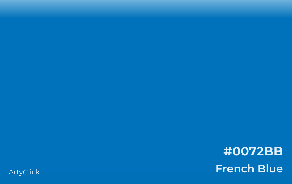
Defining French Blue: More Than Just a Hue
Unlike scientifically precise colors defined by hexadecimal codes or CMYK values, “French Blue” often eludes a singular, universally accepted definition. It exists more as a concept, a collection of related blues that evoke a particular aesthetic—one rooted in European artistry, fashion, and historical significance. To truly grasp its branding potential, one must first appreciate its elusive nature and its journey through history.
The Elusive Nature of French Blue
In common parlance, “French Blue” typically refers to a shade of blue that is vibrant yet sophisticated, often leaning towards a medium to dark intensity with possible undertones of green or purple, depending on the interpretation. It’s frequently described as a deep, rich blue, reminiscent of the uniforms of the French army, the ceramic glazes of Limoges, or the iconic fashion houses that have long defined Parisian chic. The very lack of a strict definition is part of its allure; it allows for flexibility and adaptation, permitting brands to interpret the essence of French Blue rather than adhere to a rigid swatch. This adaptability is a strategic asset, enabling a brand to invoke the spirit of French Blue without being confined to a single, potentially limiting, hue. For a brand, this means the opportunity to craft a signature blue that resonates with historical elegance while maintaining a contemporary edge, distinguishing itself from competitors who might opt for more common or precisely defined shades.
Historical Context and Artistic Interpretation
The roots of French Blue are deeply embedded in European culture and art history. The color gained prominence through various periods, becoming associated with royalty and nobility. The “fleur-de-lis,” a stylized lily that served as the emblem of French kings for centuries, was almost invariably depicted in gold on a blue field. This early association imbued blue with connotations of sovereignty, power, and prestige. Later, during the Rococo and Neoclassical periods, French artists and artisans utilized various rich blues in textiles, ceramics, and paintings, further cementing a certain “French” aesthetic. Think of the deep blues found in Sèvres porcelain or the vibrant blues in the tapestries of Gobelins. These historical uses didn’t specify one single blue but rather a range of deep, often slightly desaturated, yet noble blues. For a brand, tapping into this historical vein means leveraging centuries of accumulated cultural meaning. It’s not just selecting a pretty color; it’s inheriting a legacy of elegance, quality, and timeless appeal, instantly elevating perception and establishing a narrative of heritage and enduring value, even for modern ventures.
The Strategic Impact of French Blue in Branding
In the competitive landscape of modern branding, color is one of the most immediate and impactful elements of visual identity. French Blue, despite its subjective definition, carries a potent strategic punch. Its ability to evoke specific emotions and associations makes it a powerful tool for brands aiming to communicate sophistication, heritage, and trust. Understanding its psychological underpinnings is crucial for its effective deployment.
Evoking Sophistication and Heritage
The primary strategic advantage of French Blue in branding lies in its powerful connotations of sophistication and heritage. When a brand chooses a blue that aligns with the “French Blue” aesthetic, it immediately communicates a sense of refined taste and established tradition. This is particularly valuable for luxury brands, fashion houses, culinary establishments, and high-end service providers looking to differentiate themselves through an aura of timeless elegance rather than fleeting trends. The color suggests a deep appreciation for quality, craftsmanship, and a classic aesthetic that withstands the test of time. It tells a story of origins, often implying a European sensibility that many consumers equate with superior design and product integrity. For instance, a bespoke tailoring brand using French Blue in its logo or packaging implicitly conveys a legacy of sartorial excellence, suggesting attention to detail and a commitment to enduring style that modern, fast-fashion alternatives cannot replicate. This subliminal messaging helps to cultivate a loyal customer base that values substance and history over mere novelty.
Psychological Associations of Blue in Branding
Beyond its specific historical and cultural associations, blue as a primary color carries universal psychological weight that significantly benefits branding efforts. Blue is widely recognized for its ability to convey trustworthiness, stability, reliability, and professionalism. It is often associated with the sky and the ocean, evoking feelings of calm, serenity, and depth. For brands, these are incredibly desirable attributes. When a brand adopts any shade of blue, it instinctively taps into these positive associations. French Blue amplifies these general blue characteristics by adding layers of nuance:
- Trust and Authority: The deep, rich quality of French Blue lends itself well to brands seeking to project authority and unwavering trust, making it suitable for financial institutions, legal firms, or technology companies aiming for reliability.
- Calm and Serenity: While vibrant, French Blue retains a soothing quality, making it effective for brands in wellness, hospitality, or luxury lifestyle, where creating a sense of peace and exclusivity is paramount.
- Intellectualism and Wisdom: The historical connection to academia and art can also position French Blue as a color for brands that emphasize knowledge, expertise, and thoughtful innovation.
By combining these universal psychological effects with the specific connotations of “Frenchness”—elegance, artistry, and heritage—brands can forge a highly distinctive and resonant identity. It enables them to stand out in a crowded marketplace by appealing to both the rational and emotional aspects of consumer decision-making.
Incorporating French Blue into Your Brand Identity
The decision to integrate French Blue into a brand’s visual identity requires careful consideration, moving beyond mere aesthetic preference to a strategic choice that supports the brand’s overall narrative and objectives. Effective implementation involves thoughtful selection of specific shades, harmonious palette creation, and consistent application across all brand touchpoints.
Palettes and Complementary Colors
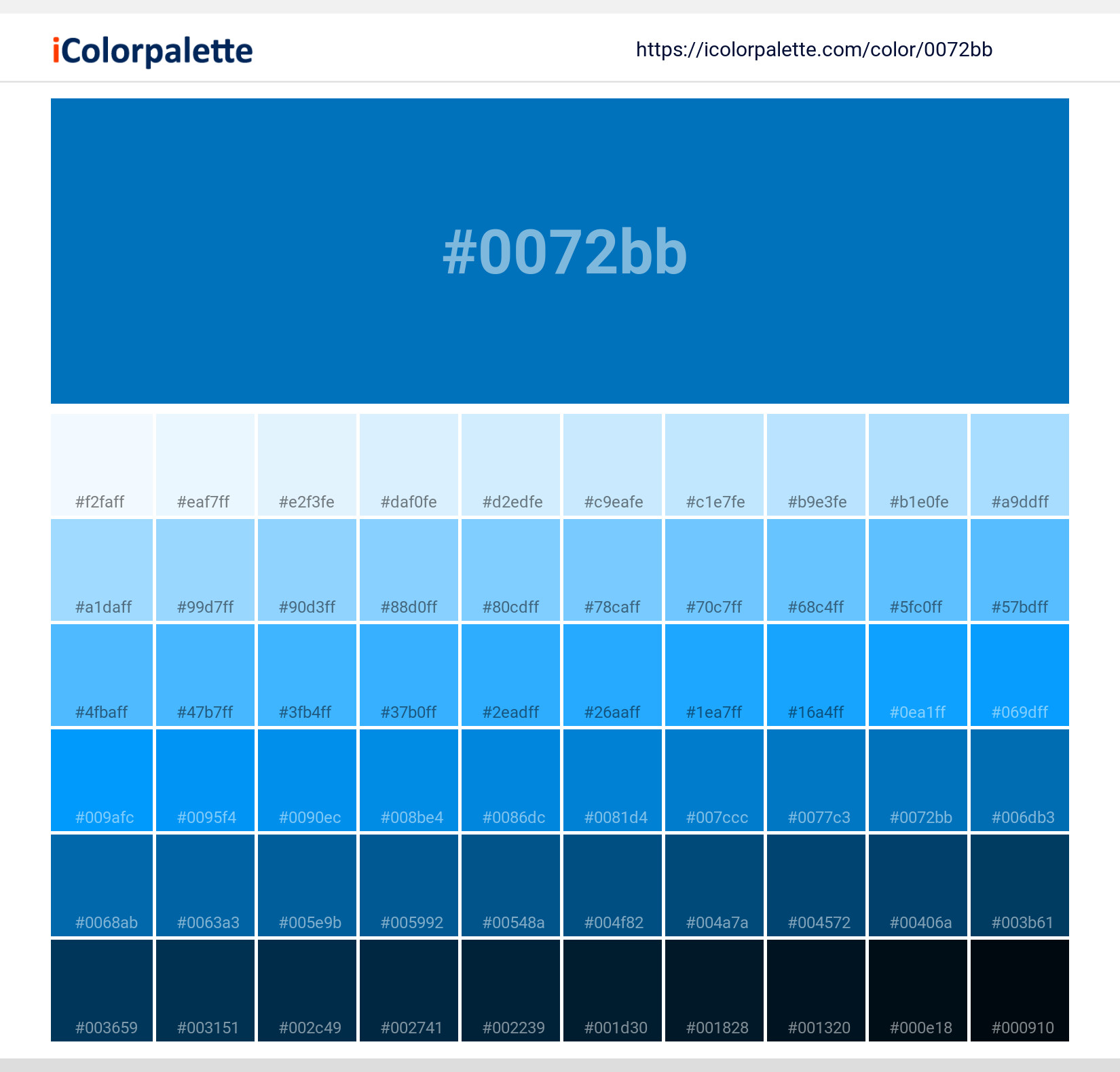
Given the variability of French Blue, a brand must first define its specific French Blue. This involves exploring various shades—from a muted cadet blue to a more vivid royal blue, or even one with slight grey or teal undertones—to find the hue that best embodies the brand’s unique personality and messaging. Once the core French Blue is established, the next critical step is to develop a complementary color palette. French Blue pairs exceptionally well with a range of colors, offering versatility for different brand applications:
- Metallics (Gold, Silver, Copper): For an overtly luxurious and opulent feel, French Blue with gold or silver accents is a classic combination. This evokes a sense of grandeur and premium quality, often seen in high-end jewelry, fashion, or interior design brands. Copper can offer a warmer, more rustic yet still sophisticated contrast.
- Neutrals (Cream, Beige, Grey): To maintain elegance and allow the French Blue to be the hero, pairing it with warm creams, soft beiges, or sophisticated greys creates a balanced, timeless aesthetic. This is ideal for brands emphasizing understated luxury, comfort, or classic design.
- Earthy Tones (Terracotta, Olive Green): For a brand that wants to blend European sophistication with a natural, grounded feel, pairing French Blue with earthy tones can create a harmonious, organic, and inviting palette. This might suit artisanal goods, eco-luxury products, or travel brands.
- Contrast (Coral, Mustard Yellow): For brands seeking a more dynamic or contemporary edge while retaining elegance, strategic pops of contrasting colors like soft coral or muted mustard yellow can add vibrancy without undermining the sophistication of French Blue. This works for creative agencies, modern lifestyle brands, or art-focused businesses.
The chosen palette must be consistent and reinforce the brand’s core values, ensuring that every color interaction contributes to the desired brand perception.
Application Across Brand Touchpoints
Consistency is paramount in brand identity, and French Blue must be thoughtfully applied across every point of interaction a consumer has with the brand. This holistic approach ensures that the color consistently communicates the brand’s message and solidifies its recognition.
- Logo and Wordmark: As the primary visual identifier, the logo is where French Blue can make its strongest statement. A French Blue logo can immediately signal prestige, stability, and elegance.
- Website and Digital Presence: The brand’s website, social media profiles, and digital advertisements should consistently feature the defined French Blue, used strategically in backgrounds, buttons, typography, or accent elements to guide user experience and maintain brand cohesion.
- Packaging: For product-based brands, packaging is a critical touchpoint. French Blue packaging can convey quality, luxury, and care, making the product stand out on shelves and elevating the unboxing experience.
- Print Materials: Business cards, brochures, letterheads, and promotional materials should all adhere to the established French Blue palette, reinforcing professionalism and brand recall.
- Physical Spaces: For retail stores, offices, or hospitality venues, incorporating French Blue into interior design elements—such as wall colors, upholstery, signage, or decorative accents—can extend the brand experience into the physical environment, creating an immersive and memorable atmosphere.
- Uniforms and Merchandise: Employee uniforms or branded merchandise in French Blue can further solidify brand identity, presenting a unified and professional image.
By meticulously integrating French Blue across all these touchpoints, a brand creates a cohesive, memorable, and powerful visual narrative that resonates deeply with its target audience and reinforces its strategic positioning in the market.
French Blue: A Timeless Choice for Modern Brands
In a rapidly evolving global marketplace where trends come and go, the pursuit of timelessness in branding is a strategic imperative for long-term success. French Blue, with its rich history, inherent sophistication, and versatile appeal, positions itself not as a fleeting fad, but as an enduring choice for brands aspiring to create a legacy. Its ability to marry historical grandeur with contemporary relevance makes it an exceptionally valuable asset in brand strategy.
The enduring appeal of French Blue lies in its intrinsic connection to quality, craftsmanship, and a certain savoir-faire that transcends geographical boundaries and cultural shifts. While the specific shade might be open to interpretation, the essence it conveys—elegance, depth, and reliability—remains constant. This makes it particularly attractive to modern brands that aim to cultivate an image of established authority and refined taste, even if they are relatively new entrants to the market. By choosing French Blue, a brand taps into a collective unconscious association with European artistry and luxury, immediately elevating its perceived value and differentiation from competitors who might opt for more generic or trend-driven color schemes.
Moreover, in an era where digital presence is paramount, French Blue translates beautifully across various media. Its depth provides excellent contrast for text and other design elements, ensuring readability and visual impact on screens, while its inherent elegance lends itself to high-quality print and tactile materials. This adaptability means a brand can maintain a consistent and impactful visual identity whether it’s viewed on a smartphone, a billboard, or a bespoke product package.
For brand strategists, understanding “what color is French Blue” extends far beyond merely identifying a hue on a color chart. It is about recognizing a powerful emblem of heritage, sophistication, and psychological resonance that can be meticulously woven into the fabric of a brand’s identity. It represents an opportunity to communicate a story of enduring quality, refined taste, and unwavering trust, making French Blue a truly timeless and strategic choice for brands seeking to make a lasting impression in the modern world.
aViewFromTheCave is a participant in the Amazon Services LLC Associates Program, an affiliate advertising program designed to provide a means for sites to earn advertising fees by advertising and linking to Amazon.com. Amazon, the Amazon logo, AmazonSupply, and the AmazonSupply logo are trademarks of Amazon.com, Inc. or its affiliates. As an Amazon Associate we earn affiliate commissions from qualifying purchases.