
The seemingly simple question, “what color is espresso?”, unravels a complex tapestry woven from sensory perception, meticulous craft, and the strategic underpinnings of brand identity. For the casual observer, espresso might simply be a rich shade of brown. However, for industry professionals, baristas, marketers, and brand strategists, the precise hue, depth, and accompanying visual characteristics of an espresso shot are critical indicators, deeply entwined with quality control, consumer expectations, and the very essence of a coffee brand’s promise. Understanding this nuanced visual spectrum moves beyond mere aesthetics; it delves into the core of how a product communicates its value, consistency, and unique attributes to a discerning market.

The Spectrum of a Signature Beverage: Beyond Brown
Espresso is not a monolith of a single color. Its visual identity is a dynamic range, a spectrum that shifts based on numerous variables, each playing a crucial role in its perceived quality and character. This variability, while inherent to the product, must be managed and leveraged by brands to maintain consistency and communicate desirability.
The Visual Cues of Quality
At its best, a perfectly pulled espresso shot presents a rich, deep reddish-brown color, often likened to mahogany or dark chocolate, crowned by a distinct layer of crema. This color is not accidental; it is the direct result of the meticulous interaction between hot water and finely ground coffee under high pressure, extracting soluble solids and oils. A shot that appears too pale might indicate under-extraction, suggesting a weak flavor profile, while an overly dark, almost black appearance without adequate crema could point to over-extraction, leading to bitterness. These visual cues serve as an immediate quality check for baristas and a subconscious signal for consumers. For a brand, consistently delivering the “correct” visual quality reinforces its commitment to excellence and craft, building trust and loyalty. Deviation from this visual standard can signal inconsistency, eroding brand equity built on perceived quality.
Regional and Roast Variations
The origin of the coffee beans and their roast level profoundly influence the final color of the espresso. Beans from different regions possess unique chemical compositions that react differently during roasting and extraction. For instance, lighter roasts, while still producing a rich brown, might lean towards a more caramel or tawny shade, often reflecting brighter acidity and floral notes. Darker roasts, conversely, yield a deeper, almost black-brown hue, indicative of bolder, more intense flavors and lower acidity. A brand specializing in single-origin espressos might intentionally showcase this diversity in color, educating consumers about the sensory journey. Conversely, a brand focused on a signature blend will strive for a highly consistent color profile, regardless of seasonal bean variations, by expertly blending and roasting to achieve a predictable visual and taste experience, thus reinforcing their specific brand identity.
Espresso’s Hue as a Brand Indicator
In the highly competitive coffee industry, visual identity is paramount. The color of espresso serves as a powerful, non-verbal brand indicator, silently communicating a brand’s ethos, quality standards, and target consumer.
Consistency in Craft and Presentation
For a coffee brand, consistency is king. This extends not only to taste and aroma but profoundly to the visual presentation of every single espresso shot served. Imagine a high-end coffee chain known for its signature espresso blend; if the color varies drastically from one location to another, or even from one shot to the next, it undermines the brand’s promise of a reliable, premium experience. Brands invest heavily in barista training and sophisticated equipment to ensure that the extraction process is standardized, leading to a consistent color and crema across all outlets. This visual uniformity reinforces the brand’s commitment to quality control and meticulous craft, assuring customers that they will receive the same high-quality product every time, irrespective of where or when they purchase it. This consistency builds brand recognition and loyalty.
Marketing the Visual Experience
The visual appeal of espresso is a significant marketing tool. Coffee brands often use high-quality photography and videography in their campaigns, showcasing the rich, inviting color of their espresso. This visual marketing is designed to evoke desire, linking the appealing aesthetics to the promise of an exceptional taste experience. From print advertisements to social media campaigns, the perfect reddish-brown shot with its distinct crema becomes an icon of indulgence and sophistication. Brands will carefully select and present images that highlight the ideal color, associating it with premium ingredients, expert preparation, and a luxurious lifestyle. This strategic visual branding helps to differentiate a product in a crowded market, creating an emotional connection with consumers before they even take their first sip.
The “Crema” Effect: A Visual Hallmark
No discussion about the color of espresso is complete without delving into the crema, the reddish-brown foam that crowns a freshly pulled shot. The crema is not merely an aesthetic embellishment; it is an intrinsic part of espresso’s visual identity, acting as a direct indicator of freshness, proper extraction, and overall quality—a critical component of a brand’s visual promise.
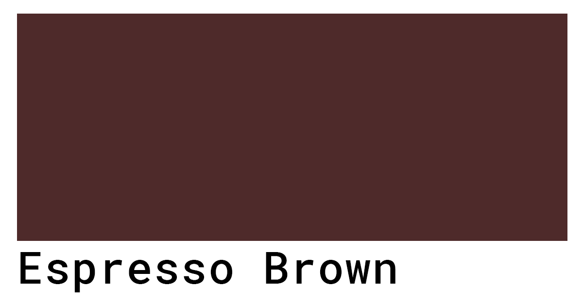
Golden-Brown Perfection: Sign of a Good Shot
Ideal crema is a dense, velvety, reddish-golden-brown foam, often streaked with darker tiger stripes. Its presence signifies that the coffee beans were fresh, ground correctly, and extracted under optimal pressure and temperature. The crema is formed by the emulsification of coffee oils and the trapping of carbon dioxide gases released during the brewing process. A thin, quickly dissipating crema, or one that is too pale or too dark, signals potential issues. Too light a crema might suggest under-extraction or stale beans, leading to a weak, sour taste. A very dark, bubbly crema, conversely, can indicate over-extraction, resulting in a bitter flavor. For premium coffee brands, delivering a shot with perfect crema is a non-negotiable aspect of their offering, underpinning their reputation for excellence and meticulous attention to detail.
Interpreting Crema: A Barista’s Branding Tool
For a skilled barista, reading the crema is an art form and a science, serving as an immediate diagnostic tool. They can instantly assess the quality of the extraction process by observing the color, thickness, and persistence of the crema. This mastery of the craft, visibly demonstrated through the consistent production of visually perfect espresso, becomes an extension of the brand itself. A barista who consistently serves shots with ideal crema reinforces the brand’s commitment to quality at the point of sale. This subtle yet powerful visual cue enhances the customer’s perception of value and expertise, contributing significantly to a positive brand experience and encouraging repeat business. It transforms the barista from a mere server into an artisan, deeply embedded in the brand’s promise of superior quality.
Design and Packaging: Reflecting the Espresso Aesthetic
The distinct color palette of espresso extends far beyond the liquid itself, influencing the broader visual language of coffee brands in their design and packaging choices. This strategic application of color helps to establish corporate identity, differentiate products, and communicate brand values before a single cup is brewed.
Color Palettes in Coffee Branding
Coffee brands often leverage colors that evoke the warmth, richness, and depth of espresso itself. Deep browns, warm ochres, rich reds, and sometimes sophisticated blacks are common choices for branding, logos, and packaging. These colors create an immediate association with coffee, quality, and often, an artisanal approach. A brand might use a deep, earthy brown to convey tradition and natural ingredients, while a touch of metallic gold or copper could signify premium quality and luxury. The choice of these colors is not arbitrary; it’s a deliberate design decision rooted in color psychology and market positioning. They aim to create a visual identity that resonates with the target audience, communicating flavor profiles, brand personality (e.g., rustic, modern, luxurious), and overall brand promise.
Evoking Experience Through Visuals
Packaging design, in particular, plays a crucial role in shaping consumer expectations and experience. A bag of espresso beans or a capsule box will often feature imagery and color schemes that mirror the ideal appearance of a finished espresso shot. This might include photographic representations of perfect crema, or abstract designs that utilize shades of dark brown and gold. The objective is to visually translate the sensory experience of drinking espresso into a tangible product. By consistently employing a refined color palette and evocative imagery, brands can establish a strong visual identity that not only attracts attention on the shelf but also builds anticipation for the taste and aroma awaiting the consumer, reinforcing the brand’s commitment to delivering a holistic, high-quality coffee experience.
The Psychology of Color in Coffee Consumption
The color of espresso, both in the cup and in the surrounding brand environment, taps into fundamental principles of color psychology, subtly influencing consumer perception, mood, and ultimately, purchase decisions.
Warm Tones and Consumer Perception
Warm colors like the reddish-brown of espresso and the associated hues in branding (brown, red, orange, gold) are generally perceived as comforting, inviting, and energizing. Brown is often linked with earthiness, naturalness, and authenticity, qualities highly desirable in premium coffee. Red can signify energy, passion, and stimulation, aligning with coffee’s stimulant properties. These psychological associations are not lost on brand strategists. By emphasizing these warm, inviting tones in their products, marketing materials, and café interiors, coffee brands aim to create an atmosphere of warmth, coziness, and vitality. This fosters a positive emotional connection with the brand, making the act of consuming coffee a more enjoyable and fulfilling experience.
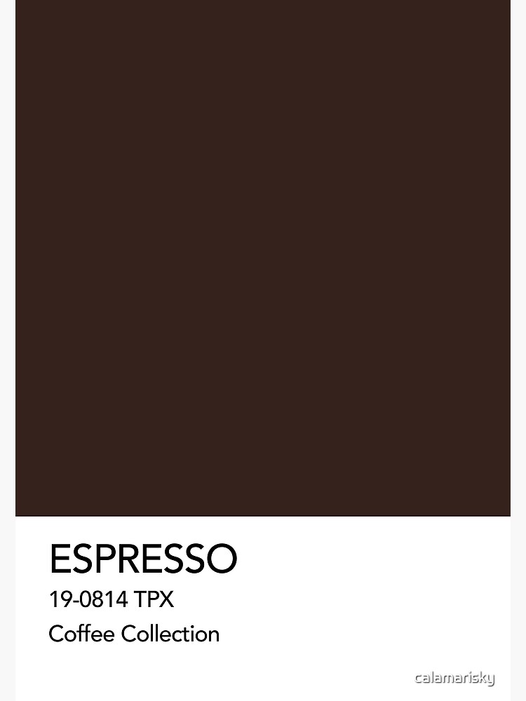
Setting Expectations and Enhancing Enjoyment
The visual presentation of espresso doesn’t just attract customers; it also sets crucial expectations for the taste experience. A perfectly colored shot with a beautiful crema signals a quality product, preparing the palate and enhancing the perceived enjoyment of the drink. Conversely, a visually unappealing shot, perhaps too pale or too dark without crema, can lower expectations, potentially diminishing the enjoyment even if the taste is acceptable. Brands understand that the first interaction is often visual, and that visual consistency is a cornerstone of brand trust. By consistently presenting espresso in its most appealing form, brands not only meet but exceed consumer expectations, contributing to a more satisfying overall experience that reinforces loyalty and positive brand association. The question of “what color is espresso” then becomes a gateway to a deeper understanding of brand strategy, product design, and consumer psychology.
aViewFromTheCave is a participant in the Amazon Services LLC Associates Program, an affiliate advertising program designed to provide a means for sites to earn advertising fees by advertising and linking to Amazon.com. Amazon, the Amazon logo, AmazonSupply, and the AmazonSupply logo are trademarks of Amazon.com, Inc. or its affiliates. As an Amazon Associate we earn affiliate commissions from qualifying purchases.