
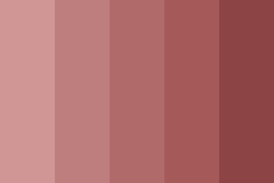
Dusty rose is more than just a shade; it is a nuanced hue that has carved out a significant space in modern design and, by extension, brand strategy. In the vast spectrum of colors available to businesses, understanding the precise nature and psychological impact of a shade like dusty rose is crucial for crafting compelling brand identities and effective marketing campaigns. It is a muted, sophisticated iteration of pink, often described as a soft, grayish-pink or a subdued, vintage rose. Its unique composition typically involves a delicate balance of red, white, and a significant touch of grey, which tempers its vibrancy and lends it an elegant, somewhat antique quality. This desaturated characteristic is precisely what differentiates it from brighter, more saccharine pinks, positioning it as a mature and versatile choice for brands aiming for subtlety and depth.

Understanding Dusty Rose: More Than Just a Shade
The allure of dusty rose lies not just in its visual appeal but also in the rich emotional tapestry it weaves. For brand strategists and designers, dissecting this color’s essence is paramount to leveraging its full potential. It evokes a sense of nostalgia, warmth, and understated luxury, making it a powerful tool in a brand’s visual arsenal.
The Nuance of Dusty Rose
At its core, dusty rose is a complex color that defies a simple one-word definition. It’s a delicate interplay of warmth and coolness, often described as a pastel pink with a strong grey undertone, or even a faded blush. This grey component is key, as it mutes the inherent sweetness of pink, transforming it into something more grounded and sophisticated. Hex codes often range from #DCAE96 to #C7A0A0, showcasing its variations from a peachier undertone to a more lavender-infused grey. This variability means that brands can select a specific iteration of dusty rose that precisely aligns with their desired brand personality—whether leaning towards rustic charm, modern minimalism, or vintage elegance. Its softness makes it inherently versatile, capable of standing alone as a primary brand color or working harmoniously as an accent within a broader palette. The nuance extends to its ability to adapt across different mediums; it can appear subtly different on screen versus in print, emphasizing the need for meticulous color management in brand guidelines.
Emotional Resonance and Psychological Impact
The psychological impact of dusty rose is profound and highly valuable for branding. Pink, in its pure form, is often associated with femininity, youth, and romance. However, the addition of grey to dusty rose elevates these associations, introducing elements of maturity, wisdom, and tranquility. Brands utilizing dusty rose often aim to evoke feelings of comfort, safety, and authenticity. It’s a color that suggests approachability without sacrificing elegance. For consumers, encountering dusty rose can induce a sense of calm and well-being, making it particularly effective for brands in the wellness, beauty, home decor, or bridal industries. It communicates a non-intrusive yet inviting message, fostering trust and rapport. This emotional resonance can be a distinct competitive advantage, allowing a brand to connect with its target audience on a deeper, more subliminal level, setting a particular mood and personality long before any explicit messaging is absorbed.
Strategic Application in Brand Identity
Incorporating dusty rose into a brand’s identity is a strategic decision that goes beyond mere aesthetic preference. It’s about articulating core brand values, communicating with a specific audience, and differentiating from competitors within a crowded market. The choice of dusty rose as a brand color can signify a commitment to sophistication, natural beauty, or timeless appeal.
Defining Your Brand’s Visual Language
A brand’s visual language is a critical component of its overall identity, and color plays a leading role. When considering dusty rose, brands are often seeking to convey qualities such as softness, luxury, and approachability. For instance, a high-end skincare brand might use dusty rose to suggest gentle efficacy and natural beauty, appealing to a demographic that values subtle elegance over overt glamour. A boutique coffee shop might employ it to create a warm, inviting atmosphere that feels artisanal and authentic, diverging from the starker aesthetics of larger chains. The strategic use of dusty rose can communicate a brand’s personality—is it playful yet refined? Traditional yet fresh? Organic and pure? The color’s muted quality allows it to blend seamlessly with natural textures like wood, linen, and clay, making it an excellent choice for eco-conscious or craft-focused brands. Furthermore, pairing dusty rose with complementary colors, such as deep greens, golds, or charcoal greys, can further refine the brand’s visual narrative, creating depth and distinction.
Target Audience Alignment and Market Positioning
Understanding who your brand is trying to reach is paramount in color selection. Dusty rose appeals to a diverse yet specific segment of consumers. It resonates strongly with individuals who appreciate understated beauty, quality craftsmanship, and a sense of calm. This includes demographics interested in slow living, sustainable fashion, artisanal goods, or minimalist design. For brands targeting women, dusty rose can offer a refreshing alternative to traditional, often stereotyped, bright pinks, projecting a more empowered and sophisticated femininity. In terms of market positioning, adopting dusty rose can help a brand carve out a niche. If competitors are using bold, vibrant colors to grab attention, a brand opting for dusty rose can position itself as a calmer, more reflective, and perhaps more exclusive option. This differentiation can be particularly effective in luxury markets, where subtlety often speaks volumes about quality and discernment. The color’s versatility also means it can be adapted across different price points, from affordable lifestyle brands to high-end couture, provided the overall brand experience supports the chosen positioning.
Marketing with Muted Elegance: Campaigns and Communication
Once dusty rose is established as a core brand color, its application in marketing campaigns and communications becomes a powerful strategic tool. It allows brands to convey their message with a distinct visual signature, enhancing recall and solidifying brand perception across various touchpoints.
Digital Presence and Website Design
In the digital realm, dusty rose offers a soft, inviting aesthetic that can significantly enhance user experience. For website design, using dusty rose as an accent color for calls to action, headers, or backgrounds can create a welcoming and sophisticated feel without being overwhelming. It promotes readability when paired with darker text and provides a gentle contrast. Brands in e-commerce, particularly those selling lifestyle products, beauty items, or home goods, can leverage dusty rose to craft an online environment that feels luxurious, trustworthy, and aesthetically pleasing. Social media strategies also benefit immensely from a consistent dusty rose palette. Instagram feeds, Pinterest boards, and Facebook ads adorned with this hue can create a cohesive and aspirational visual narrative, attracting followers who resonate with the brand’s sophisticated and tranquil vibe. From email marketing templates to banner ads, the consistent application of dusty rose helps maintain brand recognition, making every digital interaction a reinforcing brand experience.
Product Packaging and Experiential Branding
Beyond the screen, dusty rose shines in physical applications, most notably in product packaging and experiential branding. For products ranging from artisanal chocolates to cosmetic lines, packaging in dusty rose conveys a sense of premium quality, care, and a natural aesthetic. It suggests that what’s inside is precious and thoughtfully created. The color can elevate the perceived value of a product, making it feel like a luxury item. In retail environments, incorporating dusty rose into store interiors, fixtures, or signage can transform a space into a serene and inviting sanctuary. This extends to experiential branding events, where everything from decor to marketing materials utilizes the color to create a cohesive and immersive brand world. Imagine a pop-up shop or a product launch event steeped in dusty rose accents; it immediately sets a sophisticated, gentle, and memorable tone, inviting customers to linger and engage. The tactile experience of a dusty rose-colored box or bag further enhances the brand’s identity, bridging the gap between visual appeal and sensory interaction.
Case Studies and Trend Analysis
The effective use of dusty rose in branding is not merely theoretical; it is demonstrated through numerous real-world examples and fits within broader design trends. Observing how brands successfully integrate this color offers valuable insights into its strategic power.
Brands Successfully Leveraging Similar Palettes
While specific brand names might be proprietary, we can observe categories of brands that have masterfully employed dusty rose or similar muted pinks. High-end beauty and skincare brands often gravitate towards this palette to signify natural ingredients, gentle formulations, and a luxurious self-care ritual. Think of brands whose packaging emphasizes minimalism and softness, suggesting a premium, holistic approach to beauty. Similarly, fashion labels focusing on sustainable or slow fashion frequently use dusty rose to convey timelessness, authenticity, and an earth-conscious ethos. Bridal and event planning companies also find dusty rose invaluable for its romantic, elegant, and sophisticated connotations, appealing to clients seeking a classic yet modern aesthetic. Even certain technology startups, particularly those targeting a female demographic or focusing on user-friendly design, have incorporated dusty rose in their branding to soften their image and make technology feel more approachable and aesthetically pleasing. These brands understand that dusty rose allows them to stand out from the conventional, creating an identity that feels both unique and universally appealing in its subtlety.
Adapting to Evolving Design Trends
Dusty rose’s enduring appeal is partly due to its ability to adapt to evolving design trends. It fits seamlessly within the current popularity of minimalist aesthetics, where less is more and color palettes are often subdued to highlight form and function. It complements the trend towards natural and organic themes, aligning with earthy tones and materials. Furthermore, as vintage revival continues to influence design, dusty rose naturally finds its place, evoking a sense of nostalgia without appearing dated. Its versatility means it can be paired with modern typography for a contemporary feel, or with classic serifs for a more traditional look. Brand strategists should continually monitor how dusty rose interacts with other emerging trends, ensuring that its application remains fresh and relevant. This might involve pairing it with unexpected metallics, incorporating it into gradient designs, or using it alongside bolder, contrasting colors to create a dynamic visual tension. The key is to leverage its inherent timelessness while remaining agile in its stylistic presentation.
Cultivating Brand Consistency with Color
The power of any brand color, including dusty rose, is magnified exponentially through consistent application. Consistency builds recognition, reinforces brand values, and ultimately fosters trust among consumers. Without it, even the most thoughtfully chosen color can lose its impact and dilute a brand’s message.
Ensuring Uniformity Across Touchpoints
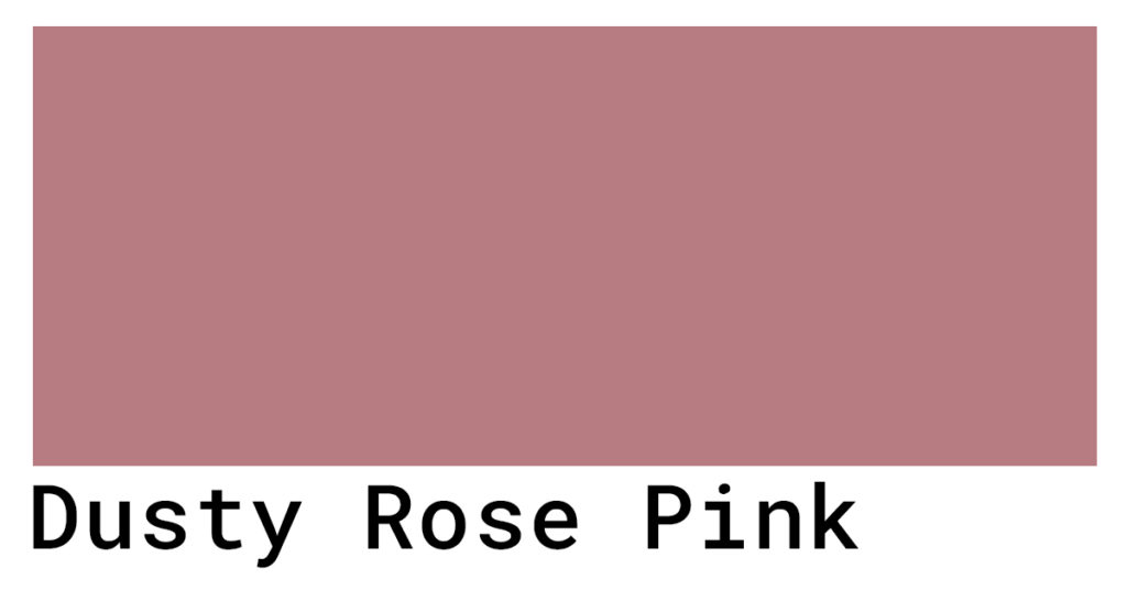
For dusty rose to truly embed itself in the consumer’s mind as an identifier for a brand, it must appear uniformly across every possible touchpoint. This means that the exact shade of dusty rose used on a brand’s website should match its social media profiles, its physical product packaging, its print advertisements, and even its employee uniforms or office decor. Discrepancies, even minor ones, can create visual dissonance and confuse consumers, leading to a perception of disorganization or lack of attention to detail. Achieving this uniformity requires meticulous planning and execution, often involving precise color codes (Hex, RGB, CMYK, Pantone) and strict adherence to brand guidelines by all internal teams and external partners. From digital assets to physical materials, ensuring that the dusty rose is consistently reproduced is a testament to a brand’s professionalism and commitment to its identity. This consistency solidifies the brand’s visual signature, making it instantly recognizable and trustworthy.
The Role of Brand Guidelines
Brand guidelines are the bedrock upon which consistent brand identity is built. For a color like dusty rose, these guidelines must be comprehensive, detailing its exact specifications, acceptable variations (if any), and rules for its application. This includes specifying the primary dusty rose hex code, its CMYK and RGB equivalents for print and digital use respectively, and its Pantone match for absolute color fidelity across different materials. Furthermore, brand guidelines should dictate how dusty rose interacts with other colors in the brand’s palette: which colors it can be paired with, which it should contrast against, and which combinations are to be avoided. They should also outline the contexts in which dusty rose is used—e.g., as a background, for text, in logos, or for accents—and the proportion of its usage relative to other brand colors. By providing clear, actionable instructions, brand guidelines empower designers, marketers, and all stakeholders to maintain a unified and impactful brand presence, ensuring that the elegant and sophisticated message of dusty rose consistently shines through.
aViewFromTheCave is a participant in the Amazon Services LLC Associates Program, an affiliate advertising program designed to provide a means for sites to earn advertising fees by advertising and linking to Amazon.com. Amazon, the Amazon logo, AmazonSupply, and the AmazonSupply logo are trademarks of Amazon.com, Inc. or its affiliates. As an Amazon Associate we earn affiliate commissions from qualifying purchases.