
The seemingly simple question, “what color is agave?”, unveils a complex and fascinating landscape when viewed through the lens of brand strategy and corporate identity. Beyond the botanical reality of the plant, the perceived and presented color of agave—whether the raw plant, its nectar, or its distilled spirits—plays a pivotal role in shaping consumer perception, communicating value, and establishing a distinct brand identity in a competitive market. For brands operating in the agave sector, understanding and strategically deploying this natural palette is not merely an aesthetic choice; it is a critical marketing imperative that influences trust, authenticity, and market differentiation.
The Spectrum of Agave: Beyond a Single Hue
To truly grasp the branding potential of agave’s color, one must first appreciate its natural variations, from the living plant to its diverse range of processed products. This inherent spectrum offers brands a rich chromatic vocabulary.
The Living Plant: Verdant and Varied
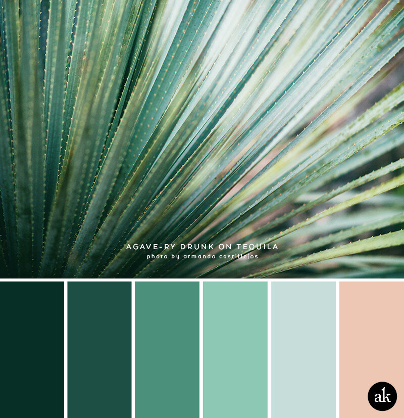
The agave plant itself is a striking spectacle of nature, predominantly recognized for its resilient, succulent leaves. Its primary color palette ranges from vibrant emerald greens to muted blue-greens, often with a silvery or glaucous cast. Variations exist significantly across the hundreds of agave species; some might exhibit more yellow undertones, others deeper forest greens, and certain varieties even present reddish or purple tips, especially under stress or specific growing conditions. Factors such as species (e.g., Agave tequilana Weber var. azul), soil composition, climate, maturity, and sunlight exposure all contribute to the subtle nuances of its verdant cloak. For brands focused on the raw, natural essence of agave, these cool, earthy tones are a powerful visual anchor, evoking themes of vitality, organic purity, and natural origin.
From Plant to Product: The Metamorphosis of Color
The journey from raw agave plant to finished product introduces a new array of colors, each carrying its own brand implications. Agave nectar, for instance, varies from a pale, almost translucent straw yellow in its “light” form to a rich, dark amber in “dark” varieties. This color difference signals distinct processing levels and flavor profiles to the consumer: lighter varieties are often associated with mild sweetness and broader culinary use, while darker ones suggest more robust caramel notes and potentially less refining.
In the realm of agave spirits, particularly tequila and mezcal, color becomes an even more intricate code. Blanco (silver) tequila is prized for its crystal-clear transparency, a visual testament to its unaged purity and vibrant agave essence. Reposado tequilas, aged for a minimum of two months in oak barrels, develop a soft golden hue, indicating a mellowing of flavor and the subtle influence of wood. Añejo (aged) tequilas, with a minimum of one year in oak, deepen to a rich amber, signifying greater complexity, smoothness, and often a higher price point. Extra Añejo, aged for over three years, achieves a profound, almost mahogany depth. Mezcal, with its diverse production methods and agave varieties, can also range from clear to various shades of pale gold or even light brown, depending on aging and specific production techniques. Each of these colors is an intrinsic part of the product’s identity and a critical marker for consumers.
Color as a Cornerstone of Agave Brand Identity
For brands, the inherent colors of agave and its products are not merely descriptive; they are foundational elements of visual identity that communicate essence, quality, and heritage.
Establishing Visual Trust and Expectation
A brand’s strategic use of color can immediately set consumer expectations and build trust. For instance, the crystal-clear appearance of a Blanco tequila instantly communicates purity, vibrancy, and a direct expression of the agave plant’s character. Any cloudiness or unexpected tint might trigger questions of quality or authenticity. Conversely, the deep amber of an Añejo tequila creates an expectation of complexity, warmth, and a sophisticated sipping experience, often associating the product with tradition and craftsmanship. Brands meticulously manage these visual cues to align with their product’s positioning and promise.
Communicating Naturalness and Purity
Brands marketing agave nectar, agave-based sweeteners, or health supplements often leverage the natural greens and blues associated with the living plant in their packaging and branding. These colors universally evoke nature, health, organic origins, and freshness. A brand aiming for a wholesome, health-conscious image might use illustrations of the agave plant itself, rendered in lush greens, to reinforce its natural credentials and appeal to consumers seeking authentic, minimally processed ingredients.
The Emotional Resonance of Agave Hues
Colors carry powerful emotional associations, and agave hues are no exception. The golden and amber tones of aged agave spirits can evoke feelings of warmth, richness, heritage, and celebration. They suggest time, patience, and the artisanal process of maturation. A brand might select a particular shade of gold in its logo or packaging to reinforce a premium, luxurious, or traditional image. The cool blues and greens, on the other hand, can convey tranquility, authenticity, and a connection to the earth, resonating with consumers who prioritize naturalness and sustainability.
Packaging the Promise: Visualizing Agave’s Essence
Packaging serves as the primary touchpoint for consumers, and its design—particularly its color scheme—is paramount in translating the agave product’s essence into a tangible brand experience.
Bottle Aesthetics and Label Design
For agave spirits, the bottle itself often becomes a canvas for color interaction. Clear glass bottles for Blanco tequilas amplify their purity. Frosted or tinted glass might be used to convey a sense of premium quality or a more subdued elegance for aged expressions. The label design then either complements or contrasts with the product’s color. Earthy tones, intricate patterns, and artisanal fonts on labels for golden añejos can reinforce their traditional, handcrafted appeal. Conversely, minimalist designs with stark white or black labels might frame a clear spirit, emphasizing modern sophistication and unadulterated purity.

Harmonizing Product and Packaging Palettes
A successful brand ensures seamless harmony between the product’s intrinsic color and its external packaging. Inconsistency can create dissonance and undermine trust. For example, a brand selling “light” agave nectar in dark, opaque packaging might inadvertently create confusion about the product’s actual color and perceived purity. Conversely, clear packaging that showcases the product’s natural hue, reinforced by a label using complementary colors (e.g., light green or beige for light nectar, richer browns for dark), creates a cohesive and authentic visual story.
The Role of Contrast and Complementary Colors
Packaging designers skillfully use complementary colors to make the agave product’s color pop or to enhance its perceived qualities. A vibrant red or deep blue on a label can create striking contrast against the golden amber of an aged tequila, drawing the eye and signaling a premium product. For brands emphasizing the organic nature of agave, packaging might incorporate raw materials like recycled paper or sustainable wood accents, often in natural browns and creams, to complement the greens of the plant or the pale hues of its nectar, reinforcing an eco-conscious brand message.
Authenticity and Consumer Perception: The Power of Natural Palettes
Consumer perception of quality and authenticity is deeply intertwined with visual cues, and the color of agave products plays a significant role in this psychological interplay.
Signaling Quality and Origin
Consumers often associate specific colors with certain quality benchmarks or production methods. The pristine clarity of a Blanco tequila, for instance, is a non-negotiable expectation; any discoloration could signal poor distillation or impurities, eroding perceived quality. Similarly, the rich, consistent amber of an añejo implies careful aging and a premium product. Brands leverage these established associations, ensuring their product’s color consistently meets or exceeds consumer expectations, thereby reinforcing their commitment to quality and traditional processes.
The ‘Natural’ Appeal: Green and Earth Tones
For agave products positioned in the health and wellness market, the use of green and earthy tones in branding is crucial. These colors instinctively evoke notions of health, vitality, organic origin, and sustainability. Brands marketing agave syrup as a natural sweetener, for example, often use packaging that prominently features shades of green, alongside imagery of the agave plant, to appeal to health-conscious consumers seeking wholesome, plant-based alternatives to refined sugars. This visual strategy taps into a broader cultural preference for naturalness.
Building Brand Loyalty Through Consistent Visuals
Consistency in color application across all brand touchpoints—from the product itself to packaging, websites, social media, and advertising—is vital for building strong brand recognition and loyalty. When a consumer repeatedly encounters a specific shade of golden amber associated with a particular tequila brand, or a distinct blue-green linked to an agave syrup, it reinforces mental connections, making the brand instantly recognizable and trustworthy. Deviations can confuse consumers and dilute brand equity.
Differentiating in a Crowded Market: Strategic Color Application
In an increasingly saturated market, strategic use of color can be a powerful tool for agave brands to carve out a unique identity and stand apart from competitors.
Standing Out on the Shelf
On a crowded retail shelf, visual impact is immediate and critical. While many tequila brands might opt for classic amber and clear hues, a new brand might deliberately choose a slightly lighter or darker shade of amber for its aged product, or use a unique bottle design that enhances the product’s natural color in an unconventional way. For agave nectar, while many opt for green, a brand might choose a deep, rich brown to emphasize its unprocessed, robust qualities, signaling a niche appeal to gourmands rather than solely health-conscious buyers.
Targeting Specific Demographics and Markets
Color psychology allows brands to target specific consumer demographics. A modern, minimalist brand appealing to a younger, design-savvy audience might use stark contrasts and an almost clinical purity in its clear Blanco tequila packaging. In contrast, a brand aiming for a traditional, artisanal market might use warmer, earthier tones and intricate patterns reminiscent of Mexican folk art for its añejo, leveraging cultural associations. Understanding the emotional and cultural resonance of colors allows brands to tailor their visual message to specific market segments.

Innovating with Color: Beyond the Expected
While adherence to traditional color cues is often paramount for authenticity in the agave market, there’s also room for innovation. A brand introducing a new agave-based beverage or a flavored agave spirit might intentionally break from conventional color schemes to signal novelty and modernity. For example, a tequila infused with an unusual botanical might adopt an unexpected color palette on its label—perhaps a vibrant purple or a striking teal—to visually represent its unique flavor profile and differentiate it from traditional offerings. This bold approach can attract adventurous consumers seeking new experiences and help define a new category or sub-category within the broader agave market.
Ultimately, the question of “what color is agave” transcends simple observation. For brands, it unlocks a strategic discussion about identity, perception, and market positioning. By mastering the diverse and evocative palette of agave, brands can craft compelling visual narratives that resonate with consumers, build lasting loyalty, and secure a distinct place in the global marketplace.
aViewFromTheCave is a participant in the Amazon Services LLC Associates Program, an affiliate advertising program designed to provide a means for sites to earn advertising fees by advertising and linking to Amazon.com. Amazon, the Amazon logo, AmazonSupply, and the AmazonSupply logo are trademarks of Amazon.com, Inc. or its affiliates. As an Amazon Associate we earn affiliate commissions from qualifying purchases.