
The question “what color is a peony?” might seem straightforward, a simple botanical inquiry. Yet, for the discerning brand strategist, marketer, or designer, it opens a vibrant discussion about color psychology, visual identity, and the potent inspiration drawn from the natural world. Peonies, with their lush petals and rich history, offer a spectrum of hues that can profoundly influence brand perception, evoke specific emotions, and define a unique aesthetic. Understanding the full chromatic range of this beloved flower is not just about botanical knowledge; it’s about harnessing a powerful natural palette for strategic branding.

The Peony’s Palette: A Spectrum of Brand Potential
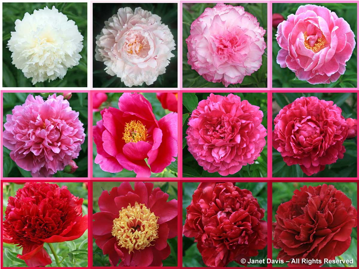
Peonies are celebrated for their incredible diversity in form and, crucially, in color. Far from being limited to a single shade, they present a rich tapestry of options that can inform and enrich a brand’s visual language. This extensive palette offers marketers and designers an array of choices, each carrying distinct connotations.
The Iconic Pink Variations
Perhaps the most recognized peony colors are within the pink family, ranging from the palest blush to vibrant fuchsia.
- Soft Pinks (Blush, Powder Pink): These delicate shades convey gentleness, romance, and subtlety. Brands aiming for a luxurious, feminine, or sophisticated yet approachable image often gravitate towards these hues. Think of high-end skincare, artisanal confectionery, or bridal wear where elegance and softness are paramount.
- Medium Pinks (Rose, Salmon Pink): More assertive than their paler counterparts, these colors retain a romantic feel but add a touch of warmth and vibrancy. They can signify joy, affection, and a playful sophistication. Lifestyle brands, floral design studios, or boutique fashion lines might employ these to communicate enthusiasm and charm.
- Deep Pinks (Magenta, Raspberry): These bold, rich pinks are full of energy and passion. They suggest confidence, creativity, and a modern edge. Brands looking to make a statement, particularly in fashion, event planning, or creative services, can leverage these vibrant tones to convey dynamism and a strong personality.
The Purity of White and Cream
White and cream peonies embody purity, elegance, and timelessness. These colors are inherently versatile and powerful in their simplicity.
- Pure White: Symbolizing new beginnings, clarity, and sophistication, pure white is a staple for luxury brands, high-end event companies, and businesses emphasizing cleanliness, precision, or minimalist design. It evokes a sense of pristine quality and unblemished excellence.
- Cream and Ivory: Softer than pure white, these shades add a touch of warmth and vintage charm. They suggest comfort, heritage, and understated luxury. Brands in interior design, artisanal crafts, or those wishing to convey an organic, natural elegance often find these hues align perfectly with their identity. They offer a refined alternative to stark white, suggesting a richer texture and depth.
The Allure of Red and Burgundy
Red peonies command attention, exuding passion, drama, and intensity. Their various shades offer distinct emotional impacts.
- Bright Reds (Crimson, Scarlet): These bold colors are associated with love, energy, and excitement. They are excellent for brands seeking to make a powerful statement, convey urgency, or symbolize strength and leadership. Luxury goods, performance-oriented brands, or those in the hospitality sector might use these to denote exclusivity and passion.
- Deep Reds (Burgundy, Wine): More sophisticated and mysterious than bright reds, these shades suggest luxury, tradition, and a rich, deep character. They are often chosen by brands in fine dining, bespoke tailoring, or high-end spirits, aiming to convey an air of refinement, heritage, and depth. These colors speak to a connoisseur’s taste.
The Rarity of Yellow and Coral
While less common than pink or white, yellow and coral peonies bring unique qualities to the branding palette.
- Yellow (Pale Yellow, Golden Hues): Yellow peonies, often in softer or more buttery tones, suggest joy, optimism, and warmth. They can be used by brands wanting to convey approachability, creativity, or a sunny disposition. Wellness brands, children’s products, or services emphasizing happiness and innovation might find these hues appealing.
- Coral (Orange-Pink): This vibrant and contemporary hue is a blend of energy and playfulness. It signifies warmth, enthusiasm, and a modern aesthetic. Brands in fashion, cosmetics, or any sector aiming for a fresh, trendy, and spirited image can leverage coral to stand out and communicate a forward-thinking attitude.
Color Psychology in Bloom: Translating Peony Hues to Brand Emotion
The colors of a peony are not just visually appealing; they are potent carriers of emotion and meaning. In brand strategy, understanding this psychological impact is critical for creating resonant visual identities and marketing campaigns.
Evoking Specific Feelings
Each color family within the peony’s spectrum naturally triggers different emotional responses, which can be strategically harnessed for branding.
- Pinks: Tend to evoke feelings of romance, tenderness, and femininity. A brand that wants to connect with its audience on an emotional, nurturing level often incorporates various pinks. This is why many beauty brands, wellness products, and businesses targeting women often feature these shades.
- Whites/Creams: Are universally associated with purity, cleanliness, and simplicity. Brands that emphasize transparency, luxury, or a minimalist aesthetic frequently use these tones. They convey an unblemished quality and a sense of calm sophistication.
- Reds: Are powerful and passionate. They demand attention and can symbolize strength, love, or even urgency. Brands that want to project confidence, energy, or a bold statement will find red hues invaluable. They are often seen in industries requiring a strong presence, like automotive, or luxury items that signify desire.
- Yellows/Corals: Bring optimism, warmth, and creativity. For brands looking to appear approachable, innovative, or joyful, these colors can be highly effective. They break away from conventional palettes and suggest a fresh, forward-thinking outlook.
Aligning Color with Brand Values
Beyond general emotion, peony colors can be meticulously aligned with specific brand values.
- If a brand prides itself on heritage and tradition, the deep burgundies or classic creams of certain peonies can reinforce this narrative.
- For a brand focused on modernity and innovation, a vibrant coral or a crisp white with a bold pink accent might be more suitable, signaling a contemporary edge.
- A brand prioritizing luxury and exclusivity could lean into the deep reds, pure whites, or specific soft pinks that exude opulence and refined taste. The subtlety of a creamy white peony, for instance, can speak volumes about understated luxury.
- Sustainability and naturalness can be implied through softer, organic tones found in less saturated peony variations, paired with natural textures and earthy complementary colors.
Designing with Nature: Peony Inspiration for Visual Identity
The beauty of the peony extends beyond individual color; it encompasses form, texture, and the overall aesthetic it presents. This natural elegance provides a rich source of inspiration for developing a cohesive and captivating visual identity.
Logo Design and Typography
The soft, undulating petals of a peony can inspire fluid, elegant lines in logo design, suggesting organic growth and beauty.
- Logo Design: Brands seeking an elegant, timeless, or feminine touch might incorporate stylized peony forms or motifs into their logos. The layering of petals can inform intricate patterns or abstract shapes that convey depth and sophistication. For example, a luxury floral brand might use a simplified peony silhouette, while a wellness brand might opt for a more abstract, soft-edged form inspired by the flower’s natural contours.
- Typography: The delicate yet full structure of a peony can influence font choices. Pairing a strong, modern sans-serif with a more decorative, flowing script font can mirror the contrast between the peony’s sturdy stem and its voluminous, soft bloom. Elegant serif fonts or sophisticated scripts often complement the flower’s inherent grace.
Packaging and Web Design
The visual appeal of peonies translates exceptionally well into packaging and digital environments, enhancing brand experience.
- Packaging: High-end cosmetics, gourmet foods, or artisanal products can draw directly from peony aesthetics for packaging design. This might involve using the flower’s colors, incorporating petal-like textures, or featuring delicate botanical illustrations. A luxurious cream might come in a jar with a soft, matte finish reminiscent of a peony petal, adorned with a subtle rose gold accent that echoes the flower’s golden stamens.
- Web Design: A website inspired by peonies can utilize soft, inviting color palettes, elegant photographic backgrounds, and intuitive, flowing layouts. The overall user experience can be designed to feel luxurious, serene, or enchanting, mirroring the sensation of beholding a beautiful peony. Brands can use parallax scrolling to mimic the unfolding of petals or incorporate subtle animations that bring the natural beauty to life.
Brand Storytelling and Imagery
Peonies are rich in symbolism, making them excellent vehicles for brand storytelling.
- Symbolism: In many cultures, peonies symbolize prosperity, good fortune, honor, and beauty. A brand can weave these meanings into its narrative, linking its products or services to these auspicious qualities. For example, a financial consulting firm might subtly use peony imagery to suggest growth and prosperity for its clients.
- Imagery: High-quality photography featuring peonies can instantly elevate a brand’s visual content, conveying sophistication and natural beauty. Whether showcasing a product nestled among blooms or using a peony as a standalone artistic element, the flower’s inherent grace adds a touch of aspirational beauty to any visual campaign. This is particularly effective for lifestyle brands, event planners, and luxury goods.
Beyond the Bloom: Seasonal & Cultural Context in Brand Messaging
The appeal of the peony is not static; it shifts with seasons and cultural interpretations, offering additional layers for brand messaging.
Seasonal Relevance
Peonies are spring and early summer flowers, carrying connotations of renewal, fresh starts, and vibrant beauty.
- Spring/Summer Campaigns: Brands launching new products or campaigns during these seasons can leverage peony imagery and color palettes to align with themes of growth, rejuvenation, and exuberance. A fashion brand might feature peony prints in its spring collection, or a beverage company might release a limited-edition flavor with packaging inspired by the flower’s fresh hues.
- Timelessness: While seasonal, the peony’s classic beauty transcends fleeting trends, making it suitable for brands that aim for a timeless elegance rather than purely seasonal appeal. Its inherent luxury and sophistication ensure it remains a relevant source of inspiration year-round for certain brand identities.

Cultural Significance
The peony holds significant cultural weight, particularly in Asian cultures where it is often referred to as the “King of Flowers.”
- Eastern Influences: In China, the peony symbolizes wealth, honor, and prosperity. Brands targeting an affluent audience or those with an appreciation for traditional Asian aesthetics can strategically incorporate peony motifs and colors to resonate with these values. A luxury real estate brand, for instance, might use peony symbolism to suggest prosperity and status for homeowners.
- Western Associations: In Western cultures, peonies are often associated with romance, bashfulness, and compassion. Brands catering to weddings, anniversaries, or those focusing on personal connection and emotional well-being can tap into these established meanings to build a relatable and heartfelt brand narrative.
In conclusion, the simple question “what color is a peony?” unveils a treasure trove of possibilities for brand development. From the nuanced psychology of its diverse hues to its inherent elegance and rich symbolism, the peony offers a sophisticated and versatile palette for crafting memorable brand identities, engaging marketing campaigns, and timeless design aesthetics. By thoughtfully integrating the peony’s visual language, brands can cultivate a deep connection with their audience, rooted in beauty, emotion, and strategic design.
aViewFromTheCave is a participant in the Amazon Services LLC Associates Program, an affiliate advertising program designed to provide a means for sites to earn advertising fees by advertising and linking to Amazon.com. Amazon, the Amazon logo, AmazonSupply, and the AmazonSupply logo are trademarks of Amazon.com, Inc. or its affiliates. As an Amazon Associate we earn affiliate commissions from qualifying purchases.