
Peach, with its inherent warmth, softness, and inviting aura, is a nuanced color that offers significant strategic potential in brand identity and marketing. Far from being a mere aesthetic choice, the selection of peach and its complementary colors can profoundly influence brand perception, emotional resonance, and audience engagement. Understanding “what color goes well with peach” is not just about visual harmony; it’s about crafting a cohesive brand narrative that speaks to specific values and aspirations.
The Psychology and Perception of Peach in Branding
The human perception of color is deeply rooted in psychology, cultural associations, and personal experiences. Peach, a delicate blend of orange and pink, carries a unique set of connotations that brands can leverage to their advantage.

Evoking Warmth and Approachability
Peach naturally exudes warmth, comfort, and friendliness. It’s reminiscent of sunsets, ripe fruit, and soft skin tones, creating an instant sense of ease and welcome. For brands aiming to cultivate an approachable, nurturing, or customer-centric image, peach can be an excellent primary or accent color. It suggests authenticity, sincerity, and a gentle presence, making it ideal for industries such as wellness, beauty, artisanal crafts, hospitality, and even certain tech brands seeking to humanize their offerings. Its subtle vibrancy prevents it from feeling overly aggressive, instead fostering a sense of gentle optimism and connection.
Modernity Meets Timelessness
While often associated with vintage aesthetics, peach has undergone a modern resurgence, particularly in digital design and fashion. Its versatility allows it to bridge the gap between classic elegance and contemporary minimalism. When paired thoughtfully, peach can feel fresh and forward-thinking without sacrificing a sense of enduring quality. This makes it suitable for brands that want to communicate innovation while retaining a touch of heritage or understated sophistication. The key lies in the specific shade of peach used – from a vibrant, almost neon peach to a muted, dusty rose peach – each conveying a slightly different message about the brand’s position and personality.
Strategic Color Pairings for Peach in Brand Design
The true power of peach in branding is unleashed when it is combined with other colors that amplify its strengths and mitigate any potential weaknesses. Strategic pairings can transform peach from a pleasant hue into a dynamic component of a compelling brand story.
Complementary Contrasts: Blues and Teals
Opposites attract, and this holds true in color theory. Blues and teals, positioned across the color wheel from peach (which leans towards orange), offer a refreshing contrast.
- Soft Blues (Sky Blue, Powder Blue): These create a serene, balanced, and sophisticated palette. Ideal for brands that want to convey trustworthiness, calmness, and professionalism while maintaining a friendly edge. Think financial advisors, healthcare services, or eco-conscious product lines that want to appear reliable yet gentle.
- Vibrant Teals and Aquas: These inject an element of energy and modernity. Teals pair beautifully with peach to evoke a sense of playfulness, creativity, and tropical vibrancy. Excellent for travel brands, lifestyle products, or contemporary fashion labels looking for a distinctive and memorable palette.
Harmonious Hues: Creams, Ivories, and Soft Neutrals
For brands seeking an elegant, refined, and minimalist aesthetic, pairing peach with harmonious neutrals is a winning strategy.
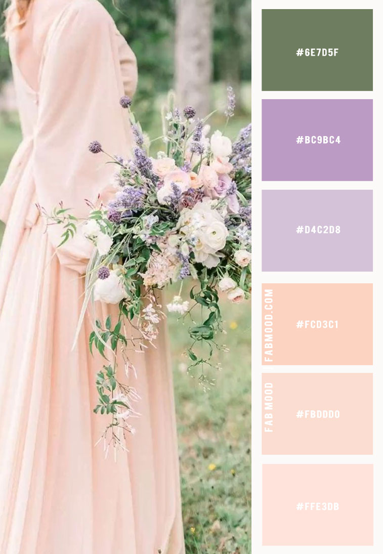
- Creams and Ivories: These soften the peach, creating a luxurious, inviting, and sophisticated feel. This combination speaks to natural beauty, high-end products, and brands that prioritize comfort and quality. It’s a popular choice for wedding planners, interior design firms, and premium skincare.
- Warm Greys and Taupes: Adding a subtle layer of sophistication, these neutrals ground the peach without overshadowing its warmth. This palette is understated, chic, and perfect for brands that value subtle elegance, timeless design, and a premium feel without being ostentatious. Think luxury apparel, artisanal goods, or high-end consulting services.
Bold Statements: Deep Greens, Burgundies, and Metallics
When a brand wants to make a powerful statement while retaining the warmth of peach, bolder pairings come into play.
- Deep Forest Greens or Emeralds: These create a rich, earthy, and opulent contrast. The natural depth of green grounds the lightness of peach, suggesting growth, luxury, and a connection to nature. This pairing is potent for organic brands, high-end hospitality, or companies focused on sustainability with a premium appeal.
- Burgundies or Deep Plums: These add a touch of drama, sophistication, and vintage allure. The combination feels rich, warm, and somewhat mysterious, conveying depth and passion. Ideal for boutique wineries, premium fashion labels, or brands that celebrate heritage and craftsmanship.
- Metallics (Gold, Copper, Rose Gold): Peach and metallics are a match made in brand heaven for luxury and glamour. Gold enhances peach’s warmth and adds opulence, while copper and rose gold create a cohesive, radiant glow. Perfect for jewelry brands, luxury cosmetics, or high-end event planning.
Playful Pops: Mints and Light Yellows
For brands with a youthful, energetic, or whimsical personality, peach can be paired with lighter, brighter accents.
- Mint Green: This fresh, airy color provides a cool, crisp contrast to peach’s warmth. It evokes a sense of cleanliness, modernity, and playful optimism. Great for children’s brands, fresh food companies, or innovative startups.
- Light Yellows (Pastel Lemon, Buttercup): These add an extra layer of sunniness and joy. The combination feels vibrant, friendly, and approachable, perfect for brands targeting a younger demographic or those wanting to project a cheerful, optimistic outlook.
Applying Peach Palettes Across Brand Touchpoints
A cohesive brand identity demands consistent application of color across all brand touchpoints. The chosen peach palette should translate seamlessly from digital screens to physical products.
Digital Presence: Websites, Social Media, and UI/UX
In the digital realm, peach can significantly enhance user experience. A soft peach background or accent can make a website feel inviting and user-friendly. For social media, consistent use of peach in graphics, filters, and templates reinforces brand recognition. In UI/UX design, peach can be used for calls-to-action or highlighted elements to draw attention without being aggressive, creating a gentle yet effective visual hierarchy. The interplay with complementary colors ensures readability and visual appeal on diverse screens.
Print Media: Packaging, Brochures, and Merchandising
Physical materials offer a tactile dimension to color perception. Peach on packaging can make products feel luxurious and desirable, particularly when combined with textured finishes or metallic foils. In brochures and marketing collateral, peach backgrounds or text accents can make information feel less daunting and more engaging. For merchandise, a peach logo or design element can imbue products with a unique, fashionable, and approachable quality. The choice of paper stock and ink finish can further amplify the desired effect, from matte sophistication to glossy vibrancy.
Environmental Branding: Retail Spaces and Events
Extending the peach palette to physical environments can create immersive brand experiences. In retail spaces, peach walls or furniture can create a warm, welcoming, and intimate atmosphere, encouraging customers to linger. At events, peach can be incorporated into decor, lighting, and signage to establish a distinct brand mood, whether it’s a sophisticated gala or a playful product launch. This physical embodiment of the brand’s color strategy reinforces its identity and creates memorable associations.
Case Studies & Considerations for Brand Application
Successfully integrating peach and its complementary colors into a brand identity requires careful consideration of the brand’s core values, target audience, and competitive landscape.
Understanding Your Target Audience
The perception of peach can vary across demographics and cultures. While universally seen as warm, its associations with femininity, youth, or luxury might resonate differently. Brands must conduct thorough audience research to ensure their chosen peach palette aligns with the aesthetic preferences and cultural sensitivities of their target market. A millennial audience might appreciate a modern, vibrant peach, while an older demographic might prefer a more subdued, elegant shade.
Consistency is Key
Regardless of the chosen palette, consistency is paramount. A brand’s use of peach and its accent colors should be unwavering across all platforms and materials. This consistent visual language builds familiarity, trust, and strong brand recall. Deviating from the established color scheme can dilute brand identity and confuse the audience, making it harder for the brand to establish a recognizable presence in a crowded market.

The Evolving Brand Landscape
While core brand colors should remain consistent, strategic refreshes can keep a brand relevant. Peach, being a versatile color, can adapt to evolving trends when paired with new accent colors or used in fresh contexts. Brands like Glossier have successfully leveraged soft, almost peach-like pinks to create a distinct, modern, and approachable beauty brand identity, often pairing it with stark whites or bold blacks for contemporary contrast. Similarly, many wellness and food brands use peach and greens to signal health, freshness, and organic quality.
Ultimately, peach is more than just a color; it’s a powerful tool in a brand strategist’s arsenal. When thoughtfully paired and consistently applied, it can craft a distinctive, memorable, and emotionally resonant brand identity that stands out and connects deeply with its audience.
aViewFromTheCave is a participant in the Amazon Services LLC Associates Program, an affiliate advertising program designed to provide a means for sites to earn advertising fees by advertising and linking to Amazon.com. Amazon, the Amazon logo, AmazonSupply, and the AmazonSupply logo are trademarks of Amazon.com, Inc. or its affiliates. As an Amazon Associate we earn affiliate commissions from qualifying purchases.