
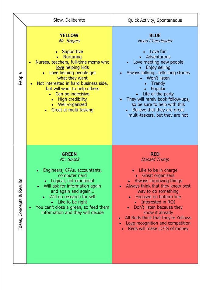
In the intricate tapestry of personal and corporate identity, the seemingly simple question “what color am I?” delves far deeper than mere aesthetic preference. It is a potent inquiry into the core of one’s brand—a journey of self-discovery that, when properly navigated, yields a powerful visual language capable of communicating values, personality, and strategic intent. Far from a whimsical quiz, embracing a metaphorical “What Color Am I Test” is a foundational exercise in branding, enabling individuals and organizations to articulate their essence through the profound psychology and cultural resonance of color.
Unpacking the Psychology of Color in Personal Branding
Color is not just seen; it’s felt, experienced, and interpreted, often unconsciously. In the realm of branding, it serves as a primary, non-verbal communicator, shaping perceptions and evoking immediate emotional responses long before a single word is read. Understanding this intrinsic power is the first step in leveraging a “color identity” for strategic advantage.

Color as a Communication Tool
Every hue carries with it a wealth of associations, born from millennia of human experience, cultural significance, and natural phenomena. Red, for instance, can signify passion, energy, and urgency, but also danger or aggression. Blue often conveys trust, stability, and professionalism, yet can also be perceived as cold or distant. Yellow radiates optimism and joy, while simultaneously hinting at caution or cheapness. The challenge, and the art, of branding is to harness these broad strokes of meaning and refine them to precisely reflect a brand’s unique attributes. For an individual building a personal brand, selecting colors that resonate with their professional aspirations and personal values—be it innovation, reliability, creativity, or authority—is crucial. These colors then become shorthand for their capabilities and character, influencing how they are perceived in networking, interviews, presentations, and digital interactions.
The Emotional Spectrum of Hues
The emotional impact of color is universal, yet subtly nuanced. Warm colors—reds, oranges, yellows—tend to be more stimulating, grabbing attention and conveying enthusiasm. Cool colors—blues, greens, purples—are often perceived as calming, trustworthy, and sophisticated. Neutrals like grays, whites, and blacks provide balance, elegance, and a foundation upon which other colors can build. A personal brand aiming to project dynamic leadership might lean into vibrant, warm tones, perhaps complemented by a strong neutral. Conversely, a brand centered on expertise and calm authority might favor a palette dominated by cool blues and greens, accented with a touch of deep purple for sophistication. The “What Color Am I Test” implicitly asks individuals to identify their core emotional offerings and then map them to a corresponding color spectrum, ensuring that their visual identity is in perfect sync with their desired emotional impact on their audience. This thoughtful selection process moves beyond mere aesthetics to strategic emotional intelligence.
The “What Color Am I Test” as a Branding Catalyst
Engaging with the idea of a “What Color Am I Test” is less about finding a definitive answer and more about initiating a profound self-assessment. It serves as a powerful catalyst for introspection, guiding individuals and organizations through the necessary steps to define their essence and translate it into a compelling brand identity.
Self-Discovery for Authentic Branding
Before one can decide “what color I am,” one must first understand “who I am” and “what I stand for.” This test, therefore, begins with deep self-discovery. For a personal brand, this involves identifying core values, unique selling propositions, career aspirations, and the desired professional persona. Are you an innovator or a traditionalist? A leader or a collaborator? An expert or a generalist? Each facet of your professional identity corresponds to certain emotional and psychological attributes, which, in turn, can be represented by specific colors or color combinations. For a company, this means revisiting mission, vision, values, target audience, and competitive landscape. An authentic brand cannot be built on superficial choices; it must emerge from a clear understanding of its internal truths. The “What Color Am I Test” prompts this essential self-audit, ensuring that the visual brand is not merely attractive, but genuinely reflective of the authentic self.
Aligning Vision with Visual Identity
Once the internal self-discovery is complete, the next critical step is to align this newfound clarity with a consistent visual identity. This isn’t just about picking a favorite color; it’s about making strategic choices that reinforce the brand’s core message. If a personal brand aims to convey trustworthiness and reliability, a predominant use of warm, energetic reds would contradict that message. Instead, shades of blue or green would be more aligned. Similarly, a startup aiming to disrupt a traditional industry might purposefully choose bold, unconventional colors to signal innovation and break from the norm, rather than sticking to the established muted palettes. The “What Color Am I Test” becomes the framework for translating abstract concepts like “innovation” or “trust” into tangible visual elements. This alignment ensures that every visual touchpoint—from a logo and website to social media graphics and professional attire—sings the same tune, reinforcing the brand’s intended message with unwavering consistency.
Translating Your Color Identity into a Cohesive Brand
Once an individual or organization has thoughtfully completed their “What Color Am I Test” and identified their core color identity, the real work of translation begins. This involves moving from abstract concepts to concrete applications, ensuring that the chosen palette permeates every aspect of the brand’s presence.

From Personality to Palette: Practical Application
The journey from understanding one’s brand personality to creating a functional color palette is where strategy meets design. It’s rarely about a single color but rather a harmonious combination that tells a complete story. A primary brand color will often be chosen to represent the core essence—the “main color” from the “What Color Am I Test.” Then, complementary and accent colors are introduced to add depth, versatility, and visual interest. These secondary colors can represent different facets of the brand, such as passion points, specific services, or target audience demographics. For example, a financial advisor wanting to convey stability (blue) might use an accent of gold to suggest prosperity and premium service. A creative professional embracing innovation (purple) might pair it with a vibrant lime green for energy and distinctiveness. This palette must then be documented, complete with specific HEX, RGB, and CMYK codes, to ensure consistent reproduction across all mediums. This level of detail transforms a subjective preference into an objective, actionable brand guideline.
Consistency Across All Touchpoints
The power of a defined color identity lies in its consistent application. Every interaction a customer or contact has with a brand is an opportunity to reinforce its message, and color plays a critical role in this reinforcement. This means the chosen brand colors must be meticulously applied across all touchpoints:
- Digital Presence: Website design, social media profiles, email newsletters, digital advertisements, online presentations.
- Print Materials: Business cards, letterheads, brochures, reports, packaging.
- Physical Environment: Office decor, event branding, signage.
- Personal Presence (for individuals): Professional attire, accessories, personal stationery.
Consistency builds recognition, trust, and a strong mental association. When a brand’s colors are seen repeatedly and cohesively, they become synonymous with its identity, creating a powerful, memorable presence that stands out in a crowded marketplace. Inconsistency, conversely, can dilute a brand’s message, confuse its audience, and undermine its credibility.
Beyond Personal Branding: Corporate Applications
The principles unearthed by the “What Color Am I Test” extend far beyond individual personal brands, proving equally vital for corporate entities seeking to cultivate a strong, cohesive identity both internally and externally.
Employee Branding and Internal Culture
A company’s color identity isn’t just for its customers; it deeply influences its employees and internal culture. When employees are surrounded by, and consistently interact with, a thoughtfully chosen brand palette, it fosters a sense of unity, shared purpose, and belonging. The colors used in office decor, internal communications, staff uniforms, and company events subtly reinforce the brand’s values and mission. For instance, a company whose “color” is energetic yellow might cultivate a vibrant, innovative, and collaborative workplace environment. One with a strong blue presence might emphasize trust, professionalism, and calm efficiency. This internal alignment—often referred to as employee branding—is crucial for morale, recruitment, and retention. Employees who feel connected to their company’s visual and cultural identity are more likely to be engaged, productive, and act as authentic brand ambassadors.
Market Perception and Competitive Advantage
In the competitive marketplace, a distinctive and well-executed color strategy can be a significant differentiator. A company’s colors are often the first point of contact and can instantly communicate its industry, target market, and unique selling proposition. Consider the immediate recognition and industry association evoked by the red of Coca-Cola, the blue of Facebook, or the green of Starbucks. These companies have effectively leveraged their color identity to carve out a unique space in consumers’ minds. The “What Color Am I Test” for a corporation becomes a strategic exercise in identifying how to stand out while remaining relevant to the target audience. Are you positioning yourself as premium (often black, gold, silver), accessible (bright, friendly colors), innovative (unconventional combinations), or traditional (classic, muted tones)? A strategic color choice can attract the right customers, convey perceived value, and establish a memorable presence that provides a tangible competitive advantage. It’s about owning a visual territory that distinctly represents your brand’s promise and resonates with your desired audience.
The Evolution of Brand Color Strategy
A brand’s color identity, while foundational, is not immutable. Just as markets evolve and audiences shift, so too can the application and interpretation of a brand’s visual language. The “What Color Am I Test” is an ongoing inquiry, necessitating periodic review and thoughtful adaptation.
Dynamic Branding and Adaptability
In today’s rapidly changing digital landscape, brands must be dynamic. This doesn’t mean constantly changing core colors, but rather understanding how to adapt and extend a brand’s palette to suit different campaigns, platforms, and cultural shifts. A core brand identity might remain steadfast, but secondary palettes can be developed for seasonal promotions, sub-brands, or specific marketing initiatives. This allows a brand to remain fresh and relevant without losing its fundamental recognition. For instance, a tech company might maintain its primary blue and white for its core products, but introduce vibrant, trending accent colors for a new product launch targeting a younger demographic. This strategic adaptability ensures the brand always feels current and connected to its audience, preventing stagnation while preserving its established equity.
Measuring Impact and Iteration
The true success of a brand’s color strategy isn’t just in its initial design but in its ongoing performance. Marketing analytics, customer feedback, and brand perception studies can provide invaluable insights into how a color palette is being received. Are the colors effectively conveying the intended message? Are they resonating with the target audience? Are they contributing to brand recall and preference? For example, A/B testing different color schemes for website calls-to-action can reveal which hues drive higher conversion rates. Feedback on advertising campaigns might indicate if a certain color is miscommunicating a message. This data-driven approach allows brands to iterate and refine their color strategy over time, ensuring that their visual identity remains maximally effective. The “What Color Am I Test” becomes a living process, continuously re-evaluating and optimizing the brand’s most visible and emotionally potent asset—its color.
aViewFromTheCave is a participant in the Amazon Services LLC Associates Program, an affiliate advertising program designed to provide a means for sites to earn advertising fees by advertising and linking to Amazon.com. Amazon, the Amazon logo, AmazonSupply, and the AmazonSupply logo are trademarks of Amazon.com, Inc. or its affiliates. As an Amazon Associate we earn affiliate commissions from qualifying purchases.