Grey has emerged as a cornerstone in contemporary design, prized for its unparalleled versatility and sophisticated neutrality. Far from being merely a lack of color, grey acts as a complex canvas, its nuanced undertones capable of shifting perception and mood. Understanding how to leverage this foundational hue with an accent wall is a strategic design decision, akin to defining the core identity of a space. The right accent color, when paired with grey, can amplify existing aesthetics, articulate a specific brand message, or simply elevate the emotional resonance of a room. This is not just about choosing a pretty shade; it’s about crafting an intentional visual narrative that defines the space’s character and impact.

The Strategic Power of Grey in Design
Grey’s prominence in modern aesthetics stems from its unique ability to be both understated and impactful. It serves as an excellent backdrop, allowing other elements to shine, yet possesses an inherent elegance that speaks to quality and timelessness. However, “grey” is a broad spectrum, encompassing warm greys with beige or brown undertones (greige) and cool greys with blue or green hints. Recognizing these subtle distinctions is the first step in strategic color pairing, as the grey itself influences the overall perception and “brand” of the room.
Understanding Grey’s Undertones
A warm grey, often perceived as more inviting and comforting, naturally harmonizes with earthy tones and other warm colors. It can create a softer, more approachable feel. Conversely, a cool grey, which typically evokes a sense of calm, modernity, and spaciousness, pairs exceptionally well with blues, greens, and crisp whites. The choice between warm and cool grey sets the foundational tone for the room’s identity, dictating the subsequent palette and the emotional experience it aims to deliver. Consider the intended message of the space: Is it meant to be a cozy, welcoming retreat (warm grey) or a sleek, contemporary hub (cool grey)? This initial assessment guides all further design choices.
Grey as a Brand Statement
In both corporate and personal branding contexts, color plays a critical role in conveying identity and values. A space designed with grey as a dominant neutral communicates professionalism, stability, and sophistication. It projects an image of measured thought and timeless appeal. An accent wall, then, becomes the opportunity to introduce a secondary brand attribute – perhaps creativity, tranquility, or dynamism – without overwhelming the grey’s inherent gravitas. It’s a strategic splash of character that refines the overall message.
Crafting Impact: Accent Wall Color Psychology with Grey
The selection of an accent wall color isn’t merely decorative; it’s a psychological tool that can dramatically influence how a space is perceived and experienced. When integrated with grey, these colors tell a story, impacting mood, focus, and overall impression – crucial elements in defining a room’s “brand.”
Blues: Stability, Trust, and Serenity
Paired with grey, blues—from deep navy to tranquil sky blue—create an environment of stability and calm. This combination is particularly effective in spaces where focus and clarity are paramount, such as home offices, studies, or corporate meeting rooms. A deep navy accent wall against a light grey background projects authority and trustworthiness, qualities highly valued in professional branding. Lighter blues, conversely, foster a sense of serenity and openness, ideal for bedrooms or spaces designed for relaxation. The cool undertones often found in grey beautifully complement blue, enhancing its calming effect and preventing the space from feeling cold.
Greens: Growth, Harmony, and Refreshment
Greens, in their myriad forms, introduce an element of nature, vitality, and balance when paired with grey. Sage green or olive, against a warm grey, can create an organic, grounding atmosphere, evoking authenticity and understated luxury—a design choice often seen in wellness brands or eco-conscious environments. Brighter emerald or teal greens with cool grey offer a more vibrant, creative energy, signalling innovation and fresh perspectives. This combination is excellent for spaces that aim to inspire creativity or foster a sense of well-being, such as creative studios, waiting areas, or living rooms.

Yellows & Oranges: Energy, Optimism, and Creativity
For a space that needs a jolt of energy, optimism, or a touch of playful creativity, yellow and orange accent walls are strategic choices with grey. A vibrant mustard or a sophisticated ochre yellow against a mid-tone grey can instantly brighten a room, stimulating conversation and fostering a positive, engaging atmosphere. This combination is often utilized in collaborative workspaces, creative hubs, or areas designed for social interaction. Similarly, a subtle terracotta or a muted burnt orange with warm grey can evoke warmth, passion, and a sense of inviting intimacy, making it suitable for dining areas or family rooms where connection is key. These bold choices signal a brand that is dynamic, innovative, and not afraid to express itself.
Pinks & Purples: Sophistication, Creativity, and Comfort
Pinks and purples, when carefully chosen, can introduce surprising depth and personality to a grey palette. A dusty rose or a blush pink against a light, cool grey creates an elegant, soft, and sophisticated ambiance, often associated with luxury fashion brands or spaces aiming for a refined, gentle aesthetic. Deeper purples, like plum or eggplant, paired with a charcoal grey, exude luxury, creativity, and a touch of mystery. This combination is impactful in artistic spaces, high-end boutiques, or personal lounges, signalling a brand that is unique, thoughtful, and possesses an artistic flair.
Neutrals (Black, Charcoal, White): Elegance, Modernity, and Focus
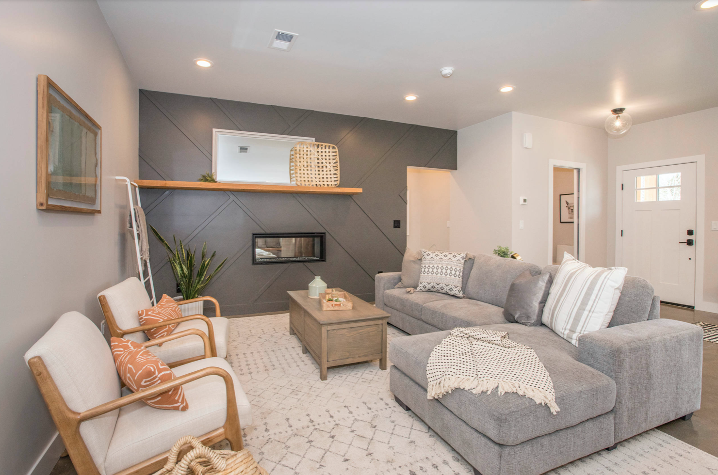
Sometimes, the most powerful statement comes from a refined continuation of the neutral palette. A charcoal or deep grey accent wall with a lighter grey main color offers a sophisticated, monochromatic look that speaks volumes about elegance and understated power. This combination creates depth, drawing the eye without introducing additional color psychology. It’s a hallmark of minimalist design and brands that prioritize clean lines, efficiency, and a sleek, modern identity. A crisp white accent wall against a dark grey can dramatically brighten a space, emphasizing cleanliness and clarity, while a black accent wall can create high drama, depth, and a strong, modern edge. These choices are about form, function, and a strong commitment to a particular aesthetic brand.
Designing Your Space’s Brand Identity
The process of selecting an accent wall color with grey is deeply tied to defining the “brand” of your space. This involves more than just personal preference; it requires a holistic consideration of the room’s purpose, the desired emotional response, and how it aligns with your overarching identity or brand strategy.
Lighting and Environmental Context
Natural and artificial lighting are critical factors in how any color is perceived. A color that looks vibrant under bright natural light might appear muted or even dull in a room with limited light or reliance on warm artificial sources. Always test paint samples directly on the accent wall, observing them at different times of day to ensure the chosen hue achieves the intended effect. The orientation of the room (north-facing vs. south-facing) also impacts natural light temperature, influencing how colors interact with grey. A sophisticated brand considers all environmental variables to ensure consistent message delivery.
Existing Furnishings and Decor
An accent wall must integrate seamlessly with existing furniture, artwork, and accessories. Consider the dominant colors and styles already present in the room. Is the furniture modern and minimalist, or classic and ornate? Does it feature bold patterns or subtle textures? The accent color should complement these elements, either by echoing a subtle tone or providing a thoughtful contrast that enhances the overall aesthetic, rather than competing with it. This creates a cohesive “brand experience” within the space. Think of it as developing a mood board for your room’s identity.
Desired Impression and Target Audience
Ultimately, the accent wall color should communicate the desired impression for the space and its occupants or visitors. For a home office, a color like deep blue or forest green might convey professionalism and focus. For a creative studio, a vibrant yellow or daring teal could ignite inspiration. In a retail environment, the accent color could reinforce brand values like luxury (deep jewel tones), sustainability (earthy greens), or innovation (bright, clean blues). Clearly defining the “target audience” (yourself, clients, family, guests) and the message you wish to impart is the cornerstone of this design strategy.
The Role of Texture and Finish
Beyond color, the finish and texture of the accent wall paint also play a role in its perceived identity. A matte finish absorbs light, creating a soft, sophisticated look, while a high-gloss finish reflects light, adding drama and a contemporary edge. Textured wallpapers or specialized finishes can introduce another layer of depth and interest, contributing to the tactile “brand” of the space. These subtle choices further refine the message, adding richness and complexity to the overall design.
By approaching the selection of an accent wall color with grey through this strategic lens, designers and homeowners can move beyond mere aesthetics to create spaces that are not only beautiful but also powerfully communicative, expressing a clear and compelling identity.
aViewFromTheCave is a participant in the Amazon Services LLC Associates Program, an affiliate advertising program designed to provide a means for sites to earn advertising fees by advertising and linking to Amazon.com. Amazon, the Amazon logo, AmazonSupply, and the AmazonSupply logo are trademarks of Amazon.com, Inc. or its affiliates. As an Amazon Associate we earn affiliate commissions from qualifying purchases.