
In the intricate world of brand identity, every element, down to the most subtle shade, carries significant weight. Colors are not merely decorative; they are potent communicators, silently narrating a brand’s essence, values, and personality. While vibrant hues often grab immediate attention, the power of understated elegance, embodied by colors like tan, is frequently underestimated. Understanding the very genesis of such a shade—”what two colors make tan”—provides a foundational insight into how brand strategists and designers construct comprehensive visual languages that resonate deeply with their target audiences.
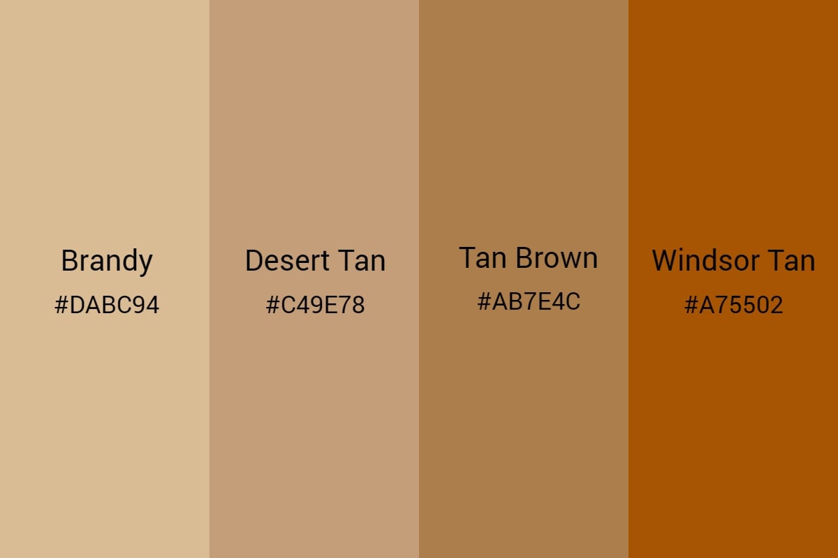
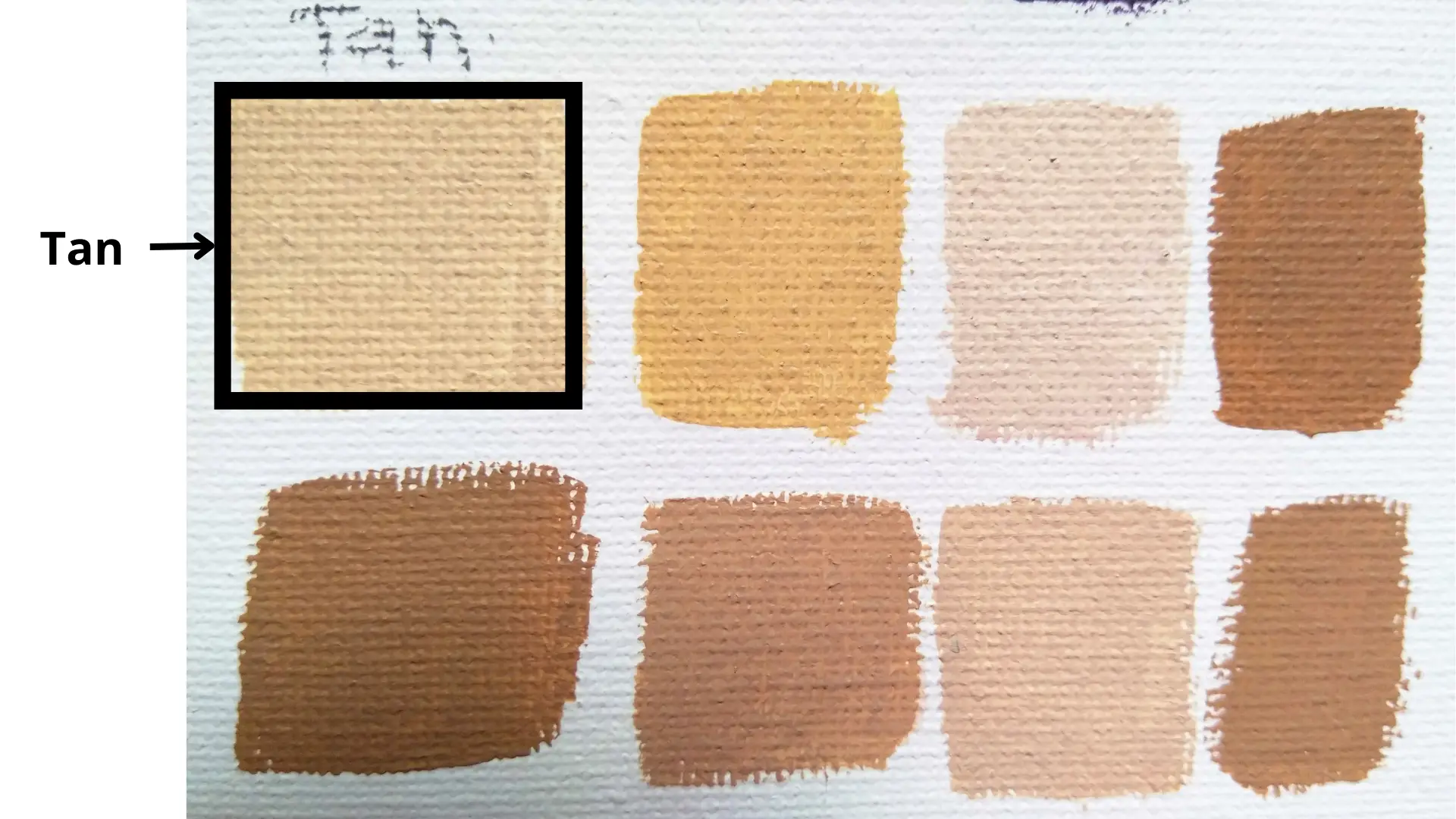
At its core, tan is not a singular color but a spectrum of earthy tones, ranging from light beige to a richer, sand-like warmth. The most direct and fundamental answer to how tan is created lies in the careful blending of brown and white. Brown provides the deep, grounded earthiness, while white introduces lightness, softness, and a certain airiness. However, the true artistry in creating a brand-specific tan lies in understanding the subtle introductions of other colors—yellow, orange, red, or even a touch of black—to achieve specific nuances that align perfectly with a brand’s desired message.

The Science of Color Mixing: Foundation for Brand Aesthetics
The ability to manipulate color is a cornerstone of effective brand design. Whether working in digital spaces or print, designers leverage different color models to achieve their desired outcomes.
Primary and Secondary Colors in Design: Digital vs. Print
In the digital realm, colors are generated using the RGB (Red, Green, Blue) additive model. Mixing these three primary colors of light in various proportions produces all other colors on screens. For instance, combining red and green light yields yellow, while all three at full intensity create white. In this model, to arrive at tan, a designer would manipulate the Red, Green, and Blue values to first create a brown (often a mix of red and green with less blue, or simply a desaturated orange/yellow), and then increase the overall brightness or introduce more white-like RGB values to lighten it.
Conversely, for printed materials, the CMYK (Cyan, Magenta, Yellow, Key/Black) subtractive model is employed. Printers mix these four inks, and the absence of all ink results in white paper, while a full combination ideally produces black. To create tan in CMYK, a designer would primarily use Yellow and Black, often with minimal Cyan and Magenta. A common formulation for a basic tan might involve a moderate amount of Yellow, a small percentage of Magenta and Cyan to control hue, and a light touch of Black (K) to provide depth without making it too dark. The K (Key/Black) component in CMYK is particularly crucial for grounding earthy tones like tan and brown.
The Elusive Tan: A Blend of Warmth and Neutrality
While brown and white is the simplest answer, it’s essential to understand that “tan” encompasses a vast range of shades.
- Warm Tan: Introducing more yellow or orange into the brown-white mix will create a warmer, sandier, or golden tan. This variant often evokes feelings of sunshine, beaches, or natural warmth.
- Cool Tan: A slight touch of blue or green (in the context of digital color adjustment, or careful CMYK mixing) can push tan towards a cooler, more desaturated, or greige (grey-beige) tone. This can lend a sophisticated, modern, and minimalist feel.
- Rich Tan: Adding a touch more black to the brown base before lightening it with white can result in a deeper, more robust tan, conveying a sense of grounded stability and luxury.
The designer’s skill lies in precisely selecting these subtle undertones to craft a tan that perfectly aligns with the brand’s identity and emotional message, far beyond a simple two-color mix.
Beyond Simple Mixtures: Achieving Specific Tones
For professional branding, relying on a subjective “brown and white” mix is insufficient. Designers utilize precise color codes like hexadecimal codes for web, RGB values for digital, and CMYK percentages for print. Furthermore, systems like Pantone provide standardized color swatches that ensure color consistency across various mediums and manufacturing processes, guaranteeing that “brand tan” remains identical whether it’s on a website, a product label, or a billboard. This meticulous approach underscores the strategic importance of every color choice in branding.
Tan in Brand Identity: More Than Just a Neutral
Tan, often perceived as merely a neutral, possesses a profound psychological depth that can be strategically harnessed in branding. Its versatility allows it to play various roles, from a primary brand color to a sophisticated accent.
Psychological Associations of Tan
Tan carries a rich tapestry of psychological associations, making it a compelling choice for brands aiming to convey specific attributes:
- Reliability & Stability: Its earthiness grounds it, making brands appear dependable and trustworthy.
- Naturalness & Authenticity: Tan evokes images of sand, natural fibers, wood, and organic materials, making it ideal for brands focused on sustainability, eco-friendliness, or natural ingredients.
- Warmth & Comfort: Certain shades of tan, particularly those with yellow or orange undertones, create a sense of coziness, welcome, and ease.
- Simplicity & Understated Luxury: Tan can project an aura of quiet sophistication, suggesting quality without ostentation. It often signifies timelessness over fleeting trends.
- Maturity & Heritage: In some contexts, tan can evoke a sense of history, tradition, and enduring legacy.
Brands That Leverage Tan (and its components)
Consider brands in sectors like:
- Sustainable & Organic Goods: Food products, clothing lines, or home goods that emphasize natural origins often use tan to align with their core values.
- Luxury & Lifestyle: High-end fashion brands, artisanal crafts, or bespoke furniture companies might use tan to convey exclusivity, quality materials, and refined taste.
- Wellness & Spa: Brands promoting relaxation, natural beauty, or holistic health frequently incorporate tan for its calming and earthy appeal.
- Finance & Professional Services: While less common as a primary, certain financial institutions or consultancies might use subtle tan accents to project stability, reliability, and approachability without being overtly corporate.
- Outdoor & Adventure: Brands focused on rugged gear, travel, or exploration often use tan to evoke nature, durability, and practical utility.
Versatility and Sophistication
Tan’s unique strength lies in its versatility. It can serve as a primary brand color, setting a serene and authentic tone, or as a powerful secondary color that grounds more vibrant hues. When paired with brighter colors, tan offers a sense of stability and allows the brighter elements to pop without feeling overwhelming. When paired with darker neutrals, it adds warmth and light, creating a balanced and inviting palette. This ability to harmonize with almost any other color, while still maintaining its distinct character, makes tan a highly sophisticated choice in brand design.
Strategic Application of Tan Across Brand Touchpoints
The effective deployment of tan extends beyond just a logo; it permeates every point of customer interaction, reinforcing brand messaging.
Logo and Visual Marks
A tan logo can immediately communicate a brand’s commitment to naturalness, understated luxury, or timelessness. For instance, a coffee brand might use a deep, warm tan to evoke roasted beans and cozy mornings, while a luxury fashion brand might opt for a lighter, cooler tan to project minimalist elegance. The choice of tan for a logo needs to consider its contrast against various backgrounds and its legibility, especially when used in digital formats or small print.
Website and Digital Interfaces
On websites and apps, tan can create a calming and intuitive user experience (UX). Using tan for backgrounds, subtle text elements, or decorative accents can reduce visual clutter, make content more readable, and evoke a sense of natural ease. It’s particularly effective for brands selling products where imagery is key, as tan provides a neutral yet warm canvas that allows product photos to shine. This can translate into a perception of trustworthiness and transparency, as users feel a sense of calm and clarity while navigating the site.
Packaging and Product Design
In packaging, tan speaks volumes about a product’s origin and values. Tan packaging for organic food, sustainable cosmetics, or handcrafted goods instantly communicates purity, eco-friendliness, and artisanal quality. It can evoke the feel of recycled paper, untreated wood, or natural fabrics, appealing to consumers who prioritize conscious consumption. When paired with tactile textures, tan packaging can create a rich sensory experience that enhances perceived value.
Marketing Collateral and Advertising
Tan plays a crucial role in setting the mood for marketing campaigns. In brochures, advertisements, and social media graphics, a tan palette can convey sincerity, authenticity, and approachability. It can be used to soften a message, add a touch of warmth to stark photography, or create a natural backdrop for lifestyle imagery. For brands targeting a demographic that values simplicity and timelessness over flashy trends, tan in marketing materials reinforces a message of enduring quality and genuine connection.
The Nuances of Color Harmony: Pairing Tan for Maximum Brand Impact
While potent on its own, tan truly shines when expertly paired with other colors, creating a harmonious and compelling brand palette.
Complementary and Analogous Schemes
- Tan and Blue: Blue, particularly softer or deeper shades, forms a beautiful complementary pairing with tan. The cool serenity of blue contrasts with tan’s warmth, evoking natural scenes like sky and sand, or water and earth. This combination can project trustworthiness, professionalism, and a grounded yet aspirational feel.
- Tan and Green: An analogous scheme, tan and green naturally harmonize, reinforcing themes of nature, growth, and sustainability. Forest greens, olive tones, or soft sage greens paired with tan create a soothing, organic, and eco-conscious aesthetic.
- Tan with Reds and Oranges: Introducing brighter reds or burnt oranges to a tan palette adds vibrancy and energy while maintaining an earthy feel. This combination can evoke warmth, passion, and traditional craftsmanship, suitable for food brands, artisanal goods, or rustic lifestyle brands.
Tan with Metallics and Textures
To elevate tan to a premium or luxurious level, pairing it with metallics like brushed gold, rose gold, or even subtle silver can be highly effective. The subtle sheen of metallics adds a touch of sophistication and glamour, contrasting beautifully with tan’s grounded nature. Incorporating tactile textures such as linen, wood grain, or embossed patterns further enhances the sensory experience, making the brand feel more substantial and exclusive. This strategic pairing is often seen in high-end packaging and interior design elements.
Avoiding Monotony: Adding Depth and Interest
The key to a successful tan-centric palette is to avoid blandness. This requires careful consideration of various elements:
- Shade Variation: Utilize different shades of tan—from very light beige to deeper, richer browns—to create visual hierarchy and depth.
- Accent Colors: Introduce one or two carefully chosen accent colors (e.g., a muted blue, a soft green, or even a deep burgundy) to provide points of interest and prevent the palette from feeling monotonous.
- Typography: The choice of fonts—serifs for tradition, sans-serifs for modernity—can dramatically alter how a tan palette is perceived.
- Imagery: High-quality, thoughtfully composed photography or illustrations that align with the brand’s message are crucial. Images featuring natural textures, landscapes, or human elements can inject life and personality into a tan-heavy design.
Designing with Purpose: Ensuring Tan Aligns with Brand Values
Ultimately, the choice to feature tan in a brand’s palette, and the specific mix of colors used to create it, must be a deliberate strategic decision.
Target Audience Considerations
Does the psychological resonance of tan align with the preferences and aspirations of the target audience? A minimalist, environmentally conscious demographic might strongly connect with a natural tan palette, while a youth-oriented, high-energy brand might find it too subdued. Understanding the audience’s cultural context and color associations is also paramount.
Brand Storytelling Through Color
Every hue contributes to the brand’s overarching narrative. If a brand emphasizes sustainability, a natural, earthy tan reinforces that story. If it aims for understated luxury, a refined, cooler tan can convey exclusivity without being overt. The chosen tan, and the colors that comprise it, should organically weave into the brand’s mission, vision, and core message, making the visual identity an authentic extension of its purpose.
Consistency Across All Channels
Once a specific tan shade and its accompanying palette are defined, consistency is non-negotiable. From a brand’s logo and website to its social media presence, packaging, and physical retail spaces, the precise application of color ensures a cohesive and recognizable brand experience. This consistency builds trust, reinforces brand recall, and solidifies the brand’s identity in the minds of consumers. The answer to “what two colors make tan” is not just a technical detail; it’s a gateway to understanding the thoughtful, strategic construction of a powerful and enduring brand aesthetic.
aViewFromTheCave is a participant in the Amazon Services LLC Associates Program, an affiliate advertising program designed to provide a means for sites to earn advertising fees by advertising and linking to Amazon.com. Amazon, the Amazon logo, AmazonSupply, and the AmazonSupply logo are trademarks of Amazon.com, Inc. or its affiliates. As an Amazon Associate we earn affiliate commissions from qualifying purchases.