
Jewel tone colors represent a palette of rich, deeply saturated hues inspired by precious gemstones. Far from mere decorative choices, these vibrant and opulent shades wield significant power in brand strategy, corporate identity, and marketing design, signaling luxury, sophistication, and a distinguished aesthetic. Understanding the nature and strategic application of jewel tones is paramount for brands aiming to cultivate a strong, memorable, and high-value perception in the market.
Defining the Luster: The Essence of Jewel Tones
At its core, a jewel tone is characterized by its intense saturation and often deep, vivid quality, mirroring the inherent brilliance and concentrated color found in natural gemstones. Unlike pastels or muted earth tones, jewel tones possess an inherent richness that commands attention without being garish, conveying depth and a sense of premium quality.

Origins and Visual Characteristics
The concept of jewel tones is directly derived from the world’s most coveted gems: sapphires, rubies, emeralds, amethysts, topazes, and citrines, among others. Each gem provides a visual blueprint for a distinct color:
- Sapphire: A deep, regal blue, often associated with trustworthiness, stability, and sophistication.
- Ruby: A rich, passionate red, symbolizing energy, power, and luxury.
- Emerald: A vibrant, lush green, evoking growth, prosperity, and natural elegance.
- Amethyst: A deep, mystical purple, linked to creativity, imagination, and regality.
- Topaz (Blue/Yellow): Ranging from vibrant sky blue to warm honey yellow, representing clarity, warmth, and vibrancy.
- Citrine: A sunny, golden yellow, associated with optimism, joy, and abundance.
These colors are typically mid to dark in value, but their key characteristic is their high chroma—their purity and intensity. They are not desaturated or muddy; instead, they burst with concentrated color, making them visually impactful and inherently luxurious.
The Core Palette
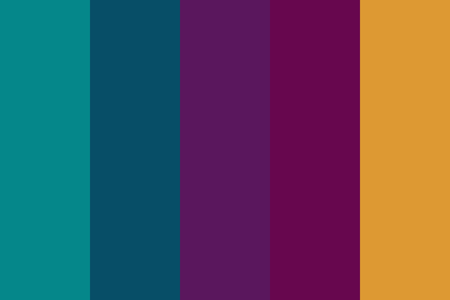
While the term “jewel tone” can encompass a broad spectrum, the most recognized core palette includes:
- Deep Blues: Think navy, sapphire, royal blue.
- Rich Reds: From ruby red to deep crimson.
- Vivid Greens: Emerald, forest green, jade.
- Opulent Purples: Amethyst, plum, deep violet.
- Warm Oranges/Yellows (Accent): Often represented by citrine or deep amber, used sparingly to add warmth and contrast.
The interplay of these highly saturated colors creates a visual harmony that is both striking and elegant, making them a powerful tool in a brand’s visual identity toolkit.
The Psychology of Richness: Why Jewel Tones Resonate in Branding
The human brain processes color with incredible speed, triggering emotional and psychological responses even before conscious thought. Jewel tones, with their inherent depth and vibrancy, tap into primal associations of value, rarity, and natural beauty, making them incredibly effective in brand communication.
Evoking Luxury and Sophistication
The most immediate association with jewel tones is luxury. This connection stems from their origin—precious gemstones—which have historically been symbols of wealth, status, and prestige. When a brand incorporates jewel tones, it subtly communicates:
- High Quality: The richness of the color implies superior materials or craftsmanship.
- Exclusivity: The perceived rarity of the colors (like actual gems) suggests a bespoke or limited offering.
- Sophistication: The depth and elegance of jewel tones convey refinement and good taste.
For brands operating in high-end markets—fashion, automotive, hospitality, and luxury goods—jewel tones are often a default choice for their ability to instantly elevate brand perception and justify premium pricing.
Emotional and Perceptual Impact
Beyond luxury, each jewel tone carries its own set of psychological triggers that can be strategically harnessed:
- Blue (Sapphire): Trust, reliability, wisdom, tranquility. Ideal for financial institutions, tech brands, or any service emphasizing stability.
- Red (Ruby): Passion, energy, urgency, power, courage. Effective for brands wanting to convey excitement, dynamism, or leadership.
- Green (Emerald): Growth, harmony, nature, prosperity, health. Excellent for sustainable brands, wellness products, or organizations focused on wealth management.
- Purple (Amethyst): Creativity, imagination, luxury, royalty, spirituality. Suited for creative agencies, luxury fashion, or brands targeting an aspirational audience.
- Yellow/Orange (Citrine/Topaz): Optimism, joy, warmth, accessibility (when brighter); richness, heritage (when deeper). Used as accents, these can add a welcoming touch to an otherwise serious palette.
By carefully selecting and combining jewel tones, brands can craft a nuanced emotional narrative that resonates deeply with their target audience, influencing purchasing decisions and fostering brand loyalty.
Standing Out in a Saturated Market
In an increasingly crowded marketplace, differentiation is key. While many brands gravitate towards muted, minimalist, or bright primary palettes, jewel tones offer a distinct path to visual prominence. Their intensity and depth allow a brand to:
- Command Attention: A jewel-toned logo or website banner naturally draws the eye due to its vibrant saturation.
- Create Memorability: Distinctive color palettes are easier to recall, contributing to stronger brand recognition.
- Project Confidence: Brands that confidently use bold, rich colors often project an image of self-assurance and leadership, distinguishing them from competitors who might play it safer.
This distinctiveness is not about being loud, but about being impactful and memorable, carving out a unique visual identity that speaks volumes about the brand’s quality and vision.
Strategic Application: Integrating Jewel Tones into Brand Identity
The true power of jewel tones in branding lies in their strategic application across all touchpoints, ensuring a consistent and compelling brand narrative. From the smallest logo detail to the expansive design of a physical retail space, these colors can reinforce a brand’s desired perception.

Logo and Visual Mark Design
A brand’s logo is its most condensed visual representation. Using jewel tones in a logo immediately signals sophistication and often, premium quality. A deep sapphire logo for a tech company can convey trustworthiness and cutting-edge reliability, while an emerald mark for an eco-luxury brand speaks to natural elegance and sustainability. The richness of these colors ensures that the logo stands out, even at small sizes, and maintains its impact across various mediums.
Digital and Print Marketing
In digital marketing, jewel tones create visually stunning websites, social media graphics, and digital advertisements that capture attention. Their vibrancy renders beautifully on screens, enhancing user experience and driving engagement. In print, their depth translates into luxurious brochures, business cards, and packaging, making the tangible assets feel substantial and high-quality. A dark, jewel-toned background can make lighter text pop, while jewel tones used as accent colors can highlight key calls to action.
Product and Packaging Aesthetics
For products themselves, jewel tones can be intrinsic to the design. High-end electronics, cosmetics, fashion items, and home decor often leverage jewel tones to imbue products with a sense of luxury and desirability. The packaging of such products also benefits immensely from this palette. A perfume bottle with an amethyst hue, or a skincare line encased in emerald green packaging, immediately elevates the perceived value and aesthetic appeal, making the product feel more precious and exclusive.
Experiential Branding (Retail Spaces, Events)
Beyond static visuals, jewel tones play a crucial role in experiential branding. The interior design of a flagship store, the lighting at a brand event, or even the uniforms of staff can all integrate jewel tones to create an immersive brand environment. Imagine a luxury boutique adorned with deep ruby accents and sapphire velvet upholstery; such spaces communicate opulence and exclusivity, drawing customers into the brand’s world and making their experience memorable and aligned with the brand’s premium image.
Crafting Harmonious Palettes: Design Principles for Jewel Tones
While powerful, the effective use of jewel tones requires careful consideration of design principles to avoid overwhelming the audience or creating a disjointed visual identity. Balance, contrast, and thoughtful combination are key.
Balancing Depth with Contrast
Due to their inherent intensity, jewel tones need to be balanced. A common strategy is to pair them with neutral colors like cream, ivory, charcoal, or gold accents. These neutrals provide breathing room and prevent the palette from becoming too heavy or claustrophobic. For instance, a sapphire blue primary color might be beautifully contrasted with a crisp white for text and a metallic gold for subtle highlights, lending a sophisticated yet legible design.
Complementary and Analogous Schemes
Designers often employ color theory to create harmonious jewel-tone palettes:
- Complementary Schemes: Using colors opposite each other on the color wheel (e.g., emerald green and ruby red) can create a dynamic, high-contrast look that is vibrant and energetic. This must be handled judiciously to avoid a festive or holiday feel, often by letting one color dominate and the other act as a precise accent.
- Analogous Schemes: Pairing colors adjacent on the color wheel (e.g., sapphire blue, amethyst purple, and ruby red) creates a more harmonious, flowing aesthetic. This approach is often seen in luxury brands that want to convey a sense of seamless elegance and depth without sharp contrasts.
Modern Interpretations and Trends
Contemporary branding often sees jewel tones applied with a fresh perspective. This can include:
- Monochromatic Depth: Using varying shades and tints of a single jewel tone to create depth and sophistication.
- Gradient Transitions: Smooth shifts between jewel tones or from a jewel tone to a neutral, adding a modern, ethereal quality.
- Textural Integration: Combining jewel tones with rich textures like velvet, silk, or brushed metals in physical branding elements.
- Digital Luminosity: Leveraging the bright backlighting of screens to make jewel tones glow with an almost ethereal quality, particularly in gradients or overlays.
Staying attuned to these evolving trends allows brands to harness the timeless appeal of jewel tones while maintaining a contemporary and relevant visual identity.
Case Studies and Brand Success Stories
Many successful brands across diverse industries have intuitively or deliberately integrated jewel tones into their identity to great effect, often without explicitly labeling them as such.
Luxury Market Leadership
High-end automotive brands frequently use deep, metallic jewel tones in their vehicle finishes and promotional materials to underscore prestige and engineering excellence. Similarly, designer fashion houses leverage rich emeralds, sapphires, and rubies in their collections, runway shows, and retail environments to communicate exclusivity, craftsmanship, and a discerning taste level. These brands understand that the color choices directly contribute to the perception of quality and the price point.
Creative Industry Innovators
Even in sectors not traditionally associated with overt luxury, jewel tones can signify creativity and forward-thinking. Certain high-tech companies or design agencies might use deep amethysts or vibrant teal (a jewel-like shade of blue-green) to convey innovation, uniqueness, and a sophisticated approach to problem-solving. These choices help position them as leaders who blend artistic flair with cutting-edge functionality, appealing to clients seeking imaginative yet professional solutions.
In essence, jewel tone colors are more than just a beautiful palette; they are a strategic asset in branding. Their inherent associations with luxury, depth, and emotional resonance provide a powerful language for brands to communicate their values, elevate their image, and forge a lasting connection with their audience. The thoughtful integration of these opulent hues can transform a brand’s visual identity into a compelling narrative of distinction and quality.
aViewFromTheCave is a participant in the Amazon Services LLC Associates Program, an affiliate advertising program designed to provide a means for sites to earn advertising fees by advertising and linking to Amazon.com. Amazon, the Amazon logo, AmazonSupply, and the AmazonSupply logo are trademarks of Amazon.com, Inc. or its affiliates. As an Amazon Associate we earn affiliate commissions from qualifying purchases.