Mint green, a refreshing and often understated hue, holds a distinctive position in the lexicon of color, wielding significant influence in brand strategy, corporate identity, and design. More than just a specific shade, it represents a confluence of natural tranquility, modernity, and subtle sophistication. Understanding the multifaceted nature of mint green is crucial for any brand looking to leverage its unique chromatic identity to communicate specific values, evoke desired emotions, and resonate with its target audience.
The Chromatic Identity of Mint Green
To truly grasp mint green’s branding potential, one must first define its essence and explore its inherent psychological and historical dimensions.

Defining the Hue
Mint green is broadly defined as a pale, light green color, often described as a pastel shade, that closely resembles the color of the Mentha (mint) plant. It is characterized by its cool undertones, typically incorporating a significant amount of white and often a touch of blue, which differentiates it from warmer, yellower greens. Its exact composition can vary, ranging from slightly brighter, more vibrant iterations to softer, muted versions, each carrying subtle shifts in its perceived character. This inherent versatility allows it to adapt to diverse aesthetic needs while maintaining its core identity of freshness and clarity.
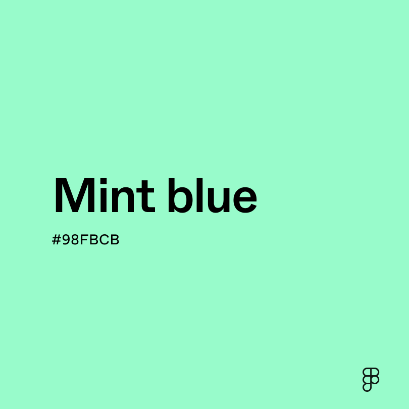
In the RGB color model, commonly used for digital displays, mint green often falls into ranges like RGB (152, 255, 152) or similar light green-blue variations. In the hexadecimal system, common values include #98FF98 or #C4FDC7, demonstrating its high saturation in green and often blue channels with significant lightness. These technical specifications underpin its visual properties, contributing to its distinct appearance across different media.
Psychological Associations and Perceptions
The psychological impact of mint green is profoundly significant for branding. It is overwhelmingly associated with nature, growth, and revitalization, instantly conjuring images of fresh leaves, spring meadows, and calm waters. This connection to the natural world imbues it with feelings of serenity, health, and purity. Brands aiming to project an image of environmental consciousness, organic purity, or wellness frequently find mint green to be an ideal choice.
Beyond its natural connotations, mint green also evokes a sense of cleanliness, clarity, and renewal. This makes it particularly effective for brands in the health, beauty, and hospitality sectors. It suggests a fresh start, a clean slate, and a meticulous attention to detail. Its gentle and calming presence can reduce anxiety and create a feeling of peacefulness, making it suitable for environments or products designed to soothe and relax. Furthermore, it often carries associations with innovation and modernity when paired with contemporary design elements, suggesting forward-thinking and sophisticated simplicity.
Historical and Cultural Context
Historically, green, in general, has been linked to nature, fertility, and renewal across various cultures. Mint green, as a lighter, more refined iteration, began to gain prominence in design and fashion in the mid-20th century, particularly in the Art Deco and mid-century modern eras. It became a popular choice for interiors, appliances, and fashion, symbolizing a fresh, optimistic outlook and a departure from heavier, more traditional palettes. Its inclusion in product design during these periods often signaled modernity and a touch of elegance without being overtly opulent.
In contemporary culture, mint green has experienced several resurgences, often tied to trends emphasizing sustainability, minimalism, and digital aesthetics. Its gentle yet distinctive character allows it to stand out without being ostentatious, making it a favorite for brands seeking a friendly, approachable, yet sophisticated visual identity. It transcends typical gender associations, often used effectively in both traditionally feminine and masculine contexts, depending on its complementary colors and design applications.
Mint Green in Brand Strategy and Corporate Identity
The strategic deployment of mint green can significantly shape a brand’s personality, enhance its memorability, and forge strong connections with its target audience.
Crafting Brand Personality with Mint Green
Choosing mint green for a brand’s core identity is a deliberate strategic decision that speaks volumes about its personality. A brand that adopts mint green often seeks to convey attributes such as:
- Freshness and Innovation: Ideal for tech startups, food and beverage companies, or beauty brands aiming to highlight newness, vitality, or a modern approach.
- Health and Wellness: Strongly associated with organic products, healthcare services, spas, or fitness brands, reinforcing themes of purity, natural ingredients, and well-being.
- Sustainability and Eco-Friendliness: A natural fit for environmentally conscious brands, sustainable fashion, or eco-friendly products, signaling a commitment to nature and responsible practices.
- Calm and Trustworthiness: Financial institutions, consulting firms, or educational platforms might use subtle mint green accents to evoke a sense of stability, peace, and reliability.
- Playfulness and Approachability: When paired with brighter colors or whimsical design, mint green can inject a sense of youthful energy and friendliness, appealing to younger demographics or family-oriented brands.
The specific shade and its accompanying palette are crucial. A brighter mint green might convey more energy, while a muted tone could suggest understated elegance and sophistication.
Visual Impact and Memorability
Mint green’s visual distinctiveness allows brands to create a memorable mark in a crowded marketplace. Unlike more common primary or secondary colors, mint green offers a unique visual signature that can differentiate a brand. Its relative rarity in dominant brand palettes (compared to, say, blue or red) can make a brand stand out. When consistently applied across all brand touchpoints—from logos and websites to packaging and uniforms—it creates a cohesive and instantly recognizable corporate identity.
This distinctiveness is not merely aesthetic; it aids in brand recall. Consumers are more likely to remember a brand with a unique and pleasant color scheme. Mint green, with its inherent positive associations, tends to leave a favorable impression, fostering positive brand perception and increasing the likelihood of consumer engagement and loyalty. The color acts as a non-verbal cue, signaling the brand’s core values before a single word is read.
Target Audience Resonance
The effectiveness of mint green, like any color in branding, hinges on its resonance with the intended target audience. For demographics that value health, environmental responsibility, authenticity, and a serene lifestyle, mint green can be a powerful draw. It appeals to those seeking products or services that promise well-being, natural goodness, or a gentle touch.
For younger audiences, especially millennials and Gen Z, who often prioritize sustainability and authentic brand experiences, mint green can communicate a brand that aligns with their values. Its subtle yet impactful presence can feel less aggressive and more inviting than bolder colors, fostering a sense of trust and relatability. Conversely, while universally appealing, its softer nature might require complementary bold colors or strong messaging if the brand targets an audience that primarily values aggression, power, or intense excitement. A thorough understanding of the target demographic’s psychological and cultural relationship with color is paramount for effective brand communication.
Design Applications and Marketing Integration
The versatility of mint green extends across various design applications and marketing channels, enabling brands to maintain a consistent and impactful visual voice.
Web and UI/UX Design
In digital spaces, mint green is a particularly effective color for web and UI/UX design. Its calm and clear qualities contribute to a pleasant user experience. As a background color or for larger sections, it provides a gentle visual foundation that reduces eye strain and enhances readability. When used for interactive elements like buttons, links, or icons, it can draw attention subtly without being jarring, guiding the user through the interface with a sense of ease.
For apps and websites in the health, wellness, education, or productivity sectors, mint green reinforces the message of clarity, freshness, and user-friendliness. It can be paired with white for a minimalist, clean aesthetic, or with darker complementary colors like charcoal or navy to add depth and sophistication. The use of mint green in digital design also reflects current trends towards lighter, more airy interfaces, suggesting modernity and accessibility.
Packaging and Product Design
Mint green shines brightly in packaging and product design, where its tactile and visual appeal can directly influence purchasing decisions. For food and beverage products, particularly those marketed as natural, organic, or low-sugar, mint green packaging immediately communicates health and purity. Think of tea brands, yogurt, or fresh produce where it enhances the perception of wholesome ingredients.
In the beauty and personal care industry, mint green on product packaging suggests freshness, cleanliness, and natural ingredients, appealing to consumers looking for gentle yet effective solutions. For home goods or small appliances, it can evoke a sense of calm, cleanliness, and modern simplicity. The color can also be integrated directly into the product itself, as seen in fashion accessories, stationery, or home decor items, offering a subtle pop of color that is both trendy and timeless. Its ability to convey luxury, simplicity, and natural goodness makes it a potent tool in product differentiation.
Advertising and Communication
In advertising and broader marketing communications, mint green can serve as a powerful differentiator. In print ads, billboards, or social media campaigns, it can create a distinctive visual identity that captures attention without resorting to aggressive tactics. Its calming influence can be particularly effective in emotionally charged advertisements, offering a sense of hope or gentle reassurance.
When used in conjunction with compelling photography and messaging, mint green reinforces the brand’s narrative. For a brand promoting a peaceful retreat, mint green visuals might transport the viewer to a serene environment. For a new, innovative product, it could signal a fresh approach. The key is consistency across all communication channels, ensuring that every touchpoint reiterates the brand’s chosen identity, solidified by the distinctive presence of mint green.
Case Studies and Effective Use
Examining real-world applications helps to illustrate how mint green can be strategically employed to build strong brands. While many iconic brands have signature blues or reds, mint green often appears as a critical secondary or accent color, or as the primary color for brands specifically targeting freshness, health, or environmental consciousness.
Brands That Master Mint Green
Consider brands in the organic food sector, such as certain health food snack companies or organic smoothie brands. They frequently utilize mint green in their packaging and branding to directly communicate the natural origin and fresh ingredients of their products. This isn’t just an aesthetic choice; it’s a strategic one that immediately aligns the brand with consumer desires for wholesome, unprocessed foods.
Similarly, sustainable fashion labels or eco-friendly household product lines often feature mint green prominently. It signals their commitment to environmental responsibility and natural processes, resonating deeply with a consumer base that prioritizes ethical consumption. Even some modern tech accessories, like headphones or phone cases, adopt mint green to convey a sense of playful modernity, clean design, and a departure from more conventional tech aesthetics. These brands successfully harness mint green to create an authentic connection with their audience, reinforcing their core values through visual identity.

Avoiding Pitfalls and Ensuring Consistency
While mint green offers numerous advantages, its effective use requires careful consideration to avoid pitfalls. One common mistake is inconsistency; using varying shades of mint green across different platforms can dilute the brand’s identity and create confusion. Brand guidelines that specify exact color codes (Pantone, CMYK, RGB, Hex) are essential to maintain uniformity.
Another challenge is ensuring the color remains relevant and doesn’t become dated. While mint green has timeless qualities, its popularity in certain trends means brands must balance current aesthetics with enduring appeal. Pairing it with classic neutrals or strategically chosen complementary colors can ensure longevity. Lastly, brands must consider cultural interpretations of green, even light green, in international markets, although mint green generally carries positive associations universally. By being mindful of these aspects, brands can harness mint green’s full potential to craft a compelling and enduring corporate identity.
aViewFromTheCave is a participant in the Amazon Services LLC Associates Program, an affiliate advertising program designed to provide a means for sites to earn advertising fees by advertising and linking to Amazon.com. Amazon, the Amazon logo, AmazonSupply, and the AmazonSupply logo are trademarks of Amazon.com, Inc. or its affiliates. As an Amazon Associate we earn affiliate commissions from qualifying purchases.