
In the world of metallurgy and industrial manufacturing, few elements possess the distinct aesthetic and functional versatility of nickel. When professionals in the fields of product design, luxury manufacturing, and industrial branding discuss the “color of nickel,” they are rarely referring to a single, static hue. Instead, they are navigating a complex spectrum of light reflection, oxidation resistance, and plating techniques that define the aesthetic language of the modern industrial era. Understanding the true color of nickel is essential for brand strategists and designers who use materials to communicate durability, prestige, and contemporary sophistication.

The Chromatic Signature of Elemental Nickel
At its elemental state, nickel is a lustrous, silvery-white metal with a subtle, unmistakable golden undertone. Unlike chromium, which often appears as a harsh, bluish-white mirror finish, or aluminum, which tends toward a flat, matte grey, nickel possesses a warmth that makes it a preferred choice in high-end design applications.
The Science of Perception
From a metallurgical perspective, pure nickel is classified as a transition metal. Its atomic structure allows it to absorb and reflect light in a way that creates a soft, warm glow. This “warm silver” quality is why nickel is frequently utilized in luxury hardware, plumbing fixtures, and automotive trim. It is not merely a color; it is a texture of light. When polished to a mirror finish, nickel reflects the ambient colors of its environment with a slight, golden tint that feels inherently more expensive and approachable than the cold, clinical appearance of chrome.
Comparison to Other Industrial Metals
To truly appreciate the color of nickel, one must place it alongside its industrial counterparts. Stainless steel is often confused with nickel, yet stainless steel typically features a slightly darker, more muted grey profile. When a brand chooses “brushed nickel” over “brushed stainless steel,” they are making a specific strategic decision to move away from the industrial sharpness of steel toward a softer, more inviting aesthetic. This nuance is critical for corporate identity; the choice of metal finish conveys the brand’s positioning—whether it is cold and utilitarian or warm and premium.
The Evolution of “Nickel” as a Brand Aesthetic
In marketing and industrial design, the term “nickel” has transcended the periodic table to become a signifier of a specific visual lifestyle. When a brand advertises a product as having a “nickel finish,” they are selling a narrative of longevity and refined taste.
Brushed Nickel: The Soft Power of Texture
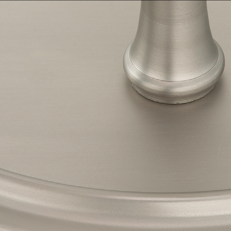
Perhaps the most popular iteration of the metal in the consumer market is brushed nickel. By physically abrading the surface of the metal, designers break the uniformity of the reflection. This process creates a satin-like finish that hides fingerprints and water spots, making it a functional darling for interior design. From a branding perspective, brushed nickel signifies reliability. It is the hallmark of the modern home—versatile, low-maintenance, and aesthetically neutral enough to pair with various color palettes while remaining distinctly premium.
Satin Nickel vs. Polished Nickel
The dichotomy between satin and polished nickel provides brands with two distinct ways to communicate with their audience. Polished nickel acts as a statement piece; it catches the eye and reflects light, suggesting opulence and classical luxury. It is frequently seen in high-end lighting and bespoke furniture. Conversely, satin nickel suggests a more restrained, architectural elegance. It is the color of the modern office, the boutique hotel, and the contemporary kitchen. By choosing between these finishes, a brand dictates the perceived “temperature” of a space or product.
Strategic Applications in Industrial and Product Design
For design-led brands, the color of nickel is a tool for storytelling. The way light plays off a nickel-plated surface can influence a consumer’s perception of value. Strategic use of this color palette requires an understanding of how it interacts with other materials in a brand’s ecosystem.
Coordinating with Color Palettes
Nickel acts as a versatile bridge in color theory. Because it contains a subtle warmth, it pairs exceptionally well with cool tones like navy blue or charcoal gray, effectively balancing the spectrum. When used alongside warmer wood tones, the metallic sheen of nickel prevents the environment from feeling too rustic, adding a layer of sophisticated contrast. Design agencies often use nickel as the “neutral anchor” in a brand’s physical assets, such as retail displays or hardware, because it rarely clashes with other design elements.
Longevity and Value Perception
In the realm of luxury goods, color is inextricably linked to the perception of value. Nickel is resistant to corrosion and oxidation, meaning that the “color of nickel” is a color that lasts. When a consumer buys a product with a high-quality nickel finish, they are purchasing a piece that will not dull, pit, or change color over time. This longevity is a core component of brand trust. Companies that commit to genuine nickel plating—rather than painting a base metal to look like nickel—leverage this durability to justify a higher price point. The color is not just a visual choice; it is a promise of quality that reinforces the brand’s reputation for excellence.
The Future of Nickel Aesthetics in Branding
As we look toward the future of industrial design, the “color of nickel” is being reimagined through new sustainable manufacturing processes. Brands are increasingly moving away from traditional electroplating, which can have significant environmental impacts, toward PVD (Physical Vapor Deposition) coating.
PVD Coating and Color Consistency
PVD technology allows for an incredible level of precision in how nickel-colored finishes are applied. This evolution means that the “color of nickel” is becoming more consistent across different manufacturing batches. For global brands, this is a massive advantage. Whether a product is manufactured in a facility in Asia or Europe, the visual language remains identical. Consistency is the foundation of brand identity, and the ability to standardize the exact shade of “nickel” across a global product line ensures that the brand’s visual story remains cohesive.

Minimalism and the “Nickel” Trend
Minimalism continues to dictate design trends, and nickel is uniquely positioned to thrive in this era. As consumers demand simpler, cleaner, and more intentional design, the muted, warm-silver aesthetic of nickel serves as the perfect minimalist accent. It does not demand attention like brass or gold, yet it provides more character than black or white. It is the understated luxury that defines the current zeitgeist. Brands that lean into this color are communicating that they value quality, subtle detail, and timelessness over the fleeting, high-contrast trends that often lead to “design fatigue.”
Ultimately, the color of nickel is a masterclass in subtlety. It is a spectrum that spans from the brilliance of polished surfaces to the understated depth of brushed finishes. For brands and designers, it remains an indispensable element in the toolkit of visual communication. By understanding the science behind its golden-silver hue and the psychological weight it carries, designers can continue to use nickel to craft environments and products that feel both contemporary and enduring. It is, quite simply, the color of modern refinement.
aViewFromTheCave is a participant in the Amazon Services LLC Associates Program, an affiliate advertising program designed to provide a means for sites to earn advertising fees by advertising and linking to Amazon.com. Amazon, the Amazon logo, AmazonSupply, and the AmazonSupply logo are trademarks of Amazon.com, Inc. or its affiliates. As an Amazon Associate we earn affiliate commissions from qualifying purchases.