
In the world of high-end motion graphics and animation, visual storytelling relies heavily on the manipulation of timing and emphasis to capture the viewer’s attention. Among the many techniques used by industry professionals, the “impact frame” stands out as a powerful tool for visual punctuation. Often associated with the frantic energy of Japanese anime and the sleek aesthetics of modern motion design, an impact frame is a brief, stylized image inserted into a sequence to heighten the intensity of an action. Whether you are a brand designer looking to elevate a motion identity or an editor working on high-conversion social media content, understanding the mechanics of the impact frame is essential for creating work that leaves a lasting impression.
The Anatomy of an Impact Frame
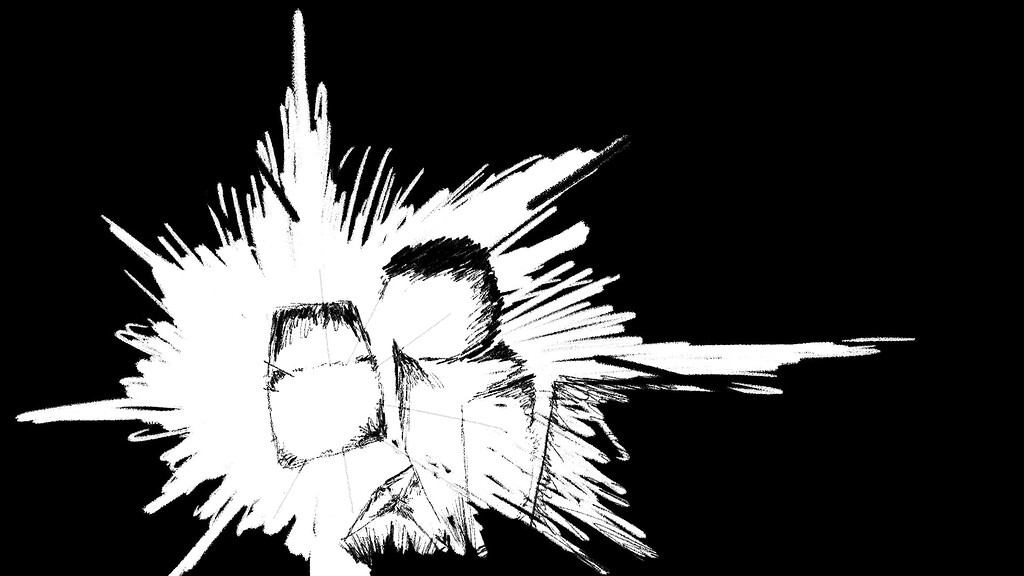
At its core, an impact frame is a single-frame (or occasionally a few-frame) visual diversion. It acts as a rhythmic “shock” within a fluid animation. Unlike a standard frame that contributes to the continuous motion of a sequence, the impact frame deviates from the established visual language to emphasize a specific moment of collision, impact, or emotional release.
Visual Contrast and Abstraction
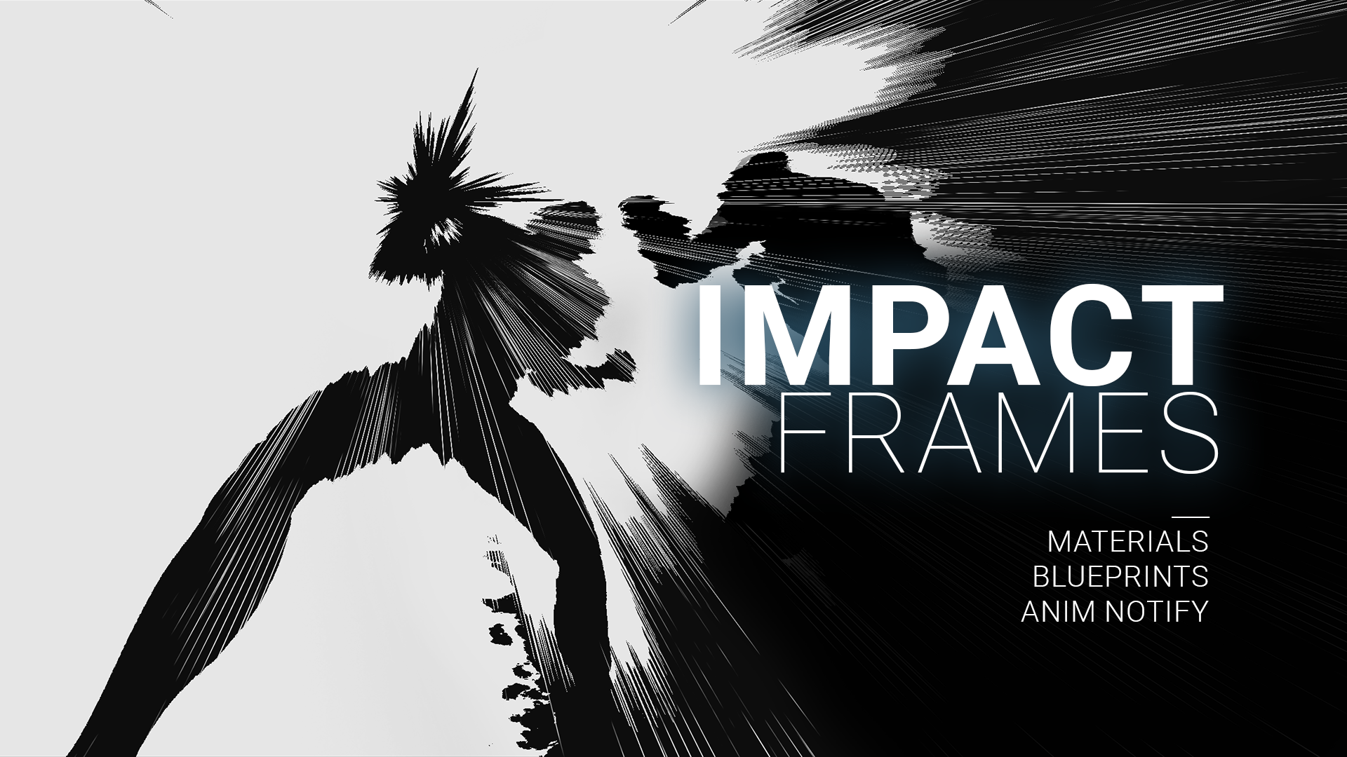
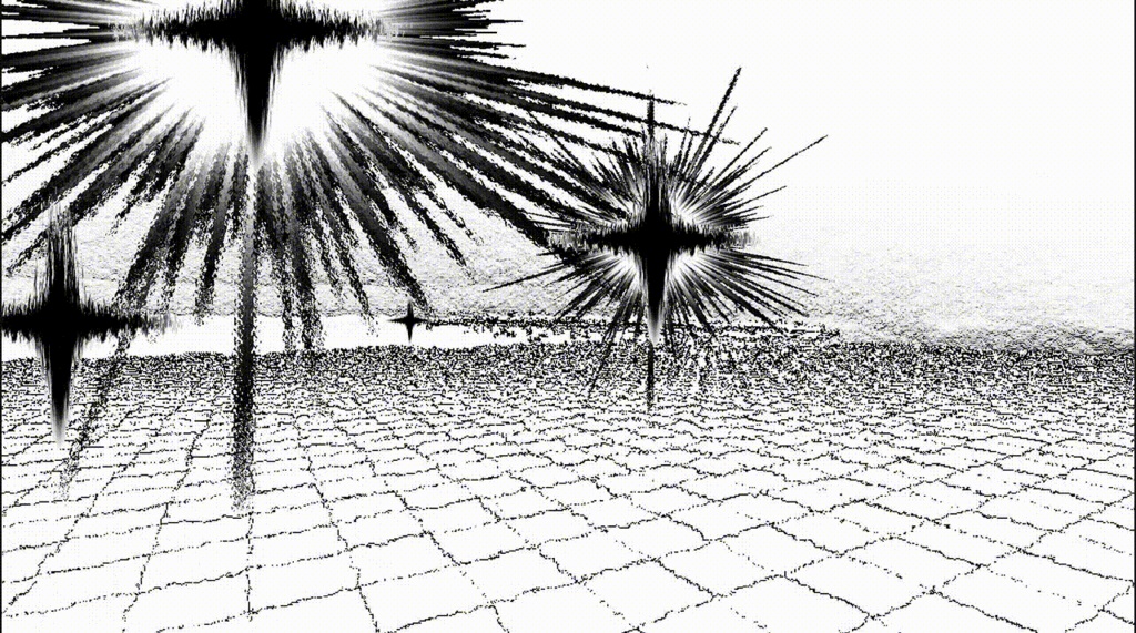
The hallmark of a well-executed impact frame is contrast. While the main action may follow a realistic or consistent art style, the impact frame often shifts toward high-contrast, graphic, or abstract imagery. This might manifest as a flash of monochromatic color, a stylized radial explosion, a jagged black-and-white silhouette, or even a sudden burst of text. By breaking the continuity of the visual flow for just 1/24th of a second, the designer signals to the audience’s subconscious that a significant event has occurred.
The Neuroscience of Attention
The efficacy of an impact frame is rooted in how the human eye processes motion. When an audience is tracking fluid motion, the brain predicts the path of objects. An impact frame disrupts this predictive pattern. This sudden “glitch” or “strobe” effect triggers an orienting response, forcing the viewer to re-engage with the content. In professional motion design, this is not a mistake; it is a calculated disruption designed to make a product reveal or a brand transition feel more substantial and weighty.
Strategic Application in Brand Identity
For brands, motion is the new frontier of corporate identity. A static logo is no longer enough; how a logo animates—and how it responds to the “impact” of a digital interface—defines a brand’s personality. Impact frames provide a way to build authority and vigor into digital brand assets.
Highlighting Key Product Moments
When designing a motion identity for a tech brand, every interaction—from a button click to a page load—should feel deliberate. If a user clicks a “Purchase” or “Submit” button, an impact frame can be used to emphasize the “confirmation.” A subtle, high-speed flash or a brief, distorted frame during the button’s expansion phase communicates responsiveness. It tells the user that their action has “hit” the system with precision.
Elevating Motion Graphics for Marketing
In marketing campaigns, engagement rates often drop if the visual rhythm is too predictable. Advertisers use impact frames to break the monotony of a 15-second spot. When a product is showcased, a subtle impact frame applied to the motion blur or the transition into the product shot adds “texture” to the commercial. It makes the visual experience feel more “expensive” and professional, effectively distinguishing premium brands from competitors who rely on standard, linear motion.
Designing Impact Frames: Best Practices and Technical Considerations
Integrating impact frames requires a delicate balance. If overused, they create visual clutter and fatigue; if underused, the animation may feel soft or lacking in energy. The goal is to use them with surgical precision to serve the broader narrative of the brand or the interface.
Timing and The “Sweet Spot”
The most effective impact frames typically occur exactly on the frame of impact—the moment of collision or the peak of an action. For example, if a character (or a graphical element) hits a wall, the impact frame should occur precisely at the point of contact. To maximize the effect, many designers use a “hold” frame immediately before the impact, followed by the impact frame, and then a slightly elongated aftermath to let the visual “settle.” This sequence—tension, discharge, and resolution—is the bedrock of compelling motion design.
Color and Palette Control
A common mistake in creating impact frames is using too many colors. An impact frame is most effective when it simplifies the visual information. Stick to a restricted palette: white-on-black, brand-specific highlight colors, or negative space silhouettes. By reducing the visual complexity of the frame, you ensure the impact is felt as a signal rather than just noise. If your brand utilizes a specific neon blue, consider using a solid white or a saturated version of that blue for your impact frame to maintain brand consistency while achieving the necessary contrast.
Balancing Style with Accessibility
In the context of software and UI/UX design, one must be mindful of accessibility. Impact frames involve flashes and quick, stroboscopic effects. Designers must ensure that the frequency and intensity of these flashes do not trigger photosensitivity. In digital product design, impact frames should be subtle—often using opacity shifts or slight scale changes—rather than high-contrast strobing, which is better reserved for gaming, entertainment, or highly stylized advertising content.
The Future of Motion Identity
As we move toward more immersive digital environments, the importance of “tactile” motion increases. Impact frames are a digital surrogate for physical weight. In the real world, objects have mass, and their collisions are felt. On a screen, mass is an illusion created by the designer. By utilizing impact frames, designers can simulate this sense of weight, making digital interfaces and brand animations feel grounded, reliable, and powerful.
Consistency as a Branding Tool
Just as a brand has a typography system and a color palette, it should have a “motion style guide.” This guide dictates when and how the brand uses impact frames. Does your brand use jagged, energetic frames to convey a sense of modern urgency? Or does it use soft, glowing flashes to convey precision and calm? Defining this aspect of your visual strategy ensures that your brand’s personality is communicated consistently across every video, animation, and digital touchpoint.
Conclusion
An impact frame is far more than a decorative flair; it is a functional tool for rhythm, emphasis, and engagement. By understanding the intersection of visual contrast and audience attention, designers can transform standard sequences into memorable brand experiences. Whether you are crafting a logo reveal or designing the motion language for a new software platform, the impact frame serves as the ultimate punctuation mark. It is the moment where the virtual becomes tangible, turning a simple flicker into a statement of intent. In a world saturated with digital noise, the ability to control the viewer’s focus through precision motion design is the hallmark of a master craftsman. Use the impact frame not to fill space, but to give your motion design the weight it deserves.
aViewFromTheCave is a participant in the Amazon Services LLC Associates Program, an affiliate advertising program designed to provide a means for sites to earn advertising fees by advertising and linking to Amazon.com. Amazon, the Amazon logo, AmazonSupply, and the AmazonSupply logo are trademarks of Amazon.com, Inc. or its affiliates. As an Amazon Associate we earn affiliate commissions from qualifying purchases.