When building a brand identity or establishing a visual language for a creative project, the materials you choose to feature carry significant weight. Pine, as one of the most widely used softwoods in the world, occupies a unique position in design. It is not merely a piece of timber; it is a visual signifier of accessibility, rustic authenticity, and structural potential. For designers, marketers, and brand strategists, understanding the aesthetic properties of pine is essential for creating authentic visual narratives that resonate with audiences looking for transparency and warmth.
The Visual Anatomy of Pine
To leverage pine in your design assets or product photography, you must first understand the specific characteristics that define its appearance. Pine is classified as a softwood, a term that refers to its botanical origin rather than its physical durability. This distinction is the primary driver of its distinct visual texture.
Color Palette and Tone
Freshly cut pine is known for its light, creamy, and often yellowish-white appearance. As the wood is exposed to light and oxygen, it undergoes a natural process of oxidation. Over time, pine transitions from a pale, almost sterile blonde to a deeper, richer honey-amber hue. This characteristic is crucial for brand storytelling; a piece of raw, unfinished pine communicates “start-up energy” or a “work-in-progress” aesthetic, whereas aged, golden-hued pine evokes heritage, craftsmanship, and stability.
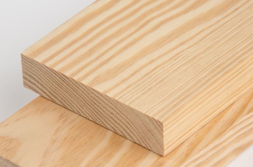
Grain Patterns and Texture
Pine is visually defined by its high-contrast grain. Unlike hardwoods like maple, which are characterized by subtle, uniform patterns, pine features prominent, swirling grain lines that darken significantly when stained. The growth rings are clearly visible, often creating a “cathedral” effect—a series of arching lines that draw the eye across the surface. This high-contrast aesthetic serves as a visual anchor in interior design photography and brand-focused lifestyle shots, providing a sense of natural movement that minimalist, synthetic materials cannot replicate.
Knots: The Signature of Authenticity
Perhaps the most polarizing feature of pine is the presence of knots. These dark, circular clusters occur where branches once grew from the trunk. In high-end minimalist design, these are often viewed as “defects” to be painted over, but in the context of modern brand strategy, knots are the ultimate signifier of organic reality. Brands that celebrate the imperfections of pine are effectively communicating a message of sustainability, eco-consciousness, and a rejection of the mass-produced, uniform “perfection” that dominates global retail.
Branding with Wood Aesthetics
In the digital landscape, texture plays a pivotal role in brand positioning. Using imagery or physical elements that feature pine allows a brand to align itself with specific values. Whether you are designing a website background, choosing materials for a physical retail space, or selecting textures for product mockups, pine dictates the “vibe” of your brand.
The “Rustic-Modern” Intersection
Pine is the backbone of the “Rustic-Modern” design movement. By pairing the organic, knotty appearance of pine with clean, matte black hardware or sleek, monochromatic color palettes, brands can bridge the gap between traditional craftsmanship and contemporary luxury. This aesthetic is highly effective for lifestyle brands, coffee shops, and boutique architecture firms. It tells the consumer: “We value history, but we function in the present.”
Communicating Transparency and Simplicity
The simple, unpretentious appearance of pine mirrors the push for radical transparency in modern marketing. Because pine is affordable and historically tied to utilitarian uses—like shelving, crates, and basic furniture—using it in your visual identity suggests that your company is straightforward, approachable, and devoid of hidden agendas. If your brand strategy focuses on “honest products” or “simplified living,” the raw, unpainted, or lightly waxed pine aesthetic is your most powerful visual tool.
Tactile Marketing and Physical Touchpoints
For companies operating in the physical space, such as retail boutiques or experiential agencies, the look of pine is just the beginning. The visual expectation of pine is that it will be soft to the touch and warm. When a brand integrates pine into its physical environment, it utilizes the brain’s “haptic perception”—the way we perceive a material’s texture through sight alone. A space accented with pine feels welcoming and human-centric, lowering the customer’s guard and encouraging longer engagement times.

Material Psychology in Design
When you incorporate the visual language of pine into your brand assets, you are engaging in a form of silent psychology. Consumers subconsciously associate materials with emotions. Pine, with its light color and pronounced grain, triggers a specific set of associations that should be handled with intentionality.
The Warmth Factor
Compared to the cold, sterile appearance of brushed steel or polished concrete, pine radiates warmth. This is due to the natural golden undertones present in the wood fiber. If your brand is currently struggling with a cold or distant reception, introducing the visual texture of pine—even through stylized stock photography or web design elements—can effectively lower the perceived temperature of your brand, making it feel more accessible and human.
The Sustainability Narrative
In an era where “greenwashing” is a major concern for consumers, pine serves as a legitimate visual marker of sustainability. As a fast-growing, renewable resource, pine is often associated with responsible forestry. By highlighting the grain and natural features of the wood in your brand imagery, you are subtly communicating that your brand is in touch with nature. However, for this to be effective, your visual messaging must be consistent. If you use the look of organic pine to sell products that are inherently wasteful or non-biodegradable, the visual dissonance will be detected by your audience.
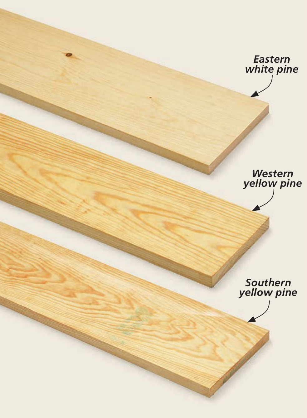
The Challenge of Versatility
A common mistake in brand design is assuming that all pine looks the same. Depending on the finish, the visual identity of pine can shift dramatically.
- Raw/Unfinished Pine: Communicates DIY, youth, accessibility, and potential.
- Whitewashed Pine: Communicates Scandinavian minimalism, airiness, and a clean, serene environment.
- Stained/Dark Pine: Communicates traditional luxury, permanence, and depth.
Understanding these variations is critical. A tech startup looking to project a sleek, fast-moving image should avoid the rustic, heavy-knot look of raw pine, opting instead for a lime-washed or light-matte finish that mimics the cleaner aesthetic of birch.
Strategic Integration into Design Systems
To finalize your brand’s relationship with this material, you must move beyond viewing pine as an “accessory” and begin to treat it as an essential element of your design system.
Creating a Visual Library
If your brand strategy relies on the aesthetic of pine, build a curated asset library. This should include high-resolution textures showing the wood under different lighting conditions. Include shots of extreme close-ups showing the grain, mid-range shots showing the knots, and wide-angle shots showing how the wood interacts with negative space. By standardizing the “look” of the pine within your library, you ensure that your website, social media, and physical storefront all speak the same visual language.
Balancing Pine with Brand Architecture
Pine has a strong visual personality; it is not a “quiet” material. Because of its high-contrast grain, it can easily overwhelm a design if not balanced correctly. Use pine as a “hero” texture—apply it to primary surfaces or as a background for high-impact photography. Surround it with neutral, non-patterned surfaces to prevent visual fatigue. If your logo is complex, do not place it over a highly knotted piece of pine, as the competing patterns will dilute your brand’s recognizability.
Longevity and Brand Evolution
Just as pine darkens and changes over time, your brand’s visual identity should have the capacity to evolve. Consider how your use of this material will grow with your business. Are you using it to signify a “budget-friendly” startup phase, or are you looking to elevate the brand? If the latter, transition from raw pine to finished, refined wood tones as your brand matures.
In conclusion, pine is much more than a common building material. It is a nuanced design element that communicates values of transparency, warmth, and sustainability. When understood through the lens of brand strategy, the “look” of pine becomes a powerful tool for building a narrative that feels grounded, authentic, and inherently human. By mastering the visual anatomy of this timber, you can create a brand identity that doesn’t just look good, but feels right to your audience.
aViewFromTheCave is a participant in the Amazon Services LLC Associates Program, an affiliate advertising program designed to provide a means for sites to earn advertising fees by advertising and linking to Amazon.com. Amazon, the Amazon logo, AmazonSupply, and the AmazonSupply logo are trademarks of Amazon.com, Inc. or its affiliates. As an Amazon Associate we earn affiliate commissions from qualifying purchases.