
The psychology of color is a cornerstone of effective brand strategy. In the visual language of marketing, every hue acts as a silent communicator, triggering subconscious associations, emotional responses, and behavioral patterns. When an individual identifies orange as their favorite color, they are signaling a psychological profile characterized by high energy, social enthusiasm, and a penchant for unconventional thinking. For brand strategists and designers, understanding why certain demographics gravitate toward orange—a color that sits at the intersection of red’s passion and yellow’s optimism—is essential for crafting identities that demand attention and foster community engagement.

The Psychology of Orange in Brand Identity
Orange is arguably the most polarizing color in the spectrum. It is rarely a neutral choice; people tend to have a strong affinity for it or find it overwhelming. From a brand identity perspective, this makes it an incredibly powerful tool for differentiation. By utilizing orange, a brand intentionally positions itself as a challenger, a disruptor, or a source of infectious vitality.
The Vibrancy Factor
At its core, orange represents energy. It is the color of movement, activity, and external focus. When consumers choose orange as their favorite color, they are often identifying with a desire for stimulation and social connection. Brands like Nickelodeon, Fanta, and Home Depot leverage this by utilizing the color to signify accessibility and excitement. Unlike the sterile professionalism of blue or the intense aggression of red, orange offers a “friendly” intensity. It suggests that a brand is approachable, creative, and ready to engage in a conversation.
Cognitive Associations and Trust
In color theory, orange is associated with warmth, sunshine, and enthusiasm. However, it also carries the weight of visibility. Because it is a high-visibility color, it is often used in safety gear and warning signs, but in the context of branding, this translates to “awareness.” Brands that adopt orange are effectively saying, “Look here; something important is happening.” When a person’s favorite color is orange, they are likely drawn to brands that feel kinetic and forward-thinking. They respond to marketing that prioritizes “doing” over “being,” favoring brands that offer utility, entertainment, or innovative solutions to everyday problems.
Design Principles: Harnessing the Power of Orange
For designers and marketing professionals, orange is a high-stakes choice. Because it vibrates with such high intensity, it requires a sophisticated approach to balance. A brand that relies too heavily on orange can risk appearing “cheap” or “juvenile,” whereas a brand that integrates it strategically can appear avant-garde and bold.
Balancing Intensity and Contrast
The effectiveness of orange in a design system depends heavily on its pairing. When orange is paired with cool, muted tones like slate gray or deep navy, it acts as an accent of innovation, grounding the energy of the brand in a professional context. Conversely, pairing orange with vibrant yellows or purples creates a high-contrast, playful identity that resonates with younger, trend-conscious demographics.
Those who favor orange are usually drawn to this sense of balance. They appreciate designs that are bold enough to stand out but clever enough to be legible. This is why many fintech startups and modern tech disruptors are moving away from the “safety” of corporate blues and toward the warmer, more human-centric palette of orange and terracotta. It signals a move toward user-friendliness in a complex digital landscape.

Cultural Context and Global Perception
Brand strategy must account for the fact that color meaning is not universal. While in the West, orange is often linked to the harvest, autumn, and creativity, in other cultures, it may have spiritual or historical connotations. A brand targeting an audience that loves orange must navigate these nuances carefully. For instance, in parts of the East, orange is a color of sanctity and renunciation. A brand leveraging orange for its “excitement” value in one market might need to pivot its messaging to reflect “stability” or “wisdom” in another. Understanding the consumer’s emotional attachment to the color is the first step in creating a global brand voice that remains consistent yet culturally resonant.
Leveraging Orange for Consumer Engagement
If your target audience identifies with orange, your marketing strategy must pivot toward the principles of participation and community. Orange is the color of the “doer.” It does not demand passive observation; it invites interaction.
Crafting Call-to-Action (CTA) Strategy
In digital marketing, the “CTA button” is the most critical real estate. For decades, orange has been one of the top-performing colors for conversion buttons. Why? Because it stands out against the sea of blue and white backgrounds typical of web design, but it does so without the alarmist tone of red. If a user’s favorite color is orange, their eyes are naturally conditioned to scan for that specific hue. Utilizing orange for primary calls to action aligns with the consumer’s subconscious preferences, creating a seamless user journey that feels instinctive rather than forced.
Building Community-Centric Brands
Brands that utilize orange successfully—such as HubSpot, Etsy, or SoundCloud—often prioritize community and creator-focused experiences. Orange reflects the spark of a new idea and the warmth of a collective. For a brand, using orange in your visual identity signals that your platform is a place for collaboration, brainstorming, and social sharing.
If your marketing strategy is centered on community building, adopting orange as a dominant or secondary brand color is a strategic move to attract the “social enthusiast” archetype. These consumers are not just looking for a product; they are looking for an environment where they can express themselves. They want brands that feel like a megaphone for their own creativity.
The Future of Brand Identity: Beyond the Traditional Spectrum
As we move further into a digital-first economy, the traditional rules of branding are being rewritten. The rise of AI-driven design tools and hyper-personalized marketing means that color choices are becoming more data-driven than ever before. However, the psychological core of color—specifically the high-energy draw of orange—remains a constant.
The Evolution of the “Human” Brand
We are entering an era of “Human-Centric Branding.” Consumers are increasingly fatigued by perfectly polished, monochromatic corporate identities. They are craving warmth, imperfection, and boldness. Orange, being a color that feels distinctly human and organic (think of the spectrum of fruit, fire, and sunsets), is uniquely positioned to bridge the gap between digital utility and emotional connection.
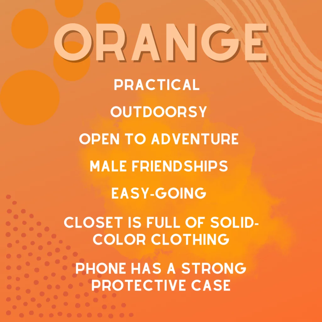
When a consumer says orange is their favorite color, they are signaling a preference for authenticity. They are opting out of the cold, calculated aesthetic and choosing a brand presence that feels vibrant and alive. For the brand strategist, this is a clear directive: if you want to capture the attention of the modern, expressive consumer, your visual identity needs to incorporate the kinetic, optimistic, and deeply social energy of orange.
Final Strategic Takeaway
A brand is more than a logo; it is a promise. By selecting orange as a foundational element of your brand identity, you are promising your audience that you are a source of energy, creativity, and progress. You are appealing to the segment of the population that refuses to blend into the background. These individuals—those who gravitate toward orange—are the early adopters, the collaborators, and the creative forces of the market. By aligning your brand strategy with the psychological needs of this demographic, you don’t just sell a product; you cultivate a movement. Whether you use it as a subtle accent or a primary brand color, orange remains the ultimate signal of a brand that is ready to engage, evolve, and shine in a crowded marketplace.
aViewFromTheCave is a participant in the Amazon Services LLC Associates Program, an affiliate advertising program designed to provide a means for sites to earn advertising fees by advertising and linking to Amazon.com. Amazon, the Amazon logo, AmazonSupply, and the AmazonSupply logo are trademarks of Amazon.com, Inc. or its affiliates. As an Amazon Associate we earn affiliate commissions from qualifying purchases.